【GitHub前端练手项目--50天50个项目---商品加载效果-----day08】
GitHub热门前端练手项目,纯HTML、CSS、JS实现,50天50个项目,每日一个项目,打卡活动,解读项目中的知识点
GitHub项目官网连接
50Projects in 50 Days
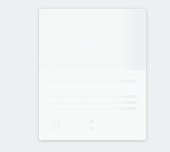
项目展示
代码
HTML
<!DOCTYPE html>
<html lang="en">
<head>
<meta charset="UTF-8" />
<meta name="viewport" content="width=device-width, initial-scale=1.0" />
<link rel="stylesheet" href="style.css" />
<title>Content Placeholder</title>
</head>
<body>
<div class="card">
<div class="card-header animated-bg" id="header"> </div>
<div class="card-content">
<h3 class="card-title animated-bg animated-bg-text" id="title">
</h3>
<p class="card-excerpt" id="excerpt">
<span class="animated-bg animated-bg-text"> </span>
<span class="animated-bg animated-bg-text"> </span>
<span class="animated-bg animated-bg-text"> </span>
</p>
<div class="author">
<div class="profile-img animated-bg" id="profile_img"> </div>
<div class="author-info">
<strong class="animated-bg animated-bg-text" id="name"
> </strong
>
<small class="animated-bg animated-bg-text" id="date"> </small>
</div>
</div>
</div>
</div>
<script src="script.js"></script>
</body>
</html>
CSS
@import url('https://fonts.googleapis.com/css2?family=Roboto:wght@400;700&display=swap');

* {
  box-sizing: border-box;
}

body {
  background-color: #ecf0f1;
  font-family: 'Roboto', sans-serif;
  display: flex;
  align-items: center;
  justify-content: center;
  height: 100vh;
  overflow: hidden;
  margin: 0;
}

img {
  max-width: 100%;
}

.card {
  box-shadow: 0 2px 10px rgba(0, 0, 0, 0.2);
  border-radius: 10px;
  overflow: hidden;
  width: 350px;
}

.card-header {
  height: 200px;
}

.card-header img {
  object-fit: cover;
  height: 100%;
  width: 100%;
}

.card-content {
  background-color: #fff;
  padding: 30px;
}

.card-title {
  height: 20px;
  margin: 0;
}

.card-excerpt {
  color: #777;
  margin: 10px 0 20px;
}

.author {
  display: flex;
}

.profile-img {
  border-radius: 50%;
  overflow: hidden;
  height: 40px;
  width: 40px;
}

.author-info {
  display: flex;
  flex-direction: column;
  justify-content: space-around;
  margin-left: 10px;
  width: 100px;
}

.author-info small {
  color: #aaa;
  margin-top: 5px;
}

.animated-bg {
  background-image: linear-gradient(
    to right,
    #f6f7f8 0%,
    #edeef1 10%,
    #f6f7f8 20%,
    #f6f7f8 100%
  );
  background-size: 200% 100%;
  animation: bgPos 1s linear infinite;
}

.animated-bg-text {
  border-radius: 50px;
  display: inline-block;
  margin: 0;
  height: 10px;
  width: 100%;
}

@keyframes bgPos {
  0% {
    background-position: 50% 0;
  }

  100% {
    background-position: -150% 0;
  }
}
JS
const header = document.getElementById('header')
const title = document.getElementById('title')
const excerpt = document.getElementById('excerpt')
const profile_img = document.getElementById('profile_img')
const name = document.getElementById('name')
const date = document.getElementById('date')

const animated_bgs = document.querySelectorAll('.animated-bg')
const animated_bg_texts = document.querySelectorAll('.animated-bg-text')

setTimeout(getData, 2500)

function getData() {
  header.innerHTML =
    '<img src="https://images.unsplash.com/photo-1496181133206-80ce9b88a853?ixlib=rb-1.2.1&ixid=eyJhcHBfaWQiOjEyMDd9&auto=format&fit=crop&w=2102&q=80" alt="" />'
  title.innerHTML = 'Lorem ipsum dolor sit amet'
  excerpt.innerHTML =
    'Lorem ipsum dolor sit amet consectetur adipisicing elit. Dolore perferendis'
  profile_img.innerHTML =-
    '<img src="https://randomuser.me/api/portraits/men/45.jpg" alt="" />'
  name.innerHTML = 'John Doe'
  date.innerHTML = 'Oct 08, 2020'

  animated_bgs.forEach((bg) => bg.classList.remove('animated-bg'))
  animated_bg_texts.forEach((bg) => bg.classList.remove('animated-bg-text'))
}
知识点总结
CSS
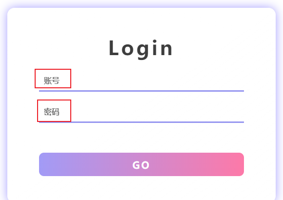
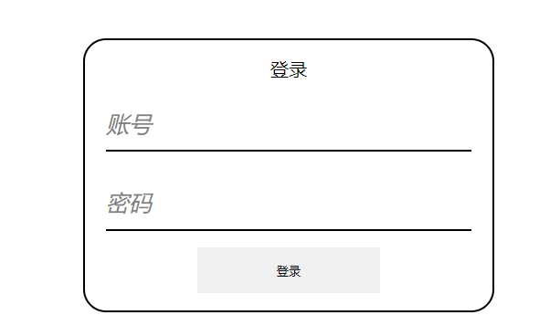
input中的placeholder属性
input中的placeholder属性可以提供该输入字段的提示信息,该提示信息会在输入字段为空时显示出来
placeholder是H5 中的新属性
<input type="text" placeholder="账号">
<input type="password" placeholder="密码">
placeholder中的信息也是支持修改样式的,需要用到伪类选择器
因为不同浏览器的兼容性不同,所以为了适配各种不同的浏览器,应该这样写
input::-webkit-input-placeholder { /* WebKit, Blink, Edge */
    color:    #909;
    font-size: 10px;
}
input:-moz-placeholder { /* Mozilla Firefox 4 to 18 */
   color:    #909;
    font-size: 10px;
}
input::-moz-placeholder { /* Mozilla Firefox 19+ */
   color:    #909;
    font-size: 10px;
}
input:-ms-input-placeholder { /* Internet Explorer 10-11 */
   color:    #909;
    font-size: 10px;
}
CSS 边框
参考自W3School
https://www.w3school.com.cn/css/css_border.asp
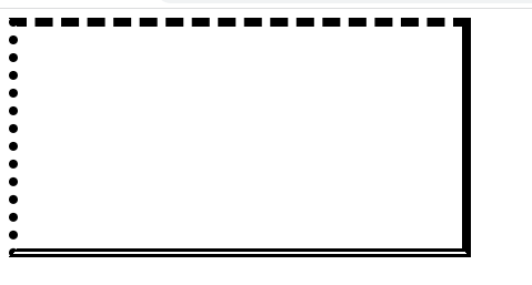
可以用border属性来设置元素的边框样式,元素的边框包含上边框、右边框、下边框、左边框,如果没有特意指出是哪个边框,那么就是四个边框的样式
边框样式
可以使用border-style属性来指定边框的样式
允许以下值:
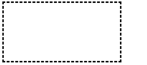
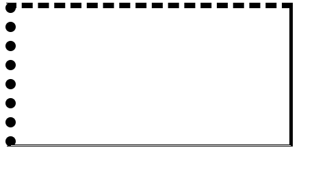
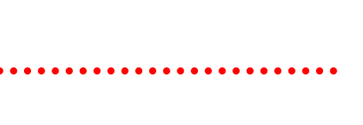
dotted- 定义点线边框dashed- 定义虚线边框solid- 定义实线边框double- 定义双边框groove- 定义 3D 坡口边框。效果取决于 border-color 值ridge- 定义 3D 脊线边框。效果取决于 border-color 值inset- 定义 3D inset 边框。效果取决于 border-color 值outset- 定义 3D outset 边框。效果取决于 border-color 值none- 定义无边框hidden- 定义隐藏边框
还可以为四个边框设置不同的样式,按照上边框、右边框、下边框、左边框的顺序书写即可
div {
    width: 400px;
    height: 200px;
    border-style: dashed solid double dotted;
}
边框宽度
通过border-width属性来设置边框宽度
div {
    width: 400px;
    height: 200px;
    border-style: dashed;
    border-width: 5px;
}
四个边框也是可以设置不同宽度的,还是按照上边框、右边框、下边框、左边框的顺序书写即可
div {
    width: 400px;
    height: 200px;
    border-style: dashed solid double dotted;
    border-width: 8px 5px 3px 15px;
}
边框颜色
通过border-color属性来设置边框颜色
div {
    width: 400px;
    height: 200px;
    border-style: dashed solid double dotted;
    border-width: 8px 5px 3px 15px;
    border-color:blue
}
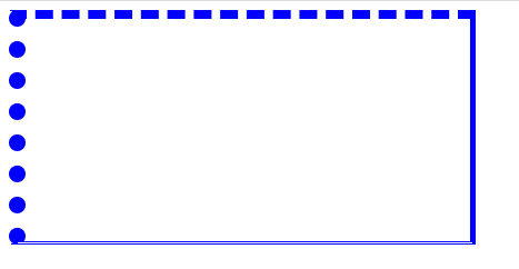
同样,也是可以定义四个边框不同的颜色,只需要按照上边框、右边框、下边框、左边框的顺序书写即可
div {
    width: 400px;
    height: 200px;
    border-style: dashed solid double dotted;
    border-width: 8px 5px 3px 15px;
    border-color:blue red green black;
}
单独设置各边框
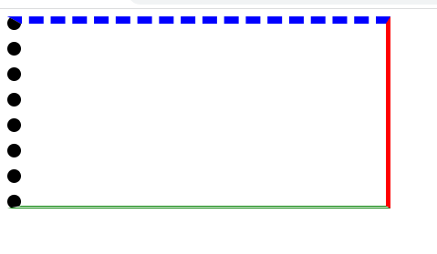
⭐️上面的各个属性,如果设置四个值:happy:
border-color: red green blue black;
就是上边框、右边框、下边框、左边框
⭐️如果设置三个值😟
border-color: red green blue;
就是上边框是red,左右边框是green,下边框是blue
⭐️如果设置两个值
border-color: red green;
则上下边框是red,左右边框是green
⭐️如果设置一个值,那么就是四个边框都是这样
如果需要单独给一个边框设置样式,利用上面的方式来书写就非常麻烦
只需要在边框的样式前面加上不同边框的前缀即可
- 上边框
border-top - 右边框
border-right - 下边框
border-bottom - 左边框
border-left
例如,指向给下边框指定样式,则可以这样写
div {
    width: 400px;
    height: 200px;
    border-bottom-style: dotted;
    border-bottom-color: red;
    border-bottom-width: 8px;
}
简写属性
边框的属性太多了,可以采用简写的形式,通通写在border这一个属性中
border 属性是以下各个边框属性的简写属性:
border-widthborder-style(必需)border-color
border: 5px red solid;
border-right: 8px green dotted;
圆角边框
一般元素默认都是直角边框
想要实现这样的圆角边框效果
可以使用**border-radius**属性来实现,数值越大,圆角弧度越大
border: 5px black solid;
border-radius: 40px;
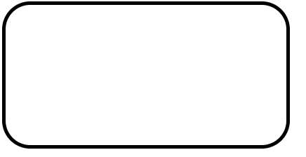
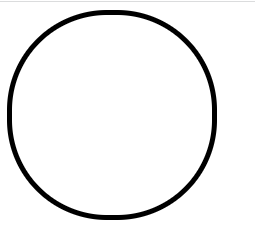
如果元素是一个正方形,还可以利用这个属性来画圆形,只需要设置为宽度的一半即可
div {
    width: 200px;
    height: 200px;
    border: 5px black solid;
    border-radius: 100px;
}
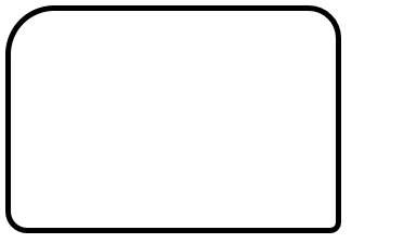
也可以每个角不同的弧度,像这样
border: 5px black solid;
border-top-left-radius: 45px;
border-top-right-radius: 30px;
border-bottom-left-radius: 20px;
border-bottom-right-radius: 10px;
CSS字体
字体颜色
使用color属性来指定字体的颜色
p{
    color: red;
}
字体族font-family
font-family可以指定不同的字体族,比如说微软雅黑、宋体、新罗马体等等
.p1 {
  font-family: "Times New Roman", Times, serif;
}
浏览器会根据本地是否有这种字体族而依次使用,
上面的代码,比如说你的电脑上有"Times New Roman"字体族,那么就应用,如果没有,就会去看后面的字体族,到最后都没有就会使用系统默认的字体族
字体样式font-style
font-style可以指定字体的样式,
此属性常用的两个属性:
- normal - 文字正常显示
- italic - 文本以斜体显示
一般用这个属性就是斜体字
字体粗细font-weight
font-weight可以用来指定字体的粗细
此属性可以是
| normal | 默认值。定义标准的字符。 |
|---|---|
| bold | 定义粗体字符。 |
| bolder | 定义更粗的字符。 |
| lighter | 定义更细的字符。 |
| 100 | |
| 200 | |
| 300 | |
| 400 | |
| 500 | |
| 600 | |
| 700 | |
| 800 | |
| 900 | 定义由粗到细的字符。400 等同于 normal,而 700 等同于 bold。 |
字体变体font-variant
font-variant属性指定是否以small-caps字体(小型大写字母)显示文本
在 small-caps 字体中,所有小写字母都将转换为大写字母。但是,转换后的大写字母的字体大小小于文本中原始大写字母的字体大小。
p {
  font-variant: normal;
}

p {
  font-variant: small-caps;
}
字体大小font-size
font-size可以用来指定字体的大小,单位可以是绝对大小px,也可以是相对大小em
16px = 1em
p {
  font-size: 14px;
}

p {
  font-size: 0.875em; /* 14px/16=0.875em */
}
字体属性简写
字体的属性太多了,逐个写起来麻烦,所以也可以使用简写的方式
都写在font这一个属性之中
font 属性是以下属性的简写属性:
font-stylefont-variantfont-weightfont-size/line-heightfont-family
像这样
p {
  font: italic small-caps bold 12px/30px Georgia, serif;
}
不想要写的属性可以不写,但是相对顺序不能变
p {
    font: 20px Arial, sans-serif;
}
注意:font-size和font-family的值必须的,不可以缺省的呦~~
CSS阴影
文字阴影
使用text-shadow属性为文本添加阴影效果
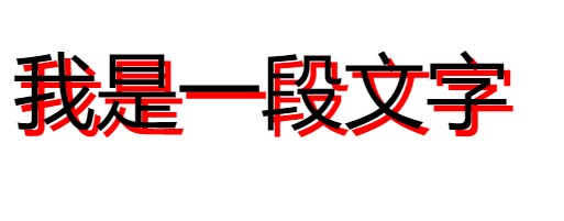
最简单直接的用法就是指定水平阴影和垂直阴影
p {
    font-size: 25px;
    text-shadow: 2px 2px;
}
还可以指定阴影的颜色
p {
    font-size: 25px;
    text-shadow: 2px 2px red;
}
还可以指定阴影的模糊程度,数值越大越模糊
p {
    font-size: 25px;
    text-shadow: 2px 2px 5px red;
  //			 水平阴影 垂直阴影 模糊像素 阴影颜色
}
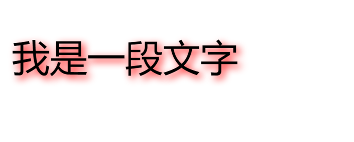
总结
text-shadow: 水平阴影 垂直阴影 模糊像素 阴影颜色 ;
多个阴影
还可以为一段文本添加多个阴影效果,只需要用逗号隔开即可,来达到更好的效果
p {
    font-size: 25px;
    color: white;
    text-shadow: 1px 1px 2px black, 0 0 25px blue, 0 0 5px darkblue;
}

盒子阴影
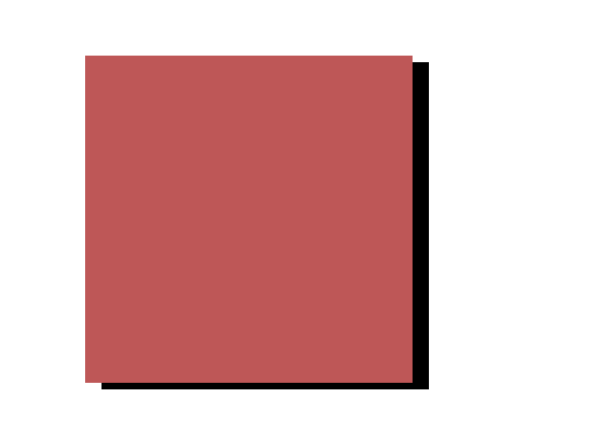
使用box-shadow属性来对元素产生阴影
最简单的用法就是指定水平阴影和垂直阴影
div {
    width: 100px;
    height: 100px;
    background-color: rgb(190, 87, 87);
    box-shadow: 5px 2px;
}
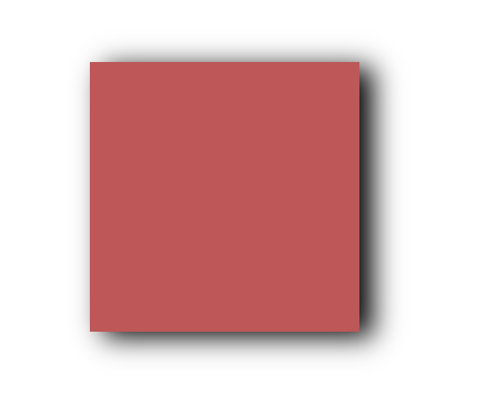
还可以指定阴影的模糊程度
div {
    width: 100px;
    height: 100px;
    background-color: rgb(190, 87, 87);
    box-shadow: 5px 2px 10px;
}
还可以指定阴影的颜色
div {
width: 100px;
height: 100px;
background-color: rgb(190, 87, 87);
box-shadow: 5px 2px 10px greenyellow;
}
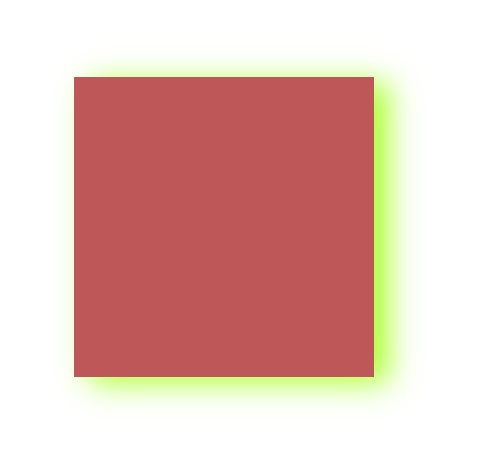
还可以设置阴影的尺寸,也就是范围
div {
width: 100px;
height: 100px;
background-color: rgb(190, 87, 87);
box-shadow: 5px 2px 10px 10px greenyellow;
}
总结:
box-shadow: 水平阴影 垂直阴影 模糊像素 阴影范围 阴影颜色;
增加多个阴影
为了达到更好的效果,还可以为一个元素增加多个阴影效果,只需要用逗号隔开即可
box-shadow: 0 4px 8px 0 rgba(0, 0, 0, 0.2), 0 6px 20px 0 rgba(0, 0, 0, 0.19);

 浙公网安备 33010602011771号