WPF Input Validation Using MVVM
Data validation is a key part in WPF.
Validation is used to alert the user that the data he entered is illegal.
In this post we will see how to Validate user input using MVVM binding.
I have created 2 different templates for input validation :
Click WPFInputValidation Link To Download full source.
Example 1 :
To impelment validation we need to use IDataErrorInfo interface.
IDataErrorInfo interface provides the functionality to offer custom error information that a user interface can bind to.
It has 2 Properties :
- Error : Gets an error message indicating what is wrong with this object.
- string this[string columnName] Indexer : it will return the error message for the property. The default is an empty string ("")
Let's go through step by step to understand validation with mvvm binding and styling the validation template.
Step 1 : First change ErrorToolTip style by customizing the Template.
<ControlTemplate x:Key="ErrorToolTipTemplate_1">
 <ControlTemplate.Resources>
  <Style x:Key="textblockErrorTooltip" TargetType="TextBlock">
   <Setter Property="HorizontalAlignment" Value="Center" />
   <Setter Property="VerticalAlignment" Value="Center" />
   <Setter Property="FontWeight" Value="Bold" />
   <Setter Property="Foreground" Value="White" />
   <Setter Property="Margin" Value="10 0 10 0" />
  </Style>
 </ControlTemplate.Resources>
 <DockPanel LastChildFill="true">
  <Border Height="Auto"
   Margin="5,0,0,0"
   Background="#DC000C"
   CornerRadius="3"
   DockPanel.Dock="right">
    <TextBlock Style="{StaticResource textblockErrorTooltip}"
Text="{Binding ElementName=customAdorner, Path=AdornedElement.(Validation.Errors)[0].ErrorContent}" />
  </Border>
  <AdornedElementPlaceholder Name="customAdorner">
   <Border BorderBrush="#DC000C" BorderThickness="1.3" />
  </AdornedElementPlaceholder>
 </DockPanel>
</ControlTemplate>
As shown in above source, created ControlTemplate and changed the error tooltip style by AddingBorder control in DockPanel, within Border TextBlock placed with Text property binded to the error message set to the property from viewmodel.
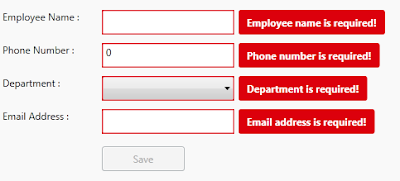
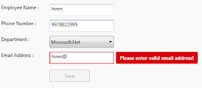
changed Backgroud of the border to Red so it will display error message surround with border fill with red color. This will dispaly error on right side of the TextBox control. like :
ErrorTemplate uses adorner layer. which is drawing layer, using adorner layer you can add visual appearance to indicate an error without replacing controltemplate.
AdornedElementPlaceholder is part of the Validation feature of data binding. it specify where a decorated control is placed relative to other elements in the ControlTemplate.
Step 2 : Create TextBox style and set Validation ErrorTemplate.
<Style TargetType="TextBox">
 <Setter Property="HorizontalAlignment" Value="Left" />
 <Setter Property="VerticalAlignment" Value="Top" />
 <Setter Property="Width" Value="150" />
 <Setter Property="Height" Value="30" />
 <Setter Property="Validation.ErrorTemplate"
                 Value="{DynamicResource ErrorToolTipTemplate_1}" />
 <Style.Triggers>
  <Trigger Property="Validation.HasError" Value="true">
   <Setter Property="ToolTip"
Value="{Binding RelativeSource={RelativeSource Self}, Path=(Validation.Errors)[0].ErrorContent}" />
  </Trigger>
 </Style.Triggers>
</Style>
Created style of TargetType=TextBox, and Validation.ErrorTemplate is set to previously created template (DynamicResource ErrorToolTipTemplate)
you have to set Resource using DynamicResource, if your temaplate/style is available at global place (App.xaml)
if your control style and template is created in page itself then set resource using StaticResourcekeyword.
Step 3 : Create ViewModel class, that contains Properties to Bind into view.
public class InputValidationViewModel : ViewModelBase
{
 public InputValidationViewModel()
 {
 }
 private string employeeName;
 public string EmployeeName
 {
  get { return employeeName; }
  set { employeeName = value; RaisePropertyChanged("EmployeeName"); }
 }
 private string email;
 public string Email
 {
  get { return email; }
  set {email = value; RaisePropertyChanged("Email"); }
 }
 private long phoneNumber;
 public long PhoneNumber
 {
  get { return phoneNumber; }
  set { phoneNumber = value; RaisePropertyChanged("PhoneNumber"); }
 }
 private bool IsValidEmailAddress
 {
  get { return emailRegex.IsMatch(Email); }
 }
}
as shown in above code, ViewModel created and added some propeties that need to bind in UserControl.
Step 4 : Implement IDataErrorInfo Interface
public class InputValidationViewModel : ViewModelBase, IDataErrorInfo
{
 private Regex emailRegex = new Regex(@"^([a-zA-Z0-9_\.\-])+\@(([a-zA-Z0-9\-])+\.)+([a-zA-Z0-9]{2,4})+$");
 public InputValidationViewModel()
 {
 }         private string error = string.Empty;
 public string Error
 {
  get { return error; }
 }
 public string this[string columnName]
 {
    get
    {
  error = string.Empty;
  if (columnName == "EmployeeName" && string.IsNullOrWhiteSpace(EmployeeName))
  {
   error = "Employee name is required!";
  }
  else if (columnName == "PhoneNumber" && PhoneNumber == 0)
  {
   error = "Phone number is required!";
  }
  else if (columnName == "PhoneNumber" && PhoneNumber.ToString().Length > 10)
  {
   error = "Phone number must have less than or equal to 10 digits!";
  }
  else if (columnName == "Email" && string.IsNullOrWhiteSpace(Email))
  {
   error = "Email address is required!";
  }
  else if (columnName == "Email" && !IsValidEmailAddress)
  {
   error = "Please enter valid email address!";
  }
  return error;

      }       }
}
IDataErrorInfo has Error property which returns the validation error that does not match the codition.
in above code, i set the error for each propeties by checking the codition, it coditiion is false then set the error for that property.
For valid email validation, created Regex expression to check entered email address is valid ro not.
This error appear on right side of the control that has property binded.
Step 5 : Last, Add TextBox cotrol in View
<TextBox Grid.Row="1"
 Grid.Column="1"
 Text="{Binding EmployeeName,
           Mode=TwoWay,
           UpdateSourceTrigger=PropertyChanged,
    ValidatesOnDataErrors=True}" />
Here EmployeeName proeprty is binded to TextBox control, you have to set ValidatesOnDataErrors=True to throw data error ( entered data is valida or not.)
Mode=TwoWay will allow user to change property from UI as well update UI from ViewModel property.
UpdateSourceTrigger=PropertyChanged will notify changes is updated as soon as the property changes.
If UpdateSourceTrigger is not set, then TextBox was not immediately sent back to the source. Instead, the source was updated only after focus was lost on the TextBox.
This behavior is controlled by a property on the binding called UpdateSourceTrigger.
Example 2 :
In this example, only ControlTemplate is chaned, other things like : ViewModels Property, Controls are same.
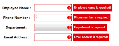
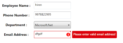
As shown in above image, tooltip style is changed, ! mark with red circle surrounded image is added on the errortemplate.
small triangle added on template, to show top right corner of the control if any data error exists.
below are the template change compare to previous example template :
<Border x:Name="ValidationErrorElement"
 BorderBrush="#FFDB000C"
 BorderThickness="1.2"
 CornerRadius="1"
 ToolTip="{Binding ElementName=customAdorner,
 Path=AdornedElement.(Validation.Errors)[0].ErrorContent}">
 <Grid Width="12"
  Height="12"
  Margin="1,-4,-4,0"
  HorizontalAlignment="Right"
  VerticalAlignment="Top"
  Background="Transparent">
  <Path Margin="1,3,0,0"
        Data="M 1,0 L6,0 A 2,2 90 0 1 8,2 L8,7 z"
        Fill="#FFDC000C" />
  <Path Margin="1,3,0,0"
        Data="M 0,0 L2,0 L 8,6 L8,8"
        Fill="#ffffff" />
 </Grid>
</Border>
<Border Grid.Column="0"
 Width="15"
 Height="15"
 Margin="0 0 3 0"
 HorizontalAlignment="Right"
 VerticalAlignment="Center"
 Background="Red"
 CornerRadius="10"
 ToolTip="{Binding ElementName=customAdorner,
 Path=AdornedElement.(Validation.Errors)[0].ErrorContent}">
 <TextBlock HorizontalAlignment="center"
  VerticalAlignment="center"
  FontWeight="Bold"
  Foreground="white"
  Text="!" />
</Border>
as shown in above code,
In First border, 2 shapes is created using path, this will create Triangle shape to disply on top right corner of the control.
To know more about how to draw shpaes using Path, Please refer Shapes & Drawing in WPF This Link
it will help you to create your custom shapes based on your requirement.
Second border will create red cirlce (by setting CornerRadius proeprty) with ! text wihin cirlce area.
it will display right side of the cotrol, if any data error is there for property.
Conclusion
This way you can create you custom error template for input controls.
Dwonload link


 浙公网安备 33010602011771号