
Echarts常用属性含义
学习网站 百度搜索 echarts gallery
https://www.makeapie.com/explore.html#charts=bar~sort=rank~timeframe=all~author=all
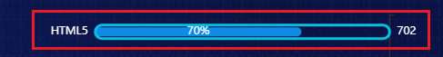
直接上效果图
属性注释
option = {
        title: {
            padding:[28,0,0,16],
            text: '哈哈',
            textStyle: {//标题样式
                fontWeight: "normal",
                color: "#59DAE8",
                fontSize: 14,
                left:'center',
             },
        },
        backgroundColor: '#001848',//整个绘图背景色
        grid: { //绘图在容易中的位置
            left: '2%',
            right: '5%',
            bottom: '5%',
            containLabel: true //grid 区域是否包含坐标轴的刻度标签。false可能溢出
        },
color:['#f7a35c', '#2f4554', '#61a0a8', '#00BCD4', '#00BCD4', '#00BCD4', '#00BCD4', '#00BCD4'], //修改legend颜色
legend: {
left: 130,
y: 24,
// 如果series中有name,那么data可以省略
data: ['支付总额','合同总额', '项目数'],
},
        xAxis: {
            name:'时间',//x轴标题
            //  'value' 数值轴,适用于连续数据。
            //  'category' 类目轴,适用于离散的类目数据,为该类型时必须通过 data 设置类目数据。
            //  'time' 时间轴,适用于连续的时序数据,与数值轴相比时间轴带有时间的格式化,在刻度计算上也有所不同,例如会根据跨度的范围来决定使用月,星期,日还是小时范围的刻度。
            //  'log' 对数轴。适用于对数数据。
            type: 'category',
            axisTick:{
                show:true,//刻度线
          alignWithLabel: true //让刻度线居            },            boundaryGap: false,            axisLabel: {                show: true,
                textStyle: {
                    color: 'rgba(255,255,255,.5)',  //更改坐标轴文字颜色
                    fontSize : 14      //更改坐标轴文字大小
                }
            },
            axisLine:{
                lineStyle:{//x轴轴线的属性配置
                    color:'rgba(87,192,255)',
                    width:1,
                }
            },
        bounddaryGap: false  // 去除轴内间距
        },
        yAxis: {
            name:'告警次数', //y轴标题
            type: 'value',
            axisTick:{
                show:true,//显示刻度线
            },
            axisLabel: {
                show: true,
                textStyle: {
                    color: 'rgba(255,255,255,.5)',  //更改坐标轴文字颜色
                    fontSize : 14      //更改坐标轴文字大小
                }
            },
            axisLine:{
                lineStyle:{//y轴的轴线的属性配置
                    width:1,
                    color:'rgba(87,192,255)',
                }
            },
            splitLine: { //网格线属性配置
                show: true,
                lineStyle: {
                    color: 'rgba(87,192,255,.2)',
                    width: 1,
                    type: 'solid'

                }
            }
        inverse:true //翻转Y轴
        },
      dataZoom:{
     id: 'dataZoomX',
     show:true, //是否显示 组件。如果设置为 false,不会显示,但是数据过滤的功能还存在。
     backgroundColor:"rgba(47,69,84,0)", //组件的背景颜色
     type: 'slider', //slider表示有滑动块的,inside表示内置的
     dataBackground:{ //数据阴影的样式。
     lineStyle:mylineStyle, //阴影的线条样式
     areaStyle:myareaStyle, //阴影的填充样式 },
     fillerColor:"rgba(167,183,204,0.4)", //选中范围的填充颜色。
     borderColor:"#ddd", //边框颜色。
     filterMode: 'filter', //'filter':当前数据窗口外的数据,被 过滤掉。即 会 影响其他轴的数据范围。每个数据项,只要有一个维度在数据窗口外,整个数据项就会被过滤掉。
     //'weakFilter':当前数据窗口外的数据,被 过滤掉。即 会 影响其他轴的数据范围。每个数据项,只有当全部维度都在数据窗口同侧外部,整个数据项才会被过滤掉。
     //'empty':当前数据窗口外的数据,被 设置为空。即 不会 影响其他轴的数据范围。
     //'none': 不过滤数据,只改变数轴范围。
     xAxisIndex:0, //设置 dataZoom-inside 组件控制的 x轴,可以用数组表示多个轴
     yAxisIndex:[0,2], //设置 dataZoom-inside 组件控制的 y轴,可以用数组表示多个轴
     radiusAxisIndex:3, //设置 dataZoom-inside 组件控制的 radius 轴,可以用数组表示多个轴
     angleAxisIndex:[0,2], //设置 dataZoom-inside 组件控制的 angle 轴,可以用数组表示多个轴
     start: 30, //数据窗口范围的起始百分比,表示30%
     end: 70, //数据窗口范围的结束百分比,表示70%
     startValue:10, //数据窗口范围的起始数值
     endValue:100, //数据窗口范围的结束数值。
     orient:"horizontal", //布局方式是横还是竖。不仅是布局方式,对于直角坐标系而言,也决定了,缺省情况控制横向数轴还是纵向数轴。
     'horizontal':水平。'vertical':竖直。
     zoomLock:false, //是否锁定选择区域(或叫做数据窗口)的大小。如果设置为 true 则锁定选择区域的大小,也就是说,只能平移,不能缩放。
     throttle:100, //设置触发视图刷新的频率。单位为毫秒(ms)。
     zoomOnMouseWheel:true, //如何触发缩放。可选值为:true:表示不按任何功能键,鼠标滚轮能触发缩放。false:表示鼠标滚轮不能触发缩放。'shift':表示按住 shift 和鼠标滚轮能触发缩放。'ctrl':表示按住 ctrl 和鼠标滚轮能触发缩放。'alt':表示按住 alt 和鼠标滚轮能触发缩放。
     moveOnMouseMove:true, //如何触发数据窗口平移。true:表示不按任何功能键,鼠标移动能触发数据窗口平移。false:表示鼠标滚轮不能触发缩放。'shift':表示按住 shift 和鼠标移动能触发数据窗口平移。'ctrl':表示按住 ctrl 和鼠标移动能触发数据窗口平移。'alt':表示按住 alt 和鼠标移动能触发数据窗口平移。
     left:"center", //组件离容器左侧的距离,'left', 'center', 'right','20%'
     top:"top", //组件离容器上侧的距离,'top', 'middle', 'bottom','20%'
      right:"auto", //组件离容器右侧的距离,'20%'
     bottom:"auto", //组件离容器下侧的距离,'20%' }, { id: 'dataZoomY', type: 'inside', filterMode: 'empty',
     disabled:false, //是否停止组件的功能。
        tooltip : {
            trigger: 'axis',
            backgroundColor:'transparent',//提示数据的背景色
            // 其中变量a、b、c在不同图表类型下代表数据含义为:
            // 折线(区域)图、柱状(条形)图: a(系列名称),b(类目值),c(数值), d(无)
            // 散点图(气泡)图 : a(系列名称),b(数据名称),c(数值数组), d(无)
            // 饼图、雷达图 : a(系列名称),b(数据项名称),c(数值), d(百分比)
            // 弦图 : a(系列名称),b(项1名称),c(项1-项2值),d(项2名称), e(项2-项1值)
       // 柱状图: a(系列名称), b (数据名),c(数据值),{@xxx}(数据中名为xxx的维度的值,如{@product}表示名为product的维度的值),{@[n]}:数据中维度n的值,如{@[3]}表示维度3的值,从0开始计数。
            // 力导向图 :
            // 节点 : a(类目名称),b(节点名称),c(节点值)
            // 边 : a(系列名称),b(源名称-目标名称),c(边权重), d(如果为true的话则数据来源是边)
            // {Function},传递参数列表如下:
            // <Array> params : 数组内容同模板变量,[[a, b, c, d], [a1, b1, c1, d1], ...]
            // <String> ticket : 异步回调标识
            // <Function> callback : 异步回调,回调时需要两个参数,第一个为前面提到的ticket,第二个为填充内容html
            formatter:'<span style="color: rgba(87,192,255);">{c}'+'次</span>',//自定义数据格式 b:X轴数据
            axisPointer: {
                type: 'line', // shadow cross line 三种类型
                crossStyle:{ //水平辅助线属性
                    color:'#f00',
                    width:0
                },
                lineStyle:{ //竖线竖线
                    color:'rgba(87,192,255)',
                },
                label: {
                    // backgroundColor: 'rgba(87,192,255)',
                    // color:'rgba(87,192,255)'
                },
            }
        },
        series: [
          {
        barWidth: 30,/* 柱状图宽度*/
        barGap:'0',/*多个并排柱子设置柱子之间的间距*/
        barCategoryGap:'30%',/*多个并排柱子设置柱子之间的间距*/

          },
{
type:'line', symbol: 'none', // 点的属性 'circle' , 'rectangle', 'triangle', 'diamond','emptyCircle', 'emptyRectangle', 'emptyTriangle', 'emptyDiamond' smooth:true, //折线图变为光滑的曲线图 itemStyle: { //曲线部分渐变 normal:{ // label : { // show: true // }, //颜色渐变函数 前四个参数分别表示四个位置依次为左、下、右、上 color: new echarts.graphic.LinearGradient(0, 1, 0, 0, [{ offset: 0, color: 'rgba(13, 191, 255, 0)' }, { offset: .5, color: 'rgba(13, 191, 255, .5)' },{ offset: 1, color: 'rgba(13, 191, 255, 1)' }])
// 颜色按照数组顺序渲染
color: funtion(params){
//params 是每条柱子/每条线
return colorList[params.dataIndex];
}
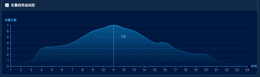
} }, areaStyle: { //阴影部分渐变 normal: { color: new echarts.graphic.LinearGradient(0, 1, 0, 0, [{ //4个参数用于配置渐变色的起止位置, 这4个参数依次对应右/下/左/上四个方位. 而0 0 0 1则代表渐变色从正上方开始 offset: 0, color: 'rgba(13, 191, 255, 0)' }, { offset: 0.75, color: 'rgba(13, 191, 255, .5)' }, { offset: 1, color: 'rgba(13, 191, 255, .6)' }, ]) //这个数组代表着渐变的过程 } }, } ] }; option.xAxis.data = ['1','2','3','4','5','6','7','8','9','10','11','12','13','14','15','16','17','18','19','20','21','22','23','24']; option.series[0].data = [0,0.5,1,3,3.3,3.5,4,5,6,6.5,7,6.5,6,5,4,4,3,2.4,2.1,2,1,0.5,0.3,0]; let chart = echarts.init(document.getElementById('chart')); chart.setOption(option);
常用配置
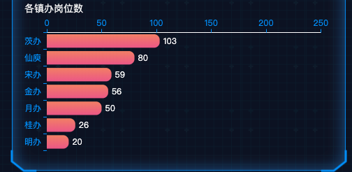


let option2 = {
    tooltip: {
        trigger: 'axis',
        axisPointer: {
            type: 'shadow'
        }
    },
    title: {
        padding:[0,0,0,0],
        text: '各镇办岗位数',
        textStyle: {
            fontWeight: "normal",
            color: "#eff0f0",
            fontSize: 14,
            left:'center',
        },
    },
    grid: {
        left: '0%',
        right: '4%',
        top: '8%',
        containLabel: true
    },
    xAxis: {
        type: 'value',
        boundaryGap: [0, 0.01],
        position: 'top',
        axisLine:{
            lineStyle:{
                color:"#fff",
                width:1,
            }
        }
    },
    yAxis: {
        type: 'category',
        data:  ['明办', '桂办', '月办', '金办', '宋办', '仙庾','茨办'],
        axisLine:{
            lineStyle:{
                color:"#fff",
                width:0,
            }
        }
    },
    series: [
        {
            type: 'bar',
            data: [20,26,50,56,59,80,103,120,150,165,168,190,201],
            label: {   //设置柱状图上显示  对应值
                show: true,
                position: 'right',
                color:'#fff'
            },
            itemStyle: {
                normal: {
                    color: function(params) {   // 设置前三个颜色不一样
                        let num = params.value;
                        let djg = params.dataIndex;   //第几个数
                        let retcoler = new echarts.graphic.LinearGradient(
                            0, 0, 0, 1,
                            [
                                {offset: 0, color: '#F48B70'},                   //柱图渐变色
                                {offset: 1, color: '#ED6191'},                   //柱图渐变色
                            ]
                        );
                        if(djg>9){
                            retcoler = '#ED6191';
                        }
                        return retcoler
                    },
                    barBorderRadius: [0, 8, 8, 0] // 设置柱状图圆角(顺时针左上,右上,右下,左下)
                },

            },
        },
    ]
};
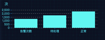
let option2 =  {
    color:['#6CF7F4','#f00','#f5f','blue'],
    title: {
        padding:[28,0,0,16],
        text: '次',
        textStyle: {
            fontWeight: "normal",
            color: "#59DAE8",
            fontSize: 14,
            left:'center',
        },
    },
    tooltip: {},
    legend: {
        // data:['销量']
        // data:['年','月','周','日']

    },
    textStyle: {
        color: '#59DAE8'
    },
    xAxis: [
        {
            type: 'category',
            data: ['告警次数', '待处理', '正常'],
            axisTick: {
                alignWithLabel: true
            },
            axisLine: {
                lineStyle: {
                    color: 'rgba(0,0,0,0)', // X轴及其文字颜色
                },
            },
            axisLabel: {
                show: true,
                textStyle: {
                    color: '#59DAE8',  //更改坐标轴文字颜色
                    // fontSize : 16      //更改坐标轴文字大小
                }
            },
        }
    ],
    yAxis: [
        {
            type: 'value',
            // data: param.yData,
            axisLine: {
                lineStyle: {
                    color: 'rgba(0,0,0,0)', // Y轴及其文字颜色
                }
            },
            axisLabel: {
                show: true,
                textStyle: {
                    color: '#59DAE8',  //更改坐标轴文字颜色
                    // fontSize : 14      //更改坐标轴文字大小
                }
            },
            splitLine:{
                show:true,
                lineStyle:{
                    type:'dashed',
                    color:'#999'
                }
            }
        }],
    series: [{
        type: 'bar',
        data: [1250, 1750, 2300]
    }]
};
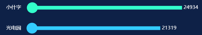
带滚动条案例
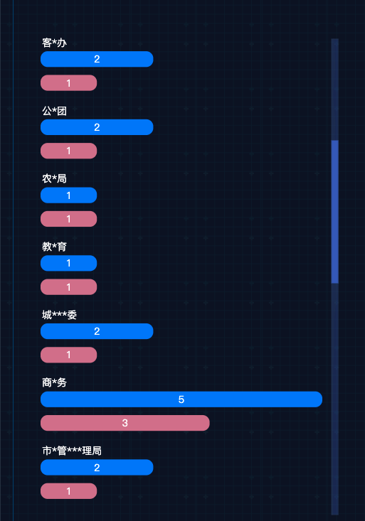
let colorList = ['#0081fa', '#d77a94']
let data = [
    ["汇聚数据", "实际汇聚类型", "剩余汇聚类型"],
    ["公*局", 2, 1],
    ["交**队", 3, 2],
    ["各*******单位", 1, 1],
    ["运*局", 3, 2],
    ["客*办", 2, 1],
    ["公*团", 2, 1],
    ["农*局", 1, 1],
    ["教*育", 1, 1],
    ["城***委", 2, 1],
    ["商*务", 5, 3],
    ["市*管***理局", 2, 1],
    ["卫**委", 2, 1],
    ["生**局", 1, 1],
    ["民***局", 1, 1],
    ["机***理局", 1, 1],
    ["一**通", 1, 1],
    ["互****业", 1, 1],
    ["机***车", 1, 1]
]

let option2 = {
    color: colorList,
    "dataset": {
        "source": data
    },
    "grid": {
        "width": '90%',
        "left": '0%',
        "right": 40,
        "bottom": 50,
        "top": "10%",
        // "containLabel": true
    },

    "xAxis": [{
        "show": false,
        position: 'top',
    }],
    "yAxis": [{
        "type": "category",
        //是否反向坐标轴
        "inverse": true,
        "axisLabel": {
            "color": "#fff",
            "fontSize": 14,
            "fontWeight": "normal",
            align: 'left',
            padding: [-80, 0, 0, 10]
        },
        max: 20,
        "show": true,
        "splitLine": {
            "show": false,
        },
        "axisTick": {
            "show": false
        },
        "axisLine": {
            "show": false
        }
    }],
    "tooltip": {
        "show": false,
        // "trigger": "axis",
        // "axisPointer": {
        //     "type": "shadow"
        // },
    },
    "legend": {
        "show": true,
        "type": "scroll",
        "top": 15,
        "left": "center",
        "textStyle": {
            "color": 'white',
            fontSize: 14
        },
    },
    "series": [{
        "type": "bar",
        "name": "汇聚数据",
        "itemStyle": {
            "barBorderRadius": 10
        },
        "barGap": "50%",
        barCateGoryGap: 20,
        // "stack": "total",
        "label": {
            "color": "#fff",
            "fontSize": 14,
            // position: [0, '-20'],
            "fontWeight": "normal",
            "show": true,
            // formatter: function(data) {
            //     return chartName[data.dataIndex];
            // }
        },
        "barMaxWidth": 22.22222222222222,
        "barWidth": 22.22222222222222,
        "animation": true
    }, {
        "type": "bar",
        "name": "共享数据",
        "itemStyle": {
            "barBorderRadius": 10
        },
        "barGap": "50%",
        barCateGoryGap: 20,
        // "stack": "total",
        "label": {
            "color": "#fff",
            "fontSize": 14,
            // position: [0, '-20'],
            "fontWeight": "normal",
            "show": true,
            // formatter: function(data) {
            //     return chartName[data.dataIndex];
            // }
        },
        "barMaxWidth": 22.22222222222222,
        "barWidth": 22.22222222222222,
        "animation": true
    }],
    "title": {
        "show": false
    },
    // 滚动条
    "dataZoom": [{
        type: 'slider',
        show: true,
        "filterMode": "empty",
        "disabled": false,
        yAxisIndex: 0,
        // top: '25%',
        right: '5%',
        // bottom: '15%',
        width: 10,
        start: 0,
        end: 30,
        handleSize: '0', // 滑动条的 左右2个滑动小块的大小
        handleIcon: 'path://M306.1,413c0,2.2-1.8,4-4,4h-59.8c-2.2,0-4-1.8-4-4V200.8c0-2.2,1.8-4,4-4h59.8c2.2,0,4,1.8,4,4V413z',
        textStyle: {
            color: "#fff"
        },
        fillerColor: '#3C62C0', // 拖动条的颜色
        borderColor: "none",
        backgroundColor: 'rgba(60, 98, 192, 0.302)',
        showDetail: false // 即拖拽时候是否显示详细数值信息 默认true
    }, ],
}
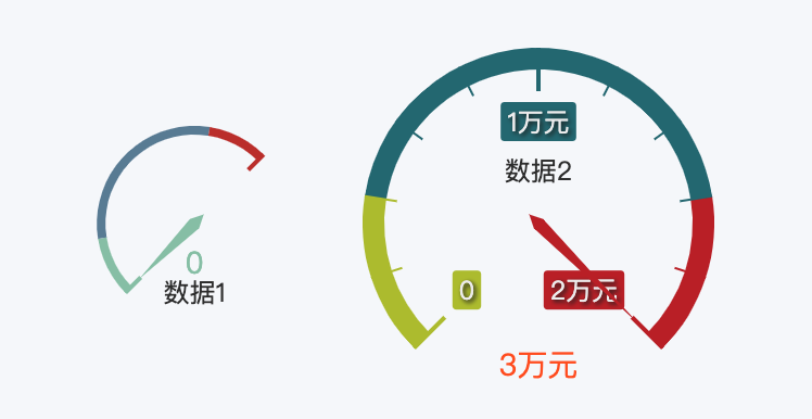
仪表盘
  let option = {
            title: {
                left: 10,
                y: 0,
                text: '移民后扶资金执行情况',
                textStyle: {
                    fontWeight: 500,
                    fontSize: 16
                }
            },
            tooltip: {
                trigger: 'axis'
            },
            legend: {
                left: 10,
                y: 24,
                data: ['收入', '支出']
            },
            grid: { //绘图在容易中的位置
                left: '2%',
                right: '5%',
                bottom: '5%',
                containLabel: true //grid 区域是否包含坐标轴的刻度标签。false可能溢出
            },
            calculable: true,
            xAxis: [
                {
                    type: 'category',
                    axisLabel: {
                        show: true
                    },
                    axisTick: {
                        show: true
                    },
                    axisLine: {
                        lineStyle: {
                            color: '#666'
                        }
                    },
                    splitLine: {
                        show: false
                    },
                    data: ['建筑', '市政道路', '绿化', '场平']
                }
            ],
            yAxis: [
                {
                    show: true,
                    type: 'value',
                    axisLabel: {
                        show: true,
                        textStyle: {
                            color: '#000',  //更改坐标轴文字颜色
                            // fontSize : 14      //更改坐标轴文字大小
                        }
                    },
                    // axisTick: {
                    //     show: false
                    // },
                    splitLine: {
                        show: false,
                        lineStyle: {
                            type: 'solid',
                            color: '#999'
                        }
                    }
                }
            ],
            series: [
                {
                    name: '收入',
                    type: 'bar',
                    effect: {
                        symbol: 'rect'
                    },
                    itemStyle: {
                        normal: {
                            color: function(params) {
                                let colorList = ['#3398db', '#00BCD4', '#90ed7d', '#f7a35c', '#61a0a8', '#61a0a8', '#91c7ae', '#2f4554'];
                                return colorList[params.dataIndex]
                            }
                        }
                    },
                    areaStyle: {
                        normal: {
                            opacity: 0.4
                        }
                    },
                    lineStyle: {
                        normal: {
                            opacity: 0
                        }
                    },
                    showSymbol: false,
                    data: [20, 30, 40, 50]
                },
            ]
        }
        // const { dataChartRiverArea, fontSize } = this.props;
        // const dataChartRiverArea2 = orderBy(dataChartRiverArea, ['fspfl'], ['desc']);
        this.chart.setOption(option);
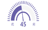
series: [
                {
                    min: 0,
                    max: 100,
                    name: '今日空气质量',
                    type: 'gauge', // 类型是仪表盘
                    startAngle: 180, //开始角度 左侧角度
                    endAngle: 0, //结束角度 右侧
                    splitNumber: 1, //刻度的值
                    radius: '130%', // 设置仪表盘半径
                    center : ['50%', '80%'],//仪表盘的位置 第一个值为x轴,第二个值为y轴
                    axisLine: { // 坐标轴线,也就是圆圈的边框线,包括了左右两侧的文字
                        show: true,
                        lineStyle: {
                            width: 20,
                            // 透明度设置为0
                            opacity: 0,
                            color: [
                              [0.09,'transparent'],
                              [1,'transparent']
                            ],
                            width:60,
                            shadowColor: 'purple',
                            shadowBlur: 10
                        },
                    },
                    splitLine: {
                        show: false,
                    },
                    axisTick: {
                        length: '15%', // 刻度线长度
                        splitNumber: 30, // 刻度线个数
                        lineStyle: {
                            width: 3,
                            color: '#675FA7',
                        },
                    },

                    pointer: { //仪表盘指针。
                        show: true,
                        length: '60%',  //指针长度
                        width: 2, //指针宽度
                        type: 'solid'

                    },
                    itemStyle: { // 指针样式
                      color: '#675FA7',
                      borderColor: '#675FA7',
                      borderType:'solid'
                    },
                    // title: {
                    //     offsetCenter: [0, '68%'], // x, y,单位px
                    //     fontWeight: 'bolder',
                    //     fontSize: 15,
                    //     fontStyle: 'italic',
                    //     color: '#fff',
                    //     shadowColor: '#fff', //默认透明
                    //     shadowBlur: 10,
                    // },
                    detail: { //最下面数值的设置
                       offsetCenter: ['0', '22%'],       // x, y,单位px
                       formatter: '{value}',  // 单位
                       textStyle: {       // 其余属性默认使用全局文本样式,详见TEXTSTYLE
                        color: '#675FA7',
                        fontSize : 30,
                        fontWeight: 'bold'
                       }
                      }, //鼠标经过时显示的名
                    data: [{ value: 45, name: '' }],
                },
                {
                  name: '内侧线条',
                  type: 'gauge',
            //起始角度。圆心 正右手侧为0度,正上方为90度,正左手侧为180度。
                  startAngle: 180,
                  //结束角度。
                  endAngle: 0,
                        center: ['50%', '80%'],    // 默认全局居中
                        //半径
                        radius: '102%',
                  //仪表盘轴线相关配置。
                  axisLine: {            // 坐标轴线
                    show:true,
                            lineStyle: {      // 属性lineStyle控制线条样式
                                width: 22,
                      color: [[0,'#675FA7'],[45 / 100,'#675FA7'],[1,'#F5F5F5']], // 仪表盘的轴线可以被分成不同颜色的多段。每段的结束位置和颜色可以通过一个数组来表示。,
                            },
                        },
                  //分隔线样式。
                  splitLine: {
                    show: false,
                  },
                  //刻度样式
                  axisTick: {
                    show: false,
                  },
                  //刻度标签。
                  axisLabel: {
                    show:false,
                  },
                   //仪表盘指针。
                  pointer: {
                    show: false,
                  },
                  //仪表盘标题。
                  title: {
                     show: false
                  },
                  //仪表盘详情,用于显示数据。
                  detail: {
                    show: false,
                    offsetCenter: [0, 0],
                    formatter: '',
                    textStyle: {
                      fontSize: 0
                    }
                  },
                  data: [
                   {name:'数量', value:'n'},
                  ],
                  zlevel:3
                  },
          {
                        name: '内侧线条',
                        type: 'gauge',
                  //起始角度。圆心 正右手侧为0度,正上方为90度,正左手侧为180度。
                        startAngle: 180,
                        //结束角度。
                        endAngle: 0,
                              center: ['50%', '80%'],    // 默认全局居中
                              //半径
                              radius: '60%',
                        //仪表盘轴线相关配置。
                        axisLine: {            // 坐标轴线
                          show:true,
                                  lineStyle: {      // 属性lineStyle控制线条样式
                                      width: 6,
                            color: [[0,'#675FA7'],[1,'#675FA7']], // 仪表盘的轴线可以被分成不同颜色的多段。每段的结束位置和颜色可以通过一个数组来表示。,
                                  },
                              },
                        //分隔线样式。
                        splitLine: {
                          show: false,
                        },
                        //刻度样式
                        axisTick: {
                          show: false,
                        },
                        //刻度标签。
                        axisLabel: {
                          show:false,
                        },
                         //仪表盘指针。
                        pointer: {
                          show: false,
                        },
                        //仪表盘标题。
                        title: {
                           show: false
                        },
                        //仪表盘详情,用于显示数据。
                        detail: {
                          show: false,
                          offsetCenter: [0, 0],
                          formatter: '',
                          textStyle: {
                            fontSize: 0
                          }
                        },
                        data: [
                         {name:'数量', value:'n'},
                        ],
                        zlevel:3
                        }
            ]
每条柱子不同背景色
   series: [
                {
                    name: 'xx',
                    type: 'bar',
                    effect: {
                        symbol: 'rect'
                    },
                    itemStyle: {
                        normal: {
                            color: function(params) {
                                let colorList = ['#3398db', '#00BCD4', '#90ed7d', '#f7a35c', '#61a0a8', '#61a0a8', '#91c7ae', '#2f4554'];
                                return colorList[params.dataIndex]
                            }
                        }
                    },
                    areaStyle: {
                        normal: {
                            opacity: 0.4
                        }
                    },
                    lineStyle: {
                        normal: {
                            opacity: 0
                        }
                    },
                    showSymbol: false,
                    data: [20, 30, 40, 50]
                },
            ]
双Y轴
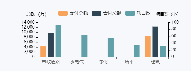
   yAxis: [//这里配置两条Y轴
              {
                  type: 'value',
                  splitLine: {
                      show: false,
                      lineStyle: {
                          color: '#000',
                          width: 1
                      }
                  },
                  axisLine: {
                      lineStyle: {
                          color: '#000',
                          width: 0.5
                      }
                  },
                  axisLabel: {
                      show: true,
                      textStyle: {
                          color: '#000'
                      },
                      fontSize: 11,
                      interval: 'auto',
                      formatter: '{value}'
                  },
                  name: '总额(万)',
                  nameTextStyle: {
                      color: '000'
                  }
              },
              {
                  type: 'value',
                  splitLine: {
                      show: false,
                      lineStyle: {
                          color: '#021439',
                          width: 1
                      }
                  },
                  axisLine: {
                      lineStyle: {
                          color: '#000',
                          width: 1
                      }
                  },
                  axisLabel: {
                      show: true,
                      textStyle: {
                          color: 'blue'
                      },
                      fontSize: 11,
                      interval: 'auto',
                      formatter: '{value}'
                  },
                  name: '项目数(个)',
                  nameTextStyle: {
                      color: '#000',
                      fontSize: 11,
                  }
              }
          ],

      {
                    name: '项目数',
                    type: 'bar',
                    effect: {
                        symbol: 'rect'
                    },
                    itemStyle: {
                        normal: {
                            color: function(params) {
                                let colorList = ['#2f4554', '#61a0a8', '#61a0a8', '#f7a35c', '#90ed7d', '#61a0a8', '#00BCD4', '#3398db'];
                                return colorList[params.dataIndex]
                            }
                        }
                    },
                    areaStyle: {
                        normal: {
                            opacity: 0.4
                        }
                    },
                    lineStyle: {
                        normal: {
                            opacity: 0
                        }
                    },
                    showSymbol: false,
                    data: countList,
                    yAxisIndex: 1,  // 这里是关键 可以显示右边的Y轴
                },
小圆
    {
            name: '外圆',
            type: 'scatter',
            hoverAnimation: false,
            data: [0, 0, 0, 0, 0, 0, 0, 0, 0, 50],
            yAxisIndex: 2,
            symbolSize: 35,
            itemStyle: {
                normal: {
                    color: function(params) {
                        var num = myColor.length;
                        return myColor[params.dataIndex % num]
                    },
                    opacity: 1,
                }
            },
            z: 2
        }
其他特点
1. yAxis可以使数组,里面有多个对象
2. yAxisIndex ,是在有多个y轴时使用,可以使两条数据层叠

 浙公网安备 33010602011771号