Configuring the Viewport
Safari on iOS displays webpages at a scale that works for most web content originally designed for the desktop. If these default settings don’t work for your webpages, it is highly recommended that you change the settings by configuring the viewport. You especially need to configure the viewport if you are designing webpages specifically for iOS. Configuring the viewport is easy—just add one line of HTML to your webpage—but understanding how viewport properties affect the presentation of your webpages on iOS is more complex. Before configuring the viewport, you need a deeper understanding of what the visible area and viewport are on iOS.
If you are already familiar with the viewport on iOS, read “Using the Viewport Meta Tag” for details on the viewport tag and “Viewport Settings for Web Applications” for web application tips. Otherwise, read the sections in this chapter in the following order:
-
Read “Layout and Metrics on iPhone and iPod touch” to learn about the available screen space for webpages on small devices.
-
Read “What Is the Viewport?” for a deeper understanding of the viewport on iOS.
-
Read “Default Viewport Settings” and “Using the Viewport Meta Tag” for how to use the viewport meta tag.
-
Read “Changing the Viewport Width and Height” and “How Safari Infers the Width, Height, and Initial Scale” to understand better how setting viewport properties affects the way webpages are rendered on iOS.
-
Read “Viewport Settings for Web Applications” if you are designing a web application for iOS.
See “Supported Meta Tags” for a complete description of the viewport meta tag.
Layout and Metrics on iPhone and iPod touch
Because Safari on iOS adds controls above and below your web content, you don’t have access to the entire screen real estate. In portrait orientation, the visible area for web content on iPhone and iPod touch is 320 x 356 pixels as shown in Figure 1-1. In landscape orientation, the visible area is 480 x 208 pixels.
Figure 3-1 Layout and metrics in portrait orientation
Note that if the URL text field is not in use, it is anchored above the webpage and moves with the webpage when the user pans. This adds 60 pixels to the height of the visible area. However, since the URL text field can appear at any time, you should not rely on this extra real estate when designing your webpage. Video playback uses the entire screen on small devices.
Read “Laying Out Forms” in “Designing Forms” for more metrics when the keyboard is displayed for user input.
Note: Although it is helpful to know the metrics on small devices like iPhone and iPod touch, you should avoid using these values in your code. Read “Using the Viewport Meta Tag” for how to use the viewport meta tag constants.
What Is the Viewport?
The viewport on the desktop and the viewport on iOS are slightly different.
Safari on iOS has no windows, scroll bars, or resize buttons as shown on the right in Figure 3-2. The user pans by flicking a finger. The user zooms in by double-tapping and pinch opening, and zooms out by pinch closing—gestures that are not available for Safari on the desktop. Because of the differences in the way users interact with web content, the viewport on the desktop and on iOS are not the same. Note that these differences between the viewports may affect some of the HTML and CSS instructions on iOS.
Figure 3-2 Differences between Safari on iOS and Safari on the desktop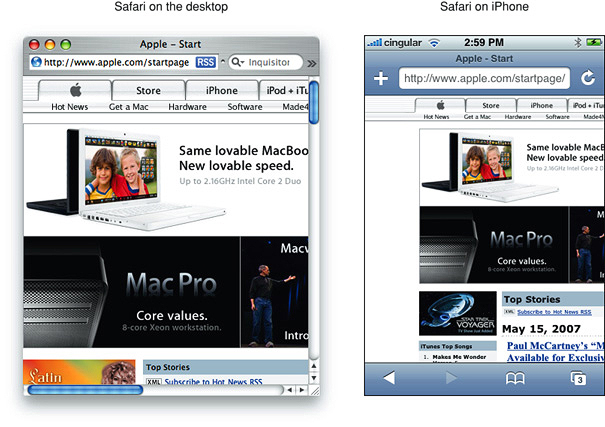
Safari on the Desktop Viewport
The viewport on the desktop is the visible area of the webpage as shown in Figure 3-3. The user resizes the viewport by resizing the window. If the webpage is larger than the viewport, then the user scrolls to see more of the webpage. When the viewport is resized, Safari may change the document’s layout—for example, expand or shrink the width of the text to fit. If the webpage is smaller than the viewport, it is filled with white space to fit the size of the viewport.
Figure 3-3 Safari on desktop viewport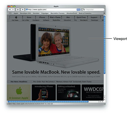
Safari on iOS Viewport
For Safari on iOS, the viewport is the area that determines how content is laid out and where text wraps on the webpage. The viewport can be larger or smaller than the visible area.
When the user pans a webpage on iOS, gray bars appear on the right and bottom sides of the screen as visual feedback to show the user the size of the visible area as compared to the viewport (similar to the length of scroll bars on the desktop). Using the double tap, pinch open, and pinch close gestures, users can change the scale of the viewport but not the size. The only exception is when the user changes from portrait to landscape orientation—under certain circumstances, Safari on iOS may adjust the viewport width and height, and consequently, change the webpage layout.
You can set the viewport size and other properties of your webpage. Mostly, you do this to improve the presentation the first time iOS renders the webpage.
Examples of Viewports on iOS
The viewport on iOS is best illustrated using a few examples. Figure 3-4 shows a webpage on iPhone, containing a single 320 x 356 pixel image, that is rendered for the first time using the default viewport settings.
Figure 3-4 Viewport with default settings
Figure 3-5 shows the same webpage with the viewport set to the size of the visible area, which is also the size of the image.
Figure 3-5 Viewport with width set to 320
However, the viewport can be larger or smaller than the visible area. If the viewport is larger than the visible area, as shown in Figure 3-6, then the user pans to see more of the webpage.
Figure 3-6 Viewport with width set to 320 and scale set to 150%
Figure 3-7 show the webpage when it is smaller than the viewport and filled with white space.
Figure 3-7 Viewport with width set to 320 and scale set to 50%
The user can also zoom in and out using gestures. When zooming in and out, the user changes the scale of the viewport, not the size of the viewport. Consequently, panning and zooming do not change the layout of the webpage. Figure 3-8 shows the same webpage when the user zooms in to see details.
Figure 3-8 Viewport with arbitrary user scale
Default Viewport Settings
Safari on iOS sets the size and scale of the viewport to reasonable defaults that work well for most webpages, as shown on the left in Figure 3-9. The default width is 980 pixels. However, these defaults may not work well for your webpages, particularly if you are tailoring your website for a particular device. For example, the webpage on the right in Figure 3-9 appears too narrow. Because Safari on iOS provides a viewport, you can change the default settings.
Figure 3-9 Default settings work well for most webpages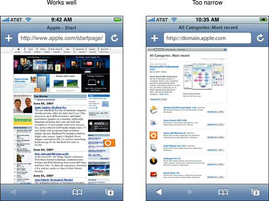
Using the Viewport Meta Tag
Use the viewport meta tag to improve the presentation of your web content on iOS. Typically, you use the viewport meta tag to set the width and initial scale of the viewport. For example, if your webpage is narrower than 980 pixels, then you should set the width of the viewport to fit your web content. If you are designing an iPhone or iPod touch-specific web application, then set the width to the width of the device. Refer to “Additional meta Tag Keys” in Safari HTML Reference for a detailed description of the viewport meta tag.
Because iOS runs on devices with different screen resolutions, you should use the constants instead of numeric values when referring to the dimensions of a device. Use device-width for the width of the device and device-height for the height in portrait orientation.
You do not need to set every viewport property. If only a subset of the properties are set, then Safari on iOS infers the other values. For example, if you set the scale to 1.0, Safari assumes the width is device-width in portrait and device-height in landscape orientation. Therefore, if you want the width to be 980 pixels and the initial scale to be 1.0, then set both of these properties.
For example, to set the viewport width to the width of the device, add this to your HTML file:
<meta name = "viewport" content = "width = device-width"> |
To set the initial scale to 1.0, add this to your HTML file:
<meta name = "viewport" content = "initial-scale = 1.0"> |
To set the initial scale and to turn off user scaling, add this to your HTML file:
<meta name = "viewport" content = "initial-scale = 2.3, user-scalable = no"> |
Use the Safari on iOS console to help debug your webpages as described in “Debugging.” The console contains tips to help you choose viewport values—for example, it reminds you to use the constants when referring to the device width and height.
Changing the Viewport Width and Height
Typically, you set the viewport width to match your web content. This is the single most important optimization that you can do for iOS—make sure your webpage looks good the first time it is displayed on iOS.
The majority of webpages fit nicely in the visible area with the viewport width set to 980 pixels in portrait orientation, as shown in Figure 3-10. If Safari on iOS did not set the viewport width to 980 pixels, then only the upper-left corner of the webpage, shown in gray, would be displayed. However, this default doesn’t work for all webpages, so you’ll want to use the viewport meta tag if your webpage is different.
Figure 3-10 Comparison of 320 and 980 viewport widths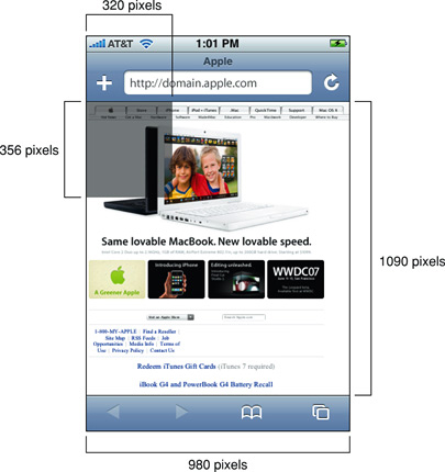
If your webpage is narrower than the default width, as shown on the left in Figure 3-11, then set the viewport width to the width of your webpage, as shown on the right in Figure 3-11. To do this, add the following to your HTML file inside the <head>block, replacing 590 with the width of your webpage:
<meta name = "viewport" content = "width = 590"> |
Figure 3-11 Webpage is too narrow for default settings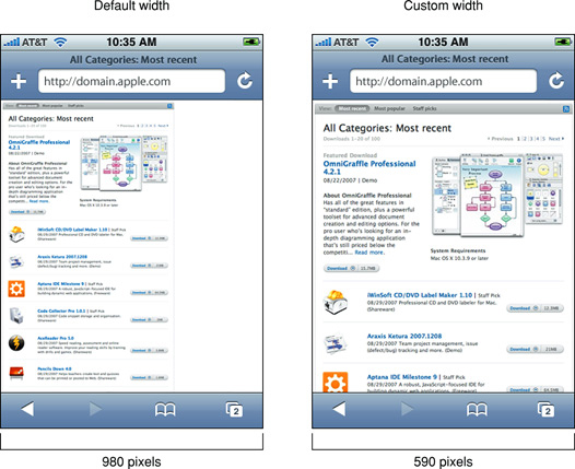
It is particularly important to change the viewport width for web applications designed for devices with smaller screens such as iPhone and iPod touch. Figure 3-12 shows the effect of setting the viewport width to device-width. Read “Viewport Settings for Web Applications” for more web application tips.
Figure 3-12 Web application page is too small for default settings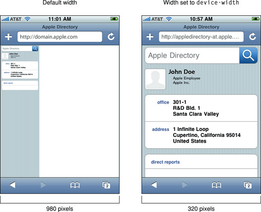
Similarly you can set the viewport height to match your web content.
How Safari Infers the Width, Height, and Initial Scale
If you set only some of the properties, then Safari on iOS infers the values of the other properties with the goal of fitting the webpage in the visible area. For example, if just the initial scale is set, then the width and height are inferred. Similarly, if just the width is set, then the height and initial scale are inferred, and so on. If the inferred values do not work for your webpage, then set more viewport properties.
Since any of the width, height, and initial scale may be inferred by Safari on iOS, the viewport may resize when the user changes orientation. For example, when the user changes from portrait to landscape orientation by rotating the device, the viewport width may expand. This is the only situation where a user action might resize the viewport, changing the layout on iOS.
Specifically, the goal of Safari on iOS is to fit the webpage in the visible area when completely zoomed out by maintaining a ratio equivalent to the ratio of the visible area in either orientation. This is best illustrated by setting the viewport properties independently, and observing the effect on the other viewport properties. The following series of examples shows the same web content with different viewport settings.
Figure 3-13 shows a typical webpage displayed with the default settings where the viewport width is 980 and no initial scale is set.
Figure 3-13 Default width and initial scale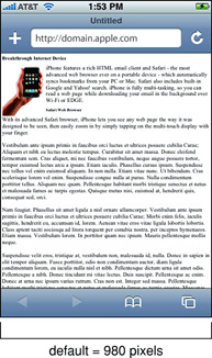
Figure 3-14 shows the same webpage when the initial scale is set to 1.0 on iPhone. Safari on iOS infers the width and height to fit the webpage in the visible area. The viewport width is set to device-width in portrait orientation and device-height in landscape orientation.
Figure 3-14 Default width with initial scale set to 1.0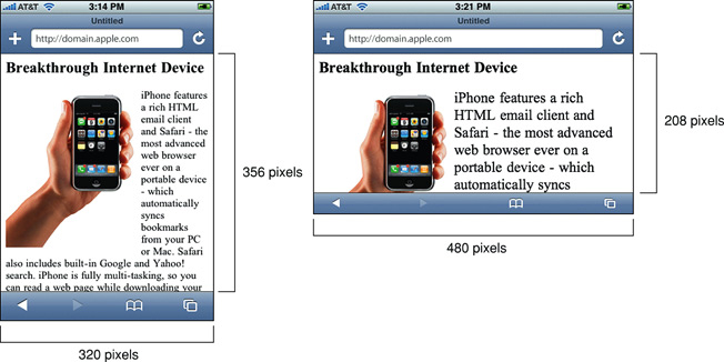
Similarly, if you specify only the viewport width, the height and initial scale are inferred. Figure 3-15 shows the rendering of the same webpage when the viewport width is set to 320 on iPhone. Notice that the portrait orientation is rendered in the same way as in Figure 3-14, but the landscape orientation maintains a width equal to device-width, which changes the initial scale and has the effect of zooming in when the user changes to landscape orientation.
Figure 3-15 Width set to 320 with default initial scale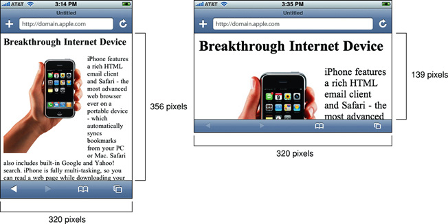
You can also set the viewport width to be smaller than the visible area with a minimum value of 200 pixels. Figure 3-16 shows the same webpage when the viewport width is set to 200 pixels on iPhone. Safari on iOS infers the height and initial scale, which has the effect of zooming in when the webpage is first rendered.
Figure 3-16 Width set to 200 with default initial scale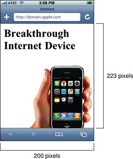
Finally, Figure 3-17 shows the same webpage when both the width and initial scale are set on iPhone. Safari on iOS infers the height by maintaining a ratio equivalent to the ratio of the visible area in either orientation. Therefore, if the width is set to 980 and the initial scale is set to 1.0 on iPhone, the height is set to 1091 in portrait and 425 in landscape orientation.
Figure 3-17 Width set to 980 and initial scale set to 1.0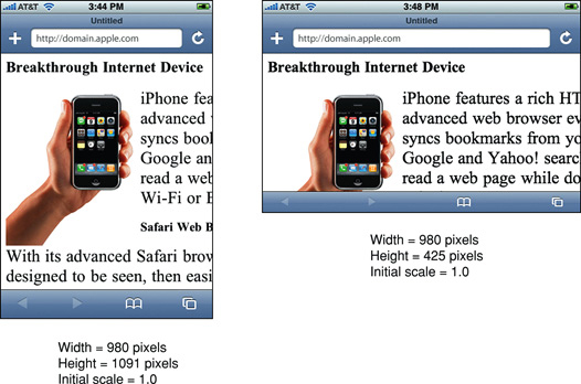
The minimum-scale and maximum-scale properties also affect the behavior when changing orientations. The range of these property values is from >0 to 10.0. The default value for minimum-scale is 0.25 and maximum-scale is 5.0.
Viewport Settings for Web Applications
If you are designing a web application specifically for iOS, then the recommended size for your webpages is the size of the visible area on iOS. Apple recommends that you set the width to device-width so that the scale is 1.0 in portrait orientation and the viewport is not resized when the user changes to landscape orientation.
If you do not change the viewport properties, Safari on iOS displays your webpage in the upper-left corner as shown in Figure 3-18. Setting the viewport width should be the first task when designing web applications for iOS to avoid the user zooming in before using your application.
Figure 3-18 Not specifying viewport properties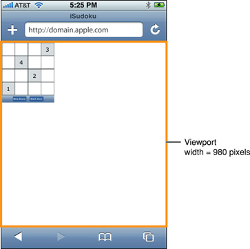
By setting the width to device-width in portrait orientation, Safari on iOS displays your webpage as show in Figure 3-19. Users can pan down to view the rest of the webpage if it is taller than the visible area. Add this line to your HTML file to set the viewport width to device-width:
<meta name = "viewport" content = "width=device-width"> |
Figure 3-19 Width set to device-width pixels
You may not want users to scale web applications designed specifically for iOS. In this case, set the width and turn off user scaling as follows:
<meta name = "viewport" content = "user-scalable=no, width=device-width"> |
Creating Video
Safari supports audio and video viewing in a webpage on the desktop and iOS. You can use audio and video HTML elements or use the embed element to use the native application for video playback. In either case, you need to ensure that the video you create is optimized for the platform and different bandwidths.
iOS streams movies and audio using HTTP over EDGE, 3G, and Wi-Fi networks. iOS uses a native application to play back video even when video is embedded in your webpages. Video automatically expands to the size of the screen and rotates when the user changes orientation. The controls automatically hide when they are not in use and appear when the user taps the screen. This is the experience the user expects when viewing all video on iOS.
Safari on iOS supports a variety of rich media, including QuickTime movies, as described in “Use Supported iOS Rich Media MIME Types.” Safari on iOS does not support Flash so don’t bring up JavaScript alerts that ask users to download Flash. Also, don’t use JavaScript movie controls to play back video since iOS supplies its own controls.
Safari on the desktop supports the same audio and video formats as Safari on iOS. However, if you use the audio and video HTML elements on the desktop, you can customize the play back controls. See Safari DOM Additions Reference for more details on the HTMLMediaElement class.
Follow these guidelines to deliver the best web audio and video experience in Safari on any platform:
-
Follow current best practices for embedding movies in webpages as described in “Sizing Movies Appropriately,” “Don’t Let the Bit Rate Stall Your Movie,” and “Using Supported Movie Standards.”
-
Use QuickTime Pro to encode H.264/AAC at appropriate sizes and bit rates for EDGE, 3G, and Wi-Fi networks, as described in “Encoding Video for Wi-Fi, 3G, and EDGE.”
-
Use reference movies so that iOS automatically streams the best version of your content for the current network connection, as described in “Creating a Reference Movie.”
-
Use poster JPEGs (not poster frames in a movie) to display a preview of your embedded movie in webpages, as described in “Creating a Poster Image for Movies.”
-
Make sure the HTTP servers hosting your media files support byte-range requests, as described in “Configuring Your Server.”
-
If your site has a custom media player, also provide direct links to the media files. iOS users can follow these links to play those files directly.
Sizing Movies Appropriately
In landscape orientation on iOS, the screen is 480 x 320 pixels. Users can easily switch the view mode between scaled-to-fit (letterboxed) and full-screen (centered and cropped). You should use a size that preserves the aspect ratio of your content and fits within a 480 x 360 rectangle. 480 x 360 is a good choice for 4:3 aspect ratio content and 480 x 270 is a good choice for widescreen content as it keeps the video sharp in full-screen view mode. You can also use 640 x 360 or anamorphic 640 x 480 with pixel aspect ratio tagging for widescreen content.
Don’t Let the Bit Rate Stall Your Movie
When viewing media over the network, the bit rate makes a crucial difference to the playback experience. If the network cannot keep up with the media bit rate, playback stalls. Encode your media for iOS as described in “Encoding Video for Wi-Fi, 3G, and EDGE” and use a reference movie as described in “Creating a Reference Movie.”
Using Supported Movie Standards
The following compression standards are supported:
-
H.264 Baseline Profile Level 3.0 video, up to 640 x 480 at 30 fps. Note that B frames are not supported in the Baseline profile.
-
MPEG-4 Part 2 video (Simple Profile)
-
AAC-LC audio, up to 48 kHz
Movie files with the extensions .mov, .mp4, .m4v, and .3gp are supported.
Any movies or audio files that can play on iPod play correctly on iPhone.
If you export your movies using QuickTime Pro 7.2, as described in “Encoding Video for Wi-Fi, 3G, and EDGE,” then you can be sure that they are optimized to play on iOS.
Encoding Video for Wi-Fi, 3G, and EDGE
Because users may be connected to the Internet via wired or wireless technology, using either Wi-Fi, 3G, or EDGE on iOS, you need to provide alternate media for these different connection speeds. You can use QuickTime Pro, the QuickTime API, or any Apple applications that provide iOS exporters to encode your video for Wi-Fi, 3G, and EDGE. This section contains specific instructions for exporting video using QuickTime Pro.
Follow these steps to export video using QuickTime Pro 7.2.1 and later:
-
Open your movie using QuickTime Player Pro.
-
Choose File > Export for Web.
A dialog appears.
-
Enter the file name prefix, location of your export, and set of versions to export as shown in Figure 9-1.
Figure 9-1 Export movie panel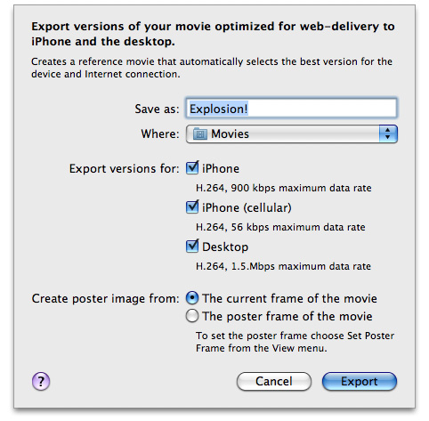
-
Click Export.
QuickTime Player Pro saves these versions of your QuickTime movie, along with a reference movie, poster image, and
ReadMe.htmlfile to the specified location. See theReadMe.htmlfile for instructions on embedding the generated movie in your webpage, including sample HTML.
Creating a Reference Movie
A reference movie contains a list of movie URLs, each of which has a list of tests, as show in Figure 9-2. When opening the reference movie, a playback device or computer chooses one of the movie URLs by finding the last one that passes all its tests. Tests can check the capabilities of the device or computer and the speed of the network connection.
Figure 9-2 Reference movie components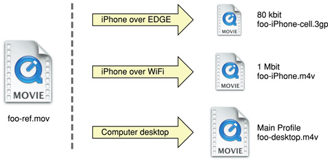
If you use QuickTime Pro 7.2.1 or later to export your movies for iOS, as described in “Encoding Video for Wi-Fi, 3G, and EDGE,” then you already have a reference movie. Otherwise, you can use the MakeRefMovie tool to create reference movies. For more information on creating reference movies see Creating Reference Movies - MakeRefMovie.
Also, refer to the MakeiPhoneRefMovie sample for a command-line tool that creates reference movies.
For more details on reference movies and instructions on how to set them up see “Applications and Examples” in HTML Scripting Guide for QuickTime.
Creating a Poster Image for Movies
The video is not decoded until the user enters movie playback mode. Consequently, when displaying a webpage with video, users may see a gray rectangle with a QuickTime logo until they tap the Play button. Therefore, use a poster JPEG as a preview of your movie. If you use QuickTime Pro 7.2.1 or later to export your movies, as described in “Encoding Video for Wi-Fi, 3G, and EDGE,” then a poster image is already created for you. Otherwise, follow these instructions to set a poster image.
If you are using the <video> element, specify a poster image by setting the poster attribute as follows:
<video poster="poster.jpg" src="movie.m4v" ...> </video> |
If you are using an <embed> HTML element, specify a poster image by setting the image for src, the movie for href, the media MIME type for type, and myself as the target:
<embed src="poster.jpg" href="movie.m4v" type="video/x-m4v" target="myself" scale="1" ...> |
Make similar changes if you are using the <object> HTML element or JavaScript to embed movies in your webpage.
On the desktop, this image is displayed until the user clicks, at which time the movie is substituted.
Configuring Your Server
HTTP servers hosting media files for iOS must support byte-range requests, which iOS uses to perform random access in media playback. (Byte-range support is also known as content-range or partial-range support.) Most, but not all, HTTP 1.1 servers already support byte-range requests.
If you are not sure whether your media server supports byte-range requests, you can open the Terminal application in OS X and use the curl command-line tool to download a short segment from a file on the server:
curl --range 0-99 http://example.com/test.mov -o /dev/null |
If the tool reports that it downloaded 100 bytes, the media server correctly handled the byte-range request. If it downloads the entire file, you may need to update the media server. For more information on curl, see OS X Man Pages.
Ensure that your HTTP server sends the correct MIME types for the movie filename extensions shown in Table 9-1.
|
Extensions |
MIME type |
|---|---|
|
|
video/quicktime |
|
|
video/mp4 |
|
|
video/x-m4v |
|
|
video/3gpp |
Be aware that iOS supports movies larger than 2 GB. However, some older web servers are not able to serve files this large. Apache 2 supports downloading files larger than 2 GB.
RTSP is not supported.
Debugging
With Safari on iOS 6 and later, you can debug your mobile web content from your Mac. You can view errors, warnings, and logs for HTML, JavaScript, and CSS, just as you would when developing for Safari on OS X. This chapter describes how to use Web Inspector to debug web content on iOS.
You should test your web content on both the desktop and various iOS devices. If you do not have iOS devices for testing, you can use Simulator in the iOS SDK. Because there is a difference between web browsing on iOS and OS X, you should specifically test your content on iPhone and iPad or emulate the hardware device in Simulator. When testing in Safari on any platform, you can use Web Inspector to debug your web content.
For more tips on debugging web content in Safari, read Safari Developer Tools Guide. Read the section “Changing the User Agent String” in Safari Developer Tools Guide to learn how to simulate iPhone- and iPad-like behavior in Safari on OS X.
Enabling Web Inspector on iOS
Web Inspector provides valuable insight on what might be going wrong with your web content. Even though Web Inspector is accessed through Safari on OS X, you can use it to inspect content that has loaded in Safari or in any UIWebView on iOS.
-
Open the Settings app.
-
Tap Safari.
-
Scroll down and select Advanced.

-
Switch Web Inspector to ON.

Inspecting From Your Mac
When Web Inspector on iOS is enabled, connect your device to your Mac with a USB cable. A menu item in the Develop menu of Safari on OS X appears, as shown in Figure 12-1.
The name of the menu item will be either the name of each device connected and/or the name of the Simulator. A submenu containing each available page for each inspectable app appears. Select the page that you are interested in, and Web Inspector opens in a new window.
The same interface and workflow to debug web content on OS X is used to debug web content on iOS, as shown in Figure 12-2.
All of the Web Inspector’s features on OS X—such as timing HTTP requests, profiling JavaScript, or manipulating the DOM Tree—are available on iOS as well. The sole difference is that by selecting your web page through the Develop menu, you actively inspect web content on your device instead of on your Mac. If you browse to another URL on your device with the Inspector window still open, you’ll notice that the inspected data reloads to reflect the page to which you navigated.
Inspecting Content in a Web View
If you have a development provisioning profile installed on your device, you can debug any web view (UIWebView object) in your app. This is particularly useful if your app manipulates the DOM on the fly and you want to observe the generated code.
To inspect a UIWebView, make sure that your app is open to the desired view so it appears under the Develop menu. The name of your app will appear under the name of your device. When debugging web content in a web view, Web Inspector behaves in the same manner as debugging web content in Safari.
Important: You can only inspect apps on devices that have been transferred to your device from Xcode. You cannot inspect apps that have been downloaded from the App Store, even if it is your app.
Using JavaScript to Interact with Your Device
You can communicate to your device from your Mac by sending JavaScript commands with the interactive Web Inspector debug console. Through the debug console you have access to variables, functions, and the DOM tree of the page being inspected. As you start typing, notice that acceptable values autopopulate. Press Return to send your command, and you receive a response, as shown in Figure 12-3.
Figure 12-3 Observing the value of document.title in the debug console
Conversely, you can create messages on your device and send their values to your Mac for observation. Throughout your JavaScript code, you can call the log(), warn(), and error() methods of the console object. Pass an object containing any runtime variables you are curious about. In this way, you can determine the value of an object at any stage of the loading process, instead of just at the end via the debug console. For example, the following code prints the value of a variable to the console using the log() method:
console.log("The current value of myVariable is " + myVariable);
|
Observe the output of console logs, warnings, and erros in the Log navigator (control-8).
Not only can you pass messages back and forth between iOS and OS X but you can also trigger functions on your device from your Mac. The example shown in Figure 12-4 calls window.alert(), but you can call any top-level function available to the webpage, including functions of your own. This behavior is useful if you want to closely examine the implementation of your code programmatically instead of through a user interface.
Figure 12-4 Alert dialog triggered from the debug console
© 2012 Apple Inc. All Rights Reserved. (Last updated: 2012-09-19)
南来地,北往的,上班的,下岗的,走过路过不要错过!
======================个性签名=====================
之前认为Apple 的iOS 设计的要比 Android 稳定,我错了吗?
下载的许多客户端程序/游戏程序,经常会Crash,是程序写的不好(内存泄漏?刚启动也会吗?)还是iOS本身的不稳定!!!
如果在Android手机中可以简单联接到ddms,就可以查看系统log,很容易看到程序为什么出错,在iPhone中如何得知呢?试试Organizer吧,分析一下Device logs,也许有用.


