css帮助文档解析

2.页面布局常用属性:


3.关于伪类选择器: :hover 鼠标移到元素上时添加的特殊样式。 :link 点击前的状态。 :action:鼠标点击时刻的状态。 :visited:鼠标点击后的状态。 :before 对指定的支持文本的元素批量插入文本。 :checked 选择器匹配每个选中的输入元素(仅适用于单选按钮或复选框)。 :nth-child(i) 匹配父元素中的第n个子元素,元素类型没有限制。
4.关于过渡效果(动画) transition-property 规定设置过渡效果的 CSS 属性的名称。 -duration 规定完成过渡效果需要多少秒或毫秒。 -timing-function 规定过度效果的速度曲线。 -delay 定义过渡效果开始时间。 速度曲线: Linear 匀速开始至结束的过渡效果 (匀速) Ease 慢速开始,中间变快,慢速结束的过渡效果(中间快,两头慢) ease-in 以慢速开始的过渡效果 (开始的时候慢,之后快) ease-out 以慢速结束的过渡效果(开始时快,结束时候减慢) ease-in-out 以慢速开始和结束的过渡效果 cubic-bezier(n,n,n,n) 自定义速度曲线
一些比较少用的属性: text-shadow: 1px 1px 1px rgba(0,0,0,0.1); 设置字体的阴影 左右,上下,清晰度(非透明),颜色 content:‘文本’; 对指定的元素绑定文本,文件则content:url(…/Images/1.jpg); transform: scale(i); 元素缩放,默认为1 background-size: 400% 100%; 规定背景图像尺寸:宽 高; background-position: 0% 0px; 设置背景图像在其元素内的位置:左右,上下
一:backgroud:
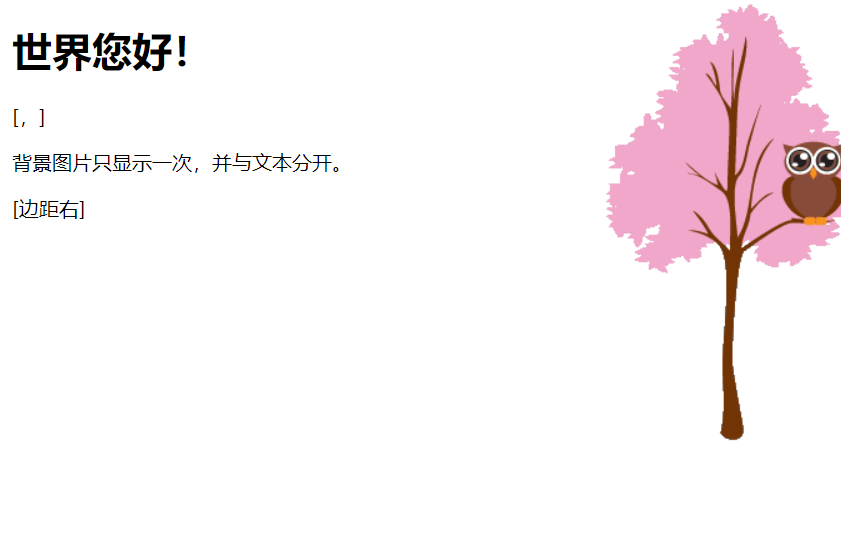
<style> body { background-image:url('img_tree.png'); background-repeat:no-repeat; background-position:top right; margin-right:200px; } </style> </head> <body> <h1>Hello World!</h1> <p>背景图片不重复,设置 position 实例。</p> <p>背景图片只显示一次,并与文本分开。</p> <p>实例中还添加了 margin-right 属性用于让文本与图片间隔开。</p> </body>
二:文本:
| 属性 | 描述 |
|---|---|
| color | 设置文本颜色 |
| direction | 设置文本方向。 |
| letter-spacing | 设置字符间距 |
| line-height | 设置行高 |
| text-align | 对齐元素中的文本 |
| text-decoration | 向文本添加修饰 |
| text-indent | 缩进元素中文本的首行 |
| text-shadow | 设置文本阴影 |
| text-transform | 控制元素中的字母 |
| unicode-bidi | 设置或返回文本是否被重写 |
| vertical-align | 设置元素的垂直对齐 |
| white-space | 设置元素中空白的处理方式 |
| word-spacing | 设置字间距 |
<!--1.文本对齐方式-->text-align h1 {text-align:center;} p.date {text-align:right;} p.main {text-align:justify;} //2.对文本作修饰text-decoration(上中下画一道线) h1 {text-decoration:overline;} h2 {text-decoration:line-through;} h3 {text-decoration:underline;} //3.文本大小写转换transform p.uppercase {text-transform:uppercase;} p.lowercase {text-transform:lowercase;} p.capitalize {text-transform:capitalize;} //4.文本缩进:text-indent(不是很常用) p {text-indent:50px;}
//1.字体系列:font-family p{font-family:"Times New Roman", Times, serif;} //2.字体样式:font-style p{font-style:strong italic} //3.字体大小:font-size:40px //4.使用百分比或EM组合实现浏览器兼容: body {font-size:100%;} h1 {font-size:2.5em;} h2 {font-size:1.875em;} p {font-size:0.875em;} //5.字体粗细:font-weight
四:css链接样式:
//1.链接字体改变 a:link {color:#000000;} /* 未访问链接*/ a:visited {color:#00FF00;} /* 已访问链接 */ a:hover {color:#FF00FF;} /* 鼠标移动到链接上 */ a:active {color:#0000FF;} /* 鼠标点击时 */ | V //1.5重点:放到上面会有下划线: a:link {text-decoration:none;} a:visited {text-decoration:none;} a:hover {text-decoration:underline;} a:active {text-decoration:underline;} 2.链接周围颜色改变: a:link {background-color:#B2FF99;} /* 未访问链接 */ a:visited {background-color:#FFFF85;} /* 已访问链接 */ a:hover {background-color:#FF704D;} /* 鼠标移动到链接上 */ a:active {background-color:#FF704D;} /* 鼠标点击时 */
注意:一定要按照上面的顺序来写才可以
五:列表(有序和无序)
//1.列表标记:list-style-list ul.a{list-style-list:circle/square}无序 ol.c {list-style-type: upper-roman/lower-alpha;} //2.列表标记为图像: ul.a{list-style-image: url('sql.gif')} //3.消除标记: ul.demo { list-style-type: none; margin: 0; padding: 0; } //4.位置:position ul { list-style-position: inside; }
六:表格:
1.表格:border border :1px solid black; 2.折叠边框:border-collapse(可以理解为更加美观) table{border-collapse:collapse;} 3.常用属性:height,weight,text-align,vertical-align:bottom;(垂直对齐),background-color,clolor 4.表格填充:padding
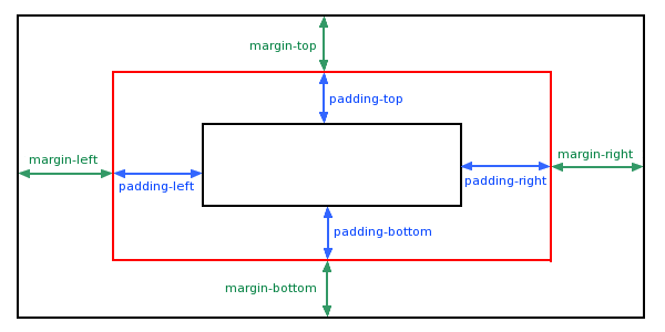
七:盒子模型:
-
Margin(外边距) - 清除边框外的区域,外边距是透明的。
-
Border(边框) - 围绕在内边距和内容外的边框。
-
Padding(内边距) - 清除内容周围的区域,内边距是透明的。
-
Content(内容) - 盒子的内容,显示文本和图像。

1.边框:border
//1.边框-单独设置各边:border-style
    border-top-style:dotted;
    border-right-style:solid;
    border-bottom-style:dotted;
    border-left-style:solid;
border-style:dotted solid double dashed;
2.outline:轮廓(给这些东西修饰)
//outside border between margin
p {
    border:1px solid red;
    outline-style:dotted;
    outline-color:#00ff00;}
3.the realationship between margin and padding:最外面的
八:分组和嵌套:
//1.分组选择器:使用都好隔开
h1,h2,p
{
    color:green;
}

//2.嵌套选择器:用于选择器内部的选择器的样式(这也是为什么最好子元素为class的而不是id)
    p{ }: 为所有 p 元素指定一个样式。
    .marked{ }: 为所有 class="marked" 的元素指定一个样式。
    .marked p{ }: 为所有 class="marked" 元素内的 p 元素指定一个样式。
    p.marked{ }: 为所有 class="marked" 的 p 元素指定一个样式。
九:显示与隐藏:
//1.display
    display:inline/block/none;//inline:作为内联元素,block:作为块元素,none:隐藏不会占空间
    li {display:inline;}//
    span {display:block;}
//2.visibility
    visibility:hidden//隐藏会占空间
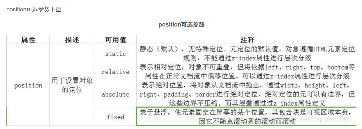
十:定位:position
//1.static:静态定位的元素不会受到 top, bottom, left, right影响。
div.static {
    position: static;
    border: 3px solid #73AD21;
}

//2.fixed:页面滑动不会消失
p.pos_fixed
{
    position:fixed;
    top:30px;
    right:5px;
}

//2.5重点:粘贴定位(类似于fixed):sticky
<div class="sticky">我是粘性定位!</div>
div.sticky {
  position: -webkit-sticky;
  position: sticky;
  top: 0;
  padding: 5px;
  background-color: #cae8ca;
  border: 2px solid #4CAF50;
}

//3.relative:相对位置(指的是在原来的位置基础上移动)
    移动相对定位元素,但它原本所占的空间不会改变。
//4.absolute:绝对定位的元素的位置相对于最近的已定位父元素,如果元素没有已定位的父元素,那么它的位置相对于html
    absolute 定位使元素的位置与文档流无关,因此不占据空间。
    absolute 定位的元素和其他元素重叠。
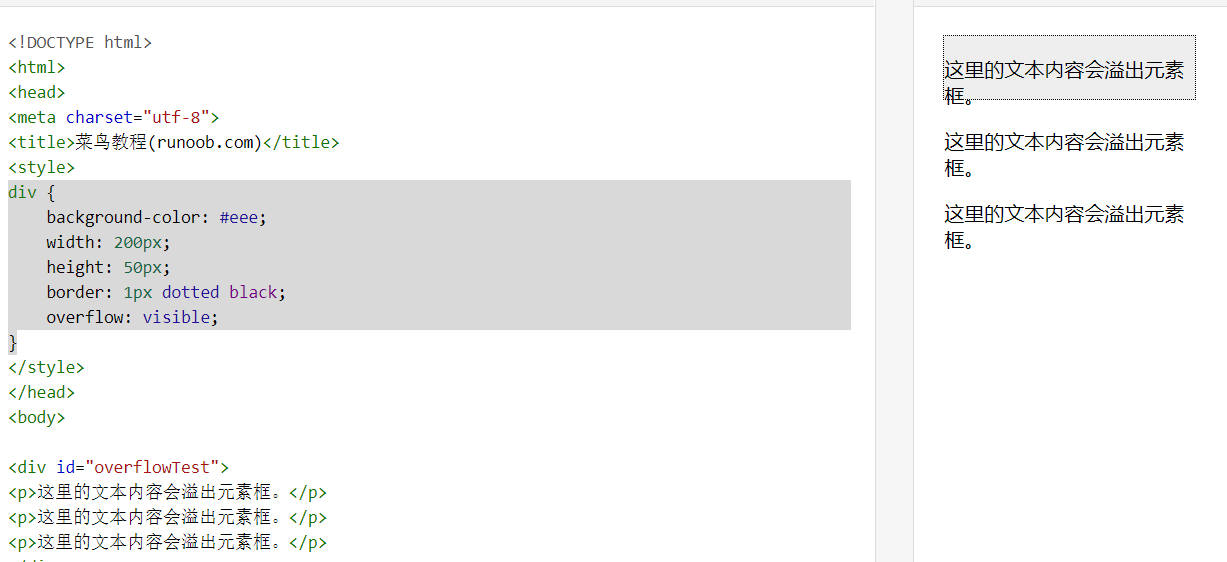
十一:溢出处理:overflow
| 值 | 描述 |
|---|---|
| visible | 默认值。内容不会被修剪,会呈现在元素框之外。 |
| hidden | 内容会被修剪,并且其余内容是不可见的。 |
| scroll | 内容会被修剪,但是浏览器会显示滚动条以便查看其余的内容。 |
| auto | 如果内容被修剪,则浏览器会显示滚动条以便查看其余的内容。 |
| inherit | 规定应该从父元素继承 overflow 属性的值。 |
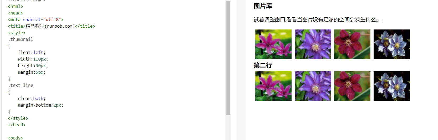
十二:Float与clear
.thumbnail
{
    float:left;
    width:110px;
    height:90px;
    margin:5px;
}

//clear:元素浮动之后,周围的元素会重新排列,为了避免这种情况,使用 clear 属性。
clear 属性指定元素两侧不能出现浮动元素。
使用 clear 属性往文本中添加图片廊:
一般是直接给两个浮动元素中间的那个加一个限制,九比如说是文本或者是按钮来划分开
十三:重点对齐:
//1.图片居中对齐
要让图片居中对齐, 可以使用 margin: auto; 并将它放到 块 元素中

//2.使用 position: absolute; 属性来对齐元素
    注意:在设置这个的时候,记得给body设置一下margin:0,padding:0

//3.当在块级元素中插入图片,但是最终溢出,可以使用overflow:auto解决问题

//4.设置居中对齐:
    1.设置line-height==height
    2.如果有多行文本,可以使用vertical-align:middle实现文本居中
    3.使用2D翻转:transform:translate(-50%,-50%);
十四:组合选择器:
-
后代选择器(以空格 分隔)(常用)
-
子元素选择器(以大于 > 号分隔)(常用)
-
相邻兄弟选择器(以加号 + 分隔)(常用),也就是div后面的那个元素
-
普通兄弟选择器(以波浪号 ~ 分隔)
十五:伪类(重点)
常用的一些:
//a标签链接属性
a:link {color:#FF0000;} /* 未访问的链接 */
a:visited {color:#00FF00;} /* 已访问的链接 */
a:hover {color:#FF00FF;} /* 鼠标划过链接 */
a:active {color:#0000FF;} /* 已选中的链接 */
//2.lang伪类:
可以自己定义具有不同能力的伪类
| :checked | input:checked | 选择所有选中的表单元素 |
|---|---|---|
| :disabled | input:disabled | 选择所有禁用的表单元素 |
| :empty | p:empty | 选择所有没有子元素的p元素 |
| :enabled | input:enabled | 选择所有启用的表单元素 |
| :first-of-type | p:first-of-type | 选择的每个 p 元素是其父元素的第一个 p 元素 |
| :in-range | input:in-range | 选择元素指定范围内的值 |
| :invalid | input:invalid | 选择所有无效的元素 |
| :last-child | p:last-child | 选择所有p元素的最后一个子元素 |
| :last-of-type | p:last-of-type | 选择每个p元素是其母元素的最后一个p元素 |
| :not(selector) | :not(p) | 选择所有p以外的元素 |
| :nth-child(n) | p:nth-child(2) | 选择所有 p 元素的父元素的第二个子元素 |
| :nth-last-child(n) | p:nth-last-child(2) | 选择所有p元素倒数的第二个子元素 |
| :nth-last-of-type(n) | p:nth-last-of-type(2) | 选择所有p元素倒数的第二个为p的子元素 |
| :nth-of-type(n) | p:nth-of-type(2) | 选择所有p元素第二个为p的子元素 |
| :only-of-type | p:only-of-type | 选择所有仅有一个子元素为p的元素 |
| :only-child | p:only-child | 选择所有仅有一个子元素的p元素 |
| :optional | input:optional | 选择没有"required"的元素属性 |
| :out-of-range | input:out-of-range | 选择指定范围以外的值的元素属性 |
| :read-only | input:read-only | 选择只读属性的元素属性 |
| :read-write | input:read-write | 选择没有只读属性的元素属性 |
| :required | input:required | 选择有"required"属性指定的元素属性 |
| :root | root | 选择文档的根元素 |
| :target | #news:target | 选择当前活动#news元素(点击URL包含锚的名字) |
| :valid | input:valid | 选择所有有效值的属性 |
| :link | a:link | 选择所有未访问链接 |
| :visited | a:visited | 选择所有访问过的链接 |
| :active | a:active | 选择正在活动链接 |
| :hover | a:hover | 把鼠标放在链接上的状态 |
| :focus | input:focus | 选择元素输入后具有焦点 |
| :first-letter | p:first-letter | 选择每个<p> 元素的第一个字母 |
| :first-line | p:first-line | 选择每个<p> 元素的第一行 |
| :first-child | p:first-child | 选择器匹配属于任意元素的第一个子元素的 <p> 元素 |
| :before | p:before | 在每个<p>元素之前插入内容 |
| :after | p:after | 在每个<p>元素之后插入内容 |
| :lang(language) | p:lang(it) | 为<p>元素的lang属性选择一个开始值 |
布局:
1.css导航栏布局:
//1.list-style-type:none - 移除列表前小标志。一个导航栏并不需要列表标记
//2.移除浏览器的默认设置将边距和填充设置为0。设置padding和margin都为0就可以


//3.垂直导航栏的实例:
ul {
    list-style-type: none;
    margin: 0;
    padding: 0;
    width: 200px;
    background-color: #f1f1f1;
}

li a {
    display: block;
    color: #000;
    padding: 8px 16px;
    text-decoration: none;
}

/* 鼠标移动到选项上修改背景颜色 */
li a:hover {
    background-color: #555;
    color: white;
}

<!--设置可滑动或者全屏高度的固定导航条-->
    overflow: auto; /* 如果导航栏选项多,允许滚动 */
    height: 100%; /* 全屏高度 */


//4.水平导航条:水平也一样,需要设置悬浮float属性和文字的padding和margin属性,如果有放到另一侧的元素,也需要设置float实现功能
ul {
    list-style-type: none;
    margin: 0;
    padding: 0;
    overflow: hidden;
    background-color: #333;
}
li {
    float: left;/*水平也一样子的*/
}
li a {
    display: block;
    color: white;
    text-align: center;
    padding: 14px 16px;
    text-decoration: none;
}

li a:hover {
    background-color: #111;
}
/*添加每个选项的分割线:直接在表格元素设置 border-right */
2.实现下拉菜单
/*例一:----------------------------------------------------------------------------------*/
/*本质:设置display为none,然后设置一个伪选择器设置显示效果*/
<style>
.dropdown {
    position: relative;
    display: inline-block;
}

.dropdown-content {
    display: none;
    position: absolute;
    background-color: #f9f9f9;
    min-width: 160px;
    box-shadow: 0px 8px 16px 0px rgba(0,0,0,0.2);
    padding: 12px 16px;
    z-index: 1;
}

.dropdown:hover .dropdown-content {
    display: block;
}
</style>

/*例二:-----------------------------------------------------------------*/
<div class="dropdown">
  <span>Mouse over me</span>
  <div class="dropdown-content">
    <p>Hello World!</p>
  </div>
</div>

<!DOCTYPE html>
<html>
<head>
<title>下拉菜单实例|菜鸟教程(runoob.com)</title>
<meta charset="utf-8">
<style>
.dropbtn {
    background-color: #4CAF50;
    color: white;
    padding: 16px;
    font-size: 16px;
    border: none;
    cursor: pointer;
}

.dropdown {
    position: relative;
    display: inline-block;
}

.dropdown-content {
    display: none;
    position: absolute;
    background-color: #f9f9f9;
    min-width: 160px;
    box-shadow: 0px 8px 16px 0px rgba(0,0,0,0.2);
}

.dropdown-content a {
    color: black;
    padding: 12px 16px;
    text-decoration: none;
    display: block;
}

.dropdown-content a:hover {background-color: #f1f1f1}

.dropdown:hover .dropdown-content{
    display:block;
}


.dropdown:hover .dropbtn {
    background-color: #3e8e41;
}
</style>
</head>
<body>

<h2>下拉菜单</h2>
<p>鼠标移动到按钮上打开下拉菜单。</p>

<div class="dropdown">
  <button class="dropbtn">下拉菜单</button>
  <div class="dropdown-content">
    <a href="//www.runoob.com">菜鸟教程 1</a>
    <a href="//www.runoob.com">菜鸟教程 2</a>
    <a href="//www.runoob.com">菜鸟教程 3</a>
  </div>
</div>

</body>
</html>
3.提示工具:跟上面的一样
4.图片廊:
<div class="responsive">
  <div class="img">
    <a target="_blank" href="http://static.runoob.com/images/demo/demo1.jpg">
      <img loading="lazy" src="http://static.runoob.com/images/demo/demo1.jpg" alt="图片文本描述" width="300" height="200">
    </a>
    <div class="desc">这里添加图片文本描述</div>
  </div>
</div>

<div class="responsive">
  <div class="img">
    <a target="_blank" href="http://static.runoob.com/images/demo/demo2.jpg">
      <img loading="lazy" src="http://static.runoob.com/images/demo/demo2.jpg" alt="图片文本描述" width="300" height="200">
    </a>
    <div class="desc">这里添加图片文本描述</div>
  </div>
</div>

<div class="responsive">
  <div class="img">
    <a target="_blank" href="http://static.runoob.com/images/demo/demo3.jpg">
      <img loading="lazy" src="http://static.runoob.com/images/demo/demo3.jpg" alt="图片文本描述" width="300" height="200">
    </a>
    <div class="desc">这里添加图片文本描述</div>
  </div>
</div>

<div class="responsive">
  <div class="img">
    <a target="_blank" href="http://static.runoob.com/images/demo/demo4.jpg">
      <img loading="lazy" src="http://static.runoob.com/images/demo/demo4.jpg" alt="图片文本描述" width="300" height="200">
    </a>
    <div class="desc">这里添加图片文本描述</div>
  </div>
</div>
5.图片效果:shadow,opacity
img
{
  opacity:0.4;
  filter:alpha(opacity=40); /* IE8 及其更早版本 */
  box-shadow:50%;
}
6.图像拼合技术:
//1.图像导航:
<style>
#navlist{position:relative;}
#navlist li{margin:0;padding:0;list-style:none;position:absolute;top:0;}
#navlist li, #navlist a{height:44px;display:block;}

#home{left:0px;width:46px;}
#home{background:url('/images/img_navsprites.gif') 0 0;}

#prev{left:63px;width:43px;}
#prev{background:url('/images/img_navsprites.gif') -47px 0;}

#next{left:129px;width:43px;}
#next{background:url('/images/img_navsprites.gif') -91px 0;}
</style>
</head>

<body>
<ul id="navlist">
  <li id="home"><a href="/"></a></li>
  <li id="prev"><a href="/css/"></a></li>
  <li id="next"><a href="/css/"></a></li>
</ul>
</body>
</html>

//2.图像的hover效果:
<style>
#home a:hover{background: url('img_navsprites_hover.gif') 0 -45px;}
#prev a:hover{background: url('img_navsprites_hover.gif') -47px -45px;}
#next a:hover{background: url('img_navsprites_hover.gif') -91px -45px;}
</style>
7.选择媒体类型:@media print/screen/all
@media screen
{
    p.test {font-family:verdana,sans-serif;font-size:14px;}
}
@media print
{
    p.test {font-family:times,serif;font-size:10px;}
}
@media screen,print
{
    p.test {font-weight:bold;}
}
| all | 用于所有的媒体设备。 |
|---|---|
| aural | 用于语音和音频合成器。 |
| braille | 用于盲人用点字法触觉回馈设备。 |
| embossed | 用于分页的盲人用点字法打印机。 |
| handheld | 用于小的手持的设备。 |
| 用于打印机。 | |
| projection | 用于方案展示,比如幻灯片。 |
| screen | 用于电脑显示器。 |
| tty | 用于使用固定密度字母栅格的媒体,比如电传打字机和终端。 |
| tv | 用于电视机类型的设备。 |
8.设计表单不同type的style:
css中使用P[]实现对不同type的选择
/*
input[type=text] - 选取文本输入框
input[type=password] - 选择密码的输入框
input[type=number] - 选择数字的输入框
input[type=checkbox] - 对于多选项框增加style样式
*/

/*带动画的搜索框*/
input[type=text] {
  -webkit-transition: width 0.4s ease-in-out;
  transition: width 0.4s ease-in-out;
}

/*对文本框的textarea,select,button进行样式设计*/
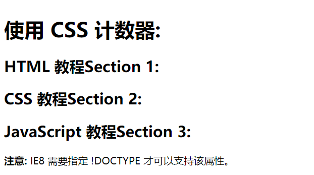
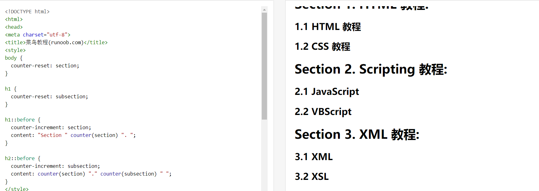
9.css中独特的计数器:
| 属性 | 描述 |
|---|---|
| content | 使用 ::before 和 ::after 伪元素来插入自动生成的内容 |
| counter-increment | 递增一个或多个值 |
| counter-reset | 创建或重置一个或多个计数器 |
<!--
    1.目的:为了节省js的使用
    2.需要先初始化定义计数器(counter-reset:section变量),然后使用递增或递减器实现递增,想要使用计数器的数字,必须使用伪类选择器before/after中的content:counter(counter-reset:section)
    3.当然也用在论文或者word文档格式中更加实用

表格菜单使用:
ol {
  counter-reset: section;
  list-style-type: none;
}

li::before {
  counter-increment: section;
  content: counters(section,".") " ";
}
-->


<!DOCTYPE html>
<html>
<head>
<meta charset="utf-8">
<title>菜鸟教程(runoob.com)</title>
<style>
body {
  counter-reset: section;
  counter-increment: 1;
}

h2::after {
  counter-increment: section;
  content: "Section " counter(section) ": ";
}
</style>
<h1>使用 CSS 计数器:</h1>
<h2>HTML 教程</h2>
<h2>CSS 教程</h2>
<h2>JavaScript 教程</h2>

 浙公网安备 33010602011771号