bootstrap5
##############
bootstrap里面提供了大量的常用组件,可以直接使用或者简单进行二次开发,加快日常业务的开发速度。同时,有些组件需要跟js(jQuery)配合,实现组件的交互效果。
里面的组件按是否需要js,可以分为两类:
- 无需js配合: Button系列、Form、Input系列、DropDown、Jumbotron、Label、Alert、Cards、Nav系列、Breadcrumb、Pagination、Progress、List
- 需js配合: Modal、Tooltips、Popovers、Carousels
需要注意的是Cards是bootstrap4新增的组件。
-
margin(外边距):是指从自身边框到另一个容器(包括父容器与同级容器)边框之间的距离,是容器外距离。避开使用margin-top
-
padding(内边距):是指自身边框到自身内部子容器边框之间的距离,是容器内距离。
bootstrap5的特点有下面几点:
-
不在支持internet explorer10和internet explorer11。节省了很多为兼容而写的代码,同时也可以更好的运用html5和css3的一些新特征。
-
不再依赖jQuery。这里说的不再依赖是说jQuery不再是必须的,如果你需要jQuery,依然可以单独引入,另外单独引入的话你还可以直接使用最新版本的jQuery,而不是Bootstrap配套的版本。
-
优化了各个组件的外观,一直以来Bootstrap给人诟病的一点就是做出的网站页面太死板,面目丑陋,需要自己另外写css优化,现在Bootstrap5做好的页面已经非常美观,可直接应用了,大家可以直接看看www.bootstrap.cn ,纯Bootstrap5开发,没有使用任何其他css文件。
-
增加了很多组件,现在基本上设计网页的常用组件都能找到了,网页设计变得不要太轻松了,简单复制、粘贴、修改以下文字,拼凑起来即可。
-
体积大大减小。完全可以将bootstrap.min.css和bootstrap.bundle.min.js提取出来,总共不到100k,目前没发现任何问题。
以下是Bootstrap重置元件的规范和原因:
-
更新部分浏览器的预设值,在可变动的元件间距上使用rem替代em。
-
避开使用margin-top。垂直边界的margins可能会重叠,进而产生不能预期的结果。更重要的是,使用单向的margin是一个更单纯的思考模式。
-
为便于跨设备大小进行缩放,块元素应使用rems作为边距。
-
尽量减少字体相关属性的声明,尽可能使用inherit。
bootstrap.css文件大概有1万行的样子,咱们使用的时候,只需关注咱们的html结构中元素的class属性,我们使用bootstrap的时候,只需设置元素的class属性即可

因此,熟悉bootstrap.css文件中的常见类class选择器即可
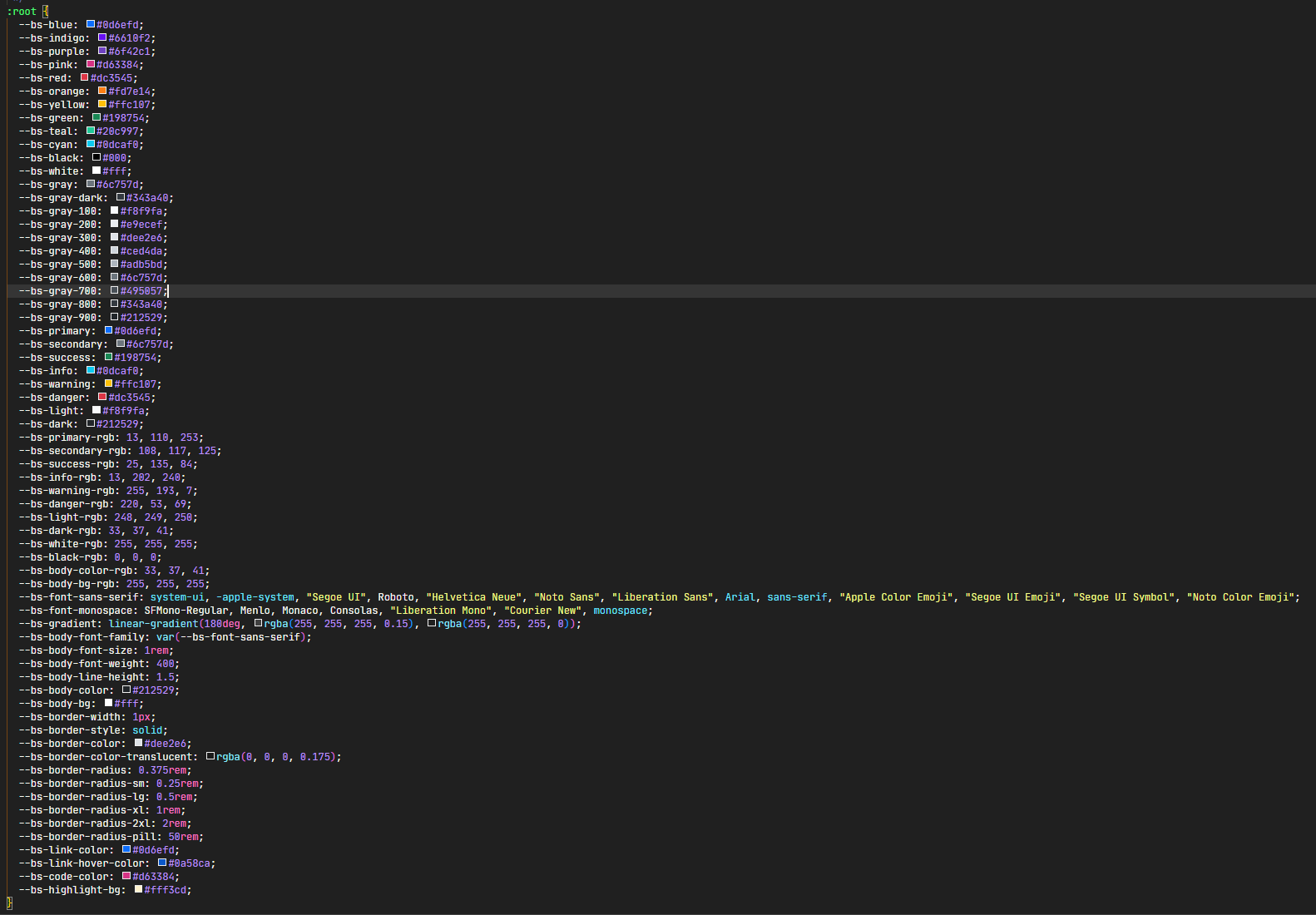
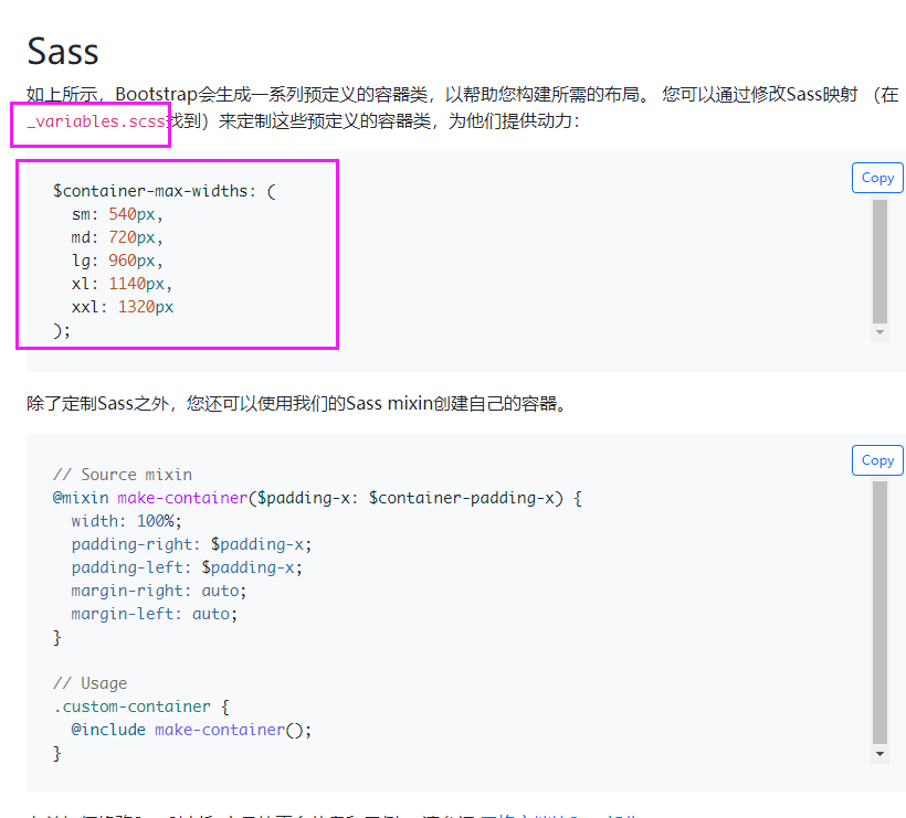
自定义全局属性:用于设置颜色和字体:
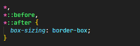
设置全局box-sizing:border-box:
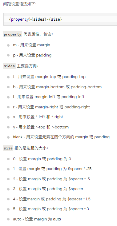
间距设置:
容器:默认情况下,容器都有填充左右内边距,顶部和底部没有填充内边距:一个页面只需要一个容器标签,将其他所有可视内容包裹进去即可:
-
margin简写为m,padding简写为p
-
top简写为t,bottom简写为b,top和bottom简写为y,left简写为start的s,right简写为end的e,left和right简写为x
-
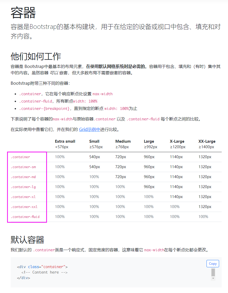
创建一个固定宽度的容器:container
-
创建一个全屏幕尺寸的容器:container-fluid
-
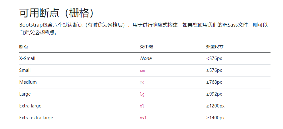
创建响应式容器:container-[sm|md|lg|xl|xxl]
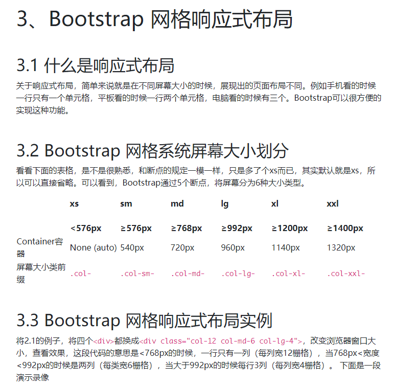
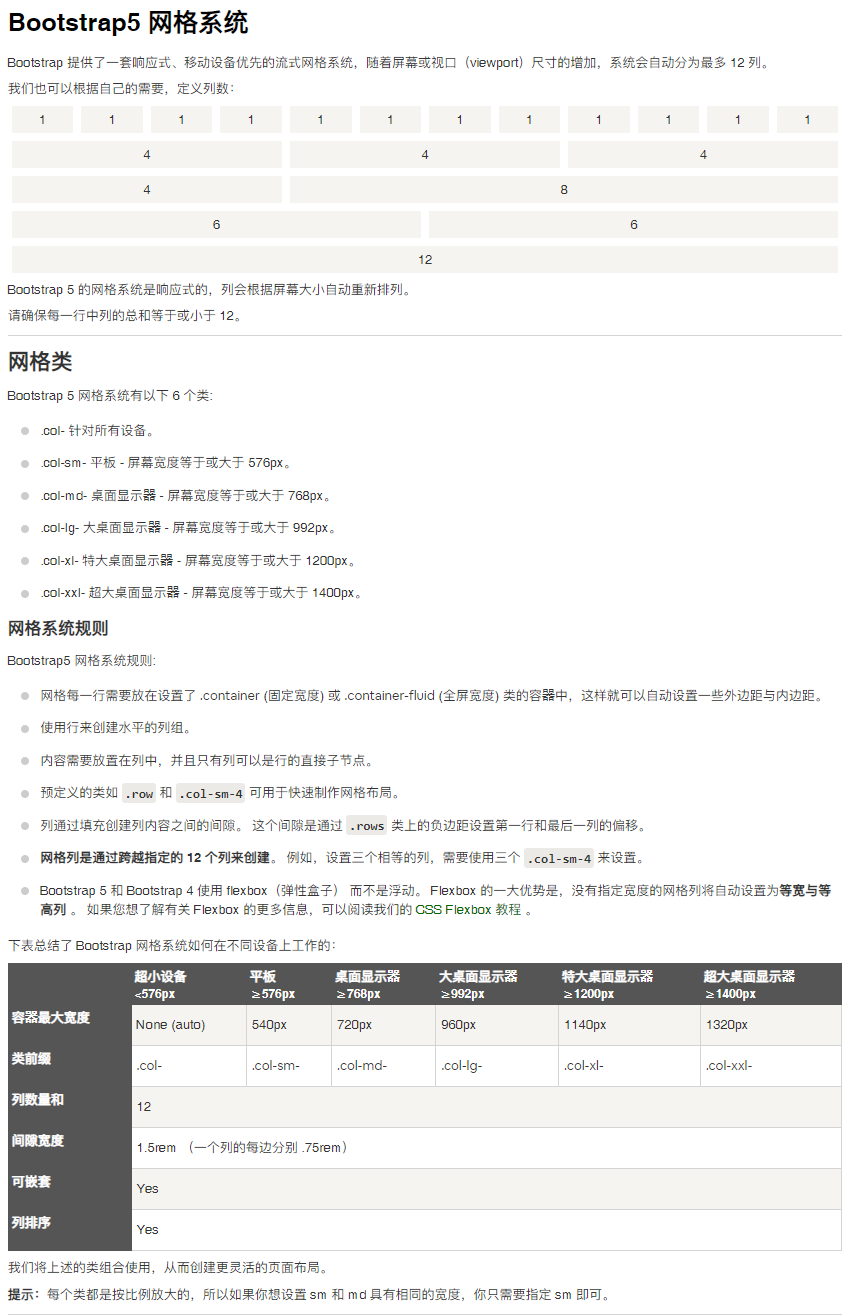
网格系统:请确保每一行中列的总和等于或小于12:
十二网格系统:
十二栅格系统的意思是将整个屏幕按宽度划分为十二等份,而一等分代表屏幕宽度的十二分之一,为什么划分为十二等份,而不是十等分或其他等份呢,这是因为12是1,2,3,4,6的最小公倍数,根据经验,按照这样的划分是最美观和实用的。
Bootstrap 网格系统设计三个标签,分别是container,row,col:
-
container是容器,在上一节中,专门做了详细的介绍。
-
row是行的意思,代表着一个水平行
-
col是单元格,代表着具体每一个单元格,其写法有三种:col、col-栅格数(如col-3)、col-屏幕大小-栅格数(如col-md-3)。
=======================================================================================================
-
使用行(row)来创建列的水平组。
-
一个页面内可以有多个行。
-
行必须放置在 容器(container)内,以便获得适当的对齐(alignment)和内边距(padding)。
-
内容应该放置在列(col)内,且唯有列可以是行的直接子元素。
-
列内还可以嵌套行,列内的行无需container,因为列本身就是个容器。
-
可以直接使用预定义的网格类,比如 col-屏幕大小-栅格数,用于快速创建栅格布局。
-
预定义类中,屏幕大小有5个值,主要用于响应式设计,见3.1。栅格数为数字1到12,代表占屏幕宽度。
-
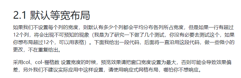
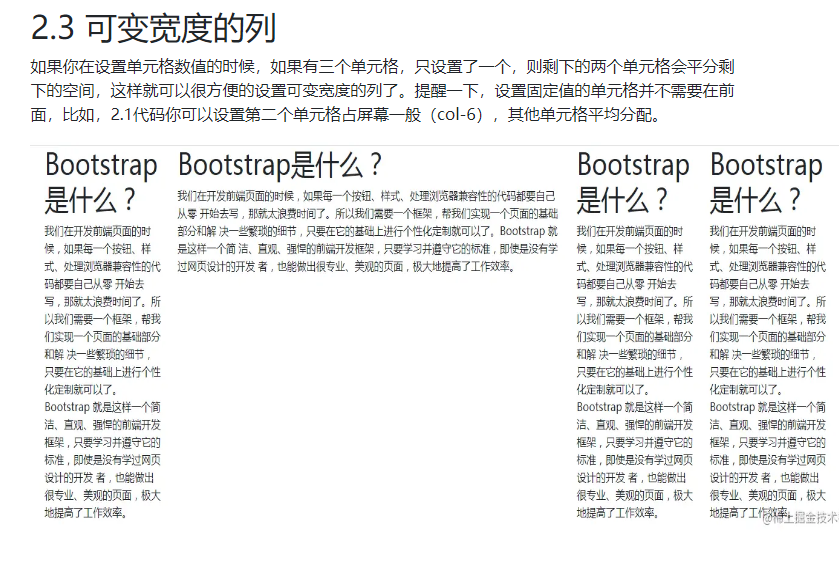
如果我们不设置每个列的宽度,则默认有多少个列都会平均分布各列所占宽度;
-
但是如果一行有超过12个列,将会出现不可预知的现象;
-
如果你想布局超过12个,可以用表格;
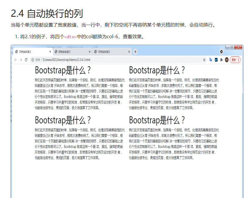
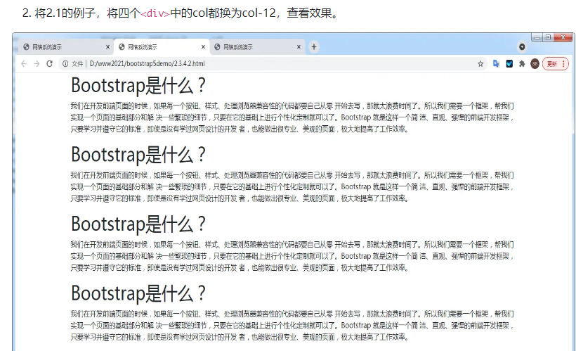
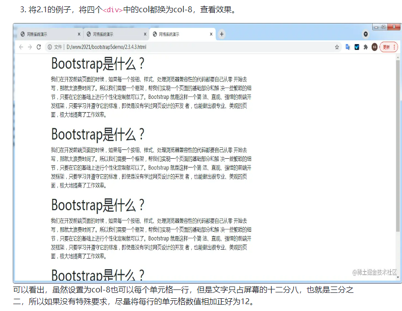
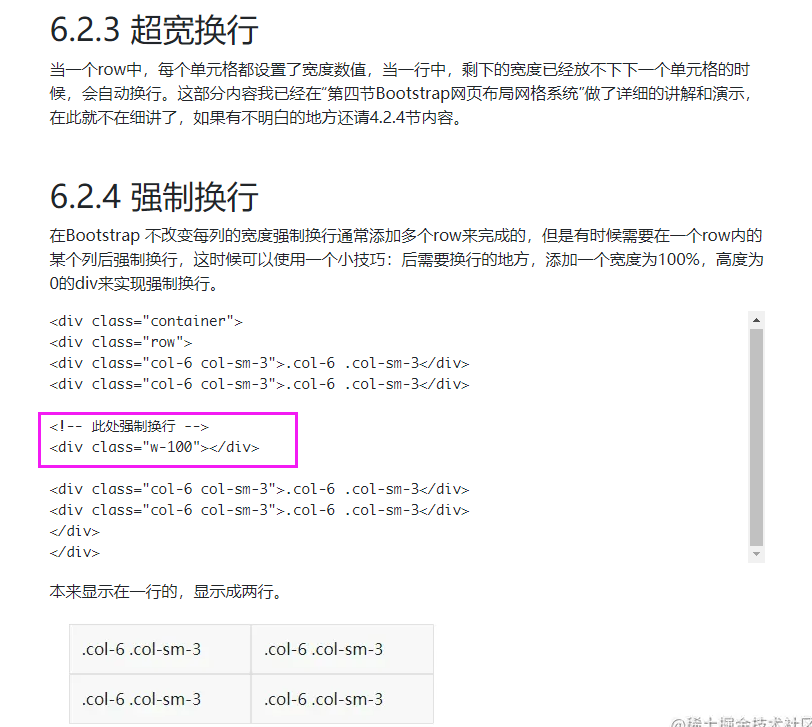
- 当每个单元格都设置了宽度数值,当一行中,剩下的空间不再容纳某个单元格的时候,会自动换行。
规则:col-[sm|md|lg|xl|xxl]-[1~12],比如:
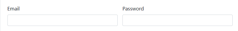
  <div class="col-md-6">
    <label for="inputEmail4" class="form-label">Email</label>
    <input type="email" class="form-control" id="inputEmail4">
  </div>
  <div class="col-md-6">
    <label for="inputPassword4" class="form-label">Password</label>
    <input type="password" class="form-control" id="inputPassword4">
  </div>
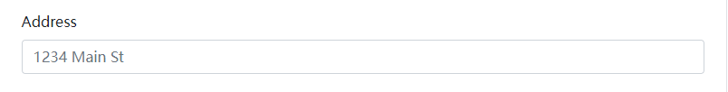
<div class="col-12">
    <label for="inputAddress" class="form-label">Address</label>
    <input type="text" class="form-control" id="inputAddress" placeholder="1234 Main St">
  </div>
举例说明:
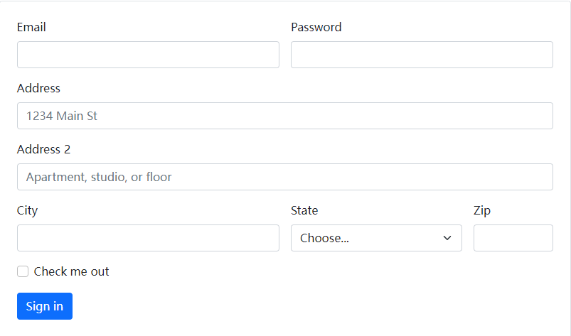
<form class="row g-3">
  <div class="col-md-6">
    <label for="inputEmail4" class="form-label">Email</label>
    <input type="email" class="form-control" id="inputEmail4">
  </div>
  <div class="col-md-6">
    <label for="inputPassword4" class="form-label">Password</label>
    <input type="password" class="form-control" id="inputPassword4">
  </div>
  <div class="col-12">
    <label for="inputAddress" class="form-label">Address</label>
    <input type="text" class="form-control" id="inputAddress" placeholder="1234 Main St">
  </div>
  <div class="col-12">
    <label for="inputAddress2" class="form-label">Address 2</label>
    <input type="text" class="form-control" id="inputAddress2" placeholder="Apartment, studio, or floor">
  </div>
  <div class="col-md-6">
    <label for="inputCity" class="form-label">City</label>
    <input type="text" class="form-control" id="inputCity">
  </div>
  <div class="col-md-4">
    <label for="inputState" class="form-label">State</label>
    <select id="inputState" class="form-select">
      <option selected>Choose...</option>
      <option>...</option>
    </select>
  </div>
  <div class="col-md-2">
    <label for="inputZip" class="form-label">Zip</label>
    <input type="text" class="form-control" id="inputZip">
  </div>
  <div class="col-12">
    <div class="form-check">
      <input class="form-check-input" type="checkbox" id="gridCheck">
      <label class="form-check-label" for="gridCheck">
        Check me out
      </label>
    </div>
  </div>
  <div class="col-12">
    <button type="submit" class="btn btn-primary">Sign in</button>
  </div>
</form>
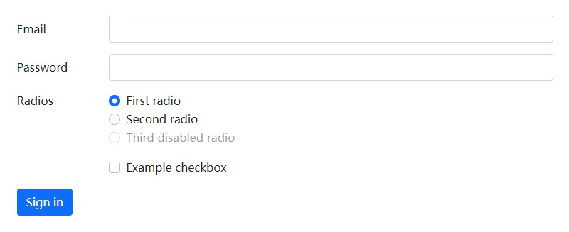
<form>
  <div class="row mb-3">
    <label for="inputEmail3" class="col-sm-2 col-form-label">Email</label>
    <div class="col-sm-10">
      <input type="email" class="form-control" id="inputEmail3">
    </div>
  </div>
  <div class="row mb-3">
    <label for="inputPassword3" class="col-sm-2 col-form-label">Password</label>
    <div class="col-sm-10">
      <input type="password" class="form-control" id="inputPassword3">
    </div>
  </div>
  <fieldset class="row mb-3">
    <legend class="col-form-label col-sm-2 pt-0">Radios</legend>
    <div class="col-sm-10">
      <div class="form-check">
        <input class="form-check-input" type="radio" name="gridRadios" id="gridRadios1" value="option1" checked>
        <label class="form-check-label" for="gridRadios1">
          First radio
        </label>
      </div>
      <div class="form-check">
        <input class="form-check-input" type="radio" name="gridRadios" id="gridRadios2" value="option2">
        <label class="form-check-label" for="gridRadios2">
          Second radio
        </label>
      </div>
      <div class="form-check disabled">
        <input class="form-check-input" type="radio" name="gridRadios" id="gridRadios3" value="option3" disabled>
        <label class="form-check-label" for="gridRadios3">
          Third disabled radio
        </label>
      </div>
    </div>
  </fieldset>
  <div class="row mb-3">
    <div class="col-sm-10 offset-sm-2">
      <div class="form-check">
        <input class="form-check-input" type="checkbox" id="gridCheck1">
        <label class="form-check-label" for="gridCheck1">
          Example checkbox
        </label>
      </div>
    </div>
  </div>
  <button type="submit" class="btn btn-primary">Sign in</button>
</form>
表单元素:
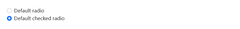
单选框type="radio":form-check,form-check-input,form-check-label:
<div class="form-check">
  <input class="form-check-input" type="radio" name="flexRadioDefault" id="flexRadioDefault1">
  <label class="form-check-label" for="flexRadioDefault1">
    Default radio
  </label>
</div>
<div class="form-check">
  <input class="form-check-input" type="radio" name="flexRadioDefault" id="flexRadioDefault2" checked>
  <label class="form-check-label" for="flexRadioDefault2">
    Default checked radio
  </label>
</div>
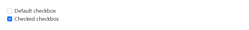
复选框type="checkbox":form-check,form-check-input,form-check-label:
<div class="form-check">
  <input class="form-check-input" type="checkbox" value="" id="flexCheckDefault">
  <label class="form-check-label" for="flexCheckDefault">
    Default checkbox
  </label>
</div>
<div class="form-check">
  <input class="form-check-input" type="checkbox" value="" id="flexCheckChecked" checked>
  <label class="form-check-label" for="flexCheckChecked">
    Checked checkbox
  </label>
</div>
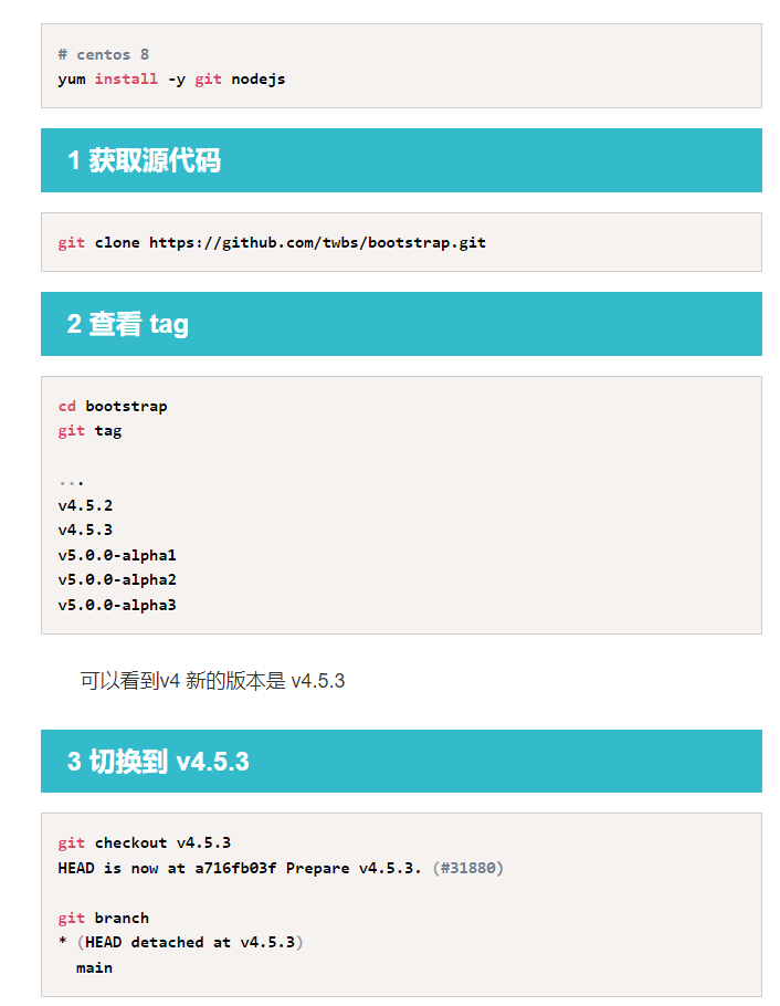
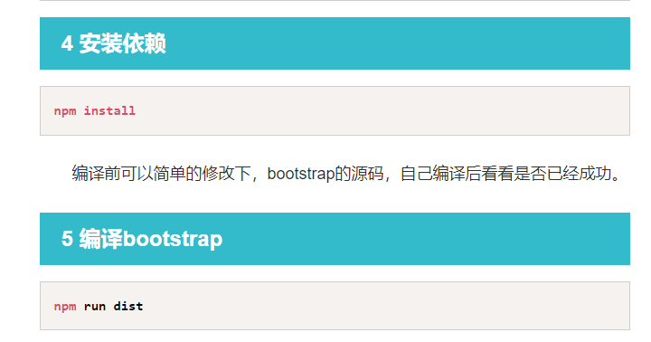
如何编译Bootstrap的源代码:npm install;npm run dist
@@@@@@@@@@@@@@@@@@@

 浙公网安备 33010602011771号