

R:ggplot2数据可视化——基础知识
1 安装
# 获取ggplot2 最容易的就是下载整个tidyverse:install.packages("tidyverse")# 也可以选择只下载ggplot2:install.packages("ggplot2")# 或者下载GitHub上的开发者版本# install.packages("devtools")devtools::install_github("tidyverse/ggplot2") |
2 快速入门
1 基本设置
1 2 3 4 5 6 7 8 9 10 | library(ggplot2)ggplot(diamonds) #以diamonds数据集为例#gg <- ggplot(df, aes(x=xcol, y=ycol)) 其中df只能是数据框 ggplot(diamonds, aes(x=carat)) # 如果只有X-axis值 Y-axis can be specified in respective geoms.ggplot(diamonds, aes(x=carat, y=price)) # if both X and Y axes are fixed for all layers.ggplot(diamonds, aes(x=carat, color=cut)) # 'cut' 变量每种类型单独一个颜色, once a geom is added.#aes代表美化格式 ggplot2 把 X 和 Y 轴也当作和颜色、尺寸、形状等相同的格式 设定颜色(不是基于数据框中的变量),需要在aes()外面设置ggplot(diamonds, aes(x=carat), color="steelblue") |
2 层
ggplot2 中的层也叫做 ‘geoms’.一旦完成基本设置,就可以再上面添加不同的层 此documentation 中提供所有的层的信息,增加层后,图形才会展示出来。
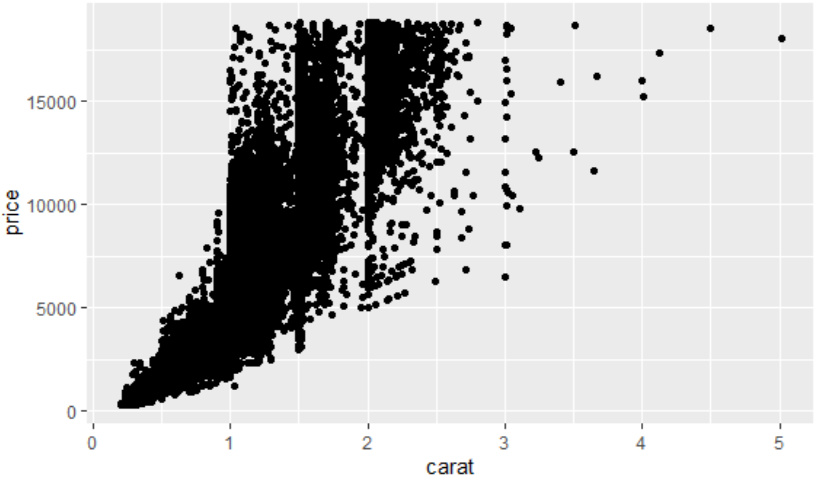
1 2 3 | library(ggplot2)gg <- ggplot(diamonds, aes(x=carat, y=price)) gg + geom_point() |
1 | gg + geom_point(size=1, shape=1, color="steelblue", stroke=2) # 'stroke' 控制点边界的宽度 静态设置格式 |

1 | gg + geom_point(aes(size=carat, shape=cut, color=color, stroke=carat)) # carat, cut color 动态根据数据框中变量设置格式 |

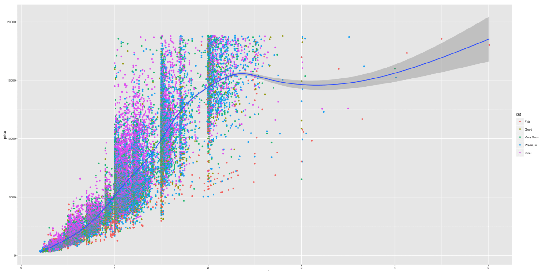
ggplot(diamonds, aes(x=carat, y=price, color=cut)) + geom_point() + geom_smooth() # Adding scatterplot geom (layer1) and smoothing geom (layer2).#或者是在geom层里面自定义美化格式ggplot(diamonds) + geom_point(aes(x=carat, y=price, color=cut)) + geom_smooth(aes(x=carat, y=price, color=cut)) |

1 2 3 | #把不同平滑曲线整合成一条<br>library(ggplot2)ggplot(diamonds) + geom_point(aes(x=carat, y=price, color=cut)) + geom_smooth(aes(x=carat, y=price)) # Remove color from geom_smoothggplot(diamonds, aes(x=carat, y=price)) + geom_point(aes(color=cut)) + geom_smooth() # same but simpler |
1 2 | # 把不同颜色的散点的形状设成不同的ggplot(diamonds, aes(x=carat, y=price, color=cut, shape=color)) + geom_point() |
添加水平或者垂直线
1 2 3 4 5 | p1 <- gg3 + geom_hline(yintercept=5000, size=2, linetype="dotted", color="blue") # linetypes: solid, dashed, dotted, dotdash, longdash and twodashp2 <- gg3 + geom_vline(xintercept=4, size=2, color="firebrick")#添加垂直线p3 <- gg3 + geom_segment(aes(x=4, y=5000, xend=4, yend=10000, size=2, lineend="round"))#添加方块p4 <- gg3 + geom_segment(aes(x=carat, y=price, xend=carat, yend=price-500, color=color), size=2) + coord_cartesian(xlim=c(3, 5)) # x, y: start points. xend, yend: end pointsgridExtra::grid.arrange(p1,p2,p3,p4, ncol=2) |

3 标签
使用 labs 层来自定义标签
1 2 3 | library(ggplot2)gg <- ggplot(diamonds, aes(x=carat, y=price, color=cut)) + geom_point() + labs(title="Scatterplot", x="Carat", y="Price") # 增加坐标轴和图像标题print(gg)#保存图形 |

4 主题和格式调整
使用Theme函数控制标签的尺寸、颜色等,在element_text()函数内自定义具体的格式,想要清除格式,则设为element_blank()即可
1 2 3 4 5 6 7 8 9 | gg1 <- gg + theme(plot.title=element_text(size=30, face="bold"), axis.text.x=element_text(size=15), #x轴文本 axis.text.y=element_text(size=15), axis.title.x=element_text(size=25), axis.title.y=element_text(size=25)) + scale_color_discrete(name="Cut of diamonds") # add title and axis text, 改变图例标题#scale_shape_discrete(name="legend title") 基于离散分类变量生成对应图例标题#scale_shape_continuous(name="legend title") 基于连续变量 shape fill color属性print(gg1) |

1 2 | #改变图形中所有文本的颜色等gg2 + theme(text=element_text(color="blue")) # all text turns blue. |
1 2 | #改变点的颜色gg3 + scale_colour_manual(name='Legend', values=c('D'='grey', 'E'='red', 'F'='blue', 'G'='yellow', 'H'='black', 'I'='green', 'J'='firebrick')) |

颜色表:

调整x y轴范围
三种方法:
- Using coord_cartesian(xlim=c(x1,x2))
- Using xlim(c(x1,x2))
- Using scale_x_continuous(limits=c(x1,x2)) 注意:第2、3种方法会删除数据框中不在范围之内的点的信息
1 2 | #调整x y 轴范围gg3 + coord_cartesian(xlim=c(0,3), ylim=c(0, 5000)) + geom_smooth() # zoom in |

1 2 3 4 | #删除坐标范围之外的点 注意这时候平滑线也会相应改变 可能会误导分析gg3 + scale_x_continuous(limits=c(0,3)) + scale_y_continuous(limits=c(0, 5000)) + geom_smooth() # deletes the points outside limits#> Warning message:#> Removed 14714 rows containing missing values (geom_point). |

1 2 | #改变x y轴标签 间隔等 gg3 + scale_x_continuous(labels=c("zero", "one", "two", "three", "four", "five")) + scale_y_continuous(breaks=seq(0, 20000, 4000)) # Y 是连续变量 X 是类型变量 |

1 2 | #旋转文本角度gg3 + theme(axis.text.x=element_text(angle=45), axis.text.y=element_text(angle=45)) |
1 | gg3 + coord_flip() #把x和y轴对换 |
1 2 3 4 | #设置图形内背景网格gg3 + theme(panel.background = element_rect(fill = 'springgreen'), panel.grid.major = element_line(colour = "firebrick", size=3), panel.grid.minor = element_line(colour = "blue", size=1)) |
图形背景与边距

1 2 | #设置图形外背景颜色和边距gg3 + theme(plot.background=element_rect(fill="yellowgreen"), plot.margin = unit(c(2, 4, 1, 3), "cm")) # top, right, bottom, left |

图例
1 2 3 4 5 6 7 8 9 10 11 12 13 14 15 16 17 18 19 20 21 22 23 24 | gg3 + scale_color_discrete(name="") # 删除图例标题p1 <- gg3 + theme(legend.title=element_blank()) # 删除图例标题p2 <- gg3 + scale_color_discrete(name="Diamonds") # 改变图例标题gg3 + scale_colour_manual(name='Legend', values=c('D'='grey', 'E'='red', 'F'='blue', 'G'='yellow', 'H'='black', 'I'='green', 'J'='firebrick'))# 改变图例标题和点颜色#隐藏图例标题gg3 + theme(legend.position="none") # hides the legend#改变图例位置p1 <- gg3 + theme(legend.position="top") # top / bottom / left / right 图形外#图形内p2 <- gg3 + theme(legend.justification=c(1,0), legend.position=c(1,0)) # legend justification 是图例的定标点 把图例的左下点作为 (0,0)gridExtra::grid.arrange(p1, p2, ncol=2) #相当于library(gridExtra)#grid.arrange(p1, p2, ncol=2) #改变图例具体项目的顺序 按照需求在图例中创建一个新的类型变量df$newLegendColumn <- factor(df$legendcolumn, levels=c(new_order_of_legend_items), ordered = TRUE) #legend.title - 图例标题#legend.text - 图例文本#legend.key - 图例背景框#guides - 图例符号gg3 + theme(legend.title = element_text(size=20, color = "firebrick"), legend.text = element_text(size=15), legend.key=element_rect(fill='steelblue')) + guides(colour = guide_legend(override.aes = list(size=2, shape=4, stroke=2))) # legend title color and size, box color, symbol color, size and shape. |


5 多图绘制
1 2 3 4 5 6 | gg1 + facet_wrap( ~ cut, ncol=3) # cut类型变量的每种类型是一个图 设置为三列gg1 + facet_wrap(color ~ cut) # row: color, column: cut 左边的对应行 右边的对应列gg1 + facet_wrap(color ~ cut, scales="free") # row: color, column: cut 释放尺度限制gg1 + facet_grid(color ~ cut) # 为方便比较 把所有图片放在网格中 头信息去掉 更多的空间给图形 |

6 一些经常用到的特征
制作时间序列图形(使用ggfortify)
使用ggfortify包很容易直接用一个时间序列对象来画时间序列图形,而不用把数据类型转换为数据框,更多请见
1 2 3 | #下载ggfortify包library(devtools)install_github('sinhrks/ggfortify') |
ggfortify 使得 ggplot2 知道怎么解译 ts 对象. 加载 ggfortify 包后, 你可以使用 ggplot2::autoplot 函数来操作 ts 对象
1 2 | library(ggfortify)autoplot(AirPassengers) + labs(title="AirPassengers") # where AirPassengers is a 'ts' object |

1 2 | autoplot(AirPassengers, ts.colour = 'red', ts.linetype = 'dashed')#改变线的颜色和类型#使用 help(autoplot.ts) (or help(autoplot.*) for any other objects) 来查询可以改变的选项 |

autoplot 也能处理其他时间序列类型. 支持的包有:
zoo::zooregxts::xtstimeSeries::timSeriestseries::irts
1 2 | library(xts)autoplot(as.xts(AirPassengers), ts.colour = 'green') |

也能通过命名改变{ggplot2} 几何图形类型. 支持线、条形、点图
1 2 | autoplot(AirPassengers, ts.geom = 'bar', fill = 'blue')autoplot(AirPassengers, ts.geom = 'point', shape = 3) |

同一张图上画多个时间序列
要求数据是数据框类型,且一列必须为时间数据
(1)转换成数据框后,累加层
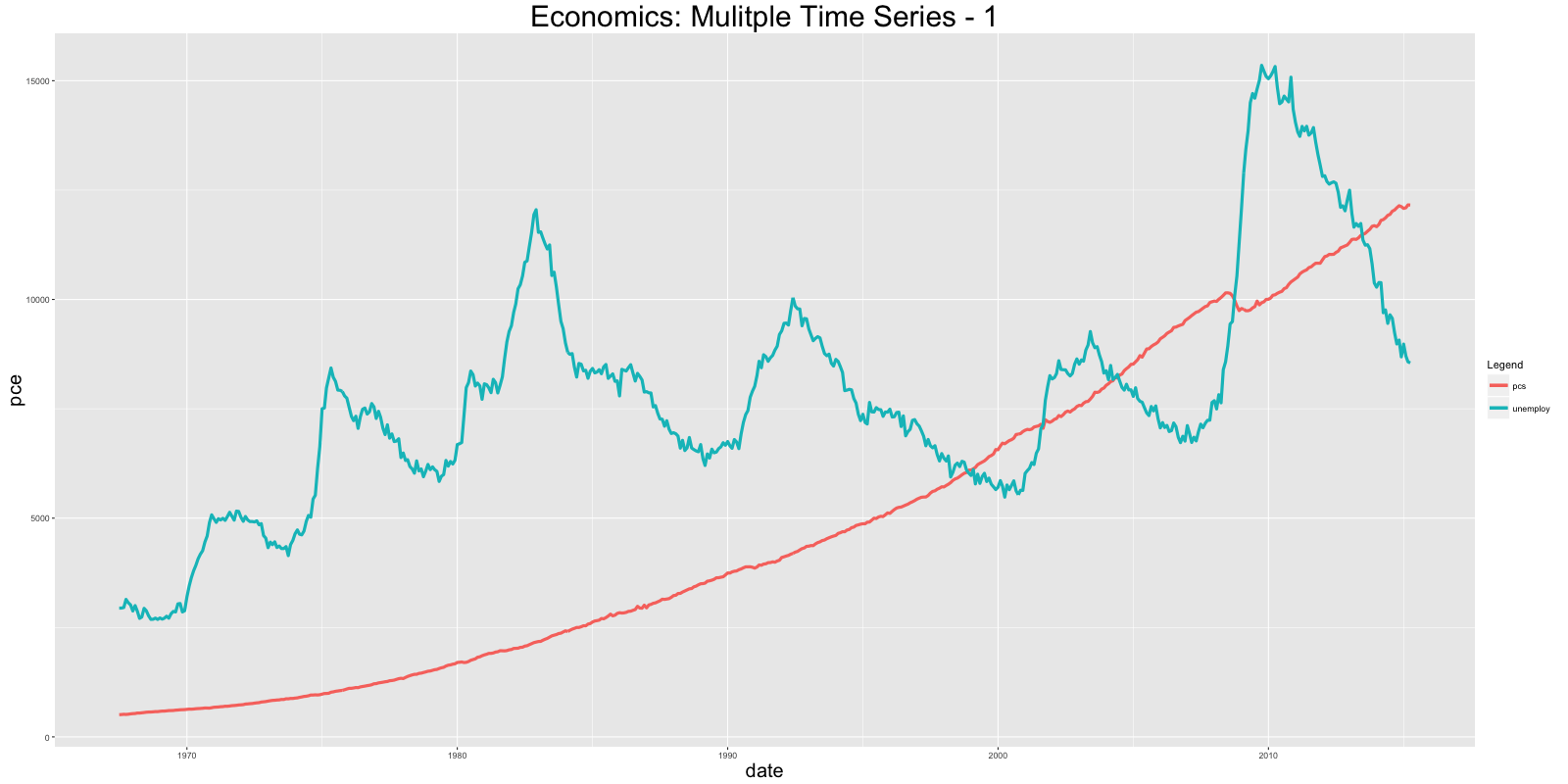
1 2 3 4 | # Approach 1:data(economics, package="ggplot2") # 数据初始化economics <- data.frame(economics) # 转换为数据框类型ggplot(economics) + geom_line(aes(x=date, y=pce, col="pcs")) + geom_line(aes(x=date, y=unemploy, col="unemploy")) + scale_color_discrete(name="Legend") + labs(title="Economics") # 画多条线 使用 'geom_line's |
(2)使用 reshape2::melt 设置 id 到日期格式来合并数据框. 然后增加一个 geom_line 把颜色格式设置为variable (此变量是在合并过程中被创建).
1 2 3 4 | # Approach 2:library(reshape2)df <- melt(economics[, c("date", "pce", "unemploy")], id="date")ggplot(df) + geom_line(aes(x=date, y=value, color=variable)) + labs(title="Economics")# plot multiple time series by melting |
条形图
ggplot 默认创建的是 ‘counts’ 型的条形图,即计算某一列变量中每种值出现的频数,这时候无需指定y轴的变量
但是呢,如果想具体指定y轴的值,这时候一定要在geom_bar内设置stat="identity"
1 2 3 4 5 6 7 8 9 10 11 | # 绝对条形图: Specify both X adn Y axis. Set stat="identity"df <- aggregate(mtcars$mpg, by=list(mtcars$cyl), FUN=mean) # 计算每个'cyl'对应的mpg变量均值names(df) <- c("cyl", "mpg")#为数据框增加变量名字head(df)#> cyl mpg#> 1 4 26.66#> 2 6 19.74#> 3 8 15.10gg_bar <- ggplot(df, aes(x=cyl, y=mpg)) + geom_bar(stat = "identity") # Y axis is explicit. 'stat=identity'print(gg_bar) |

改变条形图的颜色和宽度
1 2 3 | df$cyl <- as.factor(df$cyl)#把cyl作为类型变量gg_bar <- ggplot(df, aes(x=cyl, y=mpg)) + geom_bar(stat = "identity", aes(fill=cyl), width = 0.25)gg_bar + scale_fill_manual(values=c("4"="steelblue", "6"="firebrick", "8"="darkgreen")) |

改变颜色
1 2 3 | library(RColorBrewer)display.brewer.all(n=20, exact.n=FALSE) # 展示所有颜色方案ggplot(mtcars, aes(x=cyl, y=carb, fill=factor(cyl))) + geom_bar(stat="identity") + scale_fill_brewer(palette="Reds") # "Reds" is palette name |

1 2 3 4 | gg <- ggplot(mtcars, aes(x=cyl))p1 <- gg + geom_bar(position="dodge", aes(fill=factor(vs))) # side-by-side 并列p2 <- gg + geom_bar(aes(fill=factor(vs))) # stacked 堆积gridExtra::grid.arrange(p1, p2, ncol=2) |

折线图
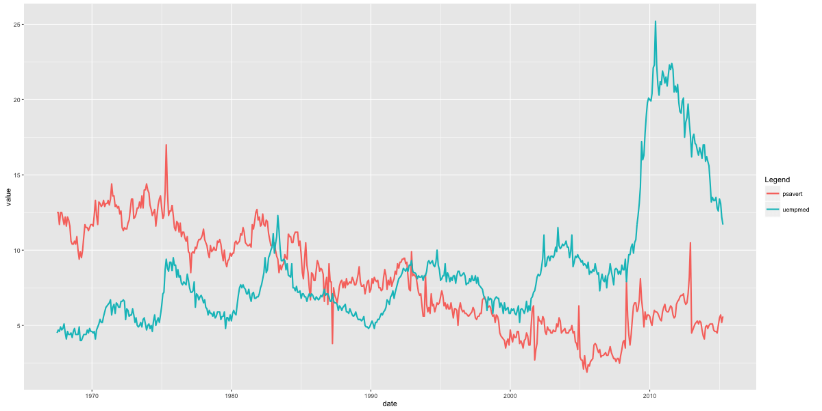
1 2 3 4 | # 方法 1:gg <- ggplot(economics, aes(x=date)) # 基本设置gg + geom_line(aes(y=psavert), size=2, color="firebrick") + geom_line(aes(y=uempmed), size=1, color="steelblue", linetype="twodash") #没有图例# 折线类型有: solid, dashed, dotted, dotdash, longdash and twodash |

1 2 3 4 5 | # 方法 2:library(reshape2)df_melt <- melt(economics[, c("date", "psavert", "uempmed")], id="date") # melt by date. gg <- ggplot(df_melt, aes(x=date)) # setupgg + geom_line(aes(y=value, color=variable), size=1) + scale_color_discrete(name="Legend") # gets legend.有图例 |
丝带图
使用 geom_ribbon()画填充时间序列图 需要 ymin and ymax 两个参量
1 2 3 4 5 6 7 8 9 10 11 12 13 14 15 16 17 | # Prepare the dataframest_year <- start(AirPassengers)[1] #开始年份st_month <- "01"st_date <- as.Date(paste(st_year, st_month, "01", sep="-"))#开始日期dates <- seq.Date(st_date, length=length(AirPassengers), by="month")#生产日期数组 以月为间隔df <- data.frame(dates, AirPassengers, AirPassengers/2)#一定要记得构建数据框head(df)#> dates AirPassengers AirPassengers.2#> 1 1949-01-01 112 56.0#> 2 1949-02-01 118 59.0#> 3 1949-03-01 132 66.0#> 4 1949-04-01 129 64.5#> 5 1949-05-01 121 60.5#> 6 1949-06-01 135 67.5# Plot ribbon with ymin=0gg <- ggplot(df, aes(x=dates)) + labs(title="AirPassengers") + theme(plot.title=element_text(size=30), axis.title.x=element_text(size=20), axis.text.x=element_text(size=15))gg + geom_ribbon(aes(ymin=0, ymax=AirPassengers)) + geom_ribbon(aes(ymin=0, ymax=AirPassengers.2), fill="green") |

1 | gg + geom_ribbon(aes(ymin=AirPassengers-20, ymax=AirPassengers+20)) + geom_ribbon(aes(ymin=AirPassengers.2-20, ymax=AirPassengers.2+20), fill="green") |

区域图
geom_area和 geom_ribbon类似,只是 ymin设置为 0,如果想画重叠的区域图,使用 alpha aesthetic 使得最外层为透明的
1 2 3 4 5 6 7 8 9 10 11 12 | # Method1: 非重叠区域df <- reshape2::melt(economics[, c("date", "psavert", "uempmed")], id="date")head(df, 3)#> date variable value#> 1 1967-07-01 psavert 12.5#> 2 1967-08-01 psavert 12.5#> 3 1967-09-01 psavert 11.7p1 <- ggplot(df, aes(x=date)) + geom_area(aes(y=value, fill=variable)) + labs(title="Non-Overlapping - psavert and uempmed")# Method2: 重叠区域 PS:因为没有构建成数据框,也就相应没有图例啦p2 <- ggplot(economics, aes(x=date)) + geom_area(aes(y=psavert), fill="yellowgreen", color="yellowgreen") + geom_area(aes(y=uempmed), fill="dodgerblue", alpha=0.7, linetype="dotted") + labs(title="Overlapping - psavert and uempmed")gridExtra::grid.arrange(p1, p2, ncol=2) |

箱形图和小提琴图
可以使用: * outlier.shape * outlier.stroke * outlier.size * outlier.colour 来控制异常点的形状 大小 边缘
如果 notch 被设为 TRUE,见下图
1 2 3 | p1 <- ggplot(mtcars, aes(factor(cyl), mpg)) + geom_boxplot(aes(fill = factor(cyl)), width=0.5, outlier.colour = "dodgerblue", outlier.size = 4, outlier.shape = 16, outlier.stroke = 2, notch=T) + labs(title="Box plot") # boxplotp2 <- ggplot(mtcars, aes(factor(cyl), mpg)) + geom_violin(aes(fill = factor(cyl)), width=0.5, trim=F) + labs(title="Violin plot (untrimmed)") # violin plotgridExtra::grid.arrange(p1, p2, ncol=2) |

密度图
1 | ggplot(mtcars, aes(mpg)) + geom_density(aes(fill = factor(cyl)), size=2) + labs(title="Density plot") # Density plot |

瓦片图(热力图)
1 2 3 4 5 6 7 8 | corr <- round(cor(mtcars), 2)#生成相关系数矩阵 对称的df <- reshape2::melt(corr)gg <- ggplot(df, aes(x=Var1, y=Var2, fill=value, label=value)) + geom_tile() + theme_bw() + geom_text(aes(label=value, size=value), color="white") + labs(title="mtcars - Correlation plot") + theme(text=element_text(size=20), legend.position="none")library(RColorBrewer)p2 <- gg + scale_fill_distiller(palette="Reds")p3 <- gg + scale_fill_gradient2()gridExtra::grid.arrange(gg, p2, p3, ncol=3) |

相同坐标轴范围
1 | ggplot(diamonds, aes(x=price, y=price+runif(nrow(diamonds), 100, 10000), color=cut)) + geom_point() + geom_smooth() + coord_equal() |
自定义布局
gridExtra包能在一个网格中安排放置多个图形
1 2 | library(gridExtra)grid.arrange(plot1, plot2, ncol=2) |
改变主题
切换不同的内置主题:
- theme_gray()
- theme_bw()
- theme_linedraw()
- theme_light()
- theme_minimal()
- theme_classic()
- theme_void()
ggthemes 包提供 另外的主题 这些主题模仿啦一些著名杂志或者软件的风格
1 2 3 4 5 | #从 CRAN下载稳定版install.packages('ggthemes', dependencies = TRUE)#或者下载开发者版本library("devtools")install_github(c("hadley/ggplot2", "jrnold/ggthemes")) |
1 | ggplot(diamonds, aes(x=carat, y=price, color=cut)) + geom_point() + geom_smooth() +theme_bw() + labs(title="bw Theme") |

注记
1 2 3 4 | library(grid)my_grob = grobTree(textGrob("This text is at x=0.1 and y=0.9, relative!\n Anchor point is at 0,0", x=0.1, y=0.9, hjust=0,gp=gpar(col="firebrick", fontsize=25, fontface="bold")))ggplot(mtcars, aes(x=cyl)) + geom_bar() + annotation_custom(my_grob) + labs(title="Annotation Example") |

保存图片
1 2 3 | plot1 <- ggplot(mtcars, aes(x=cyl)) + geom_bar()ggsave("myggplot.png") # 保存最近创建的图片ggsave("myggplot.png", plot=plot1) #保存指定的图形 |
相关链接:
非常有用:https://ggplot2.tidyverse.org/reference/
Cheatsheets:http://www.rstudio.com/wp-content/uploads/2015/12/ggplot2-cheatsheet-2.0.pdf
教程:http://r-statistics.co/ggplot2-Tutorial-With-R.html
https://ggplot2.tidyverse.org/
时间序列画图包:http://rpubs.com/sinhrks/plot_ts


【推荐】国内首个AI IDE,深度理解中文开发场景,立即下载体验Trae
【推荐】编程新体验,更懂你的AI,立即体验豆包MarsCode编程助手
【推荐】抖音旗下AI助手豆包,你的智能百科全书,全免费不限次数
【推荐】轻量又高性能的 SSH 工具 IShell:AI 加持,快人一步
· 记一次.NET内存居高不下排查解决与启示
· 探究高空视频全景AR技术的实现原理
· 理解Rust引用及其生命周期标识(上)
· 浏览器原生「磁吸」效果!Anchor Positioning 锚点定位神器解析
· 没有源码,如何修改代码逻辑?
· 分享4款.NET开源、免费、实用的商城系统
· 全程不用写代码,我用AI程序员写了一个飞机大战
· MongoDB 8.0这个新功能碉堡了,比商业数据库还牛
· 白话解读 Dapr 1.15:你的「微服务管家」又秀新绝活了
· 记一次.NET内存居高不下排查解决与启示