CSS3新特性
- 新增的特性有兼容性问题,ie9+才支持
1. 属性选择器
- 可以根据元素特定属性来选择元素
| 选择符 | 简介 |
|---|---|
E[att] |
选择具有 att 属性的 E 元素 |
E[att="val"] |
选择具有 att 属性且属性值等于 val 的 E 元素 |
E[att^="val"] |
匹配具有 att 属性且值以 val 开头的 E 元素 |
E[att$="val"] |
匹配具有 att 属性且值以 val 结尾的 E 元素 |
E[att*="val"] |
匹配具有 att 属性且值中含 有 val 的 E 元素 |
- 注:类选择器、属性选择器、伪类选择器,权重为 10
<style>
    input[value] {
        color: pink;
    }

    input[type=text] {
        color: pink;
    }

    div[class^=icon] {
        color: red;
    }

    section[class$=data] {
        color: blue;
    }
</style>

<body>
    <input type="text" value="请输入用户名">
    <input type="text">

    <input type="text" name="" id="">
    <input type="password" name="" id="">

    <div class="icon1">小图标1</div>
    <div class="icon2">小图标2</div>
    <div class="icon3">小图标3</div>

    <section class="icon1-data">哈哈哈</section>
    <section class="icon2-data">哈哈哈</section>
    <section class="icon3-ico">哈哈哈</section>
</body>
2. 结构伪类选择器
- 主要根据文档结构来选择元素,常用于根据父级选择器里面的子元素
| 选择符 | 简介 |
|---|---|
| E: first-child | 匹配第一个子元素 E |
| E: last-child | 匹配最后一个子元素 E |
| E: nth-child(n) | 匹配第 n 个子元素 E |
| E: first-of-type | 指定类型 E 的第一个 |
| E: last-of-type | 指定类型 E 的最后一个 |
| E: nth-of-type(n) | 指定类型 E 的第 n 个 |
-
nth-child(n)选择一个 / 多个特定的子元素-
n 为数字时:指选择第 n 个子元素,里面数字从 1 开始
-
n 为关键字时:even 偶数、odd 奇数
-
n 为公式时:常见的公式如下(从 0 开始计算,但第 0 个元素 / 超出元素个数会被忽略)
-
| 公式 | 取值 |
|---|---|
| 2n | 偶数 |
| 2n+1 | 奇数 |
| 5n | 5 10 15... |
| n+5 | 从第 5 个开始(含第 5 个)到最后 |
| -n+5 | 前 5 个(含第 5 个)... |
<style>
    ul li:nth-child(even) {
        background-color: #ccc;
    }

    ul li:nth-child(odd) {
        background-color: gray;
    }
    // 从0开始,每次+1,往后面计算,里面必须是n(选择所有元素)
    ul li:nth-child(n) {
        background-color: pink;
    }

    // nth-child 会把所有的盒子都排列序号,执行时先看第几个孩子,再看元素类型
    section div:nth-child(1) {
        background-color: red;
    }

    // nth-of-type会把指定元素的盒子排序号,执行时先看类型,再看第几个孩子
    section div:nth-of-type(1) {
        background-color: red;
    }
</style>

<body>
    <section>
        <p>光头强</p>
        <div>熊大</div>
        <div>熊二</div>
    </section>
</body>
-
小结
-
该选择器一般用于选择父级里的第几个孩子
-
nth-child(n)对父元素里面所有孩子排序选择(序号是固定的),先找第 n 个孩子,再看是否与 E 匹配 -
nth-of-type(n)对父元素里面指定子元素进行排序选择,先匹配 E,再根据 E 找第 n 个孩子 -
若是无序列表,用
nth-child更多
-
3. 伪元素选择器
- 利用 css 创建新标签元素,简化 html 结构
| 选择符 | 简介 |
|---|---|
::before |
在元素内部的前面插入内容 |
::after |
在元素内部的后面插入内容 |
-
注意:
-
before 和 after 创建一个元素,但属于行内元素
-
新建的这个元素在文档树是找不到的
-
before 和 after 必须有
content属性 -
伪元素选择器和标签选择器一样,权重为 1
-
- 示例:
p::before {
	position: absolute;
	right: 20px;
	top: 10px;
	content: "\e91e";
	font-size: 20px;
}
- 仿播放器的遮罩层

.tudou::before {
	content: "";
	display: none;
	position: absolute;
	top: 0;
	left: 0;
	width: 100%;
	height: 100%;
	background: rgba(0, 0, 0, 0.4) url(images/arr.png) no-repeat center;
}

//当鼠标经过,让before遮罩层显示出来
.tudou:hover::before {
	display: block;
}
4. 盒子模型
-
box-sizing: content-box盒子大小为 width + padding + border(默认) -
box-sizing: border-box盒子大小为 width -
注:若盒子模型改为
box-sizing: border-box,那么 padding 和 border 不会撑大盒子(前提是 padding 和 border 不会超过 width 宽度)
5. 其他特性(了解)
- css 滤镜 filter:将模糊 / 颜色偏移等图形效果应用于元素
filter: 函数();
例如:
filter: blur(5px);    // blur模糊处理,数值越大越模糊
- calc 函数(计算)
width: calc(100% - 80px); // 永远比父盒子小80px
括号里面可以使用 + - * / 计算
6. 过渡(重点)
- 过渡动画:从一个状态渐渐过渡到另一个状态。常搭配 :hover 一起使用
transition: 要过渡的属性 花费时间 运动曲线 何时开始;
-
属性:想要变化的 css 属性,宽度、高度、背景色、内外边距都可以。如果想要所有的属性都变化过渡,写一个 all 即可
-
花费时间:单位是秒,必须写单位,比如 0.5s
-
运动曲线:默认是 ease(可省略)
-
linear:匀速
-
ease:逐渐慢下来
-
ease-in:加速
-
ease-out:减速
-
ease-in-out:先加速后减速
-
-
何时开始:单位是秒(必须写单位),可设置延迟触发时间,默认是 0s(可省略)
-
注:谁做过渡,就给谁加
// 如果想要写多个属性,利用逗号进行分割
transition: width 0.5s height 0.5s;

transition: all 0.5s;
7. 2D 转换
transform:可以实现元素的位移(translate)、旋转(rotate)、缩放等效果
| 属性 | 说明 |
|---|---|
transform: translate(x, y); |
1. 沿 x 轴和 y 轴移动,不会影响其他元素的位置 2. translate: (50%, 50%);:其中的50%是相对于自身元素的3. 对行内元素无效 |
transform: translateX(n); |
|
transform: translateY(n); |
|
transform: rotate(度数); |
1. 括号内跟度数,单位deg 2. 正数:顺时针,负数:逆时针 3. 默认旋转的中心点是元素的中心点 |
transform-origin: x y; |
1. 转换中心点,注意 x 和 y 用空格隔开 2. x y 默认转换的中心点是元素的中心点 (50% 50%) 3. x y 可为像素 / 方位名词(top bottom left center) |
transform: scale(x, y); |
1. 可以设置转换中心点缩放,默认以中心点缩放,且不影响其他盒子 2. 数字是倍数,小于1就是缩小 3. transform: scale(2):等比缩放(x=y) |
transform: translate() rotate() scale()...; |
1. 2D 转换综合写法 2. 顺序会影响转换的效果(先旋转会改变坐标轴方向) 3. 当同时有位移和其他属性时,将位移放到最前 |
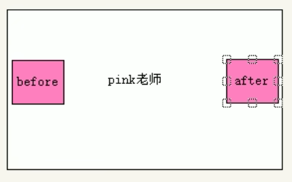
- 实现盒子垂直居中:
p {
	position: absolute;
	top: 50%;
	left: 50%;
	width: 200px;
	height: 200px;
	background-color: purple;
	transform: translate(-50%, -50%);
}
- 鼠标经过,图片旋转:
img {
	width: 150px;
	transition: all 0.3s;
}

img:hover {
	transform: rotate(360deg);
}
- 三角案例:
div::after {
	content: "";
	position: absolute;
	top: 8px;
	right: 15px;
	width: 10px;
	height: 10px;
	border-right: 1px solid #000;
	border-bottom: 1px solid #000;
	transform: rotate(45deg);
	transition: all 0.6s;
}

div:hover::after {
	transform: rotate(225deg);
}
- 转换中心点:
transform-origin: left bottom; //左下角
transform-origin: 50px 50px;
- 旋转案例:
div {
	overflow: hidden;
	width: 200px;
	height: 200px;
	border: 1px solid pink;
	margin: 100px auto;
}

div::before {
	content: "黑马";
	display: block;
	width: 100%;
	height: 100%;
	background-color: hotpink;
	transform: rotate(180deg);
	transform-origin: left bottom;
	transition: all 0.4s;
}

div:hover::before {
	transform: rotate(0deg);
}
- 缩放:
div:hover {
	transform: scale(2, 2);
	transform: scale(2, 1);	 // 宽放大2倍,高不变
	transform: scale(2);
	transform: scale(0.5);
}
- 分页案例:
li {
	float: left;
	width: 30px;
	height: 30px;
	border: 1px solid pink;
	margin: 10px;
	text-align: center;
	line-height: 30px;
	list-style: none;
	border-radius: 50%;
	cursor: pointer;
	transition: all 0.4s;
}

li:hover {
	transform: scale(1.2);
}
8. 动画 animation
可通过设置多个节点来精确控制一个 / 一组动画,常用来实现复杂的动画效果。相比过渡,动画可以实现更多变化、更多控制,连续自动播放等效果
8.1 基本使用
-
先定义动画,再使用(调用)动画
-
用 keyframes 定义动画(类似定义类选择器) 【keyframes 是关键帧的意思】
@keyframes 动画名称 {
	0% {
		width: 100px;
	}
	100% {
		width: 200px;
	}
}
// 等价于
@keyframes 动画名称 {
	from {
		width: 100px;
	}
	to {
		width: 200px;
	}
}
-
动画序列
-
0%是动画的开始,100%是动画的完成。这样的规则就是动画序列
-
动画是使元素从一种样式逐渐变化为另一种样式的效果
-
-
示例:让盒子走一圈

@keyframes move {
	// 百分比必须是整数,且是总的时间的划分
	0% {
		transform: translate(0, 0);
	}
	25% {
		transform: translate(1000px, 0);
	}
	50% {
		transform: translate(1000px, 500px);
	}
	75% {
		transform: translate(0, 500px);
	}
	100% {
		transform: translate(0, 0);
	}
}

div {
	width: 100px;
	height: 100px;
	background-color: pink;
	animation-name: move;
	animation-duration: 10s;
}
8.2 动画常用属性
| 属性 | 描述 |
|---|---|
@keyframes |
规定动画 |
animation |
所有动画属性的简写属性,除了animation-play-state属性 |
animation-name |
规定@keyframes动画的名称(必须) |
animation-duration |
规定动画完成一个周期所花费的秒 / 毫秒,默认 0(必须) |
animation-timing-function |
规定动画的速度曲线。默认:ease |
animation-delay |
规定动画何时开始,默认 0s |
animation-iteration-count |
规定动画被播放的次数,默认是 1,还有 infinite |
animation-direction |
1. 规定动画是否在下一周期逆向播放 2. 默认: normal3. alternate:逆播放,让动画走回来,而不是直接跳回来 |
animation-play-state |
1. 规定动画是否正在运行 2. 默认:running 3. 暂停动画:paused,经常和鼠标经过等其他配合使用 |
animation-fill-mode |
1. 规定动画结束后状态 2. 停在结束位置: forwards3. 回到起始: backwards |
div {
	width: 100px;
	height: 100px;
	animation-fill-mode: forwards;
}
div:hover {
	// 鼠标经过时,停止动画
	animation-play-state: paused;
}
8.3 动画简写属性
animation:动画名称 持续时间 运动曲线 何时开始 播放次数 是否反方向 动画起始/结束的状态
animation: myfirst 5s linear 2s infinite alternate;
- 简写属性里不包含 animation-play-state
- 前两个属性 name duration 一定要写
- 示例:热点新闻
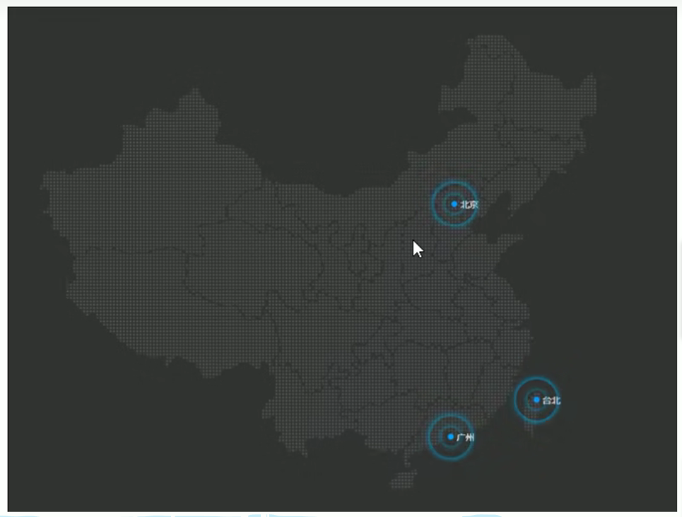
<style>
    .map {
        position: relative;
        width: 747px;
        height: 616px;
        background: url(media/map.png) no-repeat;
        margin: 0 auto;
    }

    .city {
        position: absolute;
        top: 227px;
        right: 193px;
        color: #fff;
    }

    .dotted {
        width: 8px;
        height: 8px;
        background-color: #09f;
        border-radius: 50%;
    }

    .city div[class="pulse"] {
        // 保证小波纹在父盒子里面水平垂直居中,放大之后就会中心向四周发散
        position: absolute;
        top: 50%;
        left: 50%;
        transform: translate(-50%, -50%);
        width: 8px;
        height: 8px;
        box-shadow: 0 0 12px #009dfd;
        border-radius: 50%;
        animation: pulse 1.2s linear infinite;
    }

    .city div .pulse2 {
        animation-delay: 0.4s;
    }

    .city div .pulse3 {
        animation-delay: 0.8s;
    }

    @keyframe pulse {
        0% {}
        70% {
            // transform: scale(5); 我们不用scale,因为它会让阴影变大
            width: 40px;
            height: 40px;
            opacity: 1;
        }
        100% {
            width: 70px;
            height: 70px;
            opacity: 0;
        }
    }
</style>
<body>
    <div class="map">
        <div class="city">
            <div class="dotted"></div>
            <div class="pulse1"></div>
            <div class="pulse2"></div>
            <div class="pulse3"></div>
        </div>
    </div>
</body>
8.4 速度曲线之 steps 步长
animation-timing-function:规定动画的速度曲线
| 值 | 描述 |
|---|---|
| linear | 动画匀速播放 |
| ease | 默认。动画以低速开始,然后加快,在结束前变慢 |
| ease-in | 动画以低速开始 |
| ease-out | 动画以低速结束 |
| ease-in-out | 动画以低速开始和结束 |
| steps() | 指定了时间函数中的间隔数量(步长) |
- 示例:打字机效果
<style>
    div    {
        over-flow: hidden;
        font-size: 20px;
        width: 0;
        height: 30px;
        background-color: pink;
        // 让文字强制一行内显示
        white-space: nowrap;
        // steps 分几步完成动画
        animation: w 4s steps(10) forwards;
    }

    @keyframes w {
        0% {
            width: 0;
        }
        100% {
            width: 200px;
        }
    }
</style>
<body>
    <div>世纪佳缘我在这里等你</div>
</body>
- 示例:奔跑的熊

<style>
    body {
        background-color: #ccc;
    }

    div {
        position: absolute;
        width: 200px;
        height: 100px;
        background: url(media/bear.png) no-repeat;
        // 可以添加多个动画,用逗号隔开
        animation: bear 1s steps(8) infinite, move 3s forwards;
    }

    @keyframes bear {
        0% {
            background-position: 0 0;
        }
        100% {
            background-position: -1600px 0;
        }
    }

    @keyframes move {
        0% {
            left: 0;
        }
        100% {
            left: 50%;
            // margin-left: -100px;
            transform: translateX(-50%);
        }
    }
</style>
9. 3D 转换
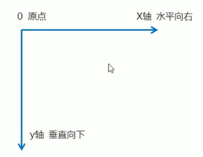
9.1 三维坐标系
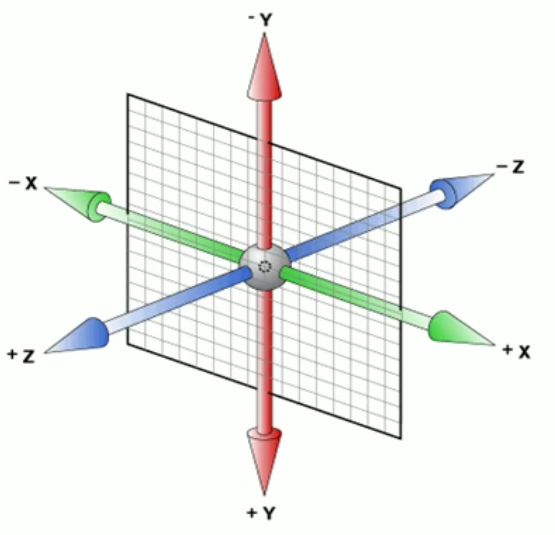
-
x 轴:水平向右
-
y 轴:垂直向下
-
z 轴:垂直屏幕
9.2 translate3d
-
transform: translateX(100px):仅在 x 轴上移动 -
transform: translateY(100px):仅在 y 轴上移动 -
transform: translateZ(100px):仅在 z 轴上移动(一般用 px 单位) -
transform: translate3d(x, y, z):其中 x、y、z 分别指要移动的轴的方向的距离
// x、y、z不能省略,没有写0
transform: translate3d(0, 100px, 100px);
9.3 透视 perspective
-
在 2d 平面产生近大远小视觉立体,但只是效果二维的
-
透视:可以理解为 3D 物体投影在 2D 平面内
-
透视也称为视距,视距是人的眼睛到屏幕的距离【距离视觉点越近的在电脑平面成像越大,越远成像越小】
-
透视的单位是 px
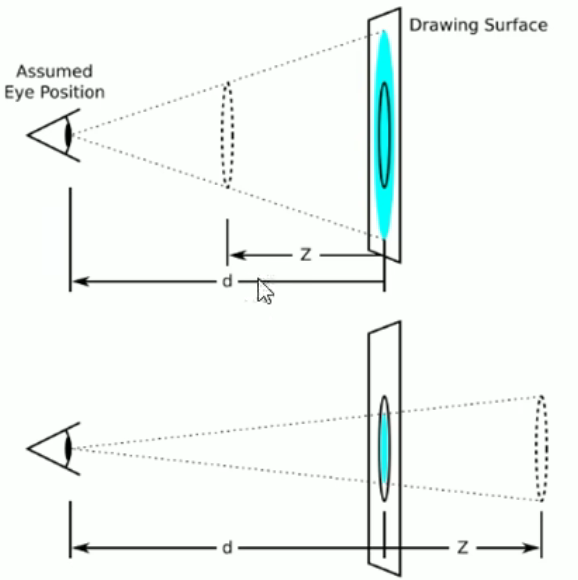
-
透视写在被观察元素的父盒子上
-
d:视距,眼睛到屏幕的距离
-
z:z 轴,物体到屏幕的距离,z 轴值越大,看到的物体越大
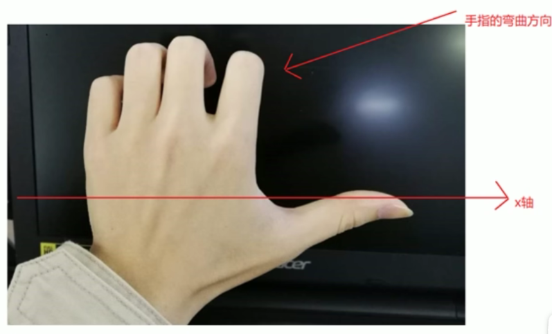
9.4 3D 旋转 rotate3d
transform: rotateX(45deg):沿着x轴正方向旋转45度
transform: rotateY(45deg):沿着y轴正方向旋转45度
transform: rotateZ(45deg):沿着z轴正方向旋转45度
transform: rotate3d(x,y,z,deg):沿着自定义轴旋转deg为角度(了解即可)
-
左手准则
-
x 轴:四指弯曲方向即该元素沿 x 轴旋转的方向(正值)
- y 轴
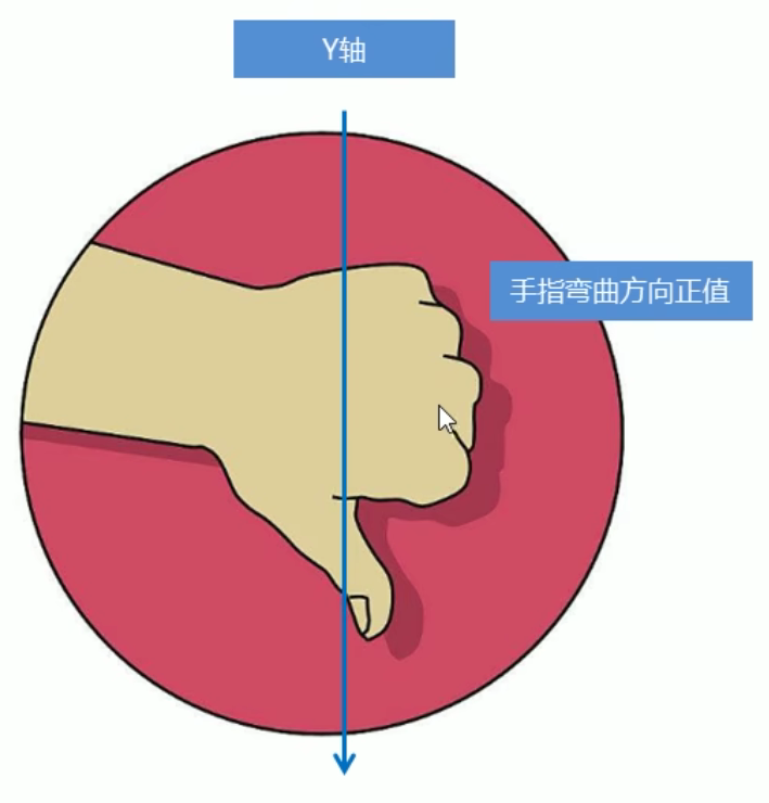
-
z 轴:跟 2D 旋转一致
-
transform: rotate3d(x,y,z,deg):沿着自定义轴旋转,deg 为角度(了解即可)
transform: rotate3d(1,0,0,45deg) 就是沿着x轴旋转 45deg
transform: rotate3d(1,1,0,45deg) 就是沿着对角线旋转 45deg
9.5 3D 呈现 transform-style(重要)
-
控制子元素是否开启三维立体环境
-
transform-style: flat;:子元素不开启 3D 立体空间(默认) -
transform-style: preserve-3d;:子元素开启立体空间 -
代码写给父级,但影响的是子盒子
-
示例:两面翻转
<style>
    .box {
        position: relative;
        width: 300px;
        height: 300px;
        margin: 100px auto;
        transition: all .4s;
        // 让背面的紫色盒子保留立体空间
        transform-style: preserve-3d;
    }

    .box:hover {
        transform: rotateY(180deg);
    }

    .front,
    .back {
        position: absolute;
        top: 0;
        left: 0;
        width: 100%;
        height: 100%;
        border-radius: 50%;
    }

    .front {
        background-color: pink;
        z-index: 1;
    }

    .back {
        background-color: purple;
        transform: rotateY(180deg);    // back盒子要沿着Y轴翻转180度
    }
</style>

<body>
    // box父盒子是翻转的盒子
    <div class="box">
        <div class="front">黑马程序员</div>
        <div class="back">pink老师这里等你</div>
    </div>
</body>
- 示例:立体导航栏
<style>
    ul {
        margin: 100px;
    }

    ul li {
        width: 120px;
        height: 35px;
        list-style: none;
        // 需要给box旋转,也需要透视,干脆给li加透视,使里面的子盒子都有透视效果
        perspective: 500px;
    }

    .box {
        position: relative;
        width: 100%;
        height: 100%;
        transform-style: preserve-3d;
        transition: all .4s;
    }

    .box:hover {
        transform: rotateX(90deg);
    }

    .front,
    .bottom {
        position: absolute;
        left: 0;
        top: 0;
        width: 100%;
        height: 100%;
    }

    .front {
        background-color: pink;
        z-index: 1;
        transform: translateZ(17.5px);
    }

    .bottom {
        background-color: purple;
        // 这个x轴一定是负值
        // 先写移动,再写其他样式
        transform: translateY(17.5px) rotateX(-90deg);
    }
</style>

<body>
    <ul>
        <li>
            <div class="box">
                <div class="front"></div>
                <div class="bottom"></div>
            </div>
        </li>
    </ul>
</body>
- 示例:图片环绕旋转
<style>
    body {
        perspective: 1000px;
    }

    section {
        position: relative;
        width: 300px;
        height: 200px;
        margin: 150px auto;
        transform-style: preserve-3d;
        // 添加动画效果
        animation: rotate 10s linear infinite;
        background: url(media/pig.jpg) no-repeat;
    }

    section:hover {
        // 鼠标放入section 停止动画
        animation-play-state: paused;
    }

    @keyframes rotate {
        0% {
            transform: rotateY(0);
        }
        100% {
            transform: rotateY(360deg);
        }
    }

    section div {
        position: absolute;
        top: 0;
        left: 0;
        width: 100%;
        height: 100%;
        background: url(media/dog.jpg) no-repeat;
    }

    section div:nth-child(1) {
        transform: translateZ(300px);
    }

    section div:nth-child(2) {
        // 先旋转好再移动
        transform: rotateY(60deg) translateZ(300px);
    }

    section div:nth-child(3) {
        // 先旋转好再移动
        transform: rotateY(120deg) translateZ(300px);
    }

    section div:nth-child(4) {
        // 先旋转好再移动
        transform: rotateY(180deg) translateZ(300px);
    }

    section div:nth-child(5) {
        // 先旋转好再移动
        transform: rotateY(240deg) translateZ(300px);
    }

    section div:nth-child(6) {
        // 先旋转好再移动
        transform: rotateY(300deg) translateZ(300px);
    }
</style>


【推荐】国内首个AI IDE,深度理解中文开发场景,立即下载体验Trae
【推荐】编程新体验,更懂你的AI,立即体验豆包MarsCode编程助手
【推荐】抖音旗下AI助手豆包,你的智能百科全书,全免费不限次数
【推荐】轻量又高性能的 SSH 工具 IShell:AI 加持,快人一步
· Manus重磅发布:全球首款通用AI代理技术深度解析与实战指南
· 被坑几百块钱后,我竟然真的恢复了删除的微信聊天记录!
· 没有Manus邀请码?试试免邀请码的MGX或者开源的OpenManus吧
· 园子的第一款AI主题卫衣上架——"HELLO! HOW CAN I ASSIST YOU TODAY
· 【自荐】一款简洁、开源的在线白板工具 Drawnix