
react中绘制饼图基础例子
使用interval标记和theta坐标系来绘制饼图
radius:设置饼图的大小
.label()中的text 指定了一个回调函数,可以设置标签,其中d是当前项数据,i是当前项的索引,data是全部的数据,注意回调函数要有返回值。
.tooltip() 设置提示信息 title:标题 items:数据项
.interaction() 交互,elementSelect:选中时, .state设置选中时、未选中时的样式
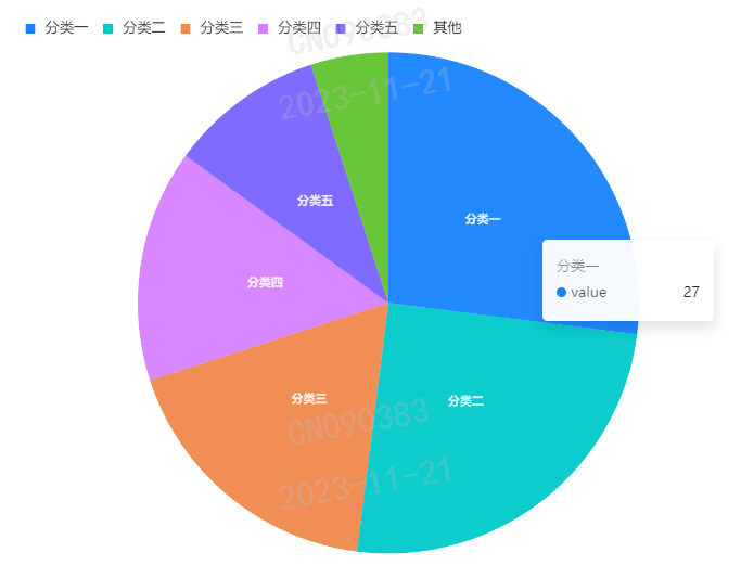
实现效果:
继续实现效果:
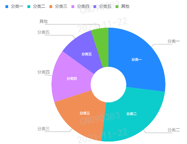
是如何实现的呢?代码里没有加,这里整理一下:
首先要加上innerRadius和outerRadius,可以理解成内圈大小和外圈大小
1 2 3 4 5 6 7 8 9 10 11 12 13 14 15 16 17 18 19 20 21 22 23 24 25 26 27 28 29 30 31 32 33 34 35 36 37 38 39 40 41 42 43 44 | import { Chart } from '@antv/g2'import React from 'react'const data = [ { type: '分类一', value: 27 }, { type: '分类二', value: 25 }, { type: '分类三', value: 18 }, { type: '分类四', value: 15 }, { type: '分类五', value: 10 }, { type: '其他', value: 5 }]export default function Pie() { React.useEffect(() => { const chart = new Chart({ container:'pie-container' }) // 写在视图层级 chart.interval().coordinate()写在mark层级 chart.coordinate({ type: 'theta' }) chart.interval() .transform({type:'stackY'}) .data(data) .encode('y', 'value') .encode('color', 'type') .label({ // 指定绑定的字段 text: (d, i, data) => { return d.value<10 ? '' : d.type }, // d当前项 i当前项的索引 data 数据 radius: 0.5, fontSize: 10, fontWeight: 'bold' }) .tooltip({ title: 'type', items:['value'] }) .state('selected', { offset: 10 }) // 偏移 chart.interaction('elementSelect',true) chart.render() },[]) return ( <div id="pie-container"> </div> )} |


【推荐】国内首个AI IDE,深度理解中文开发场景,立即下载体验Trae
【推荐】编程新体验,更懂你的AI,立即体验豆包MarsCode编程助手
【推荐】抖音旗下AI助手豆包,你的智能百科全书,全免费不限次数
【推荐】轻量又高性能的 SSH 工具 IShell:AI 加持,快人一步
· TypeScript + Deepseek 打造卜卦网站:技术与玄学的结合
· 阿里巴巴 QwQ-32B真的超越了 DeepSeek R-1吗?
· 【译】Visual Studio 中新的强大生产力特性
· 【设计模式】告别冗长if-else语句:使用策略模式优化代码结构
· 10年+ .NET Coder 心语 ── 封装的思维:从隐藏、稳定开始理解其本质意义