seaborn模块的基本使用
Seaborn是基于matplotlib的Python可视化库。 它提供了一个高级界面来绘制有吸引力的统计图形。Seaborn其实是在matplotlib的基础上进行了更高级的API封装,从而使得作图更加容易,不需要经过大量的调整就能使你的图变得精致。但应强调的是,应该把Seaborn视为matplotlib的补充,而不是替代物。
一、整体布局风格设置
import seaborn as sns
import numpy as np
import matplotlib.pyplot as plt
import matplotlib as mpl
%matplotlib inline #这句话的意思就是可以直接显示图
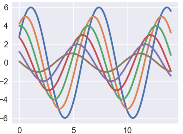
def sinplot(flip = 1):
x = np.linspace(0, 14, 100)
for i in range(1, 7):
plt.plot(x, np.sin(x + i*0.5) * (7 - i) * flip)
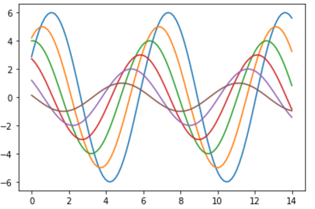
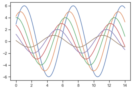
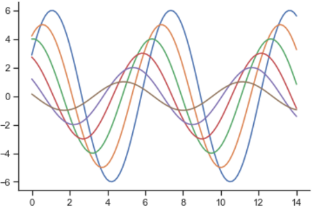
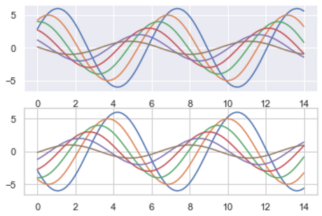
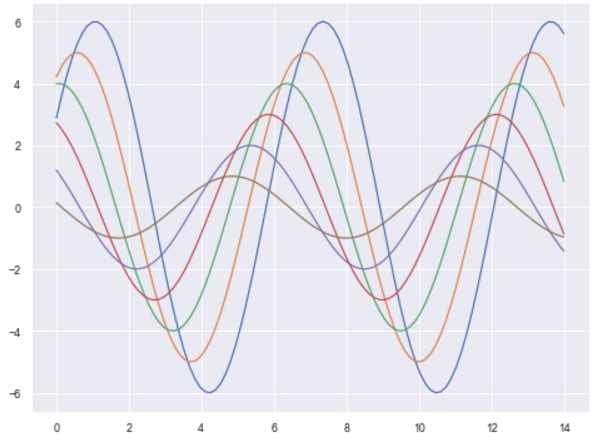
sinplot()#采用的是matplot默认的一些参数画图
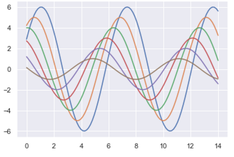
#接下来采用的是seaborn的画图的风格,首先看看默认的变化
sns.set()
sinplot()
#seaborn主要分为五种主题风格:darkgrid whitegrid dark white ticks
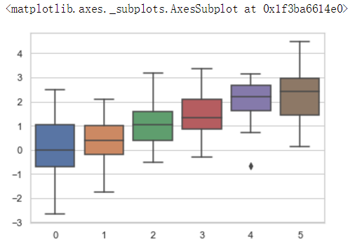
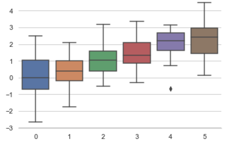
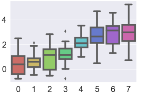
sns.set_style("whitegrid")
data = np.random.normal(size=(20, 6)) + np.arange(6) / 2
sns.boxplot(data=data)
高斯分布的概率密度函数
numpy中
numpy.random.normal(loc=0.0, scale=1.0, size=None)
参数的意义为:
loc:float
概率分布的均值,对应着整个分布的中心center
scale:float
概率分布的标准差,对应于分布的宽度,scale越大越矮胖,scale越小,越瘦高
size:int or tuple of ints
输出的shape,默认为None,只输出一个值
我们更经常会用到np.random.randn(size)所谓标准正太分布(μ=0, σ=1),对应于np.random.normal(loc=0, scale=1, size)
所以上面从正态分布随机产生20*6的二维数组,加上后面的6*1的一维数组。
boxplot 箱线图

"盒式图" 或叫 "盒须图" "箱形图",,其绘制须使用常用的统计量,能提供有关数据位置和分散情况的关键信息,尤其在比较不同的母体数据时更可表现其差异。
如上图所示,标示了图中每条线表示的含义,其中应用到了分位值(数)的概念。
主要包含五个数据节点,将一组数据从大到小排列,分别计算出他的上边缘,上四分位数,中位数,下四分位数,下边缘。
具体用法如下:seaborn.boxplot(x=None, y=None, hue=None, data=None, order=None, hue_order=None, orient=None, color=None, palette=None, saturation=0.75, width=0.8, fliersize=5, linewidth=None, whis=1.5, notch=False, ax=None, **kwargs)
Parameters:
x, y, hue: names of variables in data or vector data, optional #设置 x,y 以及颜色控制的变量
Inputs for plotting long-form data. See examples for interpretation.
data : DataFrame, array, or list of arrays, optional #设置输入的数据集
Dataset for plotting. If x and y are absent, this is interpreted as wide-form. Otherwise it is expected to be long-form.
order, hue_order : lists of strings, optional #控制变量绘图的顺序
Order to plot the categorical levels in, otherwise the levels are inferred from the data objects.
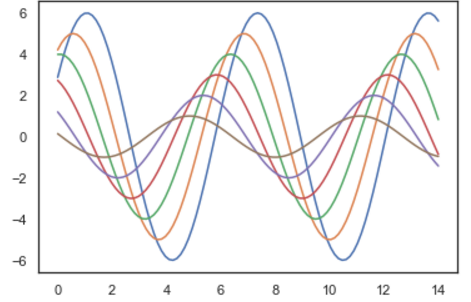
sns.set_style("dark")

sinplot()

sns.set_style("white")

sinplot()
sns.set_style("ticks")

sinplot()
sinplot()

sns.despine() #在ticks基础上去掉上面的和右边的端线
二、风格细节的设置
import seaborn as sns
import numpy as np
import matplotlib.pyplot as plt
import matplotlib as mpl
%matplotlib inline #这句话的意思就是可以直接显示图
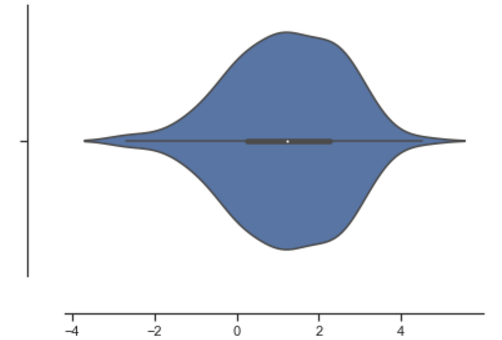
sns.violinplot(data)
sns.despine(offset=30) #显示的是图形的最低点距横轴的距离
sns.set_style("whitegrid")

sns.boxplot(data=data, palette="deep")

sns.despine(left = True) #把左边的轴去掉了。
with sns.axes_style("darkgrid"): #通过with可以显示一种一个子图的风格。
    plt.subplot(211)
    sinplot()

plt.subplot(212)
sinplot(-1)
#另一种调节图中线的粗细程度的风格:paper talk poster notebook,前三种风格的线越来越粗,最后一个notebook是可以通过参数的修改的
sns.set()

sns.set_context("paper")

plt.figure(figsize=(8, 6))

sinplot()
sns.set_context("talk")

plt.figure(figsize=(8, 6))

sinplot()
sns.set_context("poster")

plt.figure(figsize=(8, 6))

sinplot()
sns.set_context("notebook", font_scale = 2, rc={"lines.linewidth" : 4.5}) #这个是可以的设置的参数的,font_scale是改变坐标轴上的大小,rc中的line.linewidth是改变线的粗细

plt.figure(figsize=(8, 6))

sinplot()
三、调色板
color_palette()能传入任何Matplotlib所支持的颜色
set_palette()设置所有图的颜色
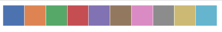
#显示默认的颜色 deep, muted, pastel, bright, dark, colorblind......
current_palette = sns.color_palette()

sns.palplot(current_palette)
圆形画板
当需要更多分类要区分时,最简单的方法就是在一个圆形的颜色空间中画出均匀间隔的颜色(这样的色调会保持亮度和饱和度不变)。这是大多数的需要使用的比默认颜色循环中的设置的颜色更多的默认方案。
最常用的方法是使用hls的颜色空间,这是RGB值的一个简单转换。
#比如我想画个12个不同的颜色
sns.palplot(sns.color_palette("hls", 12))

data = np.random.normal(size = (20, 8)) + np.arange(8) / 2

sns.boxplot(data = data, palette = sns.color_palette("hls", 8))
hls_palette()函数来控制颜色的亮度和饱和度
l------亮度 lightness
s------饱和 saturation
sns.palplot(sns.hls_palette(8, l = 0.3, s = 0.8))

sns.palplot(sns.color_palette("Paired", 8)) #Paired意思是比如8就是4对颜色,每一对颜色都是一浅一深。

使用xkcd颜色来命名颜色
xkcd包含了一套众包努力的针对随机RGB色的命名。产生了954个可以随机通过xkcd_rgb字典中调用的命名颜色。
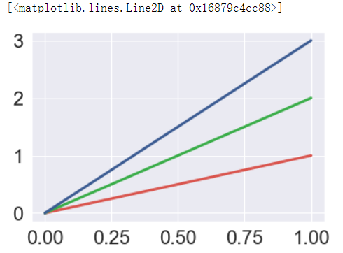
plt.plot([0, 1], [0, 1], sns.xkcd_rgb["pale red"], lw=3)

plt.plot([0, 1], [0, 2], sns.xkcd_rgb["medium green"], lw=3)

plt.plot([0, 1], [0, 3], sns.xkcd_rgb["denim blue"], lw=3)
#其他xkcd的一些颜色
colors = ["windows blue", "amber", "greyish", "faded green", "dusty purple"]

sns.palplot(sns.xkcd_palette(colors))

连续色板
色彩随数据变换,比如数据越来越重要则颜色越来越深
sns.palplot(sns.color_palette("Blues"))

如果想要翻转渐变,可以在面板名称中添加一个_r后缀
sns.palplot(sns.color_palette("BuGn_r"))

cubehelix_palette()调色板
色调线性变换
sns.palplot(sns.color_palette("cubehelix", 8))

sns.palplot(sns.cubehelix_palette(8, start = 0.5, rot = -0.75))

sns.palplot(sns.cubehelix_palette(8, start = 0.75, rot = -0.150))

light_palette()和dark_palette()调用定制连续调色板
sns.palplot(sns.light_palette("green"))

sns.palplot(sns.dark_palette("purple"))

sns.palplot(sns.light_palette("navy", reverse=True))

四、单变量分析绘图
import seaborn as sns
import numpy as np
import matplotlib.pyplot as plt
import matplotlib as mpl
from scipy import stats, integrate
%matplotlib inline

x = np.random.normal(size = 100) #正态分布

sns.distplot(x, kde=False) #绘制直方图
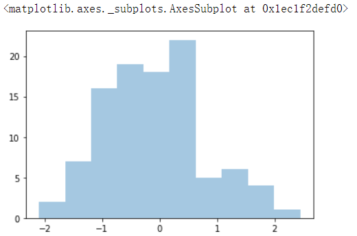
sns.distplot(x, bins = 20, kde = False) #通过bins可以改变条的数目
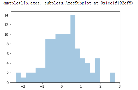
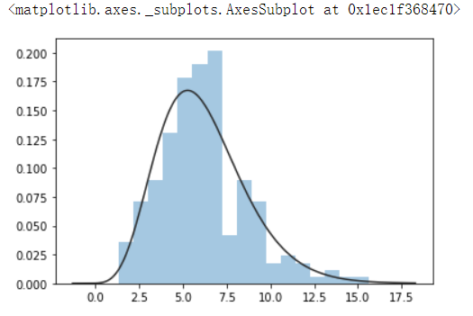
x = np.random.gamma(6, size = 200)

sns.distplot(x, kde = False, fit = stats.gamma) #通过fit进行拟合
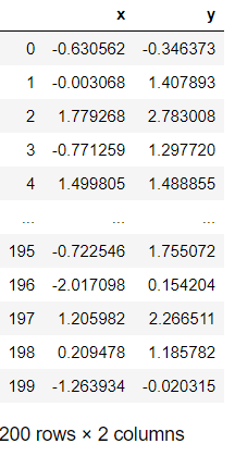
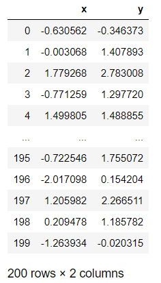
根据均值和协方差生成数据
#生成两个变量是DateFrame格式的
mean, cov = [0, 1], [(1, 0.5), (0.5, 1)]
data = np.random.multivariate_normal(mean, cov, 200)

df = pd.DataFrame(data, columns=["x", "y"])

df
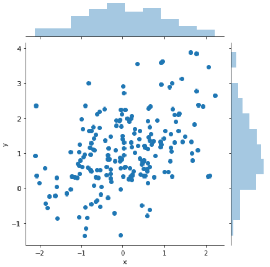
观测两个变量之间的分布关系最好用散点图
sns.jointplot(x="x", y ="y", data=df);
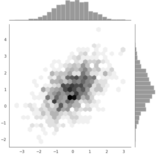
x, y = np.random.multivariate_normal(mean, cov, 1000).T

with sns.axes_style("white"):
    sns.jointplot(x=x, y=y, kind="hex", color='k')


 浙公网安备 33010602011771号