python读取excel数据并且画图
python读取excel数据并且画图
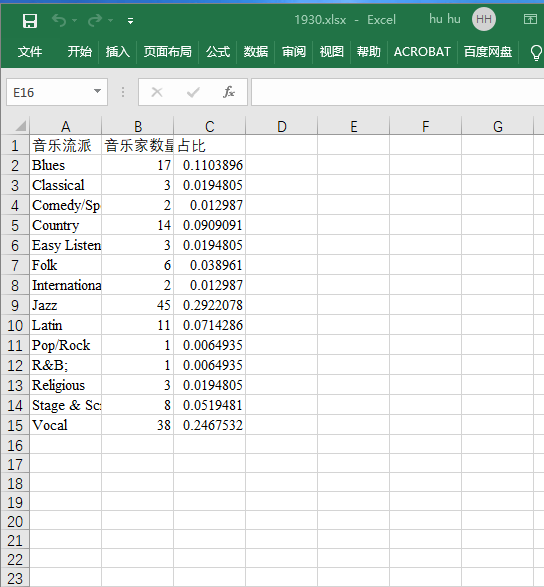
一,要读取的数据的格式:
二,数据读取部分:
# 1930
workbook=xlrd.open_workbook('1930.xlsx')
sheet= workbook.sheet_by_index(0)
A1=[]
B1=[]
# sheet.cell_value(i,0):第i行的第0个元素
for i in range(1,sheet.nrows):
    A1.append(sheet.cell_value(i,0))
    B1.append(sheet.cell_value(i,1))

if len(A1)!=len(B1):
    print("False")
drawBar(A1,B1,1930)
三,画图函数
1. def drawBar(Music_genre,singer_num,year)
参数介绍
| 参数名 | 参数含义 |
|---|---|
| Music_genre | 音乐流派名称list |
| singer_num | 音乐流派对应音乐家数量list |
| year | 读的文件的年份(因为源代码是从1840到2020的) |
def drawBar(Music_genre,singer_num,year):
    arr_len=len(Music_genre)
    # 由循环得到一个字典,key是音乐流派,value是这个音乐流派对应的音乐家的数量
    i=0
    dict_music_singer={}
    while i<arr_len:
        dict_music_singer[Music_genre[i]]=singer_num[i]
        i=i+1

	# 注释1
    pyplot.bar(x=0, bottom=range(arr_len), height=0.3, width=singer_num, orientation="horizontal")
    # 注释2
    pyplot.yticks(range(arr_len),Music_genre)
    # 加title,展示图像
    pyplot.title(year)
    pyplot.show()

    ...
    ...
    drawBar(A1,B1,1930)
注释1:
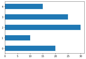
"""
    水平条形图,需要修改以下属性
    orientation="horizontal"
"""
import numpy as np
import matplotlib.pyplot as plt

# 数据
N = 5
x = [20, 10, 30, 25, 15]
y = [0,1,2,3,4]

# 绘图 x= 起始位置, bottom= 水平条的底部(左侧), y轴, height 水平条的宽度, width 水平条的长度
p1 = plt.bar(x=0, bottom=y, height=0.5, width=x, orientation="horizontal")
pyplot.bar(range(arr_len),singer_num,align='center')
pyplot.bar(x=0, bottom=range(arr_len), height=0.5, width=singer_num, orientation="horizontal")
# 展示图形
plt.show()
注释2:plt.xticks的第一个参数和plt.plot的第一个参数一样,第二个参数是和第一个参数相同长度的list此例中用来代替横坐标
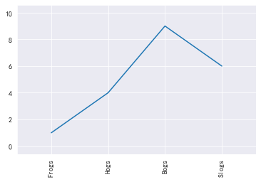
import matplotlib.pyplot as plt
x = [1, 2, 3, 4]
y = [1, 4, 9, 6]
labels = ['Frogs', 'Hogs', 'Bogs', 'Slogs']

plt.plot(x, y)
# You can specify a rotation for the tick labels in degrees or with keywords.
plt.xticks(x, labels, rotation='vertical')
# Pad margins so that markers don't get clipped by the axes
plt.margins(0.2)
# Tweak spacing to prevent clipping of tick-labels
plt.subplots_adjust(bottom=0.15)
plt.show()
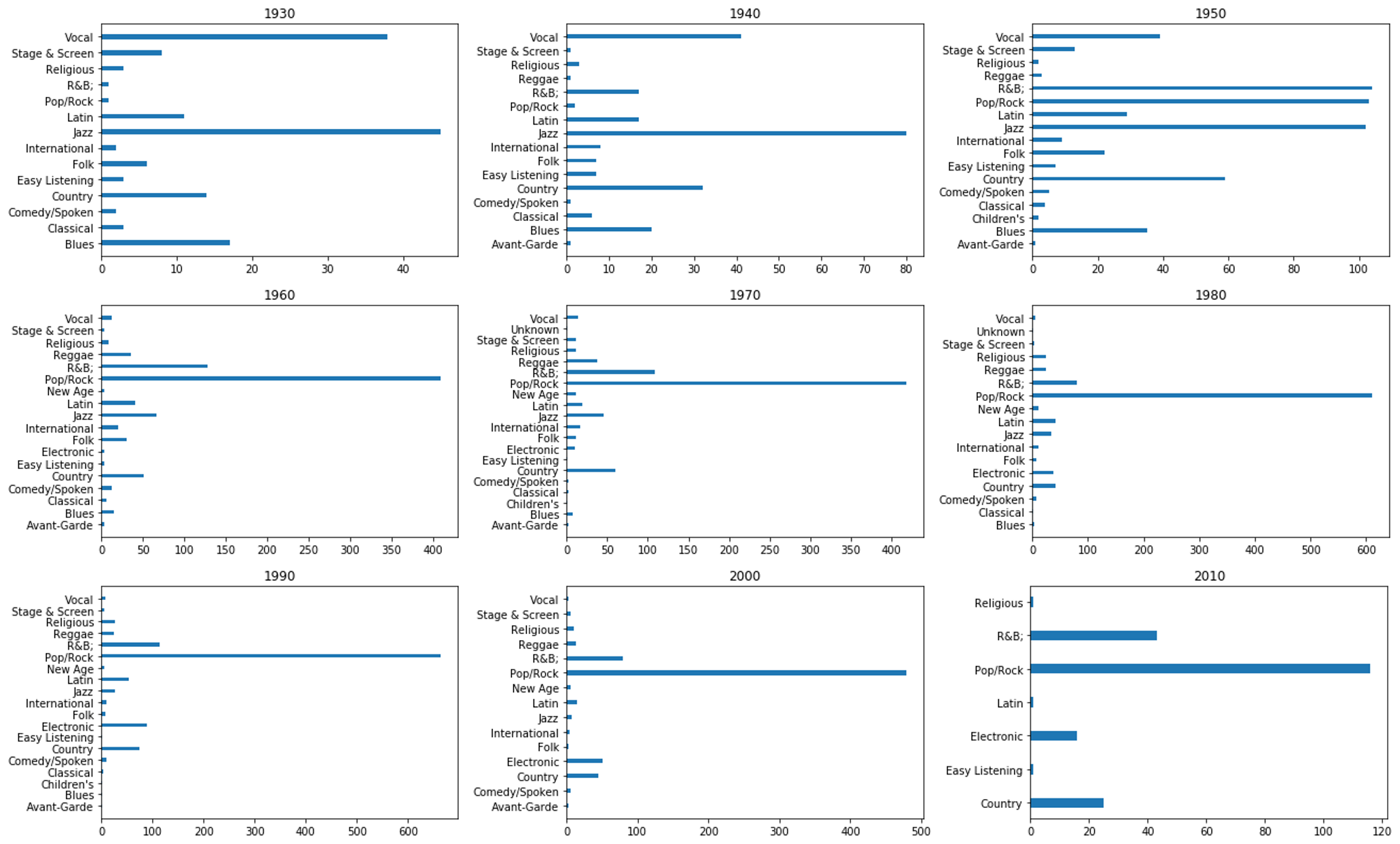
1.1 效果:
1.2 完整代码
import pandas as pd
import numpy as np
import xlrd
from matplotlib import pyplot
def drawBar(Music_genre,singer_num,year):
    arr_len=len(Music_genre)

    i=0
    dict_music_singer={}
    while i<arr_len:
        dict_music_singer[Music_genre[i]]=singer_num[i]
        i=i+1
    #pyplot.bar(range(arr_len),singer_num,align='center')
    pyplot.bar(x=0, bottom=range(arr_len), height=0.3, width=singer_num, orientation="horizontal")
    pyplot.yticks(range(arr_len),Music_genre)
    pyplot.title(year)
    pyplot.show()


# 1930
workbook=xlrd.open_workbook('1930.xlsx')
sheet= workbook.sheet_by_index(0)
A1=[]
B1=[]
for i in range(1,sheet.nrows):
    A1.append(sheet.cell_value(i,0))
    B1.append(sheet.cell_value(i,1))

if len(A1)!=len(B1):
    print("False")
drawBar(A1,B1,1930)


# 1940
workbook=xlrd.open_workbook('1940.xlsx')
sheet= workbook.sheet_by_index(0)
A2=[]
B2=[]
for i in range(1,sheet.nrows):
    A2.append(sheet.cell_value(i,0))
    B2.append(sheet.cell_value(i,1))

if len(A2)!=len(B2):
    print("False")
drawBar(A2,B2,1940)


#
workbook=xlrd.open_workbook('1950.xlsx')
sheet= workbook.sheet_by_index(0)
A3=[]
B3=[]
for i in range(1,sheet.nrows):
    A3.append(sheet.cell_value(i,0))
    B3.append(sheet.cell_value(i,1))

if len(A3)!=len(B3):
    print("False")
drawBar(A3,B3,1950)


# 6
workbook=xlrd.open_workbook('1960.xlsx')
sheet= workbook.sheet_by_index(0)
A4=[]
B4=[]
for i in range(1,sheet.nrows):
    A4.append(sheet.cell_value(i,0))
    B4.append(sheet.cell_value(i,1))

if len(A4)!=len(B4):
    print("False")
drawBar(A4,B4,1960)


#
workbook=xlrd.open_workbook('1970.xlsx')
sheet= workbook.sheet_by_index(0)
A5=[]
B5=[]
for i in range(1,sheet.nrows):
    A5.append(sheet.cell_value(i,0))
    B5.append(sheet.cell_value(i,1))

if len(A5)!=len(B5):
    print("False")
drawBar(A5,B5,1970)


#
workbook=xlrd.open_workbook('1980.xlsx')
sheet= workbook.sheet_by_index(0)
A6=[]
B6=[]
for i in range(1,sheet.nrows):
    A6.append(sheet.cell_value(i,0))
    B6.append(sheet.cell_value(i,1))

if len(A6)!=len(B6):
    print("False")
drawBar(A6,B6,1980)


# 9
workbook=xlrd.open_workbook('1990.xlsx')
sheet= workbook.sheet_by_index(0)
A7=[]
B7=[]
for i in range(1,sheet.nrows):
    A7.append(sheet.cell_value(i,0))
    B7.append(sheet.cell_value(i,1))

if len(A7)!=len(B7):
    print("False")
drawBar(A7,B7,1990)


# 2000
workbook=xlrd.open_workbook('2000.xlsx')
sheet= workbook.sheet_by_index(0)
A8=[]
B8=[]
for i in range(1,sheet.nrows):
    A8.append(sheet.cell_value(i,0))
    B8.append(sheet.cell_value(i,1))

if len(A8)!=len(B8):
    print("False")
drawBar(A8,B8,2000)


#
workbook=xlrd.open_workbook('2010.xlsx')
sheet= workbook.sheet_by_index(0)
A9=[]
B9=[]
for i in range(1,sheet.nrows):
    A9.append(sheet.cell_value(i,0))
    B9.append(sheet.cell_value(i,1))

if len(A9)!=len(B9):
    print("False")
drawBar(A9,B9,2010)


# #
# workbook=xlrd.open_workbook('2020.xlsx')
# sheet= workbook.sheet_by_index(0)
# A2=[]
# B2=[]
# for i in range(1,sheet.nrows):
#     A2.append(sheet.cell_value(i,0))
#     B2.append(sheet.cell_value(i,1))

# if len(A2)!=len(B2):
#     print("False")
# drawBar(A2,B2,2020)
2. 使用seaborn作图
1.1 代码分析
参数介绍
| 参数名 | 参数含义 |
|---|---|
| Music_genre | 音乐流派名称list |
| singer_num | 音乐流派对应音乐家数量list |
| year | 读的文件的年份(因为源代码是从1840到2020的) |
数据读取
# 1930数据的读取
workbook=xlrd.open_workbook('1930.xlsx')
sheet= workbook.sheet_by_index(0)
A1=[]
B1=[]
for i in range(1,sheet.nrows):
    A1.append(sheet.cell_value(i,0))
    B1.append(sheet.cell_value(i,1))
函数的定义与调用:
# 见例1,2
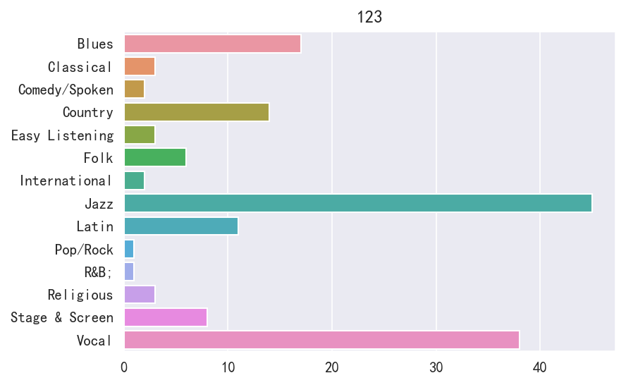
def drawBar(Music_genre,singer_num,year):
pyplot.figure(dpi=150)
# y轴放Music_genre对应的list,x轴放singer_num对应的list
sns.barplot(y=Music_genre, x=singer_num)
pyplot.title(year)
drawBar(A1,B1,'123')
例1:
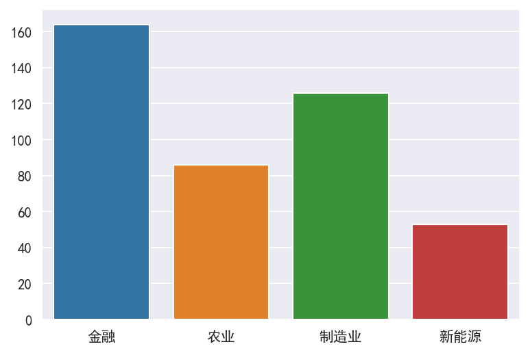
import xlrd
from matplotlib import pyplot
import seaborn as sns
import numpy as np
import pandas as pd
%matplotlib inline

# 显示正负号与中文不显示问题
pyplot.rcParams['axes.unicode_minus'] = False
sns.set_style('darkgrid', {'font.sans-serif':['SimHei', 'Arial']})

# 去除部分warning
import warnings
warnings.filterwarnings('ignore')


plt.figure(dpi=150)
a = ['金融','农业','制造业','新能源']
b = [164, 86, 126, 53]
sns.barplot(a,b)
例2:
import xlrd
from matplotlib import pyplot
import seaborn as sns
import numpy as np
import pandas as pd
%matplotlib inline

# 显示正负号与中文不显示问题
pyplot.rcParams['axes.unicode_minus'] = False
sns.set_style('darkgrid', {'font.sans-serif':['SimHei', 'Arial']})

# 去除部分warning
import warnings
warnings.filterwarnings('ignore')


plt.figure(dpi=150)
a = ['金融','农业','制造业','新能源']
b = [164, 86, 126, 53]
sns.barplot(y=a, x=b)

1.2 执行效果
1.3 完整代码
import xlrd
from matplotlib import pyplot
import seaborn as sns
import numpy as np
import pandas as pd
%matplotlib inline

# 显示正负号与中文不显示问题
pyplot.rcParams['axes.unicode_minus'] = False
sns.set_style('darkgrid', {'font.sans-serif':['SimHei', 'Arial']})

# 去除部分warning
import warnings
warnings.filterwarnings('ignore')


# 1930数据的读取
workbook=xlrd.open_workbook('1930.xlsx')
sheet= workbook.sheet_by_index(0)
A1=[]
B1=[]
for i in range(1,sheet.nrows):
    A1.append(sheet.cell_value(i,0))
    B1.append(sheet.cell_value(i,1))


#
def drawBar(Music_genre,singer_num,year):
    pyplot.figure(dpi=150)
    sns.barplot(y=Music_genre, x=singer_num)
    pyplot.title(year)


drawBar(A1,B1,'123')
四,总结
有一说一确实seaborn会简单很多,画的图还好看
五,代码使用到的数据
链接:https://pan.baidu.com/s/1NfrF7fvwL4S2iLJgcGphPA
提取码:8vtl
复制这段内容后打开百度网盘手机App,操作更方便哦--来自百度网盘超级会员V5的分享