600w+条短租房数据案例分析 ——数据可视化
3.1 每天房屋入住率
读取的数据中包含了1w多套房源,共有600w+交易记录,涵盖了交易的起止日期,因此可以探究每天房屋的入住情况(当天入住的数量除以总的房间数量)。具体分析的步骤如下:
#提取时间日期和房间状态字段并赋值新变量
calendar_new = calendar[['date', 'available']]
#添加一个新的字段记录房源是够被出租
calendar_new['busy'] = calendar_new.available.map( lambda x: 0 if x == 't' else 1)
#按照时间日期进行分组求解每日入住的均值并重置索引
calendar_new = calendar_new.groupby('date')['busy'].mean().reset_index()
#最后将时间日期转化为datetime时间格式
calendar_new['date'] = pd.to_datetime(calendar_new['date'])
#查看处理后的结果前五行
calendar_new.head()
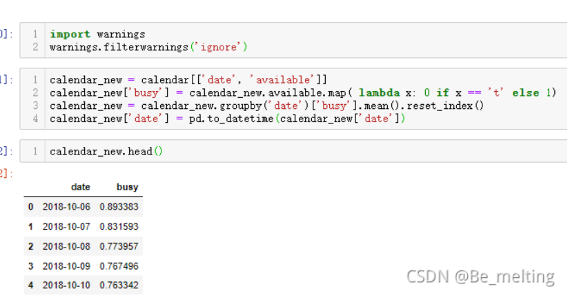
输出结果如下:(date字段就是时间日期,busy字段就代表这个每天的平均入住率)
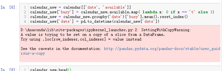
输出结果汇总发现有个粉红色的警示输出提醒xxxWarning,需要了解一下pandas在进行数据处理和分析过程中会存在版本和各类模块兼容的情况,xxxWarning是一种善意的提醒,并不是xxxError,这类提醒不会影响程序的正常运行,也可以导入模块进行提醒忽略
import warnings
warnings.filterwarnings('ignore')
导入运行后,重新执行上述分析过程,输出结果如下:(此时就没有粉红色的xxxWarning提醒了)
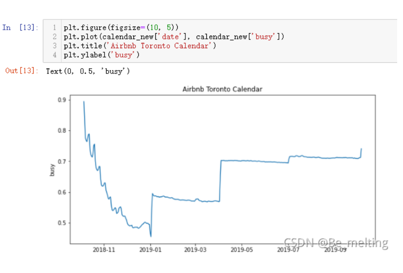
每天房屋入住率求解完毕后,就可以进行可视化展现,由于绘制图形的x轴部分为时间日期,且时间跨度较大,一般是采用折线图进行绘制图形
#设置图形的大小尺寸
plt.figure(figsize=(10, 5))
#指定x和y轴数据进行绘制
plt.plot(calendar_new['date'], calendar_new['busy'])
#添加图形标题
plt.title('Airbnb Toronto Calendar')
#添加y轴标签
plt.ylabel('busy')
3.2 房屋月份价格走势
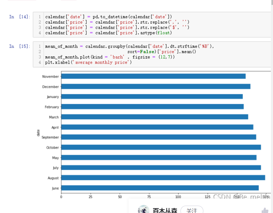
此次有两个分析技巧,由于价格部分带有$符号和,号,所以我们需要对数据进行格式化处理,并且转换时间字段。处理完时间字段后,使用柱状图进行数据分析
#先将时间日期字段转化为datetime字段方便提取月份数据
calendar['date'] = pd.to_datetime(calendar['date'])
#清洗price字段中的$符号和,号,最后转化为浮点数方便记性计算
calendar['price'] = calendar['price'].str.replace(',', '')
calendar['price'] = calendar['price'].str.replace('$', '')
calendar['price'] = calendar['price'].astype(float)

#按照月份进行分组汇总求解价钱的均值
mean_of_month = calendar.groupby(calendar['date'].dt.strftime('%B'),
                                 sort=False)['price'].mean()
#绘制条形图
mean_of_month.plot(kind = 'barh' , figsize = (12,7))
#添加x轴标签
plt.xlabel('average monthly price')
输出结果如下:(上一次转化datetime数据类型是calendar_new变量中的date字段,但是calendar变量中的date字段的数据类型还仍是字符串数据类型)

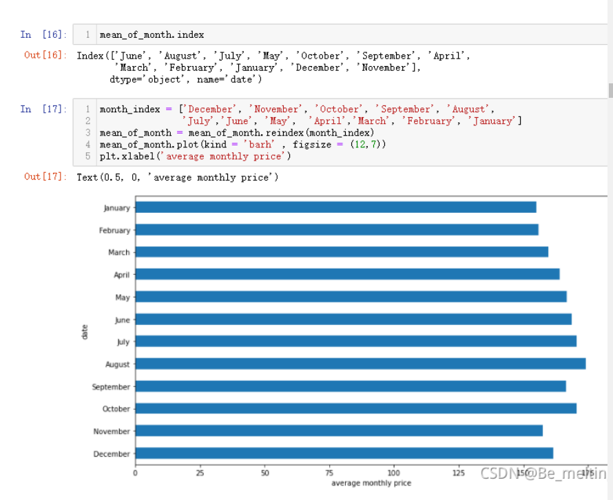
如果想要月份按照1-12月的方式进行顺序输出,可以重新指定索引。已有的索引放置在一个列表中,排好序后传入reindex()函数中,操作如下
#先查看原来的索引值
mean_of_month.index

#根据原有的索引值调整显示的位置顺序
month_index = ['December', 'November', 'October', 'September', 'August',
               'July','June', 'May',  'April','March', 'February', 'January']
#重新指定索引后绘制图形
mean_of_month = mean_of_month.reindex(month_index)
mean_of_month.plot(kind = 'barh' , figsize = (12,7))
plt.xlabel('average monthly price')
输出结果如下:(图中可以看出7月 8月和10月是平均价格最高的三个月)
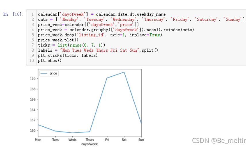
3.3 房屋星期价格特征
#获取星期的具体天数的名称
calendar['dayofweek'] = calendar.date.dt.weekday_name
#然后指定显示的索引顺序
cats = [ 'Monday', 'Tuesday', 'Wednesday', 'Thursday', 'Friday', 'Saturday', 'Sunday']
#提取要分析的两个字段
price_week=calendar[['dayofweek','price']]
#按照星期进行分组求解平均价钱后重新设置索引
price_week = calendar.groupby(['dayofweek']).mean().reindex(cats)
#删除不需要的字段
price_week.drop('listing_id', axis=1, inplace=True)
#绘制图形
price_week.plot()
#指定轴刻度的数值及对应的标签值
ticks = list(range(0, 7, 1))
labels = "Mon Tues Weds Thurs Fri Sat Sun".split()
plt.xticks(ticks, labels)

#如果不想要显示xticks信息,可以增添plt.show()
plt.show()
输出结果如下:(直接指定DataFrame绘制图形,可能x轴的刻度和标签信息不会全部显示,此时可以自行指定刻度数量和对应的标签值。短租房本身大都为了旅游而存在,所以周五周六两天的价格都比其他时间贵出一个档次。周末双休,使得入驻的时间为周五周六晚两个晚上)
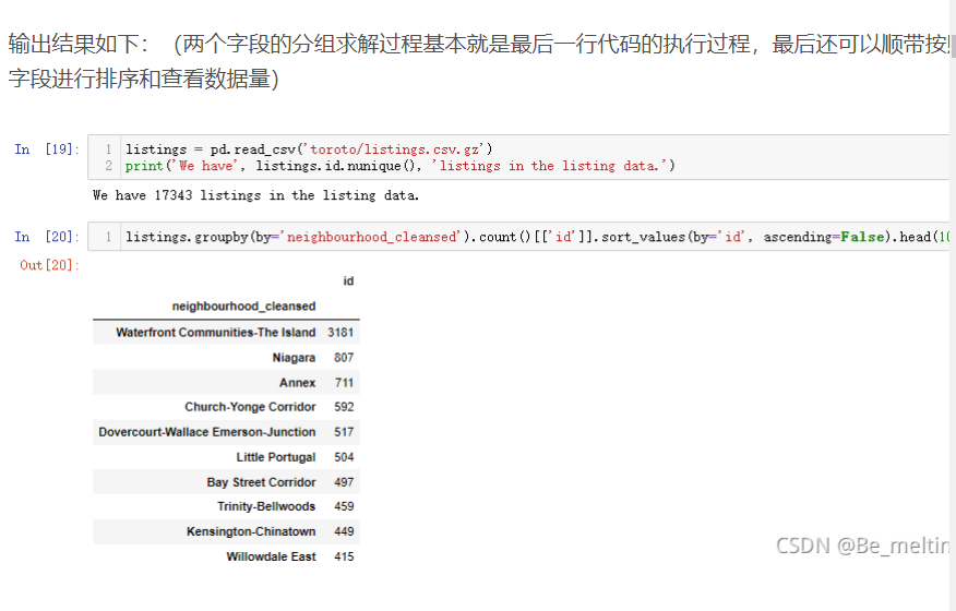
3.4 不同社区的房源数量
读取另外一个数据文件,按照每个房源社区进行分组,统计房源的数量(id字段对应着房源独特的编号)
listings = pd.read_csv('toroto/listings.csv.gz')
print('We have', listings.id.nunique(), 'listings in the listing data.')

listings.groupby(by='neighbourhood_cleansed').count()[['id']].sort_values(by='id', ascending=False).head(10)

 浙公网安备 33010602011771号