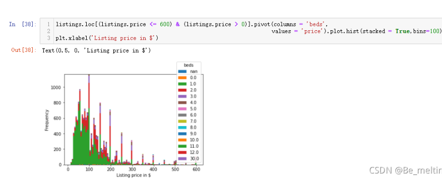
大数据预处理-- 床位的数量和房价的关系
listings.loc[(listings.price <= 600) & (listings.price > 0)].pivot(columns = 'beds',values = 'price').plot.hist(stacked = True,bins=100)
plt.xlabel('Listing price in $')
输出结果如下:(先查看各出租房汇总不同床位出现的数量分布,主要集中在1,2,3,价钱也主要在0-200区间范围内)
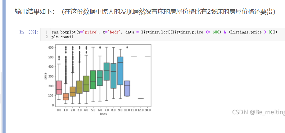
sns.boxplot(y='price', x='beds', data = listings.loc[(listings.price <= 600) & (listings.price > 0)])
plt.show()
3.12 关联关系探索
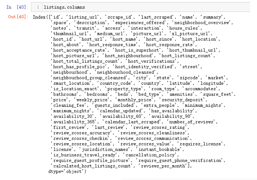
之前的尝试性探索都是在指定两个字段,然后进行两两分析。可以通过columns查看一下所有的字段名称,输出如下
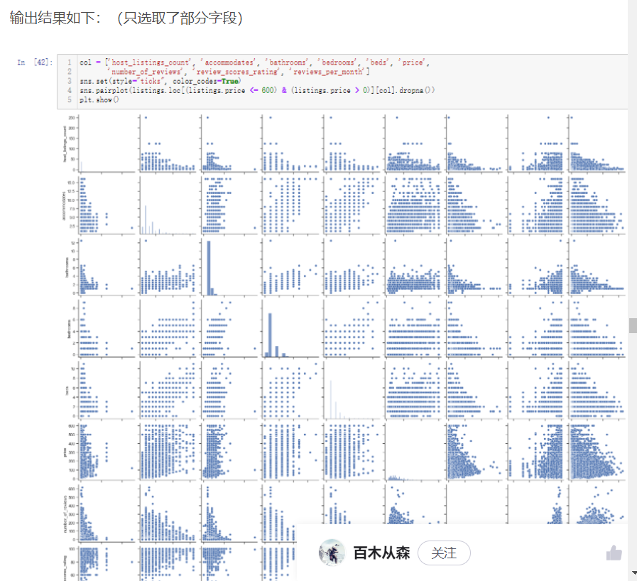
两两单独挑出来的字段进行分析就是基于常识,日常中都已经在大脑中潜意识认为这两个字段可能有所关联,如果一直使用这种方式很难挖掘出潜在的有价值信息,因此就可以借助pairplot绘制多字段的两两对比图或者heatmap热力图探究潜在的关联性
col = ['host_listings_count', 'accommodates', 'bathrooms', 'bedrooms', 'beds', 'price', 'number_of_reviews', 'review_scores_rating', 'reviews_per_month']
sns.set(style="ticks", color_codes=True)
sns.pairplot(listings.loc[(listings.price <= 600) & (listings.price > 0)][col].dropna())
plt.show()
进行热力图绘制,需要注意pairplot和heatmap绘制的图形都是只需要看主对角线上下一侧的图像即可,因为生成的图形是关于主对角线对称
plt.figure(figsize=(18,10))
corr = listings.loc[(listings.price <= 600) & (listings.price > 0)][col].dropna().corr()
plt.figure(figsize = (6,6))
sns.set(font_scale=1)
sns.heatmap(corr, cbar = True, annot=True, square = True, fmt = '.2f', xticklabels=col, yticklabels=col)
plt.show()
输出结果如下:(数字越接近1,说明字段之间的相关性越强,主对角线的数值不用看都是1)
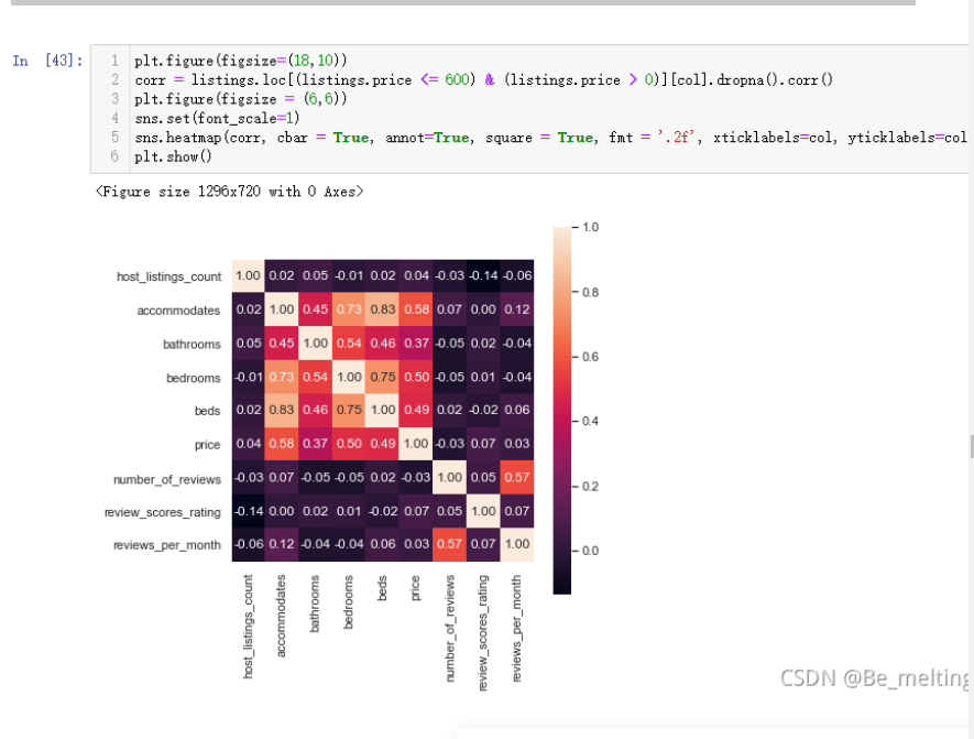
热力图除了查看相关性外,还有一个重要的用处就是展示三个字段之间的关系,比如上面相关性图中可以看到价钱price字段和bathrooms床位以及bedrooms字段都有较强的关联关系,就可以使用热力图将三者的关系表现出来
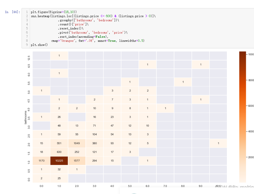
plt.figure(figsize=(18,10))
sns.heatmap(listings.loc[(listings.price <= 600) & (listings.price > 0)]\
                .groupby(['bathrooms', 'bedrooms'])\
                .count()['price']\
                .reset_index()\
                .pivot('bathrooms', 'bedrooms', 'price')\
                .sort_index(ascending=False),
            cmap="Oranges", fmt='.0f', annot=True, linewidths=0.5)
plt.show()
输出结果如下:(该热力图探究的是洗漱间和卧室的数量与房子数量的关系)
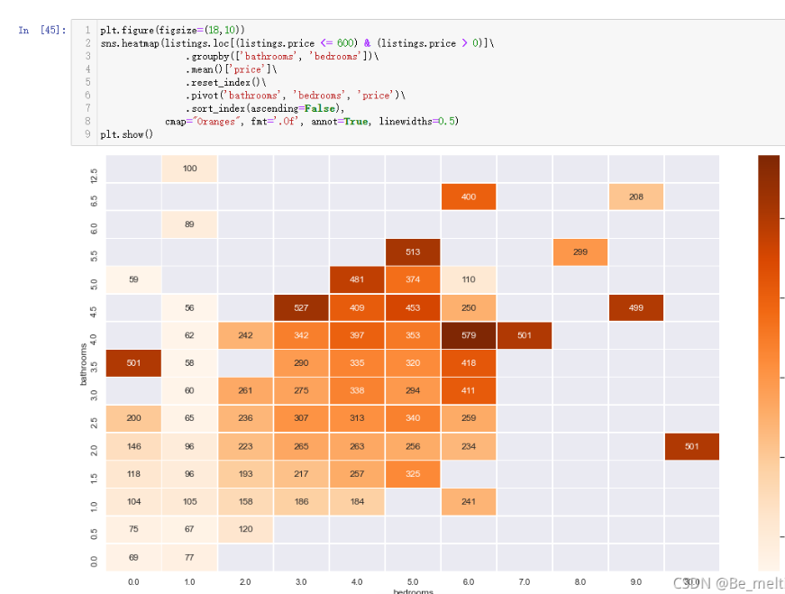
那么把count()改成mean(),就变成探究洗漱间和卧室的数量与房子平均价格之间的关系
plt.figure(figsize=(18,10))
sns.heatmap(listings.loc[(listings.price <= 600) & (listings.price > 0)]\
                .groupby(['bathrooms', 'bedrooms'])\
                .mean()['price']\
                .reset_index()\
                .pivot('bathrooms', 'bedrooms', 'price')\
                .sort_index(ascending=False),
            cmap="Oranges", fmt='.0f', annot=True, linewidths=0.5)
plt.show()
输出结果如下:

 浙公网安备 33010602011771号