css2和css3水平居中和垂直居中
css3新增了一些属性,像flex,这是css3中很重要的改变,所以除了flex以外的垂直水平居中的技巧都是属于css2的。
- css2的水平居中技巧
将元素display为行内元素,再text-align:center;即可
或者 将块级元素定义一个宽度,再margin: 0 auto;即可
- css3的水平居中技巧
将元素display设为flex,再通过justify-content: center; 实现居中。
- css2的垂直居中技巧
单行内容的垂直居中可以通过设置相同height值和line-height值来实现。
多行内容的垂直居中且高度可变可以通过设置上下相同的padding值来实现。
行级盒子:小图标和标题对齐设置vertical-align: middle。
绝对定位:top:50%; left:50%;的方法,需要已知块级的宽高
- css3的垂直居中技巧
将元素display设为flex,再通过align-items:center;来实现。
方法1: .div1{ width:400px;  height:400px;  border:#CCC 1px solid;   background:#99f;  position:absolute;  left:50%;   top:50%;   transform: translate(-50%,-50%); }   <div class="div1"></div>
方法2: .div2{ width:400px;  height:400px;  border:#CCC 1px solid;  background:#99f;  position: absolute;  left:0;  top: 0;  bottom: 0;  right: 0;  margin: auto; }  <div class="div2"></div>
方法3: .div3{ width:400px;  height:400px;  border:#CCC 1px solid;  background:#9f9;  position: absolute;  left: 50%;  top:50%;  margin-left:-200px;  margin-top: -200px;  }   <div class="div3"></div>
具体实现:将#main下的子盒子居中显示
<head>
<meta charset="utf-8">
<title>居中</title>
<style>
#main {
width: 400px;
height: 400px;
border: 1px solid #c3c3c3;
display: flex;
justify-content: center;
align-items:center;
}
#main div {
width: 50px;
height: 50px;
}
</style>
</head>
<body>
<div id="main">
<div style="">A</div>
<div style="">B</div>
<div style="">C</div>
<div style="">D</div>
<div style="">E</div>
<div style="">F</div>
</div>
</body>
</html>
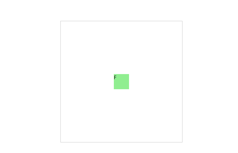
结果:#main div 盒子水平垂直居中
用absolute实现水平垂直居中
#main {
width: 400px;
height: 400px;
position:absolute;
border: 1px solid #c3c3c3;
top:50%;
left:50%;
margin-left:-200px;
margin-top:-200px;
}
#main div {
position:absolute;
top:50%;
left:50%;
width: 50px;
height: 50px;
margin-left:-25px;
margin-top: -25px;
}
</style>
</head>
<body>
<div id="main">
<div style="">A</div>
<div style="">B</div>
<div style="">C</div>
<div style="">D</div>
<div style="">E</div>
<div style="">F</div>
</div>
结果: