

android studio 自定义控件
第一种方式:

<?xml version="1.0" encoding="utf-8"?>
<LinearLayout xmlns:android="http://schemas.android.com/apk/res/android"
    android:layout_width="match_parent"
    android:background="#ff28f010"
    android:layout_height="100px">


    <Button
        android:layout_width="wrap_content"
        android:layout_height="wrap_content"
        android:background="@drawable/ic_launcher"
        android:id="@+id/imageButton"
        android:gravity="center"
        android:text="返回"
        android:textColor="#f0a4cc"
        android:layout_margin="5dp"
        />

    <TextView
        android:layout_width="wrap_content"
        android:layout_height="100px"
        android:id="@+id/textView2"
        android:text="标题"
        android:gravity="center_vertical|center_horizontal"
        android:textSize="45px"

        android:layout_weight="0.23" />

    <Button
        android:layout_width="wrap_content"
        android:layout_height="wrap_content"
        android:id="@+id/imageButton2"
        android:layout_margin="5dp"
        android:background="@drawable/ic_launcher"
        android:textColor="#f0a4cc"
        android:text="编辑"/>


</LinearLayout>
如果其他的地方引用,直接使用<include layout="@layout/title"/>
第二种方式:
xml
1 2 3 4 5 6 7 8 9 10 11 12 13 14 15 16 17 18 19 20 21 22 23 24 25 26 27 28 29 30 31 32 33 34 35 36 37 38 39 40 41 42 43 44 45 46 47 48 | <LinearLayout xmlns:android="http://schemas.android.com/apk/res/android" xmlns:tools="http://schemas.android.com/apk/res-auto" android:layout_width="match_parent" android:layout_height="match_parent" android:orientation="vertical"> <RelativeLayout android:layout_width="match_parent" android:background="#0000ff" android:layout_height="45dp"> <Button android:id="@+id/title_bar_left" android:layout_width="wrap_content" android:layout_height="wrap_content" android:layout_alignParentLeft="true" android:layout_centerVertical="true" android:layout_marginLeft="5dp" android:background="@mipmap/ic_launcher" android:minHeight="45dp" android:minWidth="45dp" android:textSize="14sp" /> <TextView android:id="@+id/title_bar_title" android:layout_width="wrap_content" android:layout_height="wrap_content" android:layout_centerInParent="true" android:text="登录" android:singleLine="true" android:textSize="17sp" /> <Button android:id="@+id/title_bar_right" android:layout_width="wrap_content" android:layout_height="wrap_content" android:layout_alignParentRight="true" android:layout_centerVertical="true" android:layout_marginRight="7dp" android:text="提交" android:textColor="@android:color/white" android:background="@null" android:minHeight="45dp" android:minWidth="45dp" android:textSize="14sp" /> </RelativeLayout></LinearLayout> |
attrs。xml代码
1 2 3 4 5 6 7 8 9 10 11 12 13 14 | <declare-styleable name="CustomTitleBar"> <attr name="title_background_color" format="reference|integer" /> <attr name="left_button_visible" format="boolean" /> <attr name="right_button_visible" format="boolean" /> <attr name="title_text" format="string" /> <attr name="title_text_color" format="color" /> <attr name="title_text_drawable" format="reference|integer" /> <attr name="right_button_text" format="string" /> <attr name="right_button_text_color" format="color" /> <attr name="right_button_drawable" format="reference|integer" /> <attr name="left_button_text" format="string" /> <attr name="left_button_text_color" format="color" /> <attr name="left_button_drawable" format="reference|integer" /> </declare-styleable> |
自定义:
1 2 3 4 5 6 7 8 9 10 11 12 13 14 15 16 17 18 19 20 21 22 23 24 25 26 27 28 29 30 31 32 33 34 35 36 37 38 39 40 41 42 43 44 45 46 47 48 49 50 51 52 53 54 55 56 57 58 59 60 61 62 63 64 65 66 67 68 69 70 71 72 73 74 75 76 77 78 79 80 81 82 83 84 85 86 87 88 89 90 91 92 93 94 95 96 97 98 99 100 101 102 103 | public class CustomTitleBar extends RelativeLayout { private Button titleBarLeftBtn; private Button titleBarRightBtn; private TextView titleBarTitle; public CustomTitleBar(Context context, AttributeSet attrs) { super(context, attrs); LayoutInflater.from(context).inflate(R.layout.custom_title_bar, this, true); titleBarLeftBtn = (Button) findViewById(R.id.title_bar_left); titleBarRightBtn = (Button) findViewById(R.id.title_bar_right); titleBarTitle = (TextView) findViewById(R.id.title_bar_title); TypedArray attributes = context.obtainStyledAttributes(attrs, R.styleable.CustomTitleBar); if (attributes != null) { //处理titleBar背景色 int titleBarBackGround = attributes.getResourceId(R.styleable.CustomTitleBar_title_background_color, Color.GREEN); setBackgroundResource(titleBarBackGround); //先处理左边按钮 //获取是否要显示左边按钮 boolean leftButtonVisible = attributes.getBoolean(R.styleable.CustomTitleBar_left_button_visible, true); if (leftButtonVisible) { titleBarLeftBtn.setVisibility(View.VISIBLE); } else { titleBarLeftBtn.setVisibility(View.INVISIBLE); } //设置左边按钮的文字 String leftButtonText = attributes.getString(R.styleable.CustomTitleBar_left_button_text); if (!TextUtils.isEmpty(leftButtonText)) { titleBarLeftBtn.setText(leftButtonText); //设置左边按钮文字颜色 int leftButtonTextColor = attributes.getColor(R.styleable.CustomTitleBar_left_button_text_color, Color.WHITE); titleBarLeftBtn.setTextColor(leftButtonTextColor); } else { //设置左边图片icon 这里是二选一 要么只能是文字 要么只能是图片 int leftButtonDrawable = attributes.getResourceId(R.styleable.CustomTitleBar_left_button_drawable, R.mipmap.ic_launcher); if (leftButtonDrawable != -1) { titleBarLeftBtn.setBackgroundResource(leftButtonDrawable); } } //处理标题 //先获取标题是否要显示图片icon int titleTextDrawable = attributes.getResourceId(R.styleable.CustomTitleBar_title_text_drawable, -1); if (titleTextDrawable != -1) { titleBarTitle.setBackgroundResource(titleTextDrawable); } else { //如果不是图片标题 则获取文字标题 String titleText = attributes.getString(R.styleable.CustomTitleBar_title_text); if (!TextUtils.isEmpty(titleText)) { titleBarTitle.setText(titleText); } //获取标题显示颜色 int titleTextColor = attributes.getColor(R.styleable.CustomTitleBar_title_text_color, Color.WHITE); titleBarTitle.setTextColor(titleTextColor); } //先处理右边按钮 //获取是否要显示右边按钮 boolean rightButtonVisible = attributes.getBoolean(R.styleable.CustomTitleBar_right_button_visible, true); if (rightButtonVisible) { titleBarRightBtn.setVisibility(View.VISIBLE); } else { titleBarRightBtn.setVisibility(View.INVISIBLE); } //设置右边按钮的文字 String rightButtonText = attributes.getString(R.styleable.CustomTitleBar_right_button_text); if (!TextUtils.isEmpty(rightButtonText)) { titleBarRightBtn.setText(rightButtonText); //设置右边按钮文字颜色 int rightButtonTextColor = attributes.getColor(R.styleable.CustomTitleBar_right_button_text_color, Color.WHITE); titleBarRightBtn.setTextColor(rightButtonTextColor); } else { //设置右边图片icon 这里是二选一 要么只能是文字 要么只能是图片 int rightButtonDrawable = attributes.getResourceId(R.styleable.CustomTitleBar_right_button_drawable, -1); if (rightButtonDrawable != -1) { titleBarRightBtn.setBackgroundResource(rightButtonDrawable); } } attributes.recycle(); } } public void setTitleClickListener(OnClickListener onClickListener) { if (onClickListener != null) { titleBarLeftBtn.setOnClickListener(onClickListener); titleBarRightBtn.setOnClickListener(onClickListener); } } public Button getTitleBarLeftBtn() { return titleBarLeftBtn; } public Button getTitleBarRightBtn() { return titleBarRightBtn; } public TextView getTitleBarTitle() { return titleBarTitle; }} |
最后其他布局使用
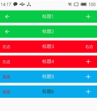
1 2 3 4 5 6 7 8 9 | <com.cqytjr.www.cheji.view.CustomTitleBar android:layout_width="match_parent" android:layout_height="45dp" android:layout_marginTop="10dp" tools:left_button_text="左边" tools:left_button_text_color="#ff0000" tools:right_button_drawable="@mipmap/titlebar_add_icon" tools:title_background_color="@color/blue" tools:title_text="标题5" /> |

【推荐】编程新体验,更懂你的AI,立即体验豆包MarsCode编程助手
【推荐】凌霞软件回馈社区,博客园 & 1Panel & Halo 联合会员上线
【推荐】抖音旗下AI助手豆包,你的智能百科全书,全免费不限次数
【推荐】博客园社区专享云产品让利特惠,阿里云新客6.5折上折
【推荐】轻量又高性能的 SSH 工具 IShell:AI 加持,快人一步