css基础
em和rem 的区别?
em会继承父级元素的字体大小。

             em是相对长度单位。相对于当前对象内文本的字体尺寸。如当前对行内文本的字体尺寸未被人为设置,则相对于浏览器的默认字体尺寸。

              使用rem为元素设定字体大小时,仍然是相对大小,但相对的只是HTML根元素
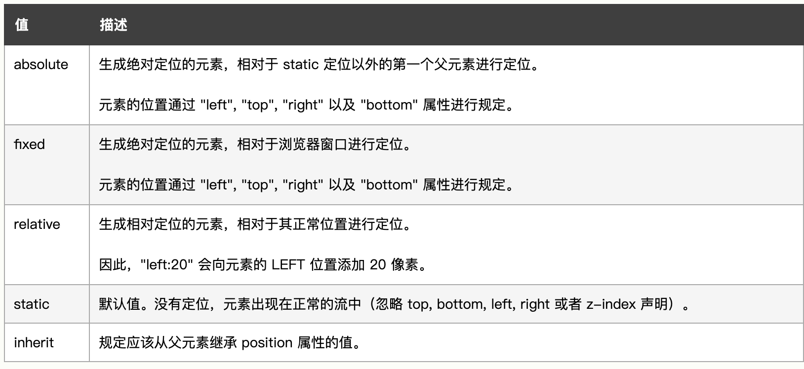
position的取值
清除浮动的方法,为什么使用清除浮动
清除浮动主要为了解决父级元素因为子级浮动引起内部高度为0 的问题; 只要把浮动的盒子圈到里面,让父盒子闭合出口和入口不让它们出来影响其他元素。

//1、设置父布局的css属性(不推荐)
设置父标签为浮动,但是这样会使其整体浮动,影响布局。
设置父标签合适的高度,前提必须确定子布局的高度,来计算父布局的合适高度,包裹住子布局。

//2.、通过css属性clear
在最后一个浮动的盒子的后面,新添加一个标签。然后设置clear清除浮动。
这种情况下,父布局不能设置高度。

 <style>
      .clear{
            clear: both;
        }
 </style>
 <div class="parent">
        <div class="child">float div</div>
        <div class="clear"></div>
    </div>

//3、Overflow 清除浮动
这种情况下,父布局不能设置高度。
父级标签的样式里面加: overflow:hidden;为了照顾ie6,我们再加上 zoom:1;

style>
       .parent {
            width: 200px;
            /* height: 50px;  */
            padding: 10px 20px 20px 10px;
            background: red;
            margin: 0 auto;
            overflow: hidden;
            zoom:1;
        }
       .child {
            width: 100px;
            height: 100px;
            line-height: 100px;
            text-align: center;
            background: green;
            float: left;
        }
  </style>
    <div class="parent">
        <div class="child">float div</div>
        <!-- <div class="clear"></div> -->
    </div>

//4、After伪类清除浮动(推荐)
为父标签添加伪类After,设置空的内容,并且使用clear:both;
这种情况下,父布局不能设置高度。

 <style>
        .parent::after {
          content: ".";
        display: block;
        height: 0;
        clear: both;
        visibility: hidden;
        }
  </style>
水平垂直居中的方法
//水平对齐+行高
【思路一】text-align + line-height实现单行文本水平垂直居中

<style>
    .f10 .test{
        text-align: center;
        line-height: 100px;
    }
</style>


//“margin:auto”结合”position:absolute”
//css代码:
.box1{
    width:200px;
    height:200px;
    border:solid 1px red;
    position: relative;
}
.box1 img{
    margin:auto;
    position:absolute;
    left:0;
    top:0;
    right:0;
    bottom:0;
}

//html代码:
<div class="box1">
    <img src="pic.jpg" width=100 height=100/>
</div>

//方法2:transform结合position
//css代码:
.box2{
    width:200px;
    height:200px;
    border:solid 1px red;
    position: relative;
}
.box2 img{
    position:absolute;
    left:50%;
    top:50%;
    transform: translate(-50%,-50%);
}

//html代码:
<div class="box2">
    <img src="pic.jpg" width=100 height=100/>
</div>

//方法3:flex方法
//css代码:
.box3{
    width:200px;
    height:200px;
    border:solid 1px red;
    display:flex;
    align-items: center;
    justify-content: center;
}

//html代码:
<div class="box3">
    <img src="pic.jpg" width=100 height=100/>
</div>

//方法4:table-cell
//css代码:
.box4{
    width:200px;
    height:200px;
    border:solid 1px red;
    text-align: center;
    vertical-align: middle;
    display: table-cell;
}
//html代码:
<div class="box4">
    <img src="pic.jpg" width=100 height=100/>
</div>
BFC块级盒子上下文是什么?怎么用?
//BFC
就是块级格式化上下文,是页面盒模型布局中的一种 CSS 渲染模式,相当于一个独立的容器,里面的元素和外部的元素相互不影响。


//创建 BFC 的方式有:
  1.html的根元素

  2.float浮动

  3.绝对定位

  4.overflow不为 visible

  5.display为表格布局或弹性布局

  6.contain值为layout

  7.content或 strict的元素等。


//BFC的作用:
  1.清除浮动

  2.解决margin塌陷问题


//BFC的特点:
  1.内部box会一个一个的垂直放置

  2.形成了BFC的区域不会与float box重叠,BFC在页面是个独立的容器,里外元素互不影响

  3.BFC在计算高度时会把浮动元素计算进去

  4.在BFC中,每一个盒子的左外边缘(margin-left)会触碰到容器的左边缘(border-left)(对于从右到左的格式来说,则触碰到右边缘)
左右登高布局
section {
    width:100%;
  display: table;
}
article  {
    display: table-cell;
}
.left {
    height: 100px;
    background: red;
}
.right {
    background: black;
}
实现一个最大的正方形
 section {
    width:100%;
    padding-bottom: 100%;
    background: #333;
}
实现一个三角形
#triangle-up {
    width: 0;
    height: 0;
    border-left: 50px solid transparent;
    border-right: 50px solid transparent;
    border-bottom: 100px solid red;
}
实现一个扇形
<style>
    .sector {
      width: 0;
      height: 0;
      border-width: 50px;
      border-style: solid;
      border-color: #f00 transparent transparent;
      border-radius: 50px;
    }
  </style>
实现一个同心圆
.box{
            width: 100px;
            height: 100px;
            border-radius: 50%;
            background:red;
            border: 50px solid green;

        }

        .circle1{
            width: 200px;
            height: 200px;
            background: red;
            border-radius: 50%;
        }
        .circle2{
            background: green;
            width: 100px;
            height: 100px;
            border-radius: 50%;
            /*外圆的半径+内圆的半径负值*/
            margin-top: -150px;
            /*外圆的半径-内圆的半径*/
            margin-left: 50px;

        }
实现一个椭圆
{
    width: 200px;
    height: 100px;
    background: red;
    border-radius: 100px / 50px;  /* 表示以水平半径100px 垂直半径50px的椭圆切割 */
}
实现一个梯形
{
    border-bottom: 100px solid red;
    border-left: 25px solid transparent;
    border-right: 25px solid transparent;
    height: 0;
    width: 100px;
}
实现一个三角箭头
  .arrow_left{
    width: 0;
    height: 0;
    border: 50px solid;
    border-color:  transparent red transparent transparent;
    position: relative;
  }
  .arrow_left::after{
    content: '';
    position: absolute;
    right: -55px;
    bottom: -50px;
    border: 50px solid;
    border-color: transparent white transparent transparent;
  }
两栏布局-左侧宽固定,右栏自适应
https://blog.csdn.net/weixin_30955617/article/details/98374220
三栏布局
高度已知,左右两栏固定,中间自适应的三栏布局有几种实现方式
/* 浮动布局 */
  .layout.float .left{
    float:left;
    width:300px;
    background: red;
  }
  .layout.float .center{
    background: yellow;
  }
  .layout.float .right{
    float:right;
    width:300px;
    background: blue;
  }
 /* 绝对定位布局 */
 .layout.absolute .left-center-right>div{
  position: absolute;
 }
.layout.absolute .left{
  left:0;
  width: 300px;
  background: red;
}
.layout.absolute .center{
  left: 300px;
  right: 300px;
  background: yellow;
}
.layout.absolute .right{
  right:0;
  width: 300px;
  background: blue;
}
 /* flex布局 */
  .layout.flexbox{
      margin-top: 110px;
    }
    .layout.flexbox .left-center-right{
      display: flex;
    }
    .layout.flexbox .left{
      width: 300px;
      background: red;
    }
    .layout.flexbox .center{
      flex:1;
      background: yellow;
    }
    .layout.flexbox .right{
      width: 300px;
      background: blue;
    }
三栏布局-圣杯布局(先写中间的部分)
  .container {
    padding-left: 220px;//为左右栏腾出空间
    padding-right: 220px;
  }
  .left {
    float: left;
    width: 200px;
    height: 400px;
    background: red;
    margin-left: -100%;
    position: relative;
    left: -220px;
  }
  .center {
    float: left;
    width: 100%;
    height: 500px;
    background: yellow;
  }
  .right {
    float: left;
    width: 200px;
    height: 400px;
    background: blue;
    margin-left: -200px;
    position: relative;
    right: -220px;
  }
外边距重叠,如何解决
//什么是外边距重叠
外边距重叠指的是,当两个垂直外边距相遇时,他们将合并形成一个外边距。

垂直相领的两个盒子外边距合并的规则
如果两个外边界值都为正,则两个盒子垂直方向的距离是两个外边距值中的最大的值。

如果一正一负,则是正边界值减去负边距值中的绝对值。

如果都是负数,则用零减去绝对值最大的负边距(只有外边距才可以为负值,内边距不允许为负值)。

//嵌套盒子(父子盒子)的外边距合并
一个元素包含在一个元素中时(假设没有内边距或边框把外边距分隔开),他们的上、下外边距也会发生合并

//上下外边距重叠
浏览器在渲染相邻两个box时,如果垂直方向且相邻的box直接各设置了上和外边距,则浏览器只会取最大的那个外边距设置值。
而从浏览器的调试工具中可以看到,实际较小的那个外边距也有设置上,只是两边的外边距发生了重叠。

//防止外边距重叠的方法
元素绝对定位,一般用在内层元素
内层元素加float:left或者display:inline-block
外层元素用padding加边距
外层元素设置overflow:hidden
内层元素透明边框 border: 1px solid transparent
css实现一个花瓣加载的效果
<!doctype html>
<html>
<head>
    <meta charset="utf-8">
    <title>-</title>
    <style>
        body {
            background: #161B29;
            margin: 0 auto;
            height: 100%;
            width: 100%;
            overflow: hidden;
        }

        .container {
            width: 40vw;
            height: 40vw;
            position: absolute;
            left: 0;
            right: 0;
            top: 0;
            bottom: 0;
            margin: auto;
            overflow: hidden;
        }

        .common {
            height: 5vw;
            max-height: 100%;
            overflow: auto;
            width: 2vw;
            margin: auto;
            max-width: 100%;
            position: absolute;
            background-color: ;
            border-radius: 0vw 10vw 0vw 10vw;
            box-shadow: inset 0vw 0vw 0vw .1vw #E645D0, 0vw 0vw 1.5vw 0vw #E645D0;
        }

        .one {
            transform: rotate(45deg);
            left: 0;
            right: 0;
            top: 0;
            bottom: 7.5vw;
        }

        .two {
            transform: rotate(90deg);
            left: 5.5vw;
            right: 0;
            top: 0;
            bottom: 5.5vw;
        }

        .three {
            transform: rotate(135deg);
            left: 7.5vw;
            right: 0;
            top: 0;
            bottom: 0;
        }

        .four {
            transform: rotate(180deg);
            left: 5.5vw;
            right: 0;
            top: 5.5vw;
            bottom: 0;
        }

        .five {
            transform: rotate(225deg);
            left: 0;
            right: 0;
            top: 7.5vw;
            bottom: 0;
        }

        .six {
            transform: rotate(270deg);
            left: 0;
            right: 5.5vw;
            top: 5.5vw;
            bottom: 0;
        }

        .seven {
            transform: rotate(315deg);
            left: 0;
            right: 7.5vw;
            top: 0;
            bottom: 0;
        }

        .eight {
            transform: rotate(360deg);
            left: 0;
            right: 5.5vw;
            top: 0;
            bottom: 5.5vw;
        }

        .bar {
            width: 12vw;
            height: .25vw;
            position: absolute;
            left: 0;
            right: 0;
            top: 16vw;
            bottom: 0;
            margin: auto;
            overflow: hidden;
            background: #E645D0;
        }

        .progress {
            width: 12vw;
            height: .5vw;
            position: absolute;
            left: 0;
            right: 0;
            top: 0;
            bottom: 0;
            margin: auto;
            overflow: hidden;
            background: #17E1E6;
        }

        .one {
            animation: one 1s ease infinite;
            -moz-animation: one 1s ease infinite;
            /* Firefox */
            -webkit-animation: one 1s ease infinite;
            /* Safari and Chrome */
            -o-animation: one 1s ease infinite;
            /* Opera */
        }

        @keyframes one {
            0%,
            100% {}
            50% {
                background: ;
                box-shadow: inset 0vw 0vw 0vw .1vw #17E1E6, 0vw 0vw 1.5vw 0vw #17E1E6;
            }
        }

        .two {
            animation: two 1s .125s ease infinite;
            -moz-animation: two 1s .125s ease infinite;
            /* Firefox */
            -webkit-animation: two 1s .125s ease infinite;
            /* Safari and Chrome */
            -o-animation: two 1s .125s ease infinite;
            /* Opera */
        }

        @keyframes two {
            0%,
            100% {}
            50% {
                background: ;
                box-shadow: inset 0vw 0vw 0vw .1vw #17E1E6, 0vw 0vw 1.5vw 0vw #17E1E6;
            }
        }

        .three {
            animation: three 1s .25s ease infinite;
            -moz-animation: three 1s .25s ease infinite;
            /* Firefox */
            -webkit-animation: three 1s .25s ease infinite;
            /* Safari and Chrome */
            -o-animation: three 1s .25s ease infinite;
            /* Opera */
        }

        @keyframes three {
            0%,
            100% {}
            50% {
                background: ;
                box-shadow: inset 0vw 0vw 0vw .1vw #17E1E6, 0vw 0vw 1.5vw 0vw #17E1E6;
            }
        }

        .four {
            animation: four 1s .375s ease infinite;
            -moz-animation: four 1s .375s ease infinite;
            /* Firefox */
            -webkit-animation: four 1s .375s ease infinite;
            /* Safari and Chrome */
            -o-animation: four 1s .375s ease infinite;
            /* Opera */
        }

        @keyframes four {
            0%,
            100% {}
            50% {
                background: ;
                box-shadow: inset 0vw 0vw 0vw .1vw #17E1E6, 0vw 0vw 1.5vw 0vw #17E1E6;
            }
        }

        .five {
            animation: five 1s .5s ease infinite;
            -moz-animation: five 1s .5s ease infinite;
            /* Firefox */
            -webkit-animation: five 1s .5s ease infinite;
            /* Safari and Chrome */
            -o-animation: five 1s .5s ease infinite;
            /* Opera */
        }

        @keyframes five {
            0%,
            100% {}
            50% {
                background: ;
                box-shadow: inset 0vw 0vw 0vw .1vw #17E1E6, 0vw 0vw 1.5vw 0vw #17E1E6;
            }
        }

        .six {
            animation: six 1s .625s ease infinite;
            -moz-animation: six 1s .625s ease infinite;
            /* Firefox */
            -webkit-animation: six 1s .625s ease infinite;
            /* Safari and Chrome */
            -o-animation: six 1s .625s ease infinite;
            /* Opera */
        }

        @keyframes six {
            0%,
            100% {}
            50% {
                background: ;
                box-shadow: inset 0vw 0vw 0vw .1vw #17E1E6, 0vw 0vw 1.5vw 0vw #17E1E6;
            }
        }

        .seven {
            animation: seven 1s .750s ease infinite;
            -moz-animation: seven 1s .750s ease infinite;
            /* Firefox */
            -webkit-animation: seven 1s .750s ease infinite;
            /* Safari and Chrome */
            -o-animation: seven 1s .750s ease infinite;
            /* Opera */
        }

        @keyframes seven {
            0%,
            100% {}
            50% {
                background: ;
                box-shadow: inset 0vw 0vw 0vw .1vw #17E1E6, 0vw 0vw 1.5vw 0vw #17E1E6;
            }
        }

        .eight {
            animation: eight 1s .875s ease infinite;
            -moz-animation: eight 1s .875s ease infinite;
            /* Firefox */
            -webkit-animation: eight 1s .875s ease infinite;
            /* Safari and Chrome */
            -o-animation: eight 1s .875s ease infinite;
            /* Opera */
        }

        @keyframes eight {
            0%,
            100% {}
            50% {
                background: ;
                box-shadow: inset 0vw 0vw 0vw .1vw #17E1E6, 0vw 0vw 1.5vw 0vw #17E1E6;
            }
        }

        .container {
            animation: container 5s linear infinite;
            -moz-animation: container 5s linear infinite;
            /* Firefox */
            -webkit-animation: container 5s linear infinite;
            /* Safari and Chrome */
            -o-animation: container 5s linear infinite;
            /* Opera */
        }

        @keyframes container {
            from {
                transform: rotate(0deg);
            }
            to {
                transform: rotate(-360deg);
            }
        }

        .progress {
            animation: progress 15s ease;
            -moz-animation: progress 15s ease;
            /* Firefox */
            -webkit-animation: progress 15s ease;
            /* Safari and Chrome */
            -o-animation: progress 15s ease;
            /* Opera */
        }

        @keyframes progress {
            0% {
                left: -24vw;
            }
            10% {
                left: -20vw;
            }
            30% {
                left: -16vw;
            }
            50% {
                left: -12vw;
            }
            65% {
                left: -10vw;
            }
            80% {
                left: -4vw;
            }
            100% {
                left: 0;
            }
        }

        .fade-in {
            animation: fade-in 2s ease;
            -moz-animation: fade-in 2s ease;
            /* Firefox */
            -webkit-animation: fade-in 2s ease;
            /* Safari and Chrome */
            -o-animation: fade-in 2s ease;
            /* Opera */
        }

        @keyframes fade-in {
            from {
                opacity: 0;
            }
            to {
                opacity: 1;
            }
        }

        .out {
            animation: out 2s 15s ease;
            -moz-animation: out 2s 15s ease;
            /* Firefox */
            -webkit-animation: out 2s 15s ease;
            /* Safari and Chrome */
            -o-animation: out 2s 15s ease;
            /* Opera */
        }

        @keyframes out {
            from {
                opacity: 1;
            }
            to {
                opacity: 0;
            }
        }
    </style>
</head>
<body>
<div class="out">
    <div class="fade-in">
        <div class="container">
            <div class="one common"></div>
            <div class="two common"></div>
            <div class="three common"></div>
            <div class="four common"></div>
            <div class="five common"></div>
            <div class="six common"></div>
            <div class="seven common"></div>
            <div class="eight common"></div>
        </div>
        <div class="bar">
            <div class="progress"></div>
        </div>
    </div>
</div>
</body>
</html>
css实现一个开关按钮
<!DOCTYPE html>
<html lang="en">
<head>
    <meta charset="UTF-8">
    <title>纯css编写开关按钮(二)</title>
    <style type="text/css">
        #toggle-button{ display: none; }
        .button-label{
            position: relative;
            display: inline-block;
            width: 80px;
            height: 30px;
            background-color: #ccc;
            box-shadow: #ccc 0px 0px 0px 2px;
            border-radius: 30px;
            overflow: hidden;
        }
        .circle{
            position: absolute;
            top: 0;
            left: 0;
            width: 30px;
            height: 30px;
            border-radius: 50%;
            background-color: #fff;
        }
        .button-label .text {
            line-height: 30px;
            font-size: 18px;
            text-shadow: 0 0 2px #ddd;
        }

        .on { color: #fff; display: none; text-indent: 10px;}
        .off { color: #fff; display: inline-block; text-indent: 34px;}
        .button-label .circle{
            left: 0;
            transition: all 0.3s;
        }
        #toggle-button:checked + label.button-label .circle{
            left: 50px;
        }
        #toggle-button:checked + label.button-label .on{ display: inline-block; }
        #toggle-button:checked + label.button-label .off{ display: none; }
        #toggle-button:checked + label.button-label{
            background-color: #51ccee;
        }

    </style>
</head>
<body>

<div class="toggle-button-wrapper">
    <input type="checkbox" id="toggle-button" name="switch">
    <label for="toggle-button" class="button-label">
        <span class="circle"></span>
        <span class="text on">ON</span>
        <span class="text off">OFF</span>
    </label>
</div>

</body>
</html>
