
CSS充电动画
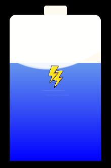
<!DOCTYPE html> <html> <head> <meta charset="UTF-8"> <title></title> <style> *{ margin: 0px; padding: 0px; } .box{ width: 800px; height: 800px; margin: 50px auto; background: black; position: relative; padding-top: 20px; } .battery{ width: 200px; height: 320px; background: floralwhite; margin: 50px auto; border-radius: 15px 15px 15px 15px; position: relative; }
.battery:before{ /*:before 选择器在被选元素的内容前面插入内容。*/ content: ""; width: 50px; height: 20px; background: floralwhite; position: absolute; top: -20px; left: 50%; margin-left: -25px; border-radius: 5px 5px 0px 0px; } .battery:after{ content: ""; position: absolute; left: 0; right: 0; top:100%; bottom: 0; background: linear-gradient(to top,blue,cornflowerblue); animation: charge 10s linear infinite;/*linear匀速*/ overflow: hidden;/*超出部分隐藏*/ } @keyframes charge{ 0%{ top: 100%;
}
5%{ top:95%; border-radius: 0px; }
95%{ top:5%; border-radius: 0px; }
100%{ top: 0%; border-radius: 15px 15px 0 0; } }
.cover{ width: 100%; height: 100%; position: absolute; left: 0; top: 0; border-radius: 15px 15px 10px 10px; z-index:1;/* z-index 是 1,因此它在文本的前面出现。*/ overflow: hidden;/*超出部分隐藏*/ }
.cover:before{ content: ""; width: 400px; height: 400px; background: rgba(255,255,255,0.8); position: absolute; border-radius: 40% 30%; left:-50% ; animation:coverBefore 10s linear infinite; overflow: hidden; }
.cover:after{ content: ""; width: 400px; height: 400px; background: rgba(255,255,255,0.6); position: absolute; border-radius: 42% 40%; left:-50% ; animation:coverBefore 10s linear infinite; overflow: hidden; } @keyframes coverBefore{ 0%{ transform: rotate(0deg); bottom: 0%;/*到底部的距离*/ } 100%{ transform: rotate(360deg); bottom: 100%; } } @keyframes coverAfter{ 0%{ transform: rotate(30deg); bottom: 3%; } 100%{ transform: rotate(0deg); bottom:95%; } } #t1{ position: absolute; left: 70px; top: 100px; z-index:3; } #t2{ position: absolute; left: 80px; top: 110px; z-index:2; }
</style> </head> <body> <div class="box"> <div class="battery"> <img src="img/shandian.png" alt="" width="50px" height="70px" align="center" id="t1"/> <img src="img/shandian.png" alt="" width="50px" height="70px" align="center" id="t2"/> <div class="cover"></div> </div> </div> </body> </html> |
