
很酷的CSS3仿Facebook登录表单
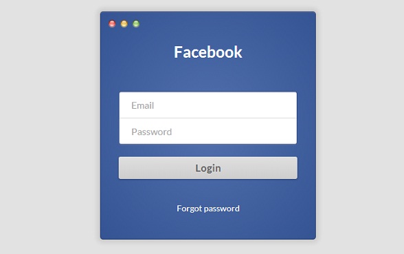
今天看到一款很不错的CSS3登录表单,外观是仿Facebook的登录表单,还挺不错的,另外也支持简单的表单输入框验证。下图是表单的效果图:
我们也可以在这里查看表单的DEMO演示。
接下来我们来分析一下这款表单的源代码,首先是HTML代码:
<section class="login-form-wrap">
        <h1>Facebook</h1>
        <form class="login-form" action="POST" action="#">
            <label>
                <input type="email" name="email" required placeholder="Email">
            </label>
            <label>
                <input type="password" name="password" required placeholder="Password">
            </label>
            <input type="submit" value="Login">
        </form>
        <h5><a href="#">Forgot password</a></h5>
    </section>
HTML代码很简单,就是构造了一个表单。
另外我们看到input元素中利用了required属性来便捷地验证输入的格式。
接下来是CSS3代码,这个漂亮的外观全靠它了:
.login-form-wrap {
  background: #5170ad;
  background: -moz-radial-gradient(center, ellipse cover, #5170ad 0%, #355493 100%);
  background: -webkit-gradient(radial, center center, 0px, center center, 100%, color-stop(0%, #5170ad), color-stop(100%, #355493));
  background: -webkit-radial-gradient(center, ellipse cover, #5170ad 0%, #355493 100%);
  background: -o-radial-gradient(center, ellipse cover, #5170ad 0%, #355493 100%);
  background: -ms-radial-gradient(center, ellipse cover, #5170ad 0%, #355493 100%);
  background: radial-gradient(ellipse at center, #5170ad 0%, #355493 100%);
  filter: progid:DXImageTransform.Microsoft.gradient(startColorstr='#5170ad', endColorstr='#355493',GradientType=1 );
  border: 1px solid #2d416d;
  box-shadow: 0 1px #5670a4 inset, 0 0 10px 5px rgba(0, 0, 0, 0.1);
  border-radius: 5px;
  position: relative;
  width: 360px;
  height: 380px;
  margin: 10px auto 20px auto;
  padding: 50px 30px 0 30px;
  text-align: center;
}
.login-form-wrap:before {
  background: url(http://i.imgur.com/0vLxyVB.png);
  display: block;
  content: '';
  width: 58px;
  height: 19px;
  top: 10px;
  left: 10px;
  position: absolute;
}
.login-form-wrap > h1 {
  margin: 0 0 50px 0;
  padding: 0;
  font-size: 26px;
  color: #fff;
}
.login-form-wrap > h5 {
  margin-top: 40px;
}
.login-form-wrap > h5 > a {
  font-size: 14px;
  color: #fff;
  text-decoration: none;
  font-weight: 400;
}

.login-form input[type="email"], .login-form input[type="password"] {
  width: 100%;
  border: 1px solid #314d89;
  outline: none;
  padding: 12px 20px;
  color: #afafaf;
  font-weight: 400;
  font-family: 'Lato', sans-serif;
  cursor: pointer;
}
.login-form input[type="email"] {
  border-bottom: none;
  border-radius: 4px 4px 0 0;
  padding-bottom: 13px;
  box-shadow: 0 -1px 0 #e0e0e0 inset, 0 1px 2px rgba(0, 0, 0, 0.23) inset;
}
.login-form input[type="password"] {
  border-top: none;
  border-radius: 0 0 4px 4px;
  box-shadow: 0 -1px 2px rgba(0, 0, 0, 0.23) inset, 0 1px 2px rgba(255, 255, 255, 0.1);
}
.login-form input[type="submit"] {
  font-family: 'Lato', sans-serif;
  font-weight: 400;
  background: #e0e0e0;
  background: -moz-linear-gradient(top, #e0e0e0 0%, #cecece 100%);
  background: -webkit-gradient(linear, left top, left bottom, color-stop(0%, #e0e0e0), color-stop(100%, #cecece));
  background: -webkit-linear-gradient(top, #e0e0e0 0%, #cecece 100%);
  background: -o-linear-gradient(top, #e0e0e0 0%, #cecece 100%);
  background: -ms-linear-gradient(top, #e0e0e0 0%, #cecece 100%);
  background: linear-gradient(to bottom, #e0e0e0 0%, #cecece 100%);
  filter: progid:DXImageTransform.Microsoft.gradient(startColorstr='#e0e0e0', endColorstr='#cecece',GradientType=0 );
  display: block;
  margin: 20px auto 0 auto;
  width: 100%;
  border: none;
  border-radius: 3px;
  padding: 8px;
  font-size: 17px;
  color: #636363;
  text-shadow: 0 1px 0 rgba(255, 255, 255, 0.45);
  font-weight: 700;
  box-shadow: 0 1px 3px 1px rgba(0, 0, 0, 0.17), 0 1px 0 rgba(255, 255, 255, 0.36) inset;
}
.login-form input[type="submit"]:hover {
  background: #DDD;
}
.login-form input[type="submit"]:active {
  padding-top: 9px;
  padding-bottom: 7px;
  background: #C9C9C9;
}
都是很普通的样式属性,也没什么可以解说的,就这样好了。
最后附上源代码,下载地址>>

 浙公网安备 33010602011771号