
map的点气泡:
<template>
<div class="c-map-dot animate" :class="mapBubbleData.colorType>0 ? 'style-3' : []" :style="positionObject">
<div class="c-map-dot-layer"></div>
<span class="c-map-dot-text left">{{mapBubbleData.city}}</span>
<!-- 气泡提示 start -->
<div class="c-bubble c-bubble-bottom c-map-bubble">
<div class="c-bubble-inner">
<h3 class="title">{{mapBubbleData.title}}</h3>
<p v-for="text in mapBubbleData.texts">{{text}}</p>
</div>
</div>
<!-- 气泡提示 end -->
</div>
</template>
<script>
export default {
props: {
mapBubbleData: Object
},
data() {
return {
positionObject: {
left: this.mapBubbleData.left,
top: this.mapBubbleData.top
}
};
}
};
</script>
<style lang="stylus" scoped>
body {
color: #333;
-webkit-tap-highlight-color: transparent;
}
.c-map-dot, .c-map-dot-explain-txt {
display: inline-block;
vertical-align: middle;
}
.c-map-dot {
position: absolute;
width: 20px;
height: 20px;
-webkit-box-shadow: inset #00a4ff 0 0 5px;
box-shadow: inset #00a4ff 0 0 5px;
border-radius: 50%;
cursor: pointer;
">f7f8fa;
}
.c-map-dot.animate:hover:after {
-webkit-animation: warn 2s ease-out 0.1s infinite;
animation: warn 2s ease-out 0.1s infinite;
}
.c-map-dot:after {
content: '';
position: absolute;
width: 20px;
height: 20px;
-webkit-box-shadow: inset #00a4ff 0 0 5px;
box-shadow: inset #00a4ff 0 0 5px;
border-radius: 50%;
top: 0;
left: 0;
opacity: 0;
}
.c-map-dot.style-3, .c-map-dot.style-3:after {
-webkit-box-shadow: inset #28c0be 0 0 5px;
box-shadow: inset #28c0be 0 0 5px;
}
.c-map-dot-layer {
width: 8px;
height: 8px;
position: absolute;
top: 50%;
left: 50%;
margin: -4px 0 0 -4px;
border-radius: 50%;
cursor: pointer;
opacity: 1;
}
.c-map-dot.style-3 .c-map-dot-layer {
}
.c-map-dot.animate:hover .c-map-dot-layer:after {
-webkit-animation: warn-2 2s ease-out 1.1s infinite;
animation: warn-2 2s ease-out 1.1s infinite;
}
.c-map-dot-layer:after {
content: '';
position: absolute;
width: 8px;
height: 8px;
-webkit-box-shadow: inset #00a4ff 0 0 5px;
box-shadow: inset #00a4ff 0 0 5px;
border-radius: 50%;
top: 0;
left: 0;
opacity: 0;
}
.c-map-dot-text.left {
left: auto;
right: 100%;
padding-left: 0;
padding-right: 5px;
}
.c-map-dot-text {
position: absolute;
left: 100%;
top: 0;
padding-left: 5px;
font-size: 14px;
line-height: 20px;
color: #111;
white-space: nowrap;
}
.c-map-dot.hover .c-map-bubble, .c-map-dot:hover .c-map-bubble {
opacity: 1;
visibility: visible;
-webkit-transform: translateY(0);
-ms-transform: translateY(0);
transform: translateY(0);
}
.c-map-bubble {
left: 50%;
bottom: 100%;
margin-left: -100px;
margin-bottom: 10px;
width: 200px;
text-align: center;
-webkit-transition: 0.3s all ease-out;
transition: 0.3s all ease-out;
opacity: 0;
visibility: hidden;
-webkit-transform: translateY(5px);
-ms-transform: translateY(5px);
transform: translateY(5px);
cursor: default;
pointer-events: none;
}
.c-bubble {
position: absolute;
color: #404A58;
z-index: 6;
}
.c-map-bubble .c-bubble-inner {
display: inline-block;
vertical-align: middle;
padding: 10px;
text-align: left;
border-color: #00a4ff;
font-size: 14px;
line-height: 24px;
color: #333;
}
.c-bubble-inner {
font-size: 12px;
-moz-box-sizing: border-box;
box-sizing: border-box;
padding: 8px 10px;
border: 1px solid #b3b7bf;
border-radius: 2px;
">fff;
line-height: 18px;
box-shadow: 1px 1px 3px rgba(0, 0, 0, 0.15);
position: static !important;
left: 50%;
top: 50%;
}
.c-map-bubble .title {
margin-bottom: 5px;
color: rgba(51, 51, 51, 0.8);
font-weight: 400;
}
.c-bubble .c-bubble-inner:after, .c-bubble .c-bubble-inner:before {
font-size: 0;
position: absolute;
width: 0;
height: 0;
content: '';
border: 8px dashed transparent;
}
.c-bubble-bottom .c-bubble-inner:before {
margin-left: -8px;
border-top-color: #b3b7bf;
}
.c-map-bubble .c-bubble-inner:before {
border-top-color: #00a4ff;
}
.c-bubble .c-bubble-inner:after {
border: 7px dashed transparent;
}
.c-bubble-bottom .c-bubble-inner:after, .c-bubble-bottom .c-bubble-inner:before {
top: 100%;
left: inherit;
right: inherit;
margin-top: -1px;
border-top-style: solid;
}
.c-bubble-bottom .c-bubble-inner:after {
margin-left: -7px;
border-top-color: #fff;
}
@keyframes warn-2 {
0% {
opacity: 0;
-webkit-transform: scale(0.1);
transform: scale(0.1);
}
5% {
opacity: 8;
}
to {
opacity: 0;
-webkit-transform: scale(10);
transform: scale(10);
}
}
@keyframes warn-2 {
0% {
opacity: 0;
-webkit-transform: scale(0.1);
transform: scale(0.1);
}
5% {
opacity: 8;
}
to {
opacity: 0;
-webkit-transform: scale(10);
transform: scale(10);
}
}
</style>
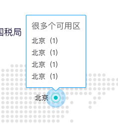
效果图:

 浙公网安备 33010602011771号