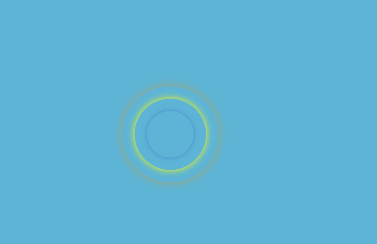
圆圈由小变大的动画效果
<!DOCTYPE html>
<html lang="zh">
    <head>
        <meta charset="UTF-8">
        <meta http-equiv="X-UA-Compatible" content="IE=edge">
        <meta name="viewport" content="width=device-width, initial-scale=1.0">
        <title>Document</title>
        <style>
            .container {

                position: relative;
                background-color: #5db4d6;
                width: 100%;
                height: 500px;
                margin: auto;
            }

            .cor {
                position: absolute;
                top: 50%;
                left: 50%;
                transform: translate(-50% -50%);
            }


            .cor .pulse {
                animation: warn1 2s linear 0.5s infinite;
                box-shadow: 0 0 5px yellow;
                /* 阴影效果 */

            }

            .cor .pulse1 {
                animation: warn1 2s linear 1s infinite;
                box-shadow: 0 0 5px rgb(65, 125, 202);
                /* 阴影效果 */

            }

            .cor .pulse2 {
                animation: warn1 2s linear 1.5s infinite;
                box-shadow: 0 0 5px rgb(67, 207, 79);
                /* 阴影效果 */

            }

            .cor .pulse3 {
                animation: warn1 2s linear 2s infinite;
                box-shadow: 0 0 5px rgb(216, 160, 40);
                /* 阴影效果 */

            }

            div[class^='pulse'] {
                position: absolute;
                width: 50px;
                height: 50px;
                left: 0;
                top: 0;
                /* border: 1px solid #9d9d9d; */
                -webkit-border-radius: 50%;
                -moz-border-radius: 50%;
                border-radius: 50%;
                z-index: 1;
                opacity: 0;
                // box-shadow: 0 0 10px #ccc; /* 阴影效果 */
            }

            @keyframes warn1 {
                0% {
                    transform: scale(1);
                    -webkit-transform: scale(1);
                    opacity: 0.5;
                }

                25% {
                    transform: scale(2);
                    -webkit-transform: scale(2);
                    opacity: 0.8;
                }

                50% {
                    transform: scale(3);
                    -webkit-transform: scale(3);
                    opacity: 1;
                }

                75% {
                    transform: scale(4);
                    -webkit-transform: scale(4);
                    opacity: 0.5;
                }

                100% {
                    transform: scale(5);
                    -webkit-transform: scale(5);
                    opacity: 0.0;
                }
            }
        </style>
    </head>
    <body>
        <div class="container">
            <div class="cor">
                <div class="pulse"></div>
                <div class="pulse1"></div>
                <div class="pulse2"></div>
                <div class="pulse3"></div>
            </div>
        </div>
    </body>
</html
效果如下:

 浙公网安备 33010602011771号