特殊border的样式 -- CSS3实现三种切角效果
效果一:
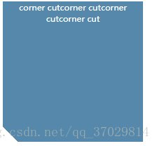
代码:<div class="cornerCut">corner cutcorner cutcorner cutcorner cut</div>
CSS:
.cornerCut{
width:200px;
margin: 10px 20px;
height: 200px;
background:#58a;
color:#fff;
text-align: center;
font-size:10px;
background:linear-gradient(45deg,transparent 15px, #58a 0);
}
效果二:
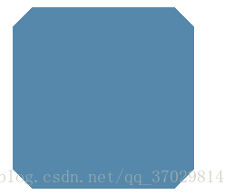
代码:<div class="cornerCut2"></div>
CSS:
.cornerCut2{
width:200px;
margin: 10px 20px;
height: 200px;
background:#58a;
background:linear-gradient(-45deg,transparent 15px, #58a 0) bottom right,
linear-gradient(45deg,transparent 15px, #58a 0) bottom left,
linear-gradient(135deg,transparent 15px, #58a 0) top left,
linear-gradient(-135deg,transparent 15px,#58a 0) top right;
background-size: 50% 50%;
background-repeat: no-repeat;
}
效果三:
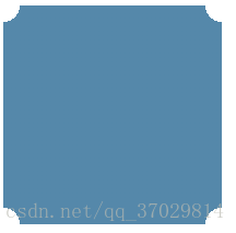
代码:<div class="cornerArc"></div>
CSS:
.cornerArc{
width:200px;
margin: 10px 20px;
height: 200px;
background:#58a;
background:radial-gradient(circle at top left,transparent 15px,#58a 0) top left,
radial-gradient(circle at top right,transparent 15px,#58a 0) top right,
radial-gradient(circle at bottom right,transparent 15px,#58a 0) bottom right,
radial-gradient(circle at bottom left,transparent 15px,#58a 0) bottom left;
background-size: 50% 50%;
background-repeat: no-repeat;
}
本文来自博客园,作者:喆星高照,转载请注明原文链接:https://www.cnblogs.com/houxianzhou/p/13953427.html
