python学习笔记9(地图、柱状图、sort函数、动态柱状图)
1. 折线图案例
对于大量数据,json的格式不规范,想要知道json的格式以及层次可以使用以下网站进行查看。P103~104
懒人工具-json 在线解析-在线JSON格式化工具-json校验-程序员必备 (ab173.com)
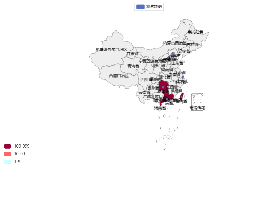
2.地图可视化
"""
地图可视化
"""
from pyecharts.charts import Map
from pyecharts.options import VisualMapOpts
# 准备地图对象
map = Map()
# 准备数据
data = [
    ("北京市", 99),
    ("上海市", 199),
    ("台湾省", 299),
    ("湖南省", 399),
    ("广东省", 499)
]
# 添加数据
map.add("测试地图", data, "china")  # 默认也是显示中国地图
# 设置全局选项
map.set_global_opts(
    visualmap_opts=VisualMapOpts(
        is_show=True,
        is_piecewise=True,
        pieces=[
            {"min": 1, "max": 9, "label": "1-9", "color": "#CCFFFF"},
            {"min": 10, "max": 99, "label": "10-99", "color": "#FF6666"},
            {"min": 100, "max": 999, "label": "100-999", "color": "#990033"}
        ]
    )
)

# 绘图
map.render()
3.全国疫情地图
4.河南省疫情地图
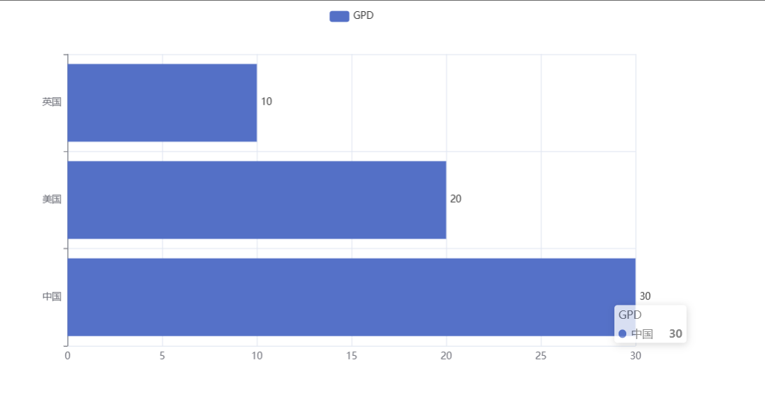
5.基础柱状图
"""
基础柱状图
"""
from pyecharts.charts import Bar
from pyecharts.options import LabelOpts
# 使用Bar构想柱状图
bar = Bar()
# 添加x轴数据
bar.add_xaxis(["中国", "美国", "英国"])
# 添加y轴数据
# bar.add_yaxis("GPD", [30, 20, 10])
# 如果在反转xy轴之后,希望这个30,20,10这些数据是显示在右侧
bar.add_yaxis("GPD", [30, 20, 10], label_opts=LabelOpts(position="right"))

# 反转xy轴
bar.reversal_axis()

# 绘图
bar.render("基础柱状图.html")
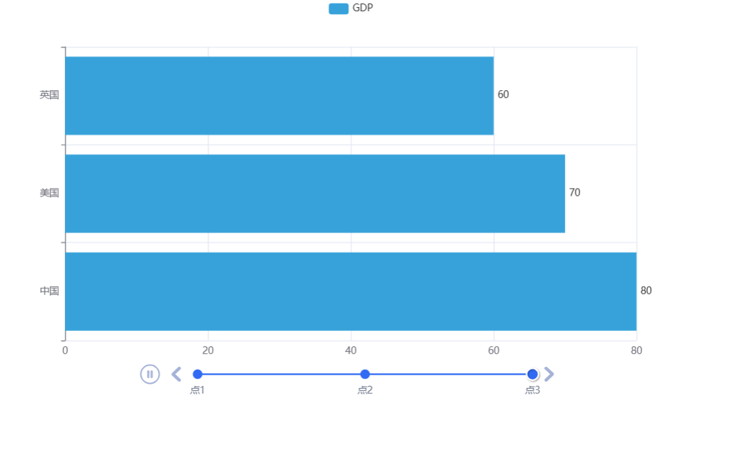
6.基础时间线柱状图
1.自动播放设置 2.主题设置
from pyecharts.charts import Bar, Timeline
from pyecharts.options import LabelOpts
from pyecharts.globals import ThemeType

bar1 = Bar()
bar1.add_xaxis(["中国", "美国", "英国"])
bar1.add_yaxis("GDP", [30, 30, 10], label_opts=LabelOpts(position="right"))
bar1.reversal_axis()

bar2 = Bar()
bar2.add_xaxis(["中国", "美国", "英国"])
bar2.add_yaxis("GDP", [50, 50, 50], label_opts=LabelOpts(position="right"))
bar2.reversal_axis()

bar3 = Bar()
bar3.add_xaxis(["中国", "美国", "英国"])
bar3.add_yaxis("GDP", [80, 70, 60], label_opts=LabelOpts(position="right"))
bar3.reversal_axis()

# 构建时间线对象
# 在构建时间线对象的时候可以设置主题
timeline = Timeline(
    {
        "theme": ThemeType.LIGHT
    }
)
# 在时间内添加柱状图
timeline.add(bar1, "点1")
timeline.add(bar2, "点2")
timeline.add(bar3, "点3")
# 自动播放设置
timeline.add_schema(
    play_interval=1000,   # 1000毫秒
    is_timeline_show=True,  # 是否显示时间线
    is_auto_play=True,  # 是否自动播放
    is_loop_play=True   # 是否循环播放
)
# 主题设置

# 绘图,用timeline而不是bar
timeline.render("基础时间柱状图.html")
7. sort函数
# 准备列表
my_list = [["a", 33], ["b", 55], ["c", 11]]


# 方法1,基于带名函数
'''
def choose_sort_key(element):
    return element[1]


my_list.sort(key=choose_sort_key, reverse=True)
print(my_list)
'''
# 方法2,匿名函数
my_list.sort(key=lambda element: element[1], reverse=True)
print(my_list)
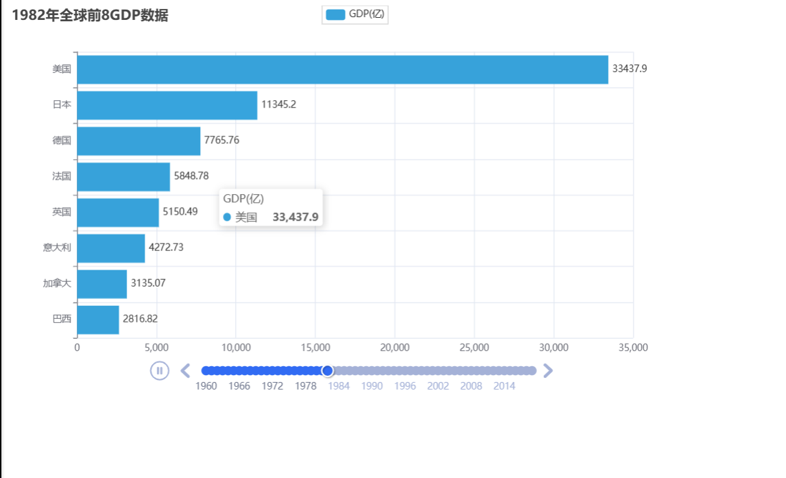
8.动态GDP柱状图
1.数据准备
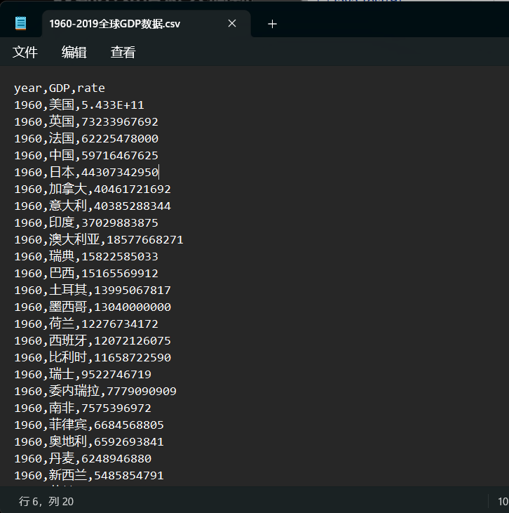
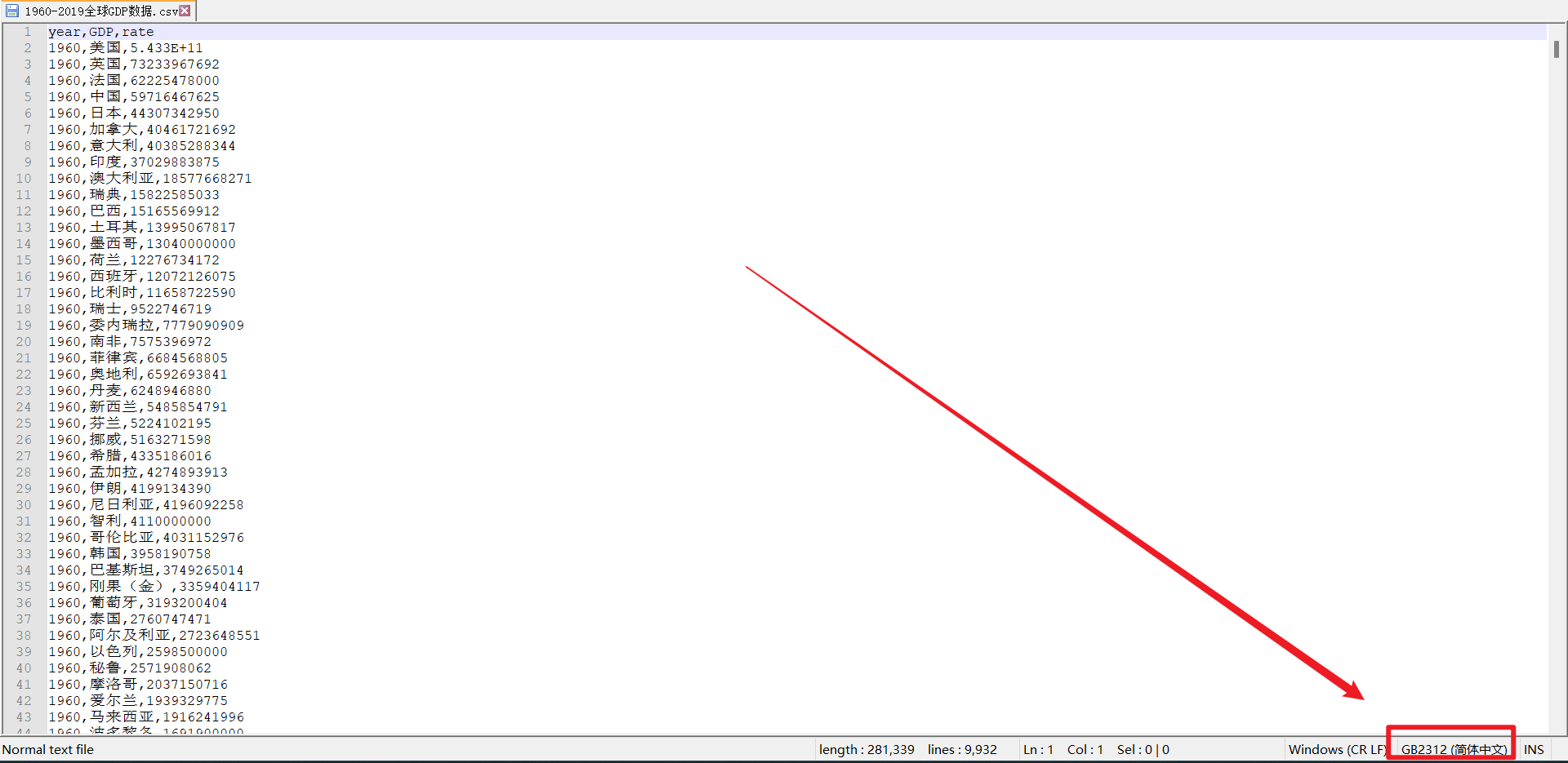
建议使用notepad++打开,可以看见文件的编码格式
"""
动态GDP柱状图绘制
"""
from pyecharts.charts import Bar, Timeline
from pyecharts.globals import ThemeType
from pyecharts.options import *

# 读取数据,注意文件要用什么编码格式打开,我的文件需要用GB2312的编码格式打开
f = open("D:/ppycharm/work/my_file/资料/可视化案例数据/动态柱状图数据/1960-2019全球GDP数据.csv", "r", encoding="GB2312")
data_lines = f.readlines()
# 关闭文件
f.close()
# 在文件中第一行数据没有用,进行删除
data_lines.pop(0)
# 将数据转换为字典
data_dict = {}
for line in data_lines:
    year = int(line.split(",")[0])
    country = line.split(",")[1]
    gdp = float(line.split(",")[2])
    # 判断字典里面是否有指定的key
    try:
        data_dict[year].append([country, gdp])
    except KeyError:
        data_dict[year] = []
        data_dict[year].append([country, gdp])
# 创建时间轴对象
timeline = Timeline({"theme": ThemeType.LIGHT})
# 排序年份
sorted_year_list = sorted(data_dict.keys())
for year in sorted_year_list:
    # 排序gdp
    data_dict[year].sort(key=lambda element: element[1], reverse=True)
    # 取出前八名,切片
    year_data = data_dict[year][0:8]
    x_data = []
    y_data = []
    for country_gdp in year_data:
        x_data.append(country_gdp[0])
        y_data.append(country_gdp[1]/100000000)

    # 构建柱状图

    bar = Bar()
    x_data.reverse()
    y_data.reverse()
    bar.add_xaxis(x_data)
    bar.add_yaxis("GDP(亿)", y_data, label_opts=LabelOpts(position="right"))
    # 反转xy轴
    bar.reversal_axis()
    # 设置标题
    bar.set_global_opts(
        title_opts=TitleOpts(title=f"{year}年全球前8GDP数据")
    )
    # 添加时间线
    timeline.add(bar, str(year))
    # 添加自动播放
    timeline.add_schema(
        play_interval=1000,
        is_timeline_show=True,
        is_auto_play=True,
        is_loop_play=False
    )
# 绘图
timeline.render("1960-2019全球GDP前8国家.html")