html 、css 实现上升的气球
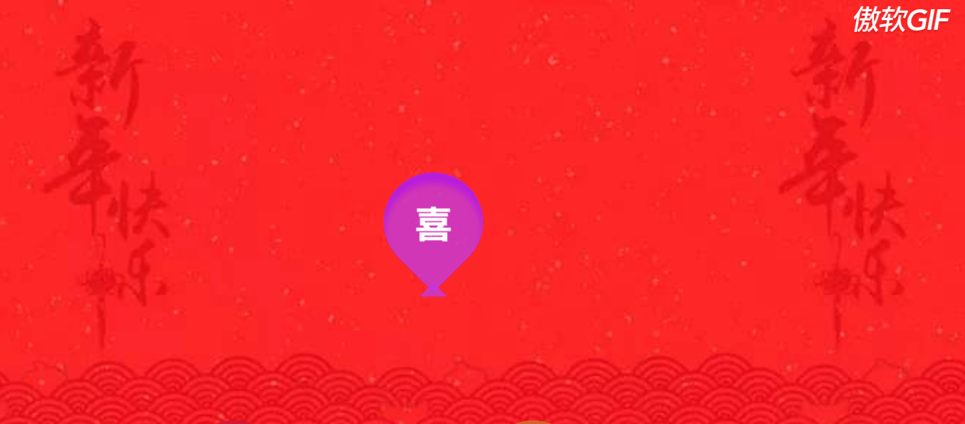
先来看看效果图!
HTML代码:
    <div id="wrap">
        <div class="balloon">
            <h2>!</h2>
        </div>
        <div class="balloon">
            <h2>恭</h2>
        </div>
        <div class="balloon">
            <h2>喜</h2>
        </div>
        <div class="balloon">
            <h2>发</h2>
        </div>
        <div class="balloon">
            <h2>财</h2>
        </div>
        <div class="balloon">
            <h2>!</h2>
        </div>
    </div>
css代码:
  1 :root {
  2     --w: 140px;
  3     --half: calc(var(--w) / 2);
  4 }
  5
  6 body {
  7     margin: 0;
  8     background: #dfd3c3 url(../images/timg.jpg);
  9     background-size: cover;
 10 }
 11
 12 #wrap {
 13     height: 100vh;
 14     display: flex;
 15     justify-content: center;
 16     padding-top: 20px;
 17     box-sizing: border-box;
 18     overflow: hidden;
 19 }
 20
 21 .balloon {
 22     width: var(--w);
 23     height: var(--w);
 24     background: green;
 25     border-radius: var(--half) var(--half) 0 var(--half);
 26     /* transform是从后往前执行 */
 27     transform: rotate(45deg) translate(100vh, 100vh);
 28     /* transform: translate(10vh,10vh) rotate(45deg); */
 29     position: relative;
 30     display: flex;
 31     justify-content: center;
 32     align-items: center;
 33 }
 34
 35 .balloon h2 {
 36     color: #fff;
 37     font-size: 50px;
 38     transform: rotate(-45deg);
 39 }
 40
 41 .balloon:before {
 42     content: '';
 43     width: 0;
 44     height: 0;
 45     position: absolute;
 46     bottom: -10px;
 47     right: -10px;
 48     transform: rotate(45deg);
 49
 50     border: 20px solid;
 51     border-color: transparent #000 transparent transparent;
 52 }
 53 .balloon:nth-child(1){
 54     background: rgba(182, 15, 97, 0.5);
 55     box-shadow: inset 10px 10px 10px rgba(135,11,72,0.5);
 56
 57     /* animation-fill-mode: forwards; */
 58     animation: rise 2s forwards,fly1 6s 2s ease-in-out infinite;
 59 }
 60 .balloon:nth-child(1):before{
 61     border-color: transparent rgba(182, 15, 97, 0.7) transparent transparent;
 62 }
 63 .balloon:nth-child(2){
 64     background: rgba(45,181,167,0.7);
 65     box-shadow: inset 10px 10px 10px rgba(35,140,129,0.7);
 66
 67     animation: rise 3s forwards,fly4 6s 3s ease-in-out infinite;
 68 }
 69 .balloon:nth-child(2):before{
 70     border-color: transparent rgba(45,181,167,0.7) transparent transparent;
 71 }
 72 .balloon:nth-child(3){
 73     background: rgba(190,61,244,0.7);
 74     box-shadow: inset 10px 10px 10px rgba(173,14,240,0.7);
 75
 76     animation: rise 1s forwards,fly1 5s 1s ease-in-out infinite;
 77 }
 78 .balloon:nth-child(3):before{
 79     border-color: transparent rgba(190,61,244,0.7) transparent transparent;
 80 }
 81 .balloon:nth-child(4){
 82     background: rgba(180,224,67,0.7);
 83     box-shadow: inset 10px 10px 10px rgba(158,206,34,0.7);
 84
 85     animation: rise 2s forwards,fly3 5s 2s ease-in-out infinite;
 86 }
 87 .balloon:nth-child(4):before{
 88     border-color: transparent rgba(180,224,67,0.7) transparent transparent;
 89 }
 90 .balloon:nth-child(5){
 91     background: rgba(242,194,58,0.7);
 92     box-shadow: inset 10px 10px 10px rgba(234,177,15,0.7);
 93
 94     animation: rise 4s forwards,fly2 4s 4s ease-in-out infinite;
 95 }
 96 .balloon:nth-child(5):before{
 97     border-color: transparent rgba(242,194,58,0.7) transparent transparent;
 98 }
 99 .balloon:nth-child(6){
100     background: rgba(242,112,45,0.7);
101     box-shadow: inset 10px 10px 10px rgba(222,85,14,0.7);
102
103     animation: rise 3s forwards,fly2 6s 5s ease-in-out infinite;
104 }
105 .balloon:nth-child(6):before{
106     border-color: transparent rgba(242,112,45,0.7) transparent transparent;
107 }
108
109 /* 气球上升 */
110 @keyframes rise{
111     100%{
112         transform: rotate(45deg) translate(0,0);
113     }
114 }
115
116 /* 气球运动轨迹,4种 */
117 @keyframes fly1{
118     0%,100%{
119         transform: rotate(45deg) translateY(0);
120     }
121     50%{
122         transform: rotate(53deg) translateY(-20px);
123     }
124 }
125
126 @keyframes fly2{
127     0%,100%{
128         transform: rotate(45deg) translateY(0);
129     }
130     50%{
131         transform: rotate(37deg) translateY(-30px);
132     }
133 }
134
135 @keyframes fly3{
136     0%,100%{
137         transform: rotate(45deg) translateY(0);
138     }
139     50%{
140         transform: rotate(37deg) translate(-20px,-30px);
141     }
142 }
143
144 @keyframes fly4{
145     0%,100%{
146         transform: rotate(45deg) translateY(0);
147     }
148     50%{
149         transform: rotate(55deg) translate(-15px,-10px);
150     }
151 }
背景图:
*:ஐ٩(๑´ᵕ`)۶ஐ:* 学习使我进步
欢迎留言讨论哦!