手写垂直居中
参考:
- https://www.cnblogs.com/zhupengcheng/p/11416034.html
- https://blog.csdn.net/fun_enjoy/article/details/100024077
- https://cloud.tencent.com/developer/article/1710943
七种垂直居中的方法
- 设定行高(line-height)
- 添加伪元素
- calc动态计算
- 使用表格或假装表格
- transform
- 绝对定位
- 使用Flexbox
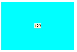
0 单行行内元素设置行高(适用于单行标题这种场景)
给父元素设置text-align:center可以实现文本、图片等行内元素的水平居中
<!DOCTYPE html>
<html>
	<head>
		<meta charset="UTF-8" />
		<title>CENTER</title>
		<style>
			.box {
				width: 300px;
				height: 200px;
				background-color: aqua;
				text-align: center;
			}
			.child {
				line-height: 200px;
				background-color: beige;
			}
		</style>
	</head>
	<body>
		<div class="box">
			<span class="child">123</span>
		</div>
	</body>
</html>
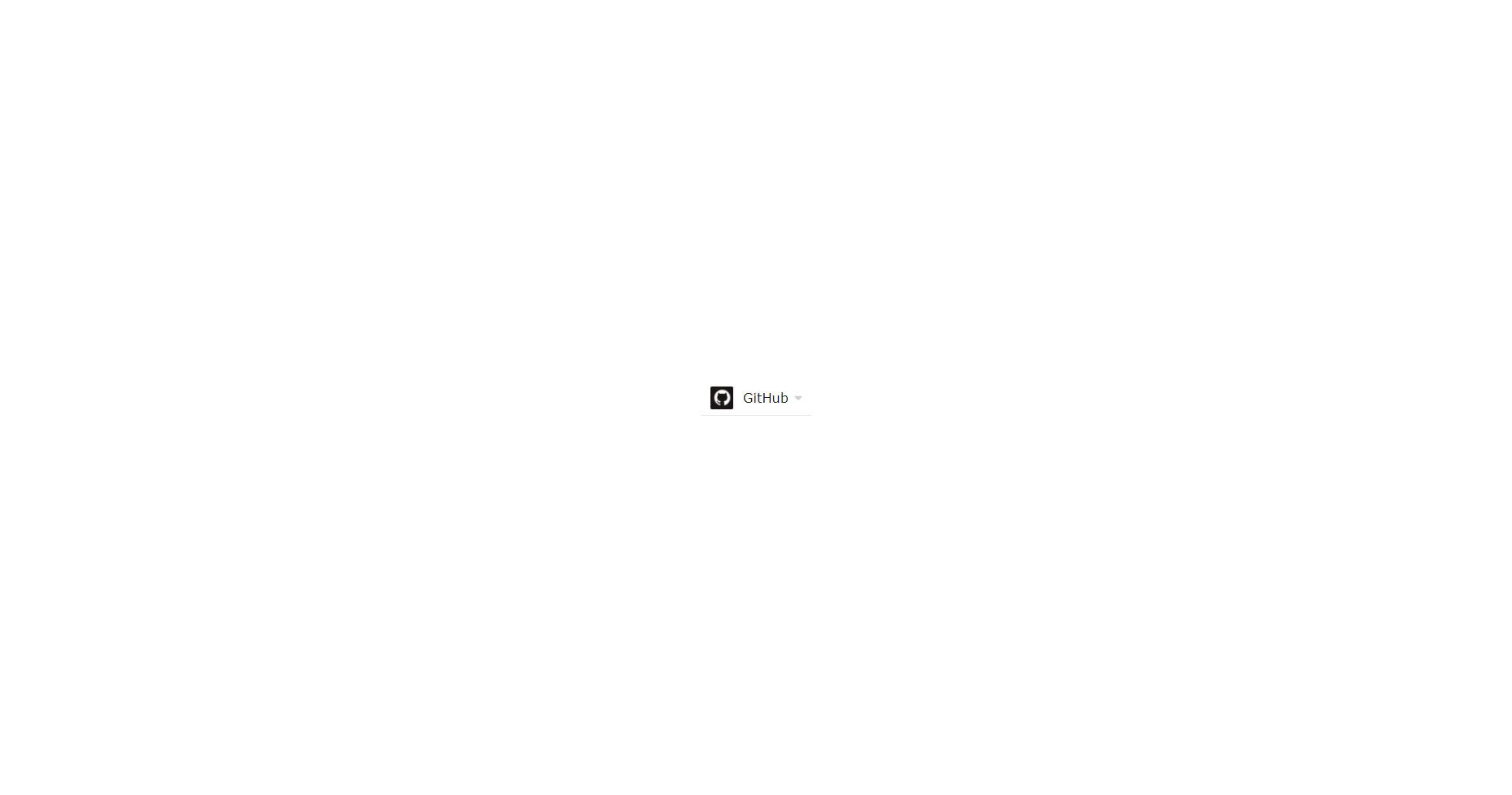
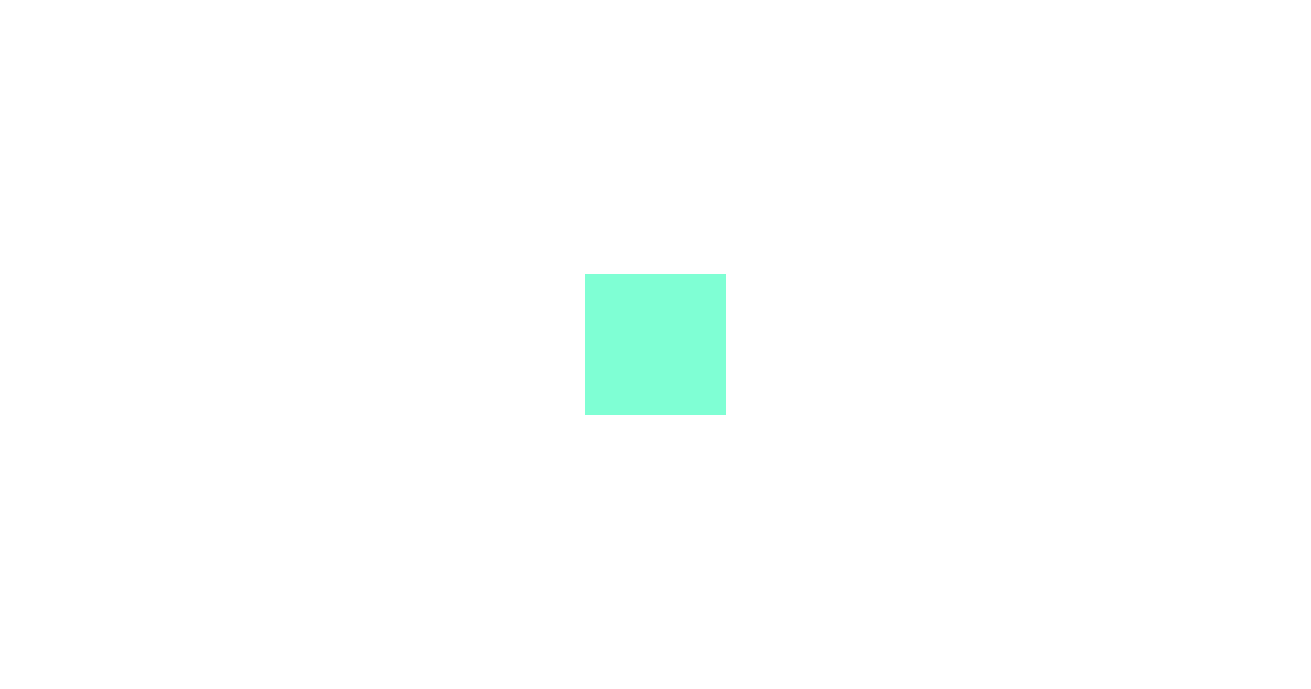
1 table布局
场景:子元素有宽度
垂直居中:母元素 display 属性设置为 table-cell,vertical-align 属性设置为 middle
水平居中:子元素 margin: 0 auto
PS:vertical-align:middle;是针对行内元素。vertical-align这个属性,这个属性虽然是垂直居中,不过却是子元素之间互相垂直居中,并不是相对于母元素
PS: 修改display有时候也会造成其他样式属性的连动影响,需要比较小心使用。
<!DOCTYPE html>
<html>
	<head>
		<meta charset="UTF-8" />
		<title>CENTER</title>
		<style>
			.mother {
				width: 200px;
				height: 200px;
				background-color: antiquewhite;
				display: table-cell;
				vertical-align: middle;
			}
			.child {
				width: 50px;
				height: 50px;
				background-color: aquamarine;
				margin: 0 auto;
			}
		</style>
	</head>
	<body>
		<div class="mother">
			<div class="child">123</div>
		</div>
	</body>
</html>
2 已知大小/未知大小
2.0 未知大小的元素在浏览器可视窗口中水平垂直居中
2.0.1 绝对定位时,top bottom 才可以自动分配
<!DOCTYPE html>
<html>
	<head>
		<meta charset="UTF-8" />
		<title>CENTER</title>
		<style>
			.child {
				position: fixed;
				left: 0;
				right: 0;
				top: 0;
				bottom: 0;
				margin: auto;
			}
		</style>
	</head>
	<body>
		<img class="child" alt="" src="./img.png" />
	</body>
</html>
2.0.2 transform:translate(-50%,-50%)
<!DOCTYPE html>
<html>
	<head>
		<meta charset="UTF-8" />
		<title>CENTER</title>
		<style>
			.child {
                position: fixed;
                left: 50%;
                top: 50%;
                transform: translate(-50%,-50%);
			}

		</style>
	</head>
	<body>
		<!-- <div class="box"> -->
			<img class="child" src="./img.png"></img>
		<!-- </div> -->
	</body>
</html>
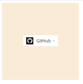
2.1 未知大小的元素在父元素中水平垂直居中
2.1.0 母元素 display 设置为 table-cell,水平和垂直设置居中。
<!DOCTYPE html>
<html>
	<head>
		<meta charset="UTF-8" />
		<title>CENTER</title>
		<style>
			.mother {
				width: 300px;
				height: 300px;
				background-color: antiquewhite;
				display: table-cell;
				text-align: center;
				vertical-align: middle;
			}
		</style>
	</head>
	<body>
		<div class="mother">
			<img src="./img.png" alt="" />
		</div>
	</body>
</html>
2.1.1 transform:translate(-50%,-50%)同样可以居中
<!DOCTYPE html>
<html>
	<head>
		<meta charset="UTF-8" />
		<title>CENTER</title>
		<style>
			.box{
                position: relative;
                width: 300px;
                height: 200px;
                background-color: aquamarine;
            }
            .child{
                position: absolute;
               left: 50%;
               top: 50%;
               transform: translate(-50%,-50%);
            }

		</style>
	</head>
	<body>
		<div class="box">
			<img class="child" src="./img.png"></img>
		</div>
	</body>
</html>
2.2 已知大小的元素在浏览器可视窗口中水平垂直居中
(因为已知大小,所以可以通过把margin设置为负的一半宽度和负的一半高度、来实现居中)
<!DOCTYPE html>
<html>
	<head>
		<meta charset="UTF-8" />
		<title>CENTER</title>
		<style>
            *{
                padding: 0;
                margin: 0;
            }
			.child {
				width: 200px;
                height: 200px;
                background-color: aquamarine;
                position: fixed;
                top: 50%;
                left: 50%;
                margin: -100px 0px 0px -100px;
			}
		</style>
	</head>
	<body>
		<div class="child"></div>
	</body>
</html>
2.3 已知大小的元素在父元素中水平垂直居中
子元素绝对定位、父元素相对定位。(因为已知大小,所以可以通过把margin设置为负的一半宽度和负的一半高度、来实现居中)
<!DOCTYPE html>
<html>
	<head>
		<meta charset="UTF-8" />
		<title>CENTER</title>
		<style>
			.mother {
				width: 300px;
				height: 300px;
				background-color: antiquewhite;
				position: relative;
			}
			.child {
				width: 100px;
				height: 100px;
				background-color: aquamarine;
				position: absolute;
				left: 50%;
				top: 50%;
				margin: -50px 0px 0px -50px;
			}
		</style>
	</head>
	<body>
		<div class="mother">
			<div class="child"></div>
		</div>
	</body>
</html>
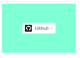
3 flex实现垂直居中
justify-content:主轴上的排列方式。默认值是flex-start,从主轴左边开始。
align-items:交叉轴上的排列方式。默认值是stretch,项目将被拉伸以适合容器。
<!DOCTYPE html>
<html>
	<head>
		<meta charset="UTF-8" />
		<title>CENTER</title>
		<style>
			.mother {
				width: 300px;
				height: 300px;
				background-color: antiquewhite;
				display: flex;
				align-items: center;
				justify-content: center;
			}
		</style>
	</head>
	<body>
		<div class="mother">
			<img src="./img.png" alt="" />
		</div>
	</body>
</html>
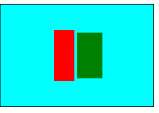
4 伪元素(::before、::after)
PS:单冒号(:)用于CSS3伪类,双冒号(::)用于CSS3伪元素
<!DOCTYPE html>
<html>
	<head>
		<meta charset="UTF-8" />
		<title>CENTER</title>
		<style>
			* {
				margin: 0px;
				padding: 0px;
			}
			.box {
				width: 300px;
				height: 200px;
				background-color: aqua;
				border: 1px solid black;
				text-align: center;
			}
			.child1 {
				display: inline-block;
				width: 40px;
				height: 100px;
				background-color: red;
				vertical-align: middle;
			}
			.child2 {
				display: inline-block;
				width: 50px;
				height: 90px;
				background-color: green;
				vertical-align: middle;
			}
			.box::before {
				content: "";
				width: 0px;
				height: 100%;
				display: inline-block;
				vertical-align: middle;
				background-color: brown;
			}
		</style>
	</head>
	<body>
		<div class="box">
			<div class="child1"></div>
			<div class="child2"></div>
		</div>
	</body>
</html>
PS 为什么margin: auto不能实现垂直居中
参考:
- https://blog.csdn.net/weixin_45954775/article/details/109222692
- https://cloud.tencent.com/developer/article/1018858
W3C规定,只有绝对定位的元素,才可以实现top bottom的自动分配
提是要找到margin的可以参照的边界点,所以要设置top,bottom,left,right为0,这样元素就可以找到边界,从而实现水平垂直居中
position属性值
-
fixed:生成绝对定位的元素,相对浏览器窗口进行定位(位置可通过:left,right,top,bottom改变);与文档流无关,不占据空间(可能与其它元素重叠)
-
relative:生成相对定位的元素(相对于元素正常位置)(left,right,top,bottom);relative的元素经常用作absolute的元素的容器块;原先占据的空间依然保留
-
absolute:生成绝对定位的元素(相对第一个已定位的父元素进行定位;若没有则相对)(left,right,top,bottom);与文档流无关,不占据空间(可能与其它元素重叠)
-
static:默认值。没有定位,元素出现在正常的文件流中(left,right,top,bottom,z-index无效!)
-
inherit:继承从父元素的position值
vertical-align
行内元素的水平垂直对齐方式
https://www.w3school.com.cn/cssref/pr_pos_vertical-align.asp
默认值: baseline: 元素放置在父元素的基线上。
middle: 把此元素放置在父元素的中部。

