echarts属性的设置
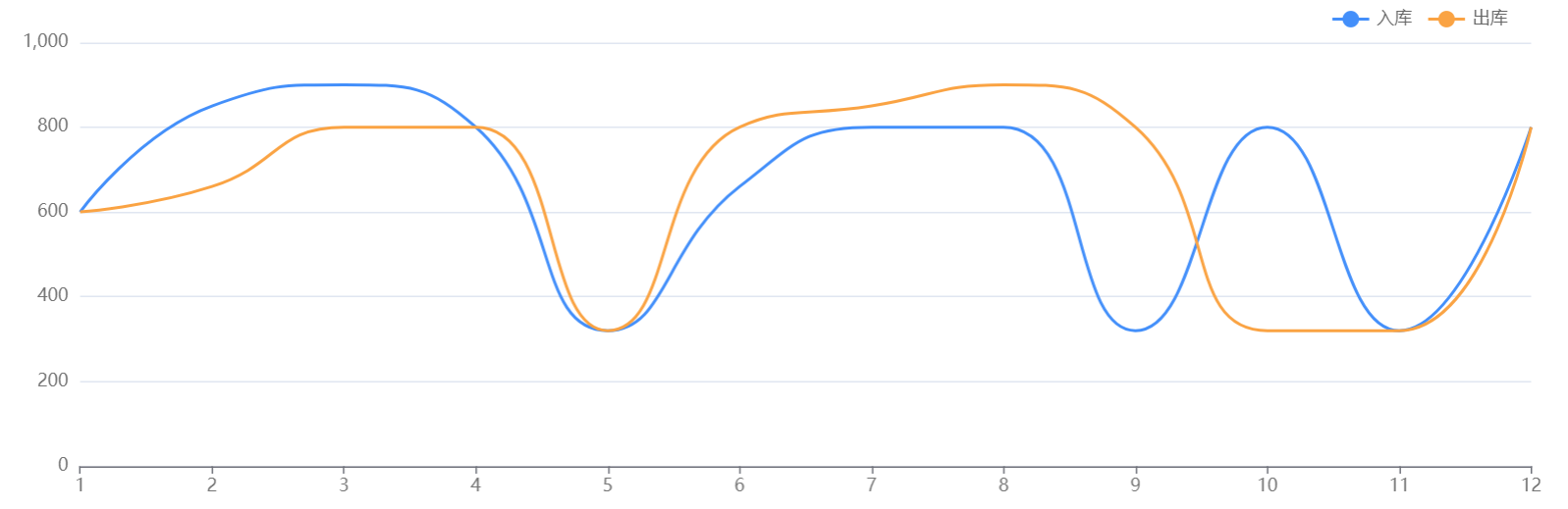
折线图
效果:
代码:


      let option = {
        tooltip: {
          transitionDuration: 0,
          trigger: 'axis'
        },
        legend: {
          data: ['入库', '出库'],
          right: '4%',
          textStyle: {
            fontSize: 12,
            color: '#666666'
          }
        },
        grid: {
          top: '8%',
          left: '3%',
          right: '3%',
          bottom: '0%',
          containLabel: true
        },
        xAxis: {
          type: 'category',
          boundaryGap: false,
          data: ['1', '2', '3', '4', '5', '6', '7', '8', '9', '10', '11', '12'],
          axisLabel: {//X轴文字
            // interval: 0,//跨度
            showMinLabel: true,
            showMaxLabel: true,
            show: true,
            textStyle: {
              color: "#747474",
              fontSize: '12',
            },
          },
        },
        yAxis: {//Y轴文字
          type: 'value',
          axisLabel: {
            show: true,
            textStyle: {
              color: "#747474",
              fontSize: '12',
            },
          },
        },
        series: [
          {
            name: "入库",
            type: 'line',
            smooth: true,//折线弧度
            symbol: 'none',//不显示点
            data: [600, 850, 900, 800, 320, 660, 800, 800, 320, 800, 320, 800],
            itemStyle: {
              normal: {
                color: '#438FFA'
              }
            }
          },
          {
            name: "出库",
            type: 'line',
            smooth: true,//折线弧度
            symbol: 'none',//不显示点
            data: [600, 660, 800, 800, 320, 800, 850, 900, 800, 320, 320, 800],
            itemStyle: {
              normal: {
                color: '#FAA343'
              }
            }
          }
        ]
      };
复杂:
      let option = {
        tooltip: {
          transitionDuration: 0,
          trigger: 'axis'
        },
        legend: {
          data: ['正常', '误报'],
          textStyle: {
            color: "#80A3FF",//图列文字颜色
          }
        },
        grid: {
          top: '5%',
          left: '3%',
          right: '8%',
          bottom: '8%',
          containLabel: true
        },
        xAxis: {
          type: 'category',
          boundaryGap: false,
          data: ['22', '23', '24', '25', '26', '27', '28'],
          axisLabel: {//X轴文字
            interval: 0,//跨度
            rotate: 25, //x轴文字倾斜展示
            showMinLabel: true,
            showMaxLabel: true,
            show: true,
            textStyle: {
              color: "#747474",
              fontSize: '12',
            },
          },
          axisLine: {//X轴轴线
            show: true,
            lineStyle: {
              color: "rgba(255,255,255,.1)",
              width: 1,
              type: "solid"
            },
          },
        },
        yAxis: {//Y轴文字
          name: '温度',
          nameTextStyle: {//y轴上方单位的颜色
            color: '#fff'
          },
          type: 'value',
          axisLabel: {
            show: true,
            textStyle: {
              color: "#747474",
              fontSize: '12',
            },
          },
          axisLine: {//Y轴轴线
            show: true,
            lineStyle: {
              color: "rgba(255,255,255,.1    )",
              width: 1,
              type: "solid"
            },
          },
          splitLine: {//内容横线
            lineStyle: {
              color: "rgba(255,255,255,.1)",
            }
          }
        },
        series: [
          {
            name: "正常",
            type: 'line',
            smooth: true,//折线弧度
            data: [600, 850, 900, 800, 320, 660, 800],
            itemStyle: {
              normal: {
                color: '#C4C4C4'
              }
            }
          }
        ]
      };
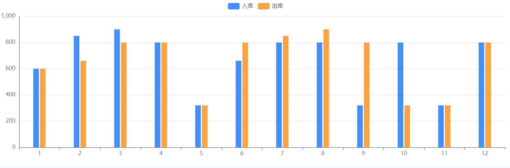
柱状图
效果:
代码:
      let option = {
        tooltip: {
          trigger: 'axis',//触发类型,坐标轴触发
          axisPointer: {
            type: 'shadow'
          }
        },
        grid: {
          left: "0",
          right: "1%",
          bottom: "0",
          top: "10%",
          containLabel: true,
        },
        color: ['#438FFA', '#FAA343'],//颜色
        legend: {
          data: ['入库', '出库'],
        },
        xAxis: {
          type: "category",
          data: ['1', '2', '3', '4', '5', '6', '7', '8', '9', '10', '11', '12'],
        },
        yAxis: {
          type: "value",
          axisLine: {
            //Y轴轴线
            show: true,
          },
        },
        series: [{
          name: "入库",
          data: [600, 850, 900, 800, 320, 660, 800, 800, 320, 800, 320, 800],
          type: "bar",
          barWidth: 12, //宽度
        }, {
          name: "出库",
          data: [600, 660, 800, 800, 320, 800, 850, 900, 800, 320, 320, 800],
          type: "bar",
          barWidth: 12, //宽度
        },
        ],
      };
复杂:
let option = {
        grid: {
          left: "0",
          right: "1%",
          bottom: "0",
          top: "11%",
          containLabel: true,
        },
        xAxis: {
          type: "category",
          data: ['吾悦广场', '罗阳大厦', '罗阳大厦', '罗阳大厦', '罗阳大厦', '罗阳大厦',],
          axisLabel: {
            //X轴文字
            interval: 0,
            // rotate: 25,//x轴文字倾斜展示
            show: true,
            textStyle: {
              color: "#59BFFF",
              fontSize: "12",
            },
          },
          axisLine: {
            //X轴轴线
            show: true,
            lineStyle: {
              color: "rgba(255,255,255,.1)",
              width: 1,
              type: "solid",
            },
          },
        },
        yAxis: {
          type: "value",
          axisLabel: {
            show: true,
            textStyle: {
              color: "#59BFFF",
            },
          },
          axisLine: {
            //Y轴轴线
            show: true,
            lineStyle: {
              color: "rgba(255,255,255,.1)",
              width: 1,
              type: "solid",
            },
          },
          splitLine: {
            //内容横线
            lineStyle: {
              color: "rgba(255,255,255,.1)",
            },
          },
        },
        series: [{
          data: [16, 12, 8, 8, 6, 5],
          type: "bar",
          barWidth: 25, //宽度
          itemStyle: {
            normal: {
              color: new echarts.graphic.LinearGradient(0, 0, 0, 1, [{
                offset: 0,
                color: "#12287F", // 高处的颜色
              }, {
                offset: 0.5,
                color: "#1E4597", // 中间的颜色
              }, {
                offset: 1,
                color: "#285EAC", // 低处的颜色
              },]), //背景渐变色
              lineStyle: {
                // 系列级个性化折线样式
                color: "#AF8E3E",
              },
            },
          },
        },],
      };
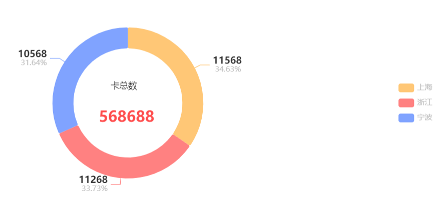
环状图
效果:
代码:
      let option = {
        tooltip: {
          trigger: 'item',
          formatter: '{a} <br/>{b}: {c} ({d}%)'
        },
        color: ['#FFC776', '#FF8181', '#80A3FF'],//颜色
        legend: {//图列
          right: '1%',//图例位置
          top: 'center',
          orient: 'vertical',
          data: ['上海', '浙江', '宁波'],
          textStyle: {//文字
            color: "#BCBCBC",
          },
        },
        graphic: [{
          type: 'text',
          //   left: '37.5%',
          right: '58.3%',
          top: '40%',
          z: 10,
          style: {
            fill: '#1a1a1a',
            text: '卡总数',
            textAlign: 'center',
            font: '14px Microsoft YaHei'
          }
        }],
        title: {
          show: true,
          text: 568688,//要显示的文本
          left: '33.8%',
          top: '52%',
          textStyle: {
            color: "#FF4D4D",
            fontWeight: "bold",
            fontSize: "24",
          },
        },
        series: [
          {
            name: '',
            type: 'pie',
            radius: ['52%', '72%'],//圆环的宽度,及圆环的大小
            center: ['40%', '50%'],//圆环的位置
            avoidLabelOverlap: false,
            itemStyle: {
              borderRadius: 2,//块的弧度
            },
            label: {
              // formatter: '{b|{b}} {c|{c}}\n {per|{d}%}',
              formatter: '{c|{c}}\n {per|{d}%}',
              rich: {
                b: {
                  color: '#333333',
                  fontSize: 12,
                  lineHeight: 33
                },
                c: {
                  color: '#333333',
                  fontSize: 15,
                  fontWeight: 'bold',
                },
                per: {
                  color: '#C2C2C2',
                  fontSize: 12,
                }
              }
            },
            labelLine: {//描述连线
              length: 10,
            },
            data: [{ value: 11568, name: '上海' }, { value: 11268, name: '浙江' }, { value: 10568, name: '宁波' }],
          }
        ]
      };
效果:
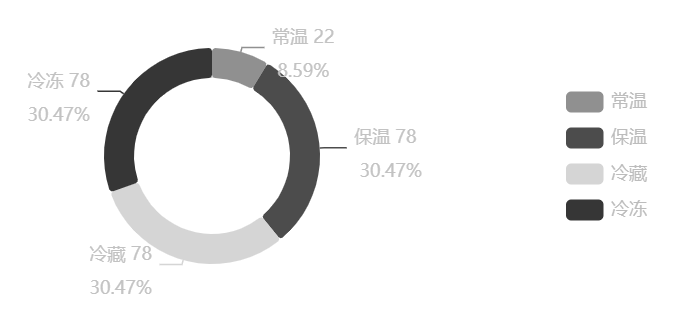
代码:
option = {
        tooltip: {
          trigger: 'item',
          formatter: '{a} <br/>{b}: {c} ({d}%)'
        },
        color: ['#909090', '#4C4C4C', '#D5D5D5', '#363636'],//颜色
        legend: {//图列
          right: '1%',//图例位置
          top: 'center',
          orient: 'vertical',
          data: ['常温', '保温', '冷藏', '冷冻'],
          textStyle: {//文字
            color: "#BCBCBC",
          },
        },
        series: [
          {
            name: '',
            type: 'pie',
            radius: ['52%', '72%'],//圆环的宽度,及圆环的大小
            center: ['40%', '50%'],//圆环的位置
            avoidLabelOverlap: false,
            itemStyle: {
              borderRadius: 2,//块的弧度
            },
            label: {
              formatter: '{b|{b}} {c|{c}}\n {per|{d}%}',
              rich: {
                b: {
                  color: '#C2C2C2',
                  fontSize: 12,
                  // fontWeight: 'bold',
                  lineHeight: 33
                },
                c: {
                  color: '#C2C2C2',
                  fontSize: 12,
                  // fontWeight: 'bold',
                  // fontFamily: 'Acens',
                },
                per: {
                  color: '#C2C2C2',
                  fontSize: 12,
                  // fontWeight: 'bold',
                  // fontFamily: 'Acens',
                }
              }
            },
            labelLine: {//描述连线
              length: 3,
            },
            data: [{ value: 22, name: '常温' }, { value: 78, name: '保温' }, { value: 78, name: '冷藏' }, { value: 78, name: '冷冻' },],
          }
        ]
      };
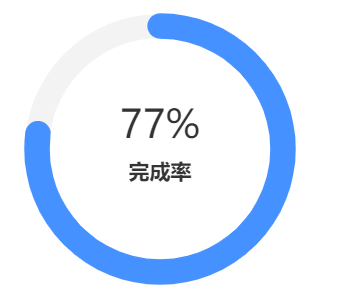
环状图(占比)
效果:
代码:
var option = {
        series: [{
          type: 'gauge',
          startAngle: 90,
          endAngle: -270,
          radius: [90],//环形图表的大小
          pointer: {
            show: false
          },
          backgroundColor: '#2c343c',
          progress: {
            show: true,
            overlap: false,
            roundCap: true,
            clip: false,
            itemStyle: {
              borderWidth: 1,
              borderColor: '#4591FF'//占比边框
            }
          },
          axisLine: {
            lineStyle: {
              width: 16,//环的粗细
              color: [[1, '#F3F3F3']],//环内背景色
            }
          },
          splitLine: {
            show: false,
            distance: 0,
            length: 10
          },
          axisTick: {
            show: false
          },
          axisLabel: {
            show: false,
            distance: 50
          },
          color: ['#4591FF'],//占比背景色
          data: [{
            value: 77,
            name: `77%`,//标题(上)
            title: {
              offsetCenter: ['0%', '-16%']//位置
            },
            detail: {
              offsetCenter: ['0%', '18%']
            }
          }
          ],
          title: {
            fontSize: 26,//标题(上)字体大小
            color: '#333333',//标题(上)字体颜色
          },
          detail: {
            width: 50,
            height: 14,
            fontSize: 14,
            color: '#333333',//内容(下)字体颜色
            borderColor: 'auto',
            formatter: '完成率'
          }
        }]
      };
仪表盘、评分图
效果:
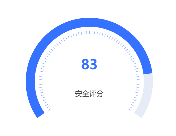
let option = {
        series: [
          {
            name: 'Pressure',
            type: 'gauge',
            center: ['50%', '60%'], //仪表盘位置
            radius: '86%', //仪表盘半径,图表大小
            startAngle: 215, //开始角度
            endAngle: -35, //结束角度
            itemStyle: {
              color: '#3572FF' //表盘颜色
            },
            axisLine: {
              lineStyle: {
                width: 20,//宽度
              }
            },
            progress: {
              show: true, //进度条是否显示
              width: 20,//进度条宽度
            },
            pointer: {
              // 仪表盘指针。
              show: false // 是否显示指针,默认 true。
            },
            axisTick: {
              //刻度线
              distance: 10, //刻度线与轴线的距离,负数时在轴线外
              length: 6, //刻度线长。支持相对半径的百分比
              splitNumber: 8,
              lineStyle: {
                color: '#86AAFF',//刻度线颜色
                width: 1 //宽度
              }
            },
            splitLine: {
              distance: -35, //数值位置
              length: 10,
              lineStyle: {
                color: '#fff',
                width: 1 //分隔
              }
            },
            axisLabel: {
              show: false //刻度文字是否显示
            },
            detail: {
              valueAnimation: true,
              offsetCenter: [0, '-25%'], //值的位置
              color: '#3572FF', //值的颜色
              formatter: '{value}'
            },
            data: [
              {
                value: 83,
                name: '安全评分'
              }
            ]
          }
        ]
      };

 浙公网安备 33010602011771号