一个牛的自适应(响应式)页面
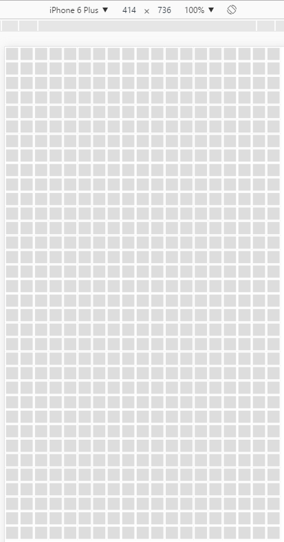
<!doctype html>
<html lang="en">
<head>
    <meta charset="UTF-8">
    <title>Document</title>
    <style>
        .box{
            width:50px;
            height:50px;
            padding:4px;
            -o-box-sizing:border-box;
            -moz-box-sizing:border-box;
            -webkit-box-sizing:border-box;
            -ms-box-sizing:border-box;
            box-sizing:border-box;
            display:inline-block;
            border:4px solid #fff;
            background-color:#ddd;
        }
        html,body{
            width:100%;
            height:100%;
            padding:0;
            margin:0;
        }
        #container{
            font-size:0;
        }
    </style>
</head>
<body>
<div id="container"></div>
</body>
</html>
<script>
    window.addEventListener('load',function(){
        size();
    });
    function size(){
        var container = document.getElementById('container');
        container.innerHTML = '';
        var x = Math.floor(window.innerWidth/50);
        var y = Math.floor(window.innerHeight/50);
        for(var i = 0; i < x*y; i++){
            var box = document.createElement('div');
            box.className = 'box';
            container.appendChild(box);
        }
    }
    window.addEventListener('resize',function(){
        size();
    });
</script>
效果图:

 浙公网安备 33010602011771号