14-animated-navigation
html
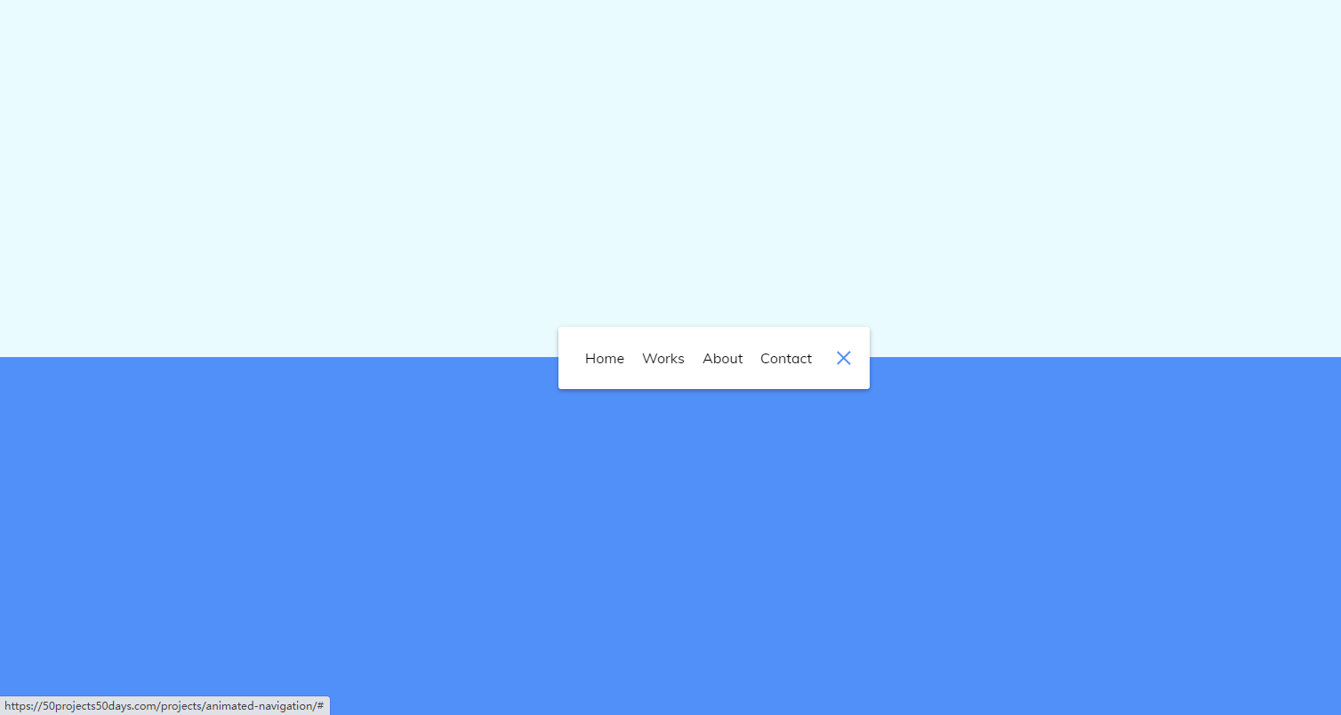
<!DOCTYPE html>
<html lang="en">
<head>
    <meta charset="UTF-8">
    <meta http-equiv="X-UA-Compatible" content="IE=edge">
    <meta name="viewport" content="width=device-width, initial-scale=1.0">
    <link rel="stylesheet" href="./style.css">
    <title>Document</title>
</head>
<body>
    <nav class="active" id="nav">
        <ul>
            <li><a href="#">Home</a></li>
            <li><a href="#">Works</a></li>
            <li><a href="#">About</a></li>
            <li><a href="#">Contact</a></li>
        </ul>
        <button class="icon" id="toggle">
            <div class="line line1"></div>
            <div class="line line2"></div>
        </button>
    </nav>
    <script src="./script.js"></script>
</body>
</html>
css
@import url('https://fonts.googleapis.com/css?family=Muli&display=swap');

* {
  box-sizing: border-box;
}


body{
    background-color: #eafbff;
    background-image: linear-gradient(
        to bottom,
        #eafbff 0%,
        #eafbff 50%,
        #5290f9 50%,
        #5290f9 100%
    );
    font-family: 'Muli',sans-serif;
    display: flex;
    align-items: center;
    justify-content: center;
    height: 100vh;
    margin: 0;
}

nav{
    background-color: #fff;
    padding: 20px;
    width: 80px;
    display: flex;
    align-items: center;
    justify-content: center;
    border-radius: 3px;
    box-shadow: 0 2px 5px rgba(0, 0, 0, 0.3);
    transition: width 0.6s linear;
    overflow-x: hidden;
}

nav.active{
    width: 350px;
}

nav ul{
    display: flex;
    list-style-type: none;
    padding: 0;
    margin: 0;
    width: 0;
    transition: width 0.6s linear;
}

nav.active ul{
    width: 100%;
}

nav ul li{
    transform: rotateY(0deg);
    opacity: 0;
    transition: transform 0.6s linear,opacity 0.6s linear;
}

nav.active ul li{
    opacity: 1;
    transform: rotateY(360deg);
}

nav ul a{
    position: relative;
    color: #000;
    text-decoration: none;
    margin: 0 10px;
}


.icon{
    background-color: #fff;
    border: 0;
    cursor: pointer;
    padding: 0;
    position: relative;
    height: 30px;
    width: 30px;
}

.icon:focus{
    outline: 0;
}

.icon .line{
    background-color: #5290f9;
    height: 2px;
    width: 20px;
    position: absolute;
    top: 10px;
    left: 5px;
    transition: transform 0.6s linear;
}

.icon .line2{
    top: auto;
    bottom: 10px;
}

nav.active .icon .line1{
    transform: rotate(-765deg) translateY(5.5px);
}
nav.active .icon .line2{
    transform: rotate(765deg) translateY(-5.5px);
}
javascript
const toggle = document.getElementById('toggle')
const nav = document.getElementById('nav')

toggle.addEventListener('click',()=>nav.classList.toggle('active'))

 浙公网安备 33010602011771号