
python从入门到实践第16章 下载数据1
 学习·1
学习·1
第一步 获取csv格式文件
需要python爬虫的相关知识
第二步 先打印第一行观察标签
import csv
filename = 'data/sitka_weather_2014.csv'
with open(filename) as f:
    reader = csv.reader(f)
    header_row = next(reader)
    print(header_row)
['AKST', 'Max TemperatureF', 'Mean TemperatureF', 'Min TemperatureF', 'Max Dew PointF', 'MeanDew PointF', 'Min DewpointF', 'Max Humidity', ' Mean Humidity', ' Min Humidity', ' Max Sea Level PressureIn', ' Mean Sea Level PressureIn', ' Min Sea Level PressureIn', ' Max VisibilityMiles', ' Mean VisibilityMiles', ' Min VisibilityMiles', ' Max Wind SpeedMPH', ' Mean Wind SpeedMPH', ' Max Gust SpeedMPH', 'PrecipitationIn', ' CloudCover', ' Events', ' WindDirDegrees']
分析可知所需数据在每行的 【0】,【1】,【3】处
代码解释:
csv格式:一系列数据用逗号隔开保存在一个表格里
csv.reader:读取文件内容
next():读取当前行的下一行,因为是第一次调用,因此结果为csv文件的第一行
第三步:提取数据
此处以提取'Max TemperatureF'为例

import csv
filename = 'data/sitka_weather_2014.csv'
with open(filename) as f:
    reader = csv.reader(f)
    header_row = next(reader)


    highs = []
    for row in reader:
        high = int(row[1])
        highs.append(high)

print(highs)
第四步:添加datetime模块并绘制图表
1 2 3 4 5 6 7 8 9 10 11 12 13 14 15 16 17 18 19 20 21 22 23 24 25 26 27 28 29 30 31 32 33 34 35 36 37 38 39 40 | import csvfrom datetime import datetimeimport matplotlib.pyplot as pltfilename = 'data/sitka_weather_2014.csv'with open(filename) as f: reader = csv.reader(f) header_row = next(reader) dates,highs = [],[] for row in reader: current_datetime = datetime.strptime(row[0],'%Y-%m-%d') dates.append(current_datetime) high = int(row[1]) highs.append(high)# 绘制图形plt.style.use('seaborn-v0_8')fig,ax = plt.subplots()ax.plot(dates,highs,c='red')ax.set_title("2018年7月每日最高温度",fontsize=24)ax.set_xlabel('',fontsize=16)fig.autofmt_xdate()ax.set_ylabel("温度(f)",fontsize=16)ax.tick_params(axis = 'both',which = 'major',labelsize = 16)plt.rcParams["font.sans-serif"]=["SimHei"]# 设置matplotlib库字体族为非衬线字体plt.rcParams["font.family"]="sans-serif"plt.show() |

2个大坑注意一下:
style格式中的
seaborn已经不能用了需要改为
seaborn-v0_8
如果图表标签上有中文的话,需要在ply.show()前加上
plt.rcParams["font.sans-serif"]=["SimHei"] # 设置matplotlib库字体族为非衬线字体 plt.rcParams["font.family"]="sans-serif"
代码解释:striptime:将时间数据按照指定格式规范化
第五步:高低气温可视化
1 2 3 4 5 6 7 8 9 10 11 12 13 14 15 16 17 18 19 20 21 22 23 24 25 26 27 28 29 30 31 32 33 34 35 36 37 38 39 40 41 42 43 44 | import csvfrom datetime import datetimeimport matplotlib.pyplot as pltfilename = 'data/sitka_weather_2014.csv'with open(filename) as f: reader = csv.reader(f) header_row = next(reader) dates,highs,lows = [],[],[] for row in reader: current_datetime = datetime.strptime(row[0],'%Y-%m-%d') dates.append(current_datetime) high = int(row[1]) highs.append(high) low = int(row[3]) lows.append(low)# 绘制图形plt.style.use('seaborn-v0_8')fig,ax = plt.subplots()ax.plot(dates,highs,c='red',alpha=0.5)ax.plot(dates,lows,c='blue',alpha=0.5)ax.fill_between(dates,highs,lows,facecolor='blue',alpha = 0.1)ax.set_title("2014年每日最高和最低温度",fontsize=24)ax.set_xlabel('',fontsize=16)fig.autofmt_xdate()ax.set_ylabel("温度(f)",fontsize=16)ax.tick_params(axis = 'both',which = 'major',labelsize = 16)plt.rcParams["font.sans-serif"]=["SimHei"]# 设置matplotlib库字体族为非衬线字体plt.rcParams["font.family"]="sans-serif"plt.show() |
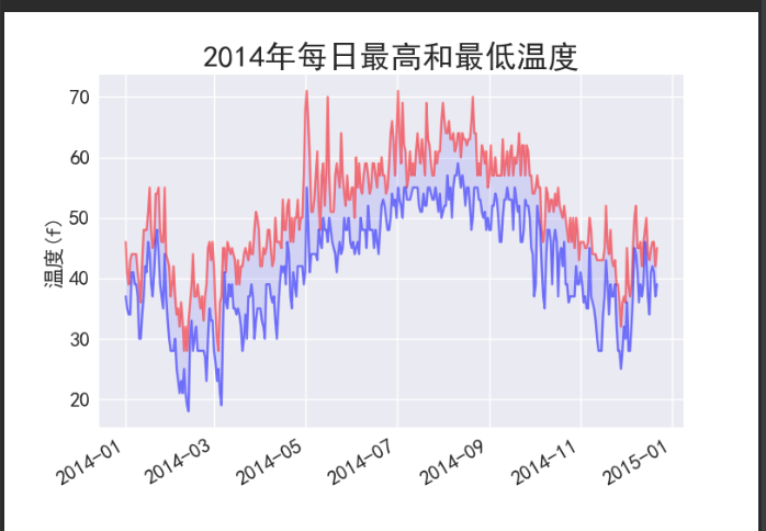
代码解释;
ax.plot()可选参数alpha的含义是透明度。值取0到1. 0代表完全透明,1代表完全不透明
ax.fill_between()表示在2个y值间隙填充
本文作者:月海与游梦人
本文链接:https://www.cnblogs.com/hbdxlzy/p/17280061.html
版权声明:本作品采用知识共享署名-非商业性使用-禁止演绎 2.5 中国大陆许可协议进行许可。


【推荐】国内首个AI IDE,深度理解中文开发场景,立即下载体验Trae
【推荐】编程新体验,更懂你的AI,立即体验豆包MarsCode编程助手
【推荐】抖音旗下AI助手豆包,你的智能百科全书,全免费不限次数
【推荐】轻量又高性能的 SSH 工具 IShell:AI 加持,快人一步