伪元素表单控件默认样式重置与自定义大全
当开发web应用程序时,表单样式是个头疼的问题。以前,web开发人员不得不接受一个现实,就是由客户端浏览器控制表单样式。然而,作者通过伪元素给web渲染引擎添加钩子,就可以控制表单的显示。
然而,所有这些伪元素都是依赖于特定浏览器引擎的(所以要带有浏览器引擎前缀),这样方便区分特定的浏览器引擎。以下是我自己搜集整理的,在Trident, Gecko, 和 WebKit浏览器引擎下面都可用的伪元素列表。
一些注意点:
这里列出的所有伪元素IE10支持,但是他们在IE的早期版本不支持
对于webkit,设置一些伪元素样式,你必须把元素的-webkit-appearance为none。例如,设置::-webkit-progress-bar样式,你必须给<progress>元素应用-webkit-appearance: none;
目录
- <input> 元素
- button checkbox / radio color date file number password placeholder 属性 range reset search submit text
- 其他元素
- 其他
input[type=button]
Gecko
查看<button>
input[type=checkbox] / input[type=radio]
Trident
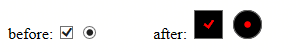
IE浏览器引擎提供::-ms-check伪元素,来控制单选复选框的样式。例如:
<input type="checkbox">
<input type="radio">
::-ms-check {
  color: red;
  background: black;
  padding: 0.5em;
}
这是在win7的IE10中的效果:
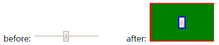
input[type=color]
WebKit
Webkit为颜色选择提供了两个伪元素, ::-webkit-color-swatch-wrapper 和 ::-webkit-color-swatch。你可以给这些元素应用多样的规则,但是我还没有想出什么好点子来使用它们。这里只是简单的演示一下。
<input type="color">
::-webkit-color-swatch-wrapper {
  border: 2px solid red;
}
::-webkit-color-swatch {
  opacity: 0.5;
}
这是chrome的显示效果:
input[type=date]
WebKit
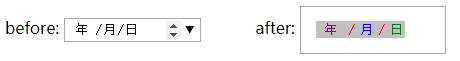
下面8个伪元素是webkit专为定制输入日期:
::-webkit-datetime-edit
::-webkit-datetime-edit-fields-wrapper
::-webkit-datetime-edit-text
::-webkit-datetime-edit-month-field
::-webkit-datetime-edit-day-field
::-webkit-datetime-edit-year-field
::-webkit-inner-spin-button
::-webkit-calendar-picker-indicator
- 下面有这些元素的内部结构:

如果你想要你输入的日期使用更多的空间和多彩的颜色,你添加如下样式:
<input type="date">
::-webkit-datetime-edit { padding: 1em; }
::-webkit-datetime-edit-fields-wrapper { background: silver; }
::-webkit-datetime-edit-text { color: red; padding: 0 0.3em; }
::-webkit-datetime-edit-month-field { color: blue; }
::-webkit-datetime-edit-day-field { color: green; }
::-webkit-datetime-edit-year-field { color: purple; }
::-webkit-inner-spin-button { display: none; }
::-webkit-calendar-picker-indicator { background: orange; }
在chrome显示如下:
input[type=file]
当我们写上<input type="file">,所有的渲染引擎会自动创建一个按钮。以前,这个按钮是完全不能设置样式的。然而,最近IE和webkit通过伪元素可以给他们添加样式了。
Trident
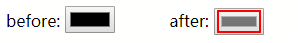
IE10可以使用::-ms-browse伪元素给<input type="file">按钮添加样式,任何添加给普通按钮的样式,都可以应用给伪元素。例如:
<input type="file">
::-ms-browse {
  background: black;
  color: red;
  padding: 1em;
}
在win7的IE10显示如下:
WebKit
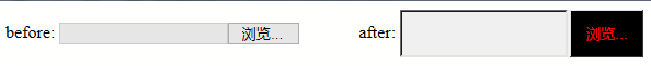
Webkit使用::-webkit-file-upload-button伪元素为<input type="file">按钮添加样式,同样任何添加给普通按钮的样式,都可以应用给伪元素。例如:
<input type="file">
::-webkit-file-upload-button {
  background: black;
  color: red;
  padding: 1em;
}
在chrome显示如下:

input[type=number]
WebKit
Webkit通过默认的数字选择器提供下拉列表一个控制。伪元素::-webkit-textfield-decoration-container, ::-webkit-inner-spin-button 和 ::-webkit-outer-spin-button提供定制化样式。虽然不能对这样的元素做过多的控制,但是至少可以隐藏掉下来
<input type="number">
::-webkit-textfield-decoration-container { }
::-webkit-inner-spin-button {
  -webkit-appearance: none;
}
::-webkit-outer-spin-button {
  -webkit-appearance: none;
}
在chrome的显示效果:

input[type=password]
Trident
Trident引擎为密码输入框提供的一种控制,就是可以让他显示显示纯文本。而这个控制是通过::-ms-reveal操作的。你可以在这个控制下修改包括字体颜色,背景色或是显示隐藏的效果。下面是隐藏的效果
<input type="password">
::-ms-reveal { display: none; }
这是在win7系统下的IE10的显示效果:

placeholder属性
Gecko
火狐引擎用伪元素::-moz-placeholder控制占位符的文本样式。你可以用他来改变占位符内字体颜色和字体属性。例如:
<input placeholder="placeholder">
::-moz-placeholder {
  color: blue;
  font-family: 'Comic Sans MS';
}
注意:火狐引擎从:-moz-placeholder在firefox的19版时改为::-moz-placeholder
Trident
Trident引擎为占位符文本提供的一个伪类而不是伪元素来设置样式。但是伪类:-ms-input-placeholder,其他渲染引擎可以用其他的伪元素代替
<input placeholder="placeholder">
:-ms-input-placeholder {
  color: blue;
  font-family: 'Comic Sans MS';
}
Win8系统的IE10显示效果:

WebKit
Webkit引擎使用::-webkit-input-placeholder,他也可以修改占位符的字体颜色和字体属性
<input placeholder="placeholder">
::-webkit-input-placeholder {
  color: blue;
  font-family: 'Comic Sans MS';
}
在chrome的显示效果

input[type=range]
Gecko
火狐在Firefox22版提供::-moz-range-track and ::-moz-range-thumb来设置范围元素的样式。可以给他应用尽可能多的样式。例如:
<input type="range">
::-moz-range-track {
  border: 2px solid red;
  height: 20px;
  background: orange;
}
::-moz-range-thumb {
  background: blue;
  height: 30px;
}
在Firefox的显示效果:

Trident
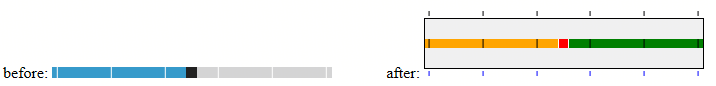
IE引擎为定制范围元素样式提供一系列很棒的伪元素:
::-ms-fill-lower: 轨道手柄前面::-ms-fill-upper: 轨道手柄后面::-ms-ticks-before: 跟踪刻度线范围前::-ms-ticks-after: 跟踪刻度线范围后::-ms-thumb: 手柄::-ms-track: 轨道::ms-tooltip: 在用户选择一个范围元素时显示工具。注意,这个元素不能设置样式,只能用display隐藏。
下面是一个水平范围元素的简单例子。如下:
<input type="range">
::-ms-fill-lower { background: orange; }
::-ms-fill-upper { background: green; }
::-ms-thumb { background: red; }
::-ms-ticks-after { display: block; color: blue; }
::-ms-ticks-before { display: block; color: black; }
::-ms-track { padding: 20px 0; }
::-ms-tooltip { display: none; /* display and visibility only */ }
Win7下IE10的效果
WebKit
Webkit为范围元素提供::-webkit-slider-runnable-track和::-webkit-slider-thumb,然而不能给他们添加过多的样式,你可以添加一些颜色和留白
<input type="range">
::-webkit-slider-runnable-track {
  border: 2px solid red;
  background: green;
  padding: 2em 0;
}
::-webkit-slider-thumb {
  outline: 2px solid blue;
}
在Chrome的效果
对于范围元素有一点要注意,IE引擎和Webkit容许在划过状态时应用样式(它们分别是::-webkit-slider-thumb:hover和::-ms-thumb:hover)而火狐引擎暂不支持
input[type=reset]
查看 <button>
input[type=search]
WebKit
webkit默认为搜索框提供一个定制的ui带有取消和搜索按钮。::-webkit-search-cancel-button 和 ::-webkit-search-results-button可以提供定制样式,但是你除了像下面那样隐藏,不能做再多的操作
<input type="search">
/* Remove the rounded corners */
input[type=search] { -webkit-appearance: none; }

/* Hide the cancel button */
::-webkit-search-cancel-button { -webkit-appearance: none; }

/* Hide the magnifying glass */
::-webkit-search-results-button { -webkit-appearance: none; }
在Chrome的效果

input[type=submit]
Gecko
查看 <button>
input[type=text]
Trident
IE10使用::-ms-value为文本输入框提供样式(文本输入框,密码输入框等等)和下拉列表。例如:
<input type="text" value="value">
<input type="password" value="value">
<select>
  <option selected>option</option>
</select>
::-ms-value {
  color: red;
  background: black;
  padding: 1em;
}
Win7下IE10的效果

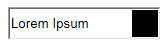
清除操控
在IE10里文本输入框获得焦点且非空的时候,文本框右侧会出现一个小x。当点击他,文本框的内容就会清空。小x的样式是由::-ms-clear pseudo-element控制的,所以你可以隐藏它。
<input type="text" >
::-ms-clear { display: none; }
有一个简化的规则::-ms-clear,所以你会看到这样:
<input type="text" value="Lorem Ipsum" >
::-ms-clear {
  color: red;
  background: black;
  padding: 1em;
}

在IE10显示效果如下:
<button> Element
Gecko
火狐应用伪元素::-moz-focus-outer 和 ::-moz-focus-inner给input类型是button,reset, 和 submit,还有button元素设置样式。
也许你用这些伪元素不能做很多事情,但是有一点重要的事情是,火狐可以应用他们添加border和padding
button::-moz-focus-inner,
input[type="reset"]::-moz-focus-inner,
input[type="button"]::-moz-focus-inner,
input[type="submit"]::-moz-focus-inner,
input[type="file"] > input[type="button"]::-moz-focus-inner {
  border: 1px dotted transparent;
  padding: 0 2px;
}
这些规则可以在火狐和其他渲染引擎上很容易的创建按钮显示的不同外观。这是令人困惑的事情,实际上需要一个方法去掉他们。自从2002开始有这个方法。
默认的padding和border可以被重置为0
button::-moz-focus-inner,
input::-moz-focus-inner {
  border: 0;
  padding: 0;
}
<keygen> 元素
WebKit
Webkit提供::-webkit-keygen-select,可用于注册元素自定义下拉样式,例如:
<keygen>
::-webkit-keygen-select {
  background: black;
  color: red;
}
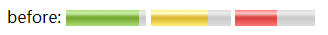
<meter> 元素
WebKit
Webkit提供::-webkit-meter-bar, ::-webkit-meter-even-less-good-value, ::-webkit-meter-optimum-value, and ::-webkit-meter-suboptimal-value用于meter元素的显示样式。
为了应用这些伪元素设置样式,你必须在meter元素上设置-webkit-appearance为none
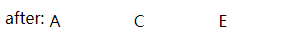
::-webkit-meter-even-less-good-value,::-webkit-meter-optimum-value, 和 ::-webkit-meter-suboptimal-value其中只有一个,会在给定时间依据meter的value值处于激活状态。
见如下例子:
<meter low="69" high="80" max="100" optimum="100" value="92">A</meter>
<meter low="69" high="80" max="100" optimum="100" value="72">C</meter>
<meter low="69" high="80" max="100" optimum="100" value="52">E</meter>
meter { -webkit-appearance: none; }
::-webkit-meter-bar {
  height: 50px;
  background: white;
  border: 2px solid black;
}
::-webkit-meter-optimum-value { background: green; }
::-webkit-meter-suboptimum-value { background: orange; }
::-webkit-meter-even-less-good-value { background: blue; }
Chrome显示效果:
<progress> 元素
WebKit
Webkit提供::-webkit-progress-inner-element, ::-webkit-progress-bar, & ::-webkit-progress-value用于进度条样式,他们的层级关系如下:

类似于meter,为了给这些元素应用样式,你必须给进度条元素设置-webkit-appearance: none;这有例子:
<progress max="100" value="50"></progress>
progress { -webkit-appearance: none; }
::-webkit-progress-inner-element { }
::-webkit-progress-bar { border: 2px solid black; }
::-webkit-progress-value { background: red; }
Chrome显示效果:

Gecko
Gecko为进度条提供::-moz-progress-bar来设置样式。例如:
<progress max="100" value="50"></progress>
::-moz-progress-bar { background: red; }
Firefox显示效果:

Trident
像火狐一样,IE给进度条提供单一的伪元素::-ms-fill,例如:
<progress max="100" value="50"></progress>
::-ms-fill { background: red; }
IE10显示效果:

<select> 元素
Trident
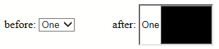
IE10提供::-ms-expand用来修改下拉列表的箭头样式。例如:
<select>
    <option selected>One</option>
</select>
::-ms-expand {
  padding: 2em;
  color: red;
  background: black;
}
Win8中IE10显示效果:
<textarea> 元素
WebKit
Webkit提供的::-webkit-resizer用于可以自动控制尺寸的元素,把它添加到文本域的右下角。
他可以用个display:none或是-webkit-appearance: none:隐藏掉。
<textarea></textarea>
::-webkit-resizer {
  display: none;
}
注意:给::-webkit-resizer添加display:none并不能阻止用户修改textarea的尺寸,他仅仅是隐藏了控制。如果你禁用尺寸调整,可以设置css属性resize:none。这个不仅可以隐藏控制,也可以在所有浏览器都禁用文本域尺寸调整。
使用::-webkit-resizer也可以添加一些基本的样式。如果你想要使用更多的颜色可以这样添加:
<textarea></textarea>
::-webkit-resizer {
  border: 2px solid black;
  background: red;
  box-shadow: 0 0 5px 5px blue;
  outline: 2px solid yellow;
}
表单验证信息
WebKit
Webkit是唯一支持约束验证api创建验证冒泡的渲染引擎。提供的伪元素如下:
::-webkit-validation-bubble::-webkit-validation-bubble-arrow::-webkit-validation-bubble-arrow-clipper::-webkit-validation-bubble-heading::-webkit-validation-bubble-message::-webkit-validation-bubble-text-block
很容易看出每个元素都可以设置视觉效果,这里有例子:
::-webkit-validation-bubble {
  padding: 1em;
  background: orange;
}
::-webkit-validation-bubble-arrow {
  background: blue;
}
::-webkit-validation-bubble-arrow-clipper {
  border: 2px solid black;
}
::-webkit-validation-bubble-heading {
  background: green;
}
::-webkit-validation-bubble-message {
  color: white;
  background: purple;
}
::-webkit-validation-bubble-text-block {
  border: 1px solid red;
  padding: 1em;
}
原文: https://www.w3cplus.com/css3/list-of-pseudo-elements-to-style-form-controls.html

 浙公网安备 33010602011771号