

easyui入门
控件:
创建方法:
一、标签模式
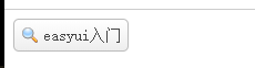
<a href='#' class='easyui-linkbutton' data-options="iconCls:'icon-search'">easyui入门</a>
二、编程模式
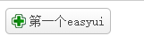
<a href="#" class="hehe">第一个easyui</a>
$(function(){ $('.hehe').linkbutton({ iconCls:'icon-add' }) })
linkbutton按钮
创建:
方法一:
<a href='#' class='easyui-linkbutton' data-options="iconCls:'icon-search'">easyui入门</a>
方法二:
<a href="#" class="hehe">第一个easyui</a>
$(function(){ $('.hehe').linkbutton({ iconCls:'icon-add' }) })
属性:
| 名称 | 描述 | 值 |
|---|---|---|
| id | 组件的ID | |
| disabled | true禁用,false启用 | boolean |
| plain | 设置为简洁效果 | boolean |
| text | 按钮显示的文本 | string |
| iconCls | 按钮显示的图标 | string |
| size | 按钮显示的大小 | large,small |
事件:
| 名称 | 属性 | 描述 |
|---|---|---|
| onClick | none | 点击事件 |
| options | none | 返回属性对象 |
| disabled | none | 禁用按钮 |
| enable | none | 启用按钮 |
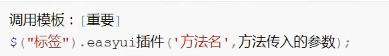
调用事件:
一、标签模式:
<a href="javascript:;" class="hehe easyui-linkbutton" data-options="onClick:test1">第一个easyui</a>
`
function test1() {
alert('easyui');
}
`
二、编程模式:
`
$(function(){
$('.hehe').linkbutton({
iconCls:'icon-add',
onClick:test1
});
});
$(function(){
$('.hehe').linkbutton({
iconCls:'icon-add',
onClick:function(){
alert(3333);
}
});
});
`
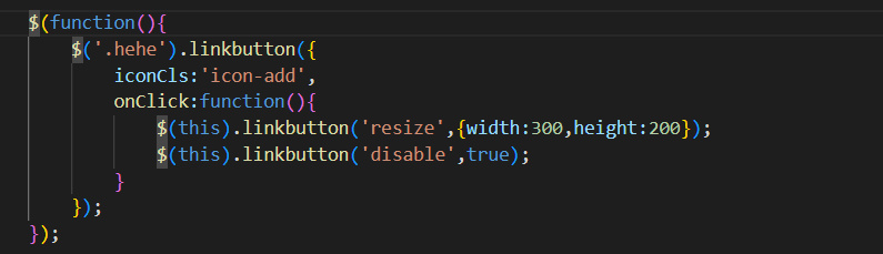
方法:
| 名称 | 属性 | 描述 |
|---|---|---|
| resize | json | 设置按钮大小 |
| disable | boolean | 禁用按钮 |
调用方法:
窗口插件window
windows
属性:
| 名称 | 属性 | 描述 |
|---|---|---|
| title | string | 窗口的标题 |
| collapsible | boolean | 定义是否显示折叠按钮 |
| minimizable | boolean | 定义是否显示最小化按钮 |
| maximizable | boolean | 定义是否显示最大化按钮 |
| colsable | boolean | 定义是否显示关闭按钮 |
| draggable | boolean | 定义窗口是否可以被拖放 |
| resizable | boolean | 定义窗口是否可以被缩放 |
| modal | boolean | 定义窗口是否有遮罩效果 |
事件(继承panel事件)
| 名称 | 属性 | 描述 |
|---|---|---|
| onload | none | 控件在载入时触发 |
| onOpen | none | 控件打开之后触发 |
| onClose | none | 控件关闭时触发 |
方法(继承panel方法)
| 名称 | 属性 | 描述 |
|---|---|---|
| window | none | 返回窗口对象 |
| resize | options | 修改窗口尺寸width,height |
| onClose | none | 控件关闭时触发 |


【推荐】国内首个AI IDE,深度理解中文开发场景,立即下载体验Trae
【推荐】编程新体验,更懂你的AI,立即体验豆包MarsCode编程助手
【推荐】抖音旗下AI助手豆包,你的智能百科全书,全免费不限次数
【推荐】轻量又高性能的 SSH 工具 IShell:AI 加持,快人一步
· Manus重磅发布:全球首款通用AI代理技术深度解析与实战指南
· 被坑几百块钱后,我竟然真的恢复了删除的微信聊天记录!
· 没有Manus邀请码?试试免邀请码的MGX或者开源的OpenManus吧
· 园子的第一款AI主题卫衣上架——"HELLO! HOW CAN I ASSIST YOU TODAY
· 【自荐】一款简洁、开源的在线白板工具 Drawnix