
Bootstrap简介,特点,用法
简介:
前端开发框架,它由规范的css,javascript插件构成。
特点
简单灵活可用于架构流行的用户界面和交互接口的html、css、javascript工具集。
友好的学习曲线,卓越的兼容性,响应式设计,12列格网,样式向导文档。
自定义JQuery插件,完整的类库,基于Less等
Bootstrap 响应式布局设w使用体验。
用法:
1.显示与隐藏 下面是现成的图
介绍:就是在手机端或者平板切换的屏幕大小的时候,控制当前模块是否显示和隐藏。
借鉴地址:https://www.cnblogs.com/hgnulb/p/10042916.html
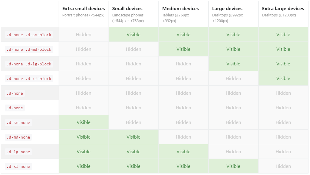
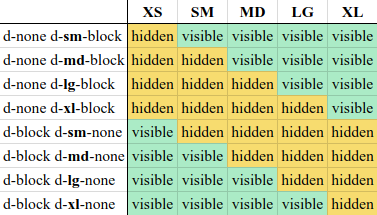
2.网格系统
描述:这个网格系统其实就是将当前的屏幕划分成12份,通过col-份数设置当前容器的大小 下面列出的是不同设备需要设置的属性 col-md-1
如下所示:如果设置sm 不设置 md 那么将以sm的尺寸来显示。
xs < 768
sm>768
md>992
lg>1200
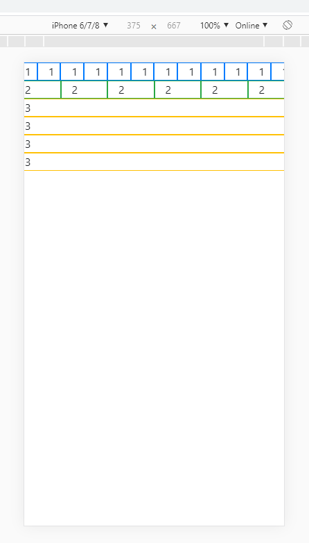
2.1实例 手机和电脑显示,还有这种流式布局,就像一锅稀饭直接倒在几个盆子里,有大盆子有小盆子
<body>
   <div class="row"><!--row表示一行,子集组成一行-->
        <div class="col-1 border border-primary" >1</div>
        <div class="col-1 border border-primary" >1</div>
        <div class="col-1 border border-primary" >1</div>
        <div class="col-1 border border-primary" >1</div>
        <div class="col-1 border border-primary" >1</div>
        <div class="col-1 border border-primary" >1</div>
        <div class="col-1 border border-primary" >1</div>
        <div class="col-1 border border-primary" >1</div>
        <div class="col-1 border border-primary" >1</div>
        <div class="col-1 border border-primary" >1</div>
        <div class="col-1 border border-primary" >1</div>
        <div class="col-1 border border-primary" >1</div>
    </div>
     <div class="row">
         <div class="col-2 border border-success" >2</div>
         <div class="col-2 border border-success" >2</div>
         <div class="col-2 border border-success" >2</div>
         <div class="col-2 border border-success" >2</div>
         <div class="col-2 border border-success" >2</div>
         <div class="col-2 border border-success" >2</div>

    </div>
     <div class="row">
          <div class=" col-md-3 col-sm-6 border border-warning">3</div>
          <div class=" col-md-3 col-sm-6 border border-warning">3</div>
          <div class=" col-md-3 col-sm-6 border border-warning">3</div>
          <div class=" col-md-3 col-sm-6 border border-warning">3</div>
    </div>
电脑显示

手机显示
2.2 实例
<body>
     <div class="row">
          <div class="col-md-4 border border-primary"><p>计算机计算机计算机凄凄切切群群群群群凄凄切切群群群群群凄凄切切群群群群群凄凄切切群群群群群凄凄切切群群群群群凄凄切切群群群群群QQ群群群群群群群群计算机计算机计算机</p></div>
          <div class="col-md-4 border border-primary"><p>笔记本笔记版笔记本笔记本</p></div>
          <div class="col-md-4 border border-primary"><p>手机手机手机手机手机手机手机手机手机手机手机手机手机手机手机手机</p></div>
    </div>

</body>
显示
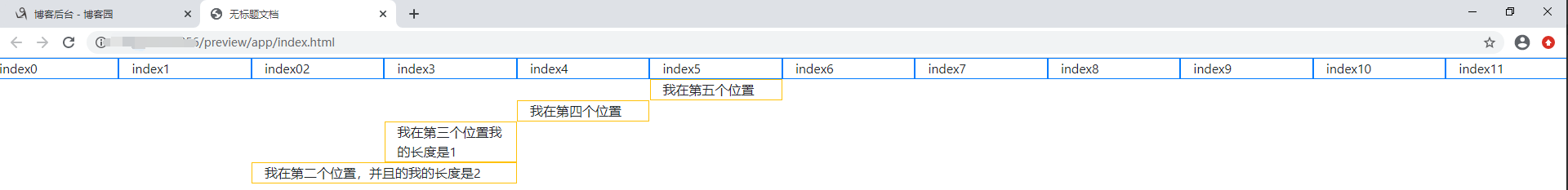
2.3偏移列 BootStrap4 写法是 offset-md-5 其他版本是 col-md-offset-5 offset是关键字,后面的数字5是索引,row 12等分,0~11
<body>
     <div class="row">
            <div class="col-md-1 border border-primary">index0</div>
            <div class="col-md-1 border border-primary">index1</div>
           <div class="col-md-1 border border-primary">index02</div>
            <div class="col-md-1 border border-primary">index3</div>
           <div class="col-md-1 border border-primary">index4</div>
            <div class="col-md-1 border border-primary">index5</div>
           <div class="col-md-1 border border-primary">index6</div>
            <div class="col-md-1 border border-primary">index7</div>
           <div class="col-md-1 border border-primary">index8</div>
            <div class="col-md-1 border border-primary">index9</div>
           <div class="col-md-1 border border-primary">index10</div>
            <div class="col-md-1 border border-primary">index11</div>
    </div>
  <div class="row">
       <div class="col-md-1 offset-md-5 border border-warning">
        我在第五个位置
      </div>
    </div>
     <div class="row">
       <div class="col-md-1 offset-md-4 border border-warning">
        我在第四个位置
      </div>
    </div>
         <div class="row">
       <div class="col-md-1 offset-md-3 border border-warning">
        我在第三个位置我的长度是1
      </div>
    </div>
     <div class="row">
       <div class="col-md-2 offset-md-2 border border-warning">
        我在第二个位置,并且的我的长度是2
      </div>

    </div>
</body>
效果
2.3嵌套列 这个一般用于网站布局比较常用的
例如: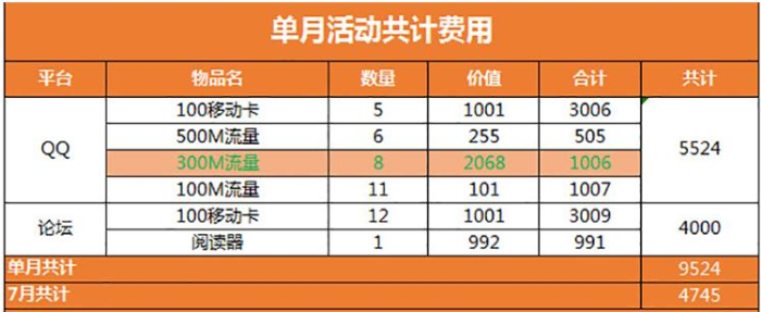
我想作出这个样子
代码
<div class="container">
    <div class="row">

        <div class="col-md-7 justify-content-center   border-left border-right border-top border-dark " style="background-color: #ED7D31; height: 65px; ">
     <h2  class="align-self-center" style="text-align: center; color: white; line-height: 62px;"><b>单月活动共计费用</b></h2>
    </div>
    </div>
    <div class="row" >
       <div class="col-md-1 border-left border-top   border-dark" style="background-color: #ED7D31; height:35px; text-align: center; line-height: 30px;"><p  style="color: white">平台</p></div>
        <div class="col-md-2 border-left border-top   border-dark" style="background-color: #ED7D31; height:35px; text-align: center; line-height: 30px;"><p style="color: white">物品名</p></div>
        <div class="col-md-1  border-left border-top   border-dark" style="background-color: #ED7D31; height:35px; text-align: center; line-height: 30px;"><p style="color: white">数量</p></div>
        <div class="col-md-1 border-left border-top   border-dark" style="background-color: #ED7D31; height:35px; text-align: center; line-height: 30px;"><p style="color: white">价值</p></div>
        <div class="col-md-1 border-left border-top   border-dark" style="background-color: #ED7D31; height:35px; text-align: center; line-height: 30px;"><p style="color: white">合计</p></div>
        <div class="col-md-1 border-left border-top  border-right  border-dark " style="background-color: #ED7D31; height:35px; text-align: center; line-height: 30px;"><p style="color: white">共计</p></div>
    </div>
    <div class="row" style="height:100px;">
           <div class="col-md-1 border-left border-top   border-dark" style="text-align: center; height: 100px; line-height: 100px; "><p style="color: black">QQ</p></div>
            <div class="col-md-2 " style="text-align: center;">
               <div class="row " style="height: 100px;line-height: 25px;">
                    <div class="col-md-12 border-left border-top  border-dark" style="height: 25px;">100移动卡</div>
                    <div class="col-md-12  border-left border-top border-dark" style="height: 25px;">500M流量</div>
                    <div class="col-md-12   border-left border-top border-dark" style="height: 25px; background-color:#F4AF85"><p style="color:green">300M流量</p></div>
                    <div class="col-md-12  border-left border-top border-dark" style="height: 25px;">100M流量</div>
               </div>
            </div>
            <div class="col-md-3 " style="text-align: center;">
               <div class="row">
                    <div class="col-md-4 border-left border-top border-dark" style="height: 25px;">5</div>
                    <div class="col-md-4 border-left border-top border-dark" style="height: 25px;">1001</div>
                    <div class="col-md-4 border-left border-top border-dark" style="height: 25px;">3006</div>
               </div>
                <div class="row">
                    <div class="col-md-4 border-left border-top border-dark" style="height: 25px;">6</div>
                    <div class="col-md-4 border-left border-top border-dark" style="height: 25px;">255</div>
                    <div class="col-md-4 border-left border-top border-dark" style="height: 25px;">505</div>
               </div>
               <div class="row" style="background-color:#F4AF85;">
                    <div class="col-md-4 border-left border-top border-dark" style="height: 25px;"><p style="color:green">8</p></div>
                    <div class="col-md-4 border-left border-top border-dark" style="height: 25px;"><p style="color:green">2068</p></div>
                    <div class="col-md-4 border-left border-top border-dark" style="height: 25px;"><p style="color:green">1006</p></div>
               </div>
                 <div class="row">
                    <div class="col-md-4 border-left border-top border-dark" style="height: 25px;">11</div>
                    <div class="col-md-4 border-left border-top border-dark" style="height: 25px;">101</div>
                    <div class="col-md-4 border-left border-top border-dark" style="height: 25px;">1101</div>
               </div>
         </div>
           <div class="col-md-1 border-left border-top border-right border-dark"  style="text-align: center; line-height: 100px;">5524</div>
    </div>
    <div class="row"style="height:50px;">
      <div class="col-md-1 border-left border-top   border-dark" style="text-align: center; height: 50px; line-height: 50px; "><p style="color: black">论坛</p></div>
      <div class="col-md-2 " style="text-align: center;">
               <div class="row " style="height: 50px;line-height: 25px;">
                    <div class="col-md-12 border-left border-top  border-dark" style="height: 25px;">100移动卡</div>
                    <div class="col-md-12  border-left border-top border-dark" style="height: 25px;">阅读器</div>
               </div>
            </div>
      <div class="col-md-3 " style="text-align: center;">
               <div class="row">
                    <div class="col-md-4 border-left border-top border-dark" style="height: 25px;">12</div>
                    <div class="col-md-4 border-left border-top border-dark" style="height: 25px;">1001</div>
                    <div class="col-md-4 border-left border-top border-dark" style="height: 25px;">3009</div>
               </div>
                <div class="row">
                    <div class="col-md-4 border-left border-top border-dark" style="height: 25px;">1</div>
                    <div class="col-md-4 border-left border-top border-dark" style="height: 25px;">992</div>
                    <div class="col-md-4 border-left border-top border-dark" style="height: 25px;">991</div>
               </div>
         </div>
      <div class="col-md-1 border-left border-top border-right border-dark"  style="text-align: center; line-height: 50px;">4000</div>
    </div>
    <div class="row">
         <div class="col-md-6 border-left border-top    border-dark" style="text-align: left; background-color: #EC7C34; height: 27px;"><p style="color:white;">单月共计</p></div>

         <div class="col-md-1 border-left border-top border-right  border-dark" style="text-align: left; background-color: #EC7C34; height: 27px"><p style="color:white;">9524</p></div>
     </div>
    <div class="row">
         <div class="col-md-6 border-left border-top border-bottom border-dark" style="text-align: left; background-color: #EC7C34; height: 27px;"><p style="color:white;">7月共计</p></div>

         <div class="col-md-1 border-left border-top border-right border-bottom border-dark" style="text-align: left; background-color: #EC7C34; height: 27px"><p style="color:white;">4745</p></div>
     </div>
</div>
</body>
效果
3文字排版
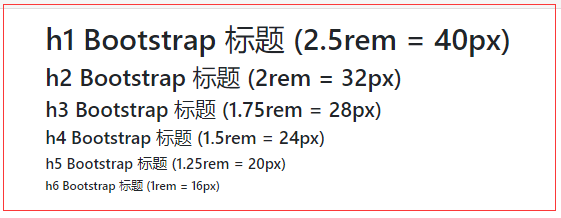
3.1 h1~h6
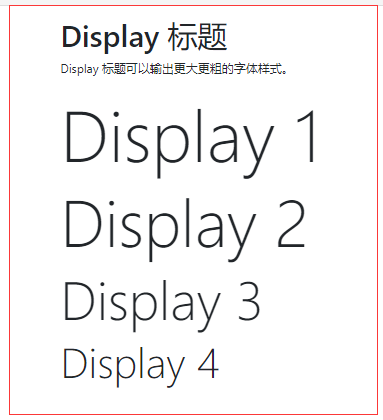
3.2 Display 标题类 更大的问题
3.3 small 标签显示的更小颜色更浅的文本
<div class="container">
  <h1>更小文本标题</h1>
  <p>small 元素用于字号更小的颜色更浅的文本:</p>
  <h1>h1 标题 <small>副标题</small></h1>
  <h2>h2 标题 <small>副标题</small></h2>
  <h3>h3 标题 <small>副标题</small></h3>
  <h4>h4 标题 <small>副标题</small></h4>
  <h5>h5 标题 <small>副标题</small></h5>
  <h6>h6 标题 <small>副标题</small></h6>
</div>
样式

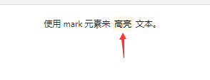
3.4 <mark> 这个标签黄色背景和一定的内边距
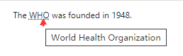
3.5 abbr 文字下方一条虚线,光标放上去显示文字
<p>The <abbr title="World Health Organization">WHO</abbr> was founded in 1948.</p>
样式
其他
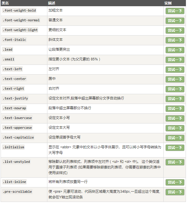
4颜色
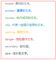
4.1其他 text-muted 文本样式,bg-muted 背景颜色
5表格 table 类来设置基础表格的样式
