ECharts 仪表盘样式修改


1.代码

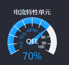
  option = {
        title: {
        },
        tooltip: {
            formatter: '{a} <br/>{b} : {c}%'
        },
        series: [
            {
                //类型
                type: 'gauge',
                //半径
                radius: 80,
             
                //起始角度。圆心 正右手侧为0度,正上方为90度,正左手侧为180度。
                startAngle: 210,
                //结束角度。
                endAngle: -30,
                center: ['50%', '60%'],
                //仪表盘轴线相关配置。
                axisLine: {
                    show: true,
                    // 属性lineStyle控制线条样式
                    lineStyle: {
                        width: 20,
                        //color: [[1, '#63869e']]
                        color: [[1, '#EDEFF2']]
                    }
                },
                //分隔线样式。
                splitLine: {
                    show: true,
                },
                //刻度样式。
                axisTick: {
                    show: true,
                },
                //刻度标签。
                axisLabel: {
                    show: true,
                },
                //仪表盘指针。
                pointer: {
                    //这个show属性好像有问题,因为在这次开发中,需要去掉指正,我设置false的时候,还是显示指针,估计是BUG吧,我用的echarts-3.2.3;希望改进。最终,我把width属性设置为0,成功搞定!
                    show: true,
                    //指针长度
                    length: '90%',
                    //width: 0,
                },
                //仪表盘标题。
                title: {
                    show: true,
                    offsetCenter: [0, '-0%'], // x, y,单位px
                    textStyle: {
                        color: '#fff',
                        fontSize: 20
                    }
                },
                //仪表盘详情,用于显示数据。
                detail: {
                    show: true,
                    offsetCenter: [0, '60%'],
                    formatter: '{value}%',
                    textStyle: {
                        fontSize: 30,
                        color: '#169FFE',
                    }
                },
                data: [{
                    value: 0,
                    name: 'OEE'
                }]
            }]
    };
    // 基于准备好的dom,初始化echarts实例
    var myChart = echarts.init(document.getElementById(“div的id”));
      var color = [[80 / 100, '#169FFE'], [1, '#EDEFF2']];
                    option.series[0].axisLine.lineStyle.color = color;
                    option.series[0].data[0].value = 80;
    // 使用刚指定的配置项和数据显示图表。
    myChart.setOption(option, true);


posted @ 2020-10-23 09:08  沉浮。。。  阅读(6783)  评论(0编辑  收藏  举报