A flexible charting library for .NET
can update your subscriptions.
- Download source files (.NET 1.1 and .NET 2.0)
- Download dll only (.NET 1.1 and .NET 2.0)
- Download C# Sample Project
- Download VB Sample Project
- Download the latest versions from SourceForge
Introduction
ZedGraph is a class library, Windows Forms UserControl, and ASP web-accessible control for creating 2D line, bar, and pie graphs of arbitrary datasets. The classes provide a high degree of flexibility - almost every aspect of the graph can be user-modified. At the same time, usage of the classes is kept simple by providing default values for all of the graph attributes. The classes include code for choosing appropriate scale ranges and step sizes based on the range of data values being plotted. Moreover, ZedGraph is compatible with .NET 2.0, and VS .NET 2005.
ZedGraph is maintained as an open-source development project on SourceForge. The site includes a project Wiki,documentation, interim (CVS) updates, and all release versions.
A set of sample graphs is also available on the Wiki, complete with source code (many of the samples include C# and VB code).
ZedGraph now supports both .NET 2.0 and .NET 1.1.
- For .NET 2.0, use ZedGraph version 5.0+.
- For .NET 1.1, use ZedGraph version 4.5+.
Background
There are many graphing libraries out there, but none seemed to fit what I needed. I found MSChart too quirky, and many of the other options did not have the flexibility I needed to achieve a polished look. Of course, most of the commercial packages would do the trick, but I needed something that was free. So, ZedGraph was born.
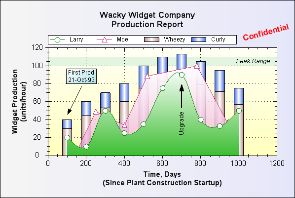
These classes will generate a variety of line, bar, or pie charts on a form or web page, given a location rectangle and some data points. ZedGraph handles 2D line/scatter graphs, horizontal/vertical bar graphs, stacked bar charts, stacked percent bar charts, error bar charts, open-high-low-close charts, Japanese candlestick charts, and pie charts - it does not yet handle 2.5D or 3D surfaces or charts. The charts can be dressed up with axis labels and titles, a legend, text labels and arrows (as shown in the example above), images, etc.
The ZedGraphWiki and the online class documentation provide lots of helpful tips and descriptions. Refer to them for more details - ZedGraph has a tremendous number of options that are not documented in this tutorial.
VB users
This article uses C# exclusively for examples, however, all the code samples for the tutorial, plus other examples are available for Visual Basic, on the ZedGraphWiki Sample Graphs section.
Using ZedGraph as a web control
ZedGraph now includes a class derived from the Control class that facilitates access from ASPX web page code. The demo project download above demonstrates this functionality. Also, the ZedGraphWiki includes detailed examples of web control usage for two rendering modes, RawImage and ImageTag.
Using ZedGraph as a UserControl
ZedGraph is accessible as a control from the control toolbox in Visual Studio .NET. To access ZedGraph, first launch Visual Studio .NET, and create a new Windows Application (Forms) project. Open the form design so that it appears in the current window. View the toolbox using the View/Toolbox menu command. Right-click inside the "General" or "Components" sub-pane of the tool box, and select the "Choose Items..." option. Click "Browse...", and navigate to thezedgraph.dll file. Once this file is added, you should see a ZedGraphControl option in the toolbox.
- In your project, under the Project menu, select the "Add Reference..." option. Use the Browse button to findZedGraph.dll, and click OK. Repeat this for ZedGraph.Web.dll. This will include all the functionality of ZedGraph into your project.
- Add a
using ZedGraph;entry to your main form code. - In the form designer, drag the
ZedGraphControlfrom the Toolbox over to the form, and drag/size it as desired. You now have a ZedGraph control in your form. - All of the ZedGraph functionality is accessible through the
ZedGraphControl.MasterPaneproperty. AZedGraphControl.GraphPaneis also provided, which simply references the firstGraphPanein theMasterPanelist (this is explained below). - In the Form designer, double click the form (not the
ZedGraphControl). This will place aForm1_Load()template in your code file. - Again, in the Form designer, with the form selected, go to Properties, pick the yellow lightning bolt to see the events, put the cursor in the box to the right of the
Resizeevent, and hit Enter to add aForm1_Resizeevent method to your code file. - Modify the
Form1_Load()andForm1_Resizemethods, and add theCreateGraph()andSetSize()methods as shown below (this code assumes the name of your control is 'zedGraphControl1'). <Note: A complete solution containing this code can be download from the ZedGraph Wiki:![]() Collapse | Copy Code
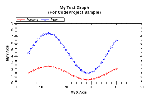
Collapse | Copy Code// Respond to the form 'Resize' event private void Form1_Resize( object sender, EventArgs e ) { SetSize(); } // SetSize() is separate from Resize() so we can // call it independently from the Form1_Load() method // This leaves a 10 px margin around the outside of the control // Customize this to fit your needs private void SetSize() { zedGraphControl1.Location = new Point( 10, 10 ); // Leave a small margin around the outside of the control zedGraphControl1.Size = new Size( ClientRectangle.Width - 20, ClientRectangle.Height - 20 ); } // Respond to form 'Load' event private void Form1_Load( object sender, EventArgs e ) { // Setup the graph CreateGraph( zedGraphControl1 ); // Size the control to fill the form with a margin SetSize(); } // Build the Chart private void CreateGraph( ZedGraphControl zgc ) { // get a reference to the GraphPane GraphPane myPane = zgc.GraphPane; // Set the Titles myPane.Title.Text = "My Test Graph\n(For CodeProject Sample)"; myPane.XAxis.Title.Text = "My X Axis"; myPane.YAxis.Title.Text = "My Y Axis"; // Make up some data arrays based on the Sine function double x, y1, y2; PointPairList list1 = new PointPairList(); PointPairList list2 = new PointPairList(); for ( int i = 0; i < 36; i++ ) { x = (double)i + 5; y1 = 1.5 + Math.Sin( (double)i * 0.2 ); y2 = 3.0 * ( 1.5 + Math.Sin( (double)i * 0.2 ) ); list1.Add( x, y1 ); list2.Add( x, y2 ); } // Generate a red curve with diamond // symbols, and "Porsche" in the legend LineItem myCurve = myPane.AddCurve( "Porsche", list1, Color.Red, SymbolType.Diamond ); // Generate a blue curve with circle // symbols, and "Piper" in the legend LineItem myCurve2 = myPane.AddCurve( "Piper", list2, Color.Blue, SymbolType.Circle ); // Tell ZedGraph to refigure the // axes since the data have changed zgc.AxisChange(); }Note that the
AxisChange()method call must be made any time you add or change the data. This tells ZedGraph to go ahead and recalculate all the axis ranges. (Note: This is allAxisChange()does - you can call it anytime you like, and it will update the axis ranges based on the current set of data points. You can also avoid calling AxisChange() if you do not want the axes rescaled.)
The above code will generate the following output:
Enhancing the graph
ZedGraph allows you to modify the graph attributes in a wide variety of ways. Each of the parts of the graph is encapsulated in a class structure, which has modifiable properties to control the output. The following are some of the classes provided in ZedGraph (Note that these classes are XML documented. See the ZedGraph documentation for details about each class.):
Class
Description
MasterPane
A class to manage multiple GraphPane objects, derived from PaneBase. Use of the MasterPaneclass is optional, as the GraphPane class can be used directly for a single pane. Also provides methods for layout, arrangement, and management of the individual GraphPane objects.
GraphPane
The primary class for the graph, derived from PaneBase. Includes all other classes as properties. Also controls the pane title, the pane frame and axis frame, backgrounds, etc.
XAxis, YAxis,Y2Axis
Children of the Axis class. These classes include many aspects of the axis display, including tics, grids, colors, pens, fonts, labels, and styles.
Scale
A class instance maintained by the Axis class. Contains the scale range, step sizes, formats, and display options for the scale. Comes in variants for Linear, Log, Text, Date, Ordinal, Exponent,LinearAsOrdinal, and DateAsOrdinal scales.
Legend
The class that describes the location, font, colors, etc., used to draw the legend.
CurveItem
An abstract base class that contains data for a single curve. LineItem, BarItem, HiLowBarItem,ErrorBarItem, PieItem, StickItem, OHLCBarItem, and JapaneseCandleStickItem are all derived from this class.
CurveList
A collection class to maintain a list of CurveItem objects. The order of the curves in the list controls the Z-Order for drawing. The last curve in the list will appear behind all other curves.
GraphObj
An abstract base class that includes position information for a variety of supplemental graphic objects on a plot. TextObj, ImageObj, LineObj, ArrowObj, EllipseObj, BoxObj, and PolyObjare derived from GraphObj.
GraphObjList
A collection class to maintain a list of GraphObj objects. The order of the objects in the list, plus aZOrder property, control the Z-Order for drawing. The last item in the list will appear behind all other items with the same ZOrder value.
FontSpec
A utility class that includes information about the font family, color, angle, size, style, frame, and background fill of the text on the graph. Each class that includes text information will contain one or more FontSpec objects to specifically describe the associated fonts.
Fill
A utility class that includes characteristics of background color fills. Each object that has color fill capability will contain one or more Fill objects to specifically describe the associated color fill.
Border
A utility class that includes characteristics of object borders. Each object that has border capability will contain one or more Border objects to specifically describe the associated border color and line properties.
Location
A general class for handling the location of graphic objects on the plot.
PointPair
A data struct that encapsulates a single pair of double values representing an (X,Y) data point. This is the internal data storage format for the value arrays in each CurveItem.
PointPairList
A collection class to maintain a list of PointPair objects.
XDate
This class encapsulates a single date-time value (stored as a System.Double), plus a wide array of methods to convert between XL date, Astronomical Julian Day number, Gregorian Calendar date, fractional year, etc. See the discussion of Date-Time axes below, for details.
The graph is modified by accessing properties in each of the above classes. For example, if you include the following lines of code in your CreateGraph() method, after the code samples shown previously, the plot will be modified accordingly:
![]() Collapse | Copy Code
Collapse | Copy Code
// Change the color of the title
myPane.Title.FontSpec.FontColor = Color.Green;

// Add gridlines to the plot, and make them gray
myPane.XAxis.MajorGrid.IsVisible = true;
myPane.YAxis.MajorGrid.IsVisible = true;
myPane.XAxis.MajorGrid.Color = Color.LightGray;
myPane.YAxis.MajorGrid.Color = Color.LightGray;

// Move the legend location
myPane.Legend.Position = ZedGraph.LegendPos.Bottom;

// Make both curves thicker
myCurve.Line.Width = 2.0F;
myCurve2.Line.Width = 2.0F;

// Fill the area under the curves
myCurve.Line.Fill = new Fill( Color.White, Color.Red, 45F );
myCurve2.Line.Fill = new Fill( Color.White, Color.Blue, 45F );

// Increase the symbol sizes, and fill them with solid white
myCurve.Symbol.Size = 8.0F;
myCurve2.Symbol.Size = 8.0F;
myCurve.Symbol.Fill = new Fill( Color.White );
myCurve2.Symbol.Fill = new Fill( Color.White );

// Add a background gradient fill to the axis frame
myPane.Chart.Fill = new Fill( Color.White,
    Color.FromArgb( 255, 255, 210 ), -45F );

// Add a caption and an arrow
TextObj myText = new TextObj( "Interesting\nPoint", 230F, 70F );
myText.FontSpec.FontColor = Color.Red;
myText.Location.AlignH = AlignH.Center;
myText.Location.AlignV = AlignV.Top;
myPane.GraphObjList.Add( myText );
ArrowObj myArrow = new ArrowObj( Color.Red, 12F, 230F, 70F, 280F, 55F );
myPane.GraphObjList.Add( myArrow );
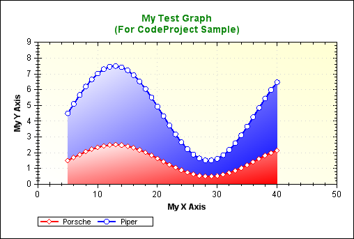
The final "dressed-up" graph will look like this:
Many more graph attributes can be modified, but listing them all in this article would be tedious. Please refer to theonline documentation for more details. Also see the demo graphs on the Wiki for samples with code.
Interesting tidbits
Drawing line graphs is no big deal, but there are some aspects of the drawing classes that proved to be interesting. The flexibility afforded by the transform matrix of the GDI+ drawing library is very cool. This allowed the same code to be employed for drawing all three of the axes. The coordinate system is transformed to accommodate the axis location and orientation. In each case, the coordinate system is translated and rotated so that the axis is oriented along the X direction and the origin is located at the left edge of the axis when facing from the label side. A few "if" exceptions were required to account for the fact that the "left" side of the X and Y2 axes is the minimum value and the "left" side of the Y axis is the maximum value.
Choosing scales
Range and step size
ZedGraph is set up to automatically select appropriate scale minimum, maximum, and step size values based on the range of data values in the curves. Alternatively, you can manually set any or all of the values, and the scale picking logic will attempt to pick the appropriate values for the remaining parameters that are left in the automatic mode. The scale picking logic is based on the assumption that the most humanly palatable step sizes will be even divisors of 10. That is, step sizes should be 1, 2, or 5 times some power of 10. The heart of the scale picking logic is found in theCalcStepSize() method:
![]() Collapse | Copy Code
Collapse | Copy Code
protected double CalcStepSize( double range, double targetSteps )
{
    // Calculate an initial guess at step size
    double tempStep = range / targetSteps;

    // Get the magnitude of the step size
    double mag = Math.Floor( Math.Log10( tempStep ) );
    double magPow = Math.Pow( (double) 10.0, mag );

    // Calculate most significant digit of the new step size
    double magMsd =  ( (int) (tempStep / magPow + .5) );

    // promote the MSD to either 1, 2, or 5
    if ( magMsd > 5.0 )
        magMsd = 10.0;
    else if ( magMsd > 2.0 )
        magMsd = 5.0;
    else if ( magMsd > 1.0 )
        magMsd = 2.0;

    return magMsd * magPow;
}
The initial guess at the step size is calculated using a default number of steps named targetSteps (this value is defaulted to 7), which is the typical number of major steps you want on an axis. The actual number of steps will usually end up being this number or more. A magnitude of the initial step size is determined using Floor( Log10( stepSize ) ). This magnitude is reduced to a most significant digit, which is then promoted to either 1, 2, or 5 to make the scale an even divisor of 10. In general, I find that this logic is very good at picking scales based on the data range.
Zero lever
Another aspect of the scale selection is whether or not the scale should be extended to include the zero value. For example, if the scale range is 1 to 10, you would typically want to go ahead and start it at zero. This is accomplished with the ZeroLever default parameter. The ZeroLever is the allowable fraction that the scale range can be extended to include the zero value. This applies below the scale range for positive scales, or above the scale range for negative scale values. As an example, if the ZeroLever is 0.25 and the data range is from 2.0 to 12.0, then the scale would be extended to a range of 0.0 to 12.0 since the zero value lies 20% outside the actual data range (which is within the 25% allowed).
Grace
Finally, ZedGraph includes "grace" properties that allow you to include extra space on the scale range before and after the minimum and maximum data values, respectively. The reason for this is to avoid having the minimum and/or maximum data points fall right on the axes. Note that the grace values apply only to the non-ordinal axis types (AxisType.Log, AxisType.Linear, and AxisType.Date). The grace values are controlled byAxis.Scale.MinGrace and Axis.Scale.MaxGrace. These values are expressed as a fraction of the total data range. For example, if MinGrace and MaxGrace are both set to 0.1, then 10% of the data range will be padded before and after the actual data range. For example, if the data values go from 50.0 to 150.0, then the data range is 100.0. 10% of this range is 10.0. Adding this before and after the range gives an effective data range of 40.0 to 160.0. The grace properties will not cause the range to extend across the zero point. That is, if both the min and max data values are zero or greater, then the axis will not be extended to negative values regardless of the grace setting. The default values for MinGrace and MaxGrace are handled by Scale.Default.MinGrace and Scale.Default.MaxGrace, respectively. Both values are set to 0.1 initially.
Axis types
Each axis now has a property called Type, which can be set to one of these eight values:
AxisType.Linear: This is the default type, which is just a regular Cartesian axis.AxisType.Log: This is a base 10 logarithmic scale.AxisType.Exponent: This is an exponential scale.AxisType.Date: This is a date-time axis, in which the corresponding values areXDatetypes. See Date-Time Axes below.AxisType.Text: This is an ordinal type, in which the data values for this axis are actually not used. All points or bars will be evenly spaced on the graph. The first point will have a value of 1.0, the second will be 2.0, etc. The actual value labels will be determined by an array of strings inAxis.TextLabels. See Text Axes below.AxisType.Ordinal: This is another ordinal type, in which the data values for this axis are not used. All points or bars will be evenly spaced on the graph. The first point will have a value of 1.0, the second will be 2.0, etc. The actual value labels are just determined by the numeric ordinal values (1.0, 2.0, etc.).AxisType.LinearAsOrdinal: This is another ordinal type, essentially the same asAxisType.Ordinal, except that the axis scale values will be displayed based on the data values (although the axis will still be treated as ordinal, with 1.0 for the first label, 2.0 for the second, etc.).AxisType.DateAsOrdinal: This is another ordinal type, essentially the same asAxisType.Ordinal, except that the axis scale values will be displayed based on the data values as dates. This mode is a good choice if you have weekday values and you want to skip the weekends without leaving gaps in the data.
Date-time axes
ZedGraph includes the capability to handle date-time axes, e.g., the axis labels can be based on an encoded date-time value, displayed in anything from seconds to years. At the heart of the date-time axis is the XDate struct, which captures a time value, and handles conversions to/from a wide range of date-time formats. You're probably wondering why I reinvented the wheel on this, rather than just using the built-in DateTime class (or equivalent). The main reason I made my own class is because an XDate stores its date-time information as a System.Double value. Therefore,XDate values can just be stored in an ordinary array of doubles, just like any other array of data that is passed to ZedGraph. The XDate struct and format are described in detail in the Wiki. If you are using DateTime structs to store your data, you can convert directly to doubles which are compatible with ZedGraph, by using theDateTime.ToOADate() method.
To use a date-time axis in ZedGraph, you need to change to AxisType.Date as follows:
![]() Collapse | Copy Code
Collapse | Copy Code
myPane.XAxis.Type = AxisType.Date;
ZedGraph will then assume that the X array double values are actually XDate values. XAxis.Scale.Min andXAxis.Scale.Max will also be XDate values, but the units of XAxis.Scale.MajorStep andXAxis.Scale.MinorStep will depend on the setting of XAxis.Scale.MajorUnit and XAxis.Scale.MinorUnit, respectively. XAxis.Scale.MajorUnit and XAxis.Scale.MinorUnit can be set to one of the following values:DateUnit.Year, DateUnit.Month, DateUnit.Day, DateUnit.Hour, DateUnit.Minute, DateUnit.Second, andDateUnit.Millisecond. Note again that XDate values are actually units of days (actually, days since a reference date). However, if XAxis.Scale.MajorUnit = DateUnit.Year, then a value of 0.25 for XAxis.Scale.MajorStepmeans that the step size is 1/4th of a year. One more extra property is used for the date-time axes: theScale.Format. This is a string that defines the format of the major tic labels for the axis. For example,XAxis.Scale.Format = "dd-MMM-yy" would give labels like "12-Dec-95". A wide range of formatting options is available - see the Wiki for details. Note that the formatting is based on DateTimeFormatInfo, which is the same as the DateTime struct.
Assuming XAxis.Scale.MinAuto, XAxis.Scale.MajorStepAuto, and XAxis.Scale.MaxAuto are all set to true, ZedGraph will attempt to select an axis range that fits the span of the dates. This means that the auto-scaling feature will automatically set the following properties: Axis.Scale.Min, Axis.Scale.Max, Axis.Scale.MajorStep,Axis.Scale.MinorStep, Axis.Scale.MajorUnit, Axis.Scale.MinorUnit, and Axis.Scale.Format.
If you want to try this out, here's the code for an example graph, which has a data point for the first day of each month, for 30 months starting with 1-Jan-1995:
![]() Collapse | Copy Code
Collapse | Copy Code
// Build the Chart
private void CreateGraph( ZedGraphControl zg1 )
{
   // Get a reference to the GraphPane
   GraphPane myPane = zg1.GraphPane;

   // Set the titles
   myPane.Title.Text = "My Test Date Graph";
   myPane.XAxis.Title.Text = "Date";
   myPane.XAxis.Title.Text = "My Y Axis";

   // Make up some random data points
   double x, y;
   PointPairList list = new PointPairList();
   for ( int i=0; i<36; i++ )
   {
      x = (double) new XDate( 1995, 5, i+11 );
      y = Math.Sin( (double) i * Math.PI / 15.0 );
      list.Add( x, y );
   }

   // Generate a red curve with diamond
   // symbols, and "My Curve" in the legend
   CurveItem myCurve = myPane.AddCurve( "My Curve",
         list, Color.Red, SymbolType.Diamond );

   // Set the XAxis to date type
   myPane.XAxis.Type = AxisType.Date;

   // Tell ZedGraph to refigure the axes since the data
   // have changed
   zg1.AxisChange();
}
The above code generates the following graph:

In this case, ZedGraph selected a major step size of six days, and a minor step size of one day. You can easily adjust the selected format, if desired. For example, if you want to use 1 month for the minor step size, just setmyPane.XAxis.Scale.MinorStep = 1.0 and myPane.XAxis.Scale.MinorUnit = DateUnit.Month just before the AxisChange() call. If you change the XAxis.Scale.MajorStep value, you will also have to manually setXAxis.Scale.MajorUnit, XAxis.Scale.MinorUnit, XAxis.Scale.MinorStep, and XAxis.Scale.Format. This is because XAxis.Scale.MajorStepAuto == false since you have chosen to manually select the step size.
Text axis
ZedGraph also handles a text axis. This is an axis in which the tic labels are arbitrary, user supplied text strings instead of value labels. Internally, a text axis is handled using ordinal values just like an ordinary axis. In this case, the first major label has a value of 1.0, the second major label has a value of 2.0, etc. It is permissible to use fractional values if you want to place points in-between the labels.
To make a text axis, you set Axis.Type = AxisType.Text. This informs ZedGraph to use the labels supplied by the user in Axis.Scale.TextLabels. The number of labels will determine the axis range. That is, 10 labels means the axis will be ranged from 1.0 to 10.0. Optionally, when you add a curve to ZedGraph, you can just skip any value array that is associated with a text axis. A default array of ordinal values will be generated. For example, if the XAxis is of typeText with 10 labels, you can add a curve, leaving the X array null, and an X array will be generated internally with values from 1.0 to 10.0. The bar chart below shows the usage of the AxisType.Text.
Bar charts
ZedGraph includes bar charting capability for vertical and horizontal bar charts, stacked bar charts, percent stacked bar charts, overlay bar charts, error bar charts, high-low bar charts, open-high-low-close bar charts, and Japanese candlestick bar charts. A bar chart is created similar to a line graph, except that you use GraphPane.AddBar(),GraphPane.AddErrorBar(), or GraphPane.AddHiLowBar() to create the bar instance. It is possible to mix bars, lines, and symbols on the same graph, by simply adding the different types.
Bars can be made horizontal or vertical, by setting the "base" axis to the X or Y axis. Under the ZedGraph terminology, the "base" axis determines the bar position, and the "value" axis determines the height of the bar.
Typically, bar charts would be created with XAxis.Type = AxisType.Text or XAxis.Type = AxisType.Ordinal(both types use ordinal values), such that the bars are drawn at integral values along the "base" axis, starting with 1 (e.g., the first bar cluster is at 1.0, the second is at 2.0, etc.). However, the ordinal axis type is not a requirement for bar charts. It is possible to create a bar chart that is not evenly spaced, by providing X values and usingAxisType.Linear (in this case, you may need to use the GraphPane.ClusterScaleWidth property to tell ZedGraph how wide the bars should be. See this wiki page for details). For bar charts, the tic marks are typically between the bar clusters, which can be accomplished with the Axis.MajorTic.IsBetweenLabels property. However, this property is only applicable for AxisType.Text axes.
ZedGraph actually has six distinct bar types, any of which can be horizontal or vertical:
BarItem- is for regular bars, stacked bars, percent stacked bars, overlay bars, and sorted overlay bars.ErrorBarItem- is for error bars, which are "I-Beam" bars with a symbol at each end, based on the upper and lower values that are user-defined.HiLowBarItem- is for rectangular bars that have both upper and lower values that are user-defined.
Other "bar-like" types are also available:
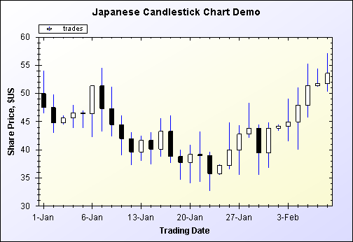
OHLCBarItem- is for open-high-low-close stock charts, similar to an error bar, and showing the open, close, high, and low prices for the day.JapaneseCandleStickItem- another stock chart type showing a narrow vertical line depicting the high-low range of prices for the day, plus a colored bar showing the open and close with a different color for rising and falling days.StickItem- a chart with a narrow line at each value going back to the X axis.
The following is an example of a JapaneseCandleStickItem chart, used to show High-Low-Open-Close data for the stock market:
The orientation (horizontal or vertical) and the size of the BarItem bars are determined globally byGraphPane.BarSettings.Base and other GraphPane.BarSettings properties. Therefore, all BarItem bars will have similar properties, and the size of the bars is scaled automatically to fill the available space. In contrast, the size ofErrorBarItem bars and HiLowBarItem bars are controlled by individual properties for each bar item, e.g.,ErrorBarItem.Bar.Size. These bar types are actually similar to symbols, since the bar width is specified in points (1/72 inch). A single plot can have a variety of different ErrorBarItems and HiLowBarItems with different sizes.
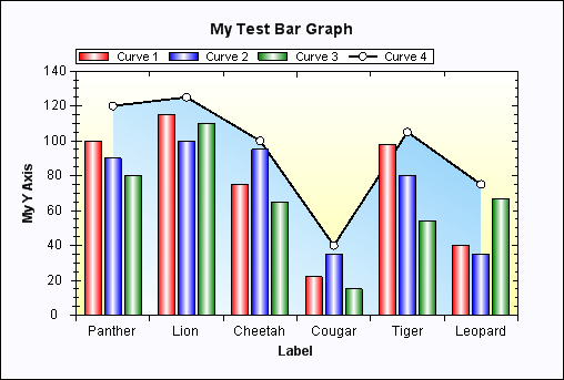
Two properties are included in the GraphPane class to control the gaps between BarItem bars;GraphPane.BarSettings.MinBarGap (default = 0.2) is the minimum size of the gap between each bar within a bar cluster (multiple bars that share the same X value), and GraphPane.BarSettings.MinClusterGap (default = 1.0) is the minimum size of the gap between the bar clusters. Both of these parameters are expressed as a fraction of the individual bar size, i.e., a value of 1.0 would make the gap the same size as the bars. Note that these properties apply only to BarItem bars (not ErrorBarItem or HiLowBarItem bars). A new Bar class has been added to the BarItemclass to control the properties of the bars. This Bar class has properties for Fill, FrameColor, FrameWidth, andIsFramed. The following example generates a simple bar chart:
![]() Collapse | Copy Code
Collapse | Copy Code
// Build the Chart
private void CreateGraph( ZedGraphControl zg1 )
{
   // get a reference to the GraphPane
   GraphPane myPane = zg1.GraphPane;

   // Set the Titles
   myPane.Title.Text = "My Test Bar Graph";
   myPane.XAxis.Title.Text = "Label";
   myPane.YAxis.Title.Text = "My Y Axis";

   // Make up some random data points
   string[] labels = { "Panther", "Lion", "Cheetah",
                      "Cougar", "Tiger", "Leopard" };
   double[] y = { 100, 115, 75, 22, 98, 40 };
   double[] y2 = { 90, 100, 95, 35, 80, 35 };
   double[] y3 = { 80, 110, 65, 15, 54, 67 };
   double[] y4 = { 120, 125, 100, 40, 105, 75 };

   // Generate a red bar with "Curve 1" in the legend
   BarItem myBar = myPane.AddBar( "Curve 1", null, y,
                                               Color.Red );
   myBar.Bar.Fill = new Fill( Color.Red, Color.White,
                                               Color.Red );

   // Generate a blue bar with "Curve 2" in the legend
   myBar = myPane.AddBar( "Curve 2", null, y2, Color.Blue );
   myBar.Bar.Fill = new Fill( Color.Blue, Color.White,
                                               Color.Blue );

   // Generate a green bar with "Curve 3" in the legend
   myBar = myPane.AddBar( "Curve 3", null, y3, Color.Green );
   myBar.Bar.Fill = new Fill( Color.Green, Color.White,
                                               Color.Green );

   // Generate a black line with "Curve 4" in the legend
   LineItem myCurve = myPane.AddCurve( "Curve 4",
         null, y4, Color.Black, SymbolType.Circle );
   myCurve.Line.Fill = new Fill( Color.White,
                         Color.LightSkyBlue, -45F );

   // Fix up the curve attributes a little
   myCurve.Symbol.Size = 8.0F;
   myCurve.Symbol.Fill = new Fill( Color.White );
   myCurve.Line.Width = 2.0F;

   // Draw the X tics between the labels instead of
   // at the labels
   myPane.XAxis.MajorTic.IsBetweenLabels = true;

   // Set the XAxis labels
   myPane.XAxis.Scale.TextLabels = labels;
   // Set the XAxis to Text type
   myPane.XAxis.Type = AxisType.Text;

   // Fill the Axis and Pane backgrounds
   myPane.Chart.Fill = new Fill( Color.White,
         Color.FromArgb( 255, 255, 166), 90F );
   myPane.Fill = new Fill( Color.FromArgb( 250, 250, 255) );

   // Tell ZedGraph to refigure the
   // axes since the data have changed
   zg1.AxisChange();
}
The above code generates the following graph:
Bar types
ZedGraph can draw BarItem bar charts in a variety of types according to the GraphPane.BarSettings.Typeproperty. This can be one of the following values:
BarType
Description
BarType.Cluster
This is the normal format in which various bar series are grouped together in clusters at each base value (like the first example chart above).
BarType.ClusterHiLow
This format draws a hi-low (bars have a top and bottom that are user defined) in a cluster format, so multiple high-low bars can be grouped together at each base value.
BarType.Overlay
In this format, the bars are drawn on top of each other, with the first BarItemdrawn at the back, and the last BarItem drawn at the front.
BarType.SortedOverlay
This is similar to Overlay, but the bars are sorted on value, and the highest value is drawn at the back, and the lowest value is drawn at the front.
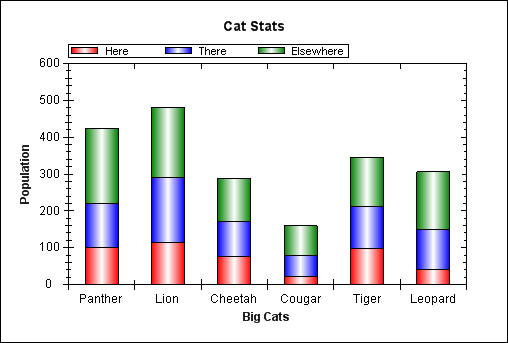
BarType.Stack
The bars are stacked on top of each other, accumulating in value.
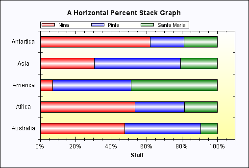
BarType.PercentStack
The bars are stacked on top of each other, and plotted as a percentile, with the total height always being 100%.
The following samples show horizontal and stacked bar types:
Pie charts
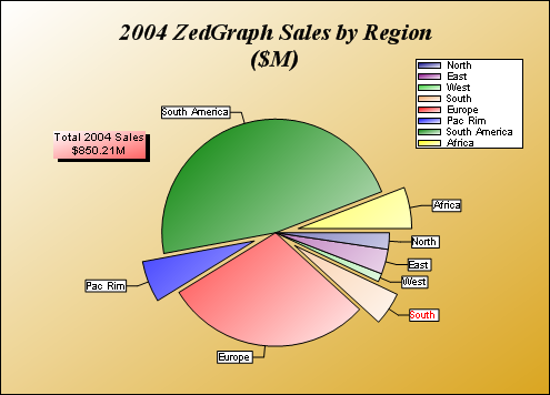
Pie charts are created in the normal fashion using the GraphPane.AddPieSlice(), which returns a PieItem. OnePieItem is added for each slice of the pie. Note that, unlike the other CurveItem - derived classes, the PieItem does not use the PointPairList to store the data value. Since the pie has only a single data value, it is stored inPieItem.PieValue. The pie charts support text labels, a legend, color fills, etc. in the typical ZedGraph fashion.
Although it is technically possible to combine pie charts with line graphs on the same GraphPane, it is not recommended. If a particular GraphPane contains only PieItem objects, then the AxisChange() method will automatically make the axes invisible by setting the Axis.IsVisible property to false.
The following is an example of a ZedGraph pie chart:
The MasterPane
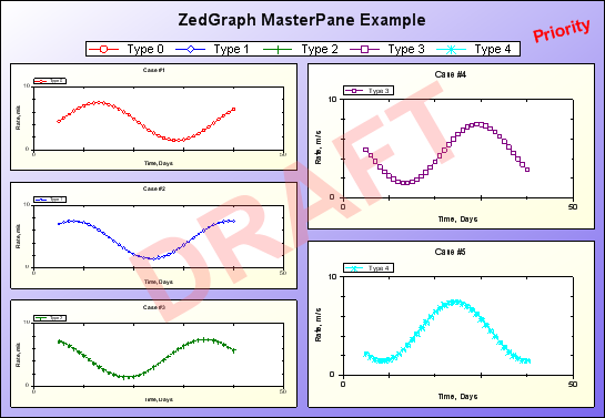
The MasterPane is designed to help facilitate the handling of multiple GraphPane objects on a page. This is done by maintaining a list of GraphPane objects, and providing utility functions for layout, rendering, mouse point location, etc. See the ZedGraphWiki for details on the MasterPane class. The following is an example of a chart based on theMasterPane class:
Pan/Zoom functions
The ZedGraphControl class now provides some interactive functionality for zooming and panning. To zoom, left click inside the AxisRect area, and drag out a new rectangle to indicate the scale region into which to zoom. To pan, either click with the middle mouse button or hold down the shift key, and left click to drag the graph around (the zoom/pan key combinations are user-modifiable as well). You can also add scrollbars to the control with IsShowHScrollBar andIsShowVScrollBar. The mouse-wheel can also be used for zooming. There is also a context menu that allows you to un-zoom and un-pan to prior states, to restore the scale to full auto mode, to show point value tool tips, and to copy the graph (bitmap form) to the clipboard. Event options are provided to allow for customization of pan, zoom, point values, etc.
The Fill class
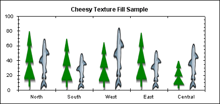
The Fill class is an important addition to ZedGraph, so it deserves a special mention. This class handles solid, linear gradient, and texture fills for the pane background, the axis background, the legend background, all text backgrounds, the symbol fill, and for filling the area under a line. Each of these classes will have one or more Fill classes to control the fill properties (e.g., CurveItem.Line.Fill controls the filling of the area under the curve). The Fill class has a number of constructors to make it flexible and easy to use:
Fill( Color )
Makes a solid color fill with the specified color.
Fill( Color, Color )
Makes a linear gradient fill from color1 to color2, with a gradient angle of 0 degrees.
Fill( Color, Color, float angle )
Makes a linear gradient fill from color1 to color2, with a gradient angle as specified.
Fill( Image, WrapMode )
Specifies an image to be used for filling.
Fill( Brush )
Uses the specified brush directly, scaling the brush to fill the destination object bounding box.
Fill( Brush, bool isScaled )
Uses the specified brush, allowing you to disable the scaling.
Fill( Brush, AlignH, AlignV )
Uses the specified brush, with no scaling, but the source brush alignment is specified.
Internally, the Fill class keeps a FillType enumeration (the Type property) to determine what type of fill is used, as follows:
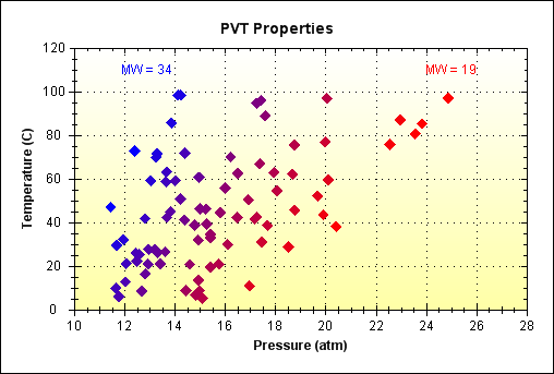
FillType.None: No filling will be done - the background will be transparent.FillType.Solid: A solid color fill will be done using theSolidBrushclass with theFill.Colorvalue.FillType.Brush: A fancy fill will be done using the user-supplied brush specified inFill.Brush. IfFill.Brushisnull, then aLinearGradientBrushwill be automatically created usingFill.ColorandColor.Whiteas the gradient colors, with a gradient angle of zero degrees.FillType.GradientByX: This mode is intended to be used withSymbol.Fill. A linear gradient is maintained internally in theFillclass, and each symbol point is filled with a solid color that is taken from the internal gradient based on the X data value for that point. Essentially, you get a scatter plot in which each data point is colored according to its X value. The data ranges for color assignment are user assigned with theFill.RangeMinandFill.RangeMaxproperties.FillType.GradientByY: This is the same asGradientByXexcept that the Y data values are used instead of X data values.FillType.GradientByZ: This is the same asGradientByXexcept that the Z data values are used instead of X data values.FillType.GradientByColorValue: This is the same asGradientByXexcept that the 'ColorValue' property values are used instead of X data values.
The following graph is an example of FillType.GradientByZ usage, in which seemingly scattered data gains visual coherency using the color attribute:
The following shows an example of using an image to fill in the bars of a bar chart:
Z-Order
The graphic items in the display are contained in two lists; GraphPane.CurveList and GraphPane.GraphObjList.CurveList contains all of the curves, including bars, lines, etc. GraphObjList contains text items, images, shapes, arrows, etc. In both lists, the Z-Order is controlled by the order of the objects in the list; the first objects in the list appear in front of the later objects in the list. You can modify the order of any object relative to other objects in the same collection (list), with the Move() method in the collection class. Further, the GraphObj class has a ZOrderproperty that controls the depth of each individual GraphObj relative to other, non-GraphObj objects. The ZOrder is an enumeration type with the following values:
ZOrder
Description
ZOrder.A_InFront
The topmost depth, in front of all other objects.
ZOrder.B_BehindLegend
Drawn behind the Legend object.
ZOrder.C_BehindChartBorder
Drawn behind the Chart frame border.
ZOrder.D_BehindAxis
Drawn behind the Axis objects (behind the scale labels, etc.).
ZOrder.E_BehindCurves
Drawn behind all the CurveItem objects.
ZOrder.F_BehindTitle
Drawn behind the GraphPane title.
ZOrder.G_BehindAll
Drawn behind the Chart rectangle fill (but still in front of the pane rectangle fill).
Utility methods
ZedGraph is being used as a class library in interactive parent applications that need information about the graph. The following are some utility methods that are worth mentioning (these are documented in the ZedGraph.chm doc file):
FindPane()is a method in theMasterPaneclass that, given a mouse point location, returns theGraphPaneobject under the mouse.FindAxisRect()is a method in theMasterPaneclass that, given a mouse point location, returns theGraphPaneobject for theAxisRectin which the mouse point lies.FindNearestObject()is a method in theGraphPaneclass that, given a mouse point location, returns the closest object and a corresponding index number for the object. This method may returnCurvepoints, theGraphPane,GraphItems, axes, the legend, etc., depending on what was clicked.FindNearestPoint()is a method in theGraphPaneclass that, given a mouse point location, returns the closestCurveItemand the index number of the closest point within thatCurveItem. This routine will only consider points that are withinDef.Pane.NearestTolpixels of the specified mouse point location. The default tolerance is 7 pixels.ReverseTransform()is a method in theGraphPaneclass that, given a mouse point location, returns the X, Y, and Y2 axis values that correspond to that location.GeneralTransform()is a method in theGraphPaneclass that, given an (X,Y) value pair, returns the corresponding (X,Y) screen pixel coordinates. The (X,Y) value pair can be expressed in a variety of coordinate systems, as follows:
CoordType.AxisXYScale: the coordinate values are from the X and left Y axes.CoordType.AxisXY2Scale: the coordinate values are from the X and right Y (Y2) axes.CoordType.ChartFraction: the coordinate values are expressed as a fraction of the totalChart.Rectwidth and height (0.5 is the center of theChart.Rect, 1.1 is just to the right or just above theAxisRect).CoordType.PaneFraction: the coordinate values are expressed as a fraction of the totalPaneRectwidth and height. The value should be from 0.0 to 1.0, since values outside this range are clipped.XChartFractionYPaneFraction: the X coordinate is a fraction of the totalChart.Rect, and the Y coordinate is a fraction of the totalPane.Rect.XPaneFractionYChartFraction: the X coordinate is a fraction of the totalPane.Rect, and the Y coordinate is a fraction of the totalChart.Rect.XScaleYChartFraction: the X coordinate is an X scale value, and the Y coordinate is fraction of the totalChart.Rect.XChartFractionYScale: the X coordinate is a fraction of the totalChart.Rect, and the Y coordinate is a Y scale value.XChartFractionY2Scale: the X coordinate is a fraction of the totalChart.Rect, and the Y coordinate is a Y2 scale value.
CalcChartRect()is a method in theGraphPaneclass that will calculate the chart rectangle (screen coordinates), given the current configuration. If, for some reason, you need to manually set the chart rectangle (to make it line up perfectly with other items, etc.), you can use this method to get the default rectangle, modify it as desired, then setGraphPane.Chart.Rect = yourRect. Changing theChart.Rectwill automatically setGraphPane.Chart.IsRectAutotofalseso that theChart.Rectwill remain as you set it.


 浙公网安备 33010602011771号