css 样式
禁止浏览器自动填充账号密码
<FormItem label="新密码" prop="loginpwd">
  <Input
    type="password"
    v-noFill
    v-model.trim="userinfo.loginpwd"
    readonly
    password
    placeholder="请输入新密码"
  />
</FormItem>
directives: {
  // 防止input输入框自动填充
  noFill: {
    inserted: el => {
      let inputEl = el.getElementsByTagName("input")[0];
      if (inputEl) {
        inputEl.addEventListener("focus", () => {
          inputEl.removeAttribute("readonly");
        });
        inputEl.addEventListener("blur", () => {
          inputEl.setAttribute("readonly", "readonly");
        });
      }
    }
  }
},
明文密文切换
input.setAttribute("type","text")
input.setAttribute("type","password")
父级元素样式overflow:auto;也会影响子元素z-index的层级显示,因为父元素overflow:auto之后允许有滚动条,子元素可以放下了,自然子元素的层级样式跟父元素没关系了。
鼠标悬停样式
//禁用样式 一个个红色圈加一个斜杠
cursor: not-allowed;

//自定义样式
cursor: url("../../../assets/img/stop.png"), auto;
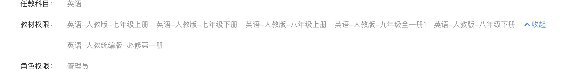
需求就是默认显示一行,多了就显示更多,上图就是电了更多后的效果。因素一、教材名称长度是不固定的。因素二、屏幕宽度也不一样。
解决方法:我用了scrollwidth 获取实际文本的长度,得到的值是盒子的宽度,行不通,也获取不到元素宽度改变之后的值。最后只能一行固定显示五个了,那么这个盒子宽度是怎么确定的呢!
神奇的地方我居然想到了收起这个按钮,我们是可以得到 offsetleft 的值,这样也算是动态取到了文本宽度,最后计算宽度再赋值给元素宽度即可。
禁止输入 输入框
disabled属性:<input type="text" :disabled="true"/>
使文本框不能修改内容,且文本框内容变灰色,通过request.getParameter("name")得不到文本框中的内容;

readonly属性:<input type="text" :readonly="true"/>
只是使文本框不能修改内容,外观没有变化,而且通过request.getParameter("name")可以得到内容
后台返回的数据自动换行
white-space: pre-wrap;
html 空格
css自定义光标样式,将鼠标替换为图片
cursor: url('../'), auto;
letter-spacing 属性增加或减少字符间的空白(字符间距)
letter-spacing: 1px;
单行文本的溢出显示省略号:
overflow: hidden;
text-overflow:ellipsis;
white-space: nowrap;
多行文本溢出显示省略号:
display: -webkit-box;
-webkit-box-orient: vertical;
-webkit-line-clamp: 3;    // 显示的行数
overflow: hidden;
如果div标签文本换行样式未生效,就改用span标签 white-space: normal;
css 一行三个 靠两边剧中布局
div是父元素下的子元素
div:nth-child(3n) {
      margin: 30px 0 0;
   }

选择器匹配属于父元素的特定类型的第 N 个子元素的每个元素.
4、nth-child(2n)
这个表示选择列表中的偶数标签,即选择 第2、第4、第6…… 标签。
5、nth-child(2n-1)
这个表示选择列表中的奇数标签,即选择 第1、第3、第5、第7……标签。
6、nth-child(n+3)
这个表示选择列表中的标签从第3个开始到最后。
7、nth-child(-n+3)
这个表示选择列表中的标签从0到3,即小于3的标签。
8、nth-last-child(3)
这个表示选择列表中的倒数第3个标签。
禁止选择
moz-user-select: -moz-none;/*火狐浏览器*/
-moz-user-select: none;/*火狐浏览器*/
-o-user-select: none;/*opera浏览器*/
-webkit-user-select: none; /*webkit浏览器*/
-ms-user-select: none; /*IE10*/
-khtml-user-select: none; /*早期浏览器*/
user-select: none;
自动换行
word-wrap:break-word !important;
缩进
p{text-indent:2em;}
//本来想让P标签内容首行缩进2个字,但是很不幸,文章有P标签下有img标签,导致图片也跟着缩进了,版式很糟糕
//解决方法 text-indent遇到display:block 或者float 就不生效了,也就是给图片加上display:block 即可
//示例
p{
    padding: 0 !important;
    text-indent: 2em;
}
p img{
    display: block;
}
下划线
p a{text-decoration:underline;}
圆角
-moz-border-radius: 6px; /* Mozilla浏览器的私有属性 */
-webkit-border-radius: 6px; /* Webkit浏览器的私有属性 */
border-radius: 6px 6px 6px 6px; /* 四个半径值分别是左上角、右上角、右下角和左下角 */
阴影
box-shadow: 1px 1px 3px 0px #DADADA;
-webkit-box-shadow: 1px 1px 3px 0px #DADADA;
-o-box-shadow: 1px 1px 3px 0px #DADADA;
-moz-box-shadow: 1px 1px 3px 0px #DADADA;
背景图
background: url('../images/arrow_up.png') center center no-repeat;
边框
border: 1px solid #ddd;
禁用li样式
list-style: none;
相同间距等宽 每行3个元素,中间间距是10px
.banklist {
  margin-left: 20px;
  margin-right: 20px;
  display: flex;
  flex-wrap: wrap;
  justify-content: flex-start;

  .bankitem {
    width: calc((100% - 20px) / 3);
    margin-left: 10px;
    height: 200px;
    border: 1px solid #e9e9e9;
    box-sizing: border-box;
    background-color: white;
  }

  .bankitem:nth-child(3n+1) {
    margin-left: 0;
  }
}
//注意
nth-child(3n+1)选择元素是从1开始的。
calc((100% - 20px) / 3)这个表达式是支持乘除的。
自定义滚动条
::-webkit-scrollbar { /*滚动条整体样式*/
  width: 10px; /*高宽分别对应横竖滚动条的尺寸*/
  height: 10px;
}

::-webkit-scrollbar-thumb { /*滚动条里面小方块*/
  border-radius: 5px;
  background: #1890ff;
}

::-webkit-scrollbar-track { /*滚动条里面轨道*/
  background: #EDEDED;
}

//隐藏滚动条但是可以滚动
.content::-webkit-scrollbar {
  display: none;
}
Table
table {
  width: 100%;
  border-collapse: collapse;

  tr {
    height: 40px;

    th,
    td {
      text-align: center;
      vertical-align: middle;
    }
  }
}
table,
tr,
td,
th {
  border: 1px solid #dcdee2;
}
position的fixed和sticky的区别
fixed相对于相对于视口(viewport,浏览器窗口)进行偏移,即定位基点是浏览器窗口。不管视口如何滚动,它的位置始终不变。

fixed如果搭配top、bottom、left、right这四个属性一起使用,表示元素的初始位置是基于视口计算的,否则初始位置就是元素的默认位置。
输入框提示语字体颜色
input::-webkit-input-placeholder {
        color: red;
      }
动态引用外部样式
const linkElem = document.createElement('link');
linkElem.setAttribute('rel', 'stylesheet');
linkElem.setAttribute('href', 'style.css');   //style.css 在同级目录下即可

document.head.appendChild(linkElem);
动态引用网页标题图标
let linkico = document.createElement("link");
linkico.setAttribute("type", "image/x-icon");
linkico.setAttribute("rel", "shortcut icon");
linkico.setAttribute("href", cloud_theme_info.loginico);   //loginico 链接
document.head.appendChild(linkico);
vue 项目中换肤
//当前目录在主index.mtnl  public下
this.$setMySkin("./theme/default.css");
flex兼容性写法
https://blog.csdn.net/amyliyanice/article/details/54926301?utm_medium=distribute.pc_relevant.none-task-blog-2~default~baidujs_baidulandingword~default-0.highlightwordscore&spm=1001.2101.3001.4242.1
text-align: lefe; 用于块元素
span 标签设置不可用
cursor:not-allowed;//是禁用的样式 一个圆圈中间一个斜杠 //其中还有一个属性也是这个样式 cursor:no-drop;
object-fit 属性指定元素的内容应该如何去适应指定容器的高度与宽度。
object-fit: fill|contain|cover|scale-down|none|initial|inherit;
fill    默认,不保证保持原有的比例,内容拉伸填充整个内容容器
contain    保持原有尺寸比例。内容被缩放。
cover    保持原有尺寸比例。但部分内容可能被剪切。
none    保留原有元素内容的长度和宽度,也就是说内容不会被重置。
scale-down    保持原有尺寸比例。内容的尺寸与 none 或 contain 中的一个相同,取决于它们两个之间谁得到的对象尺寸会更小一些。
initial    设置为默认值
inherit    从该元素的父元素继承属性。
flex 布局之骰子布局三
align-self 属性用于设置弹性元素自身在侧轴(纵轴)方向上的对齐方式。- auto:如果'align-self'的值为'auto',则其计算值为元素的父元素的'align-items'值,如果其没有父元素,则计算值为'stretch'。
- flex-start:弹性盒子元素的侧轴(纵轴)起始位置的边界紧靠住该行的侧轴起始边界。
- flex-end:弹性盒子元素的侧轴(纵轴)起始位置的边界紧靠住该行的侧轴结束边界。
- center:弹性盒子元素在该行的侧轴(纵轴)上居中放置。(如果该行的尺寸小于弹性盒子元素的尺寸,则会向两个方向溢出相同的长度)。
- baseline:如弹性盒子元素的行内轴与侧轴为同一条,则该值与'flex-start'等效。其它情况下,该值将参与基线对齐。
- stretch:如果指定侧轴大小的属性值为'auto',则其值会使项目的边距盒的尺寸尽可能接近所在行的尺寸,但同时会遵照'min/max-width/height'属性的限制。
flex 属性用于指定弹性子元素如何分配空间。- auto: 计算值为 1 1 auto
- initial: 计算值为 0 1 auto
- none:计算值为 0 0 auto
- inherit:从父元素继承
- [ flex-grow ]:定义弹性盒子元素的扩展比率。
- [ flex-shrink ]:定义弹性盒子元素的收缩比率。
- [ flex-basis ]:定义弹性盒子元素的默认基准值。
<style>
      .box {
        display: flex;
        flex-wrap: wrap;
      }
      [class$="box2"] {
        margin: 16px;
        padding: 4px;
        background-color: #e7e7e7;
        width: 104px;
        height: 104px;
        object-fit: contain;
        box-shadow: inset 0 5px white, inset 0 -5px #bbb, inset 5px 0 #d7d7d7,
          inset -5px 0 #d7d7d7;
        border-radius: 10%;
      }
      .pip {
        display: block;
        width: 24px;
        height: 24px;
        border-radius: 50%;
        margin: 4px;
        background-color: #333;
        box-shadow: inset 0 3px #111, inset 0 -3px #555;
      }
      .box2 {
        display: flex;
        justify-content: space-between;
      }
      .pip:nth-of-type(2) {
        align-self: center;
      }
      .pip:nth-of-type(3) {
        align-self: flex-end;
      }
    </style>

<div class="box">
      <div class="box2">
        <span class="pip"></span>
        <span class="pip"></span>
        <span class="pip"></span>
      </div>
      </div>
    </div>