python 数据可视化
一、基本用法
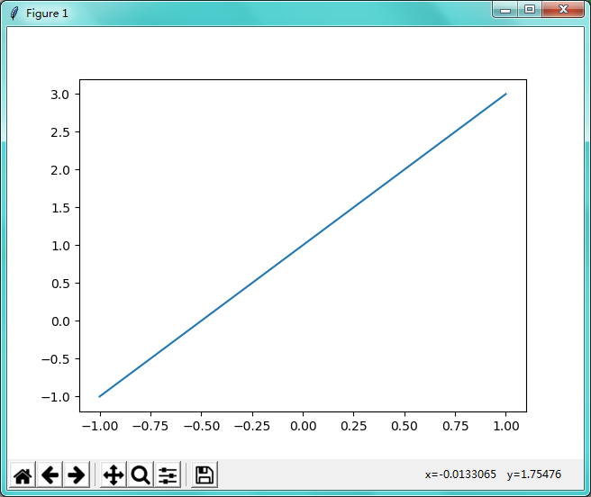


import numpy as np
import matplotlib.pyplot as plt

x = np.linspace(-1,1,50) # 生成-1到1 ,平分50个点
y = 2*x+1

plt.plot(x,y) # 把 x 和 y 展示出来
plt.show()    # 脚本当中要用.show()图才会出来
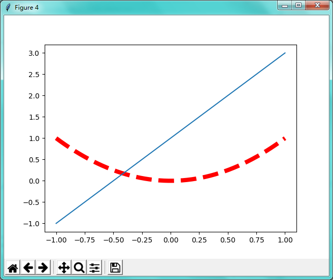
import numpy as np
import matplotlib.pyplot as plt

x = np.linspace(-1,1,50) # 生成-1到1 ,平分50个点
y1 = 2*x+1
y2 = x**2

plt.figure(num=3,figsize=(8,5))   # 指定窗口名称数为3,图形长宽为8,5
plt.plot(x,y1)

plt.figure()          # 当需要多个窗口时plt.plot(...) 上面加plt.figure()
plt.plot(x,y2,color='red',linewidth=6,linestyle='--') # 线的颜色为红色,线宽度为6(这条线有点粗),线的类型为虚线
plt.plot(x,y1)                         # 一个图像当中可以画几条线

plt.show()    # 脚本当中要用.show()图才会出来
二、设置坐标轴
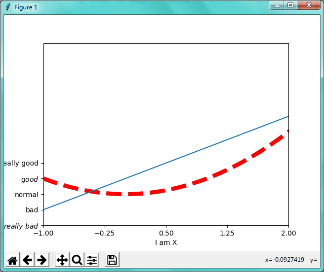
import numpy as np
import matplotlib.pyplot as plt

x = np.linspace(-3,3,50) # 生成-1到1 ,平分50个点
y1 = 2*x+1
y2 = x**2

plt.figure()          # 当需要多个窗口时plt.plot(...) 上面加plt.figure()
plt.plot(x,y2,color='red',linewidth=6,linestyle='--') # 线的颜色为红色,线宽度为6(这条线有点粗),线的类型为虚线
plt.plot(x,y1)                         # 一个图像当中可以画几条线

# 设置x轴和y轴的取值范围
plt.xlim(-1,2)
plt.ylim(-2,)
# 给x轴和y轴命名
plt.xlabel('I am X')
plt.ylabel('I am Y')

# 指定间隔单位
new_ticks = np.linspace(-1,2,5)
print(new_ticks)
plt.xticks(new_ticks)

# 把第一个列表中的替换转成第二个列表中的单词 ; 两个$$之间的单词会变成好看一点的字体、转义符\alpha 可变成数学的α
plt.yticks([-2,-1,0,1,2],[r'$really\ bad$','bad','normal',r'$good$','really good'])

plt.show()    # 脚本当中要用.show()图才会出来
改变坐标轴的位置
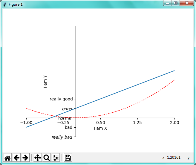
import numpy as np
import matplotlib.pyplot as plt

x = np.linspace(-3,3,50) # 生成-1到1 ,平分50个点
y1 = 2*x+1
y2 = x**2

plt.figure()          # 当需要多个窗口时plt.plot(...) 上面加plt.figure()
plt.plot(x,y2,color='red',linewidth=1,linestyle='--') # 线的颜色为红色,线宽度为1,线的类型为虚线
plt.plot(x,y1)                         # 一个图像当中可以画几条线

# 设置x轴和y轴的取值范围
plt.xlim(-1,2)
plt.ylim(-2,)
# 给x轴和y轴命名
plt.xlabel('I am X')
plt.ylabel('I am Y')

# 指定间隔单位
new_ticks = np.linspace(-1,2,5)
print(new_ticks)
plt.xticks(new_ticks)

# 把第一个列表中的替换转成第二个列表中的单词 ; 两个$$之间的单词会变成好看一点的字体、转义符\alpha 可变成数学的α
plt.yticks([-2,-1,0,1,2],[r'$really\ bad$','bad','normal',r'$good$','really good'])

# 改变坐标轴的位置
ax = plt.gca()  # 拿到当前图像
ax.spines['right'].set_color('none')  # 把方框右边隐藏
ax.spines['top'].set_color('none')    # 把方框上边隐藏

ax.xaxis.set_ticks_position('bottom')   # 把方框底边设置为x轴
ax.yaxis.set_ticks_position('left')     # 把方框左边设置为y轴

ax.spines['bottom'].set_position(('data',0))  # 把x轴设置在y轴等于0等横线上
ax.spines['left'].set_position(('data',0))  # 把y轴设置在x轴等于0等竖线上

plt.show()    # 脚本当中要用.show()图才会出来
三、Legend 图例
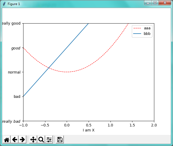
import numpy as np
import matplotlib.pyplot as plt

x = np.linspace(-3,3,50) # 生成-1到1 ,平分50个点
y1 = 2*x+1
y2 = x**2
# 设置x轴和y轴的取值范围
plt.xlim(-1,2)
plt.ylim(-2,)
# 给x轴和y轴命名
plt.xlabel('I am X')
plt.ylabel('I am Y')

# 把第一个列表中的替换转成第二个列表中的单词 ; 两个$$之间的单词会变成好看一点的字体、转义符\alpha 可变成数学的α
plt.yticks([-2,-1,0,1,2],[r'$really\ bad$','bad','normal',r'$good$','really good'])


l1, = plt.plot(x,y2,color='red',linewidth=1,linestyle='--',label='up') # 线的名字 up ; l1后面要有逗号(规定的)
l2, = plt.plot(x,y1,label='down')                                      # 线的名字down ; l2后面要有逗号(规定的)
# 生成图例1
# plt.legend()
#自定义图例2
plt.legend(handles=[l1,l2],labels=['aaa','bbb'],loc='best') # label重新定义线名 ; loc 位置参数,best 自己找最合适的位置

plt.show()    # 脚本当中要用.show()图才会出来
四、Annotation 标注
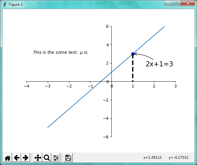
import numpy as np
import matplotlib.pyplot as plt

x = np.linspace(-3,3,50) # 生成-1到1 ,平分50个点
y1 = 2*x+1
# 设置x轴和y轴的取值范围
plt.xlim(-4,3)
plt.ylim(-6,6)

plt.figure(num=1,)
plt.plot(x,y1)

# 改变坐标轴的位置
ax = plt.gca()  # 拿到当前图像
ax.spines['right'].set_color('none')  # 把方框右边隐藏
ax.spines['top'].set_color('none')    # 把方框上边隐藏

ax.xaxis.set_ticks_position('bottom')   # 把方框底边设置为x轴
ax.yaxis.set_ticks_position('left')     # 把方框左边设置为y轴

ax.spines['bottom'].set_position(('data',0))  # 把x轴设置在y轴等于0等横线上
ax.spines['left'].set_position(('data',0))  # 把y轴设置在x轴等于0等竖线上

x0 = 1
y0 = 2*x0+1
plt.scatter(x0,y0,s=50,color='b') # x0,y0 注解点位置 ;50是像素大小;颜色为蓝色
plt.plot([x0,x0],[y0,0],'k--',lw=3) # 从点x0,x0画黑虚线 线宽为3到 点y0,0

# 打印注解方式一
# 基于data 的x0,y0 ;textcoords 文本相对点;xytext 文本相对移动+30,-30;arrowstyle线型;connectionstyle线角度和弧度
plt.annotate(r'2x+1=%s'%(y0),xy=(x0,y0),xycoords='data',xytext=(+30,-30),textcoords='offset points',
             fontsize=16,arrowprops=dict(arrowstyle='->',connectionstyle='arc3,rad=.2')   )

# 方式二
plt.text(-3.7,3,r'$This\ is\ the\ some\ text.\ \mu\ \sigma_i$')

plt.show()    # 脚本当中要用.show()图才会出来
五、tick 能见度
import numpy as np
import matplotlib.pyplot as plt

x = np.linspace(-3,3,50) # 生成-1到1 ,平分50个点
y1 = 2*x+1
# 设置x轴和y轴的取值范围
plt.xlim(-4,3)
plt.ylim(-6,6)

# 改变坐标轴的位置
ax = plt.gca()  # 拿到当前图像
ax.spines['right'].set_color('none')  # 把方框右边隐藏
ax.spines['top'].set_color('none')    # 把方框上边隐藏

ax.xaxis.set_ticks_position('bottom')   # 把方框底边设置为x轴
ax.yaxis.set_ticks_position('left')     # 把方框左边设置为y轴

ax.spines['bottom'].set_position(('data',0))  # 把x轴设置在y轴等于0等横线上
ax.spines['left'].set_position(('data',0))  # 把y轴设置在x轴等于0等竖线上

plt.figure(num=1,)
plt.plot(x,y1,lw=16)

for label in ax.get_xticklabels() + ax.get_yticklabels():
    label.set_fontsize(12)
    label.set_bbox(dict(facecolor='white',edgecolor='None',alpha=0.7)) # 白底方框住数字 透明度为0.7

plt.show()    # 脚本当中要用.show()图才会出来

# 未成功
六、散点图
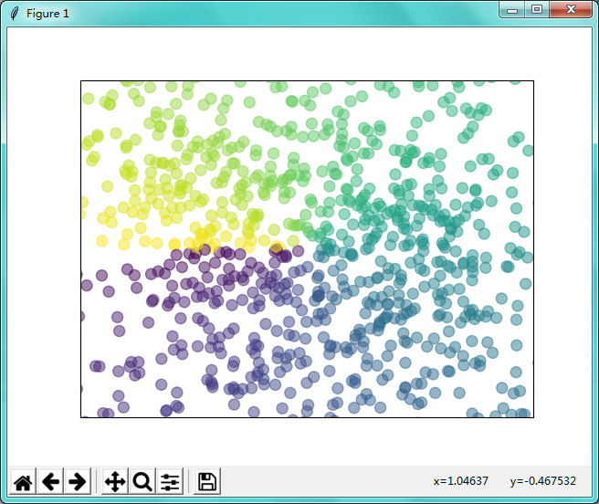
import numpy as np
import matplotlib.pyplot as plt

n = 1024
X = np.random.normal(0,1,n)
Y = np.random.normal(0,1,n)
T = np.arctan2(Y,X)         # 颜色的数量值

plt.scatter(X,Y,s=75,c=T,alpha=0.5)

plt.xlim(-1.5,1.5)
plt.ylim(-1.5,1.5)

# 隐藏横坐标和纵坐标
plt.xticks(())
plt.yticks(())

plt.show()    # 脚本当中要用.show()图才会出来
七、柱状图
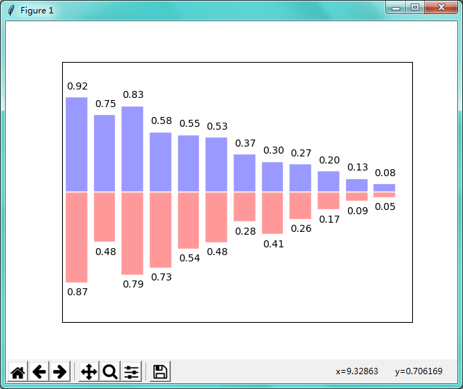
import matplotlib.pyplot as plt
import numpy as np

n = 12
X = np.arange(n)
Y1 = (1 - X / float(n)) * np.random.uniform(0.5, 1.0, n)
Y2 = (1 - X / float(n)) * np.random.uniform(0.5, 1.0, n)

plt.bar(X, +Y1, facecolor='#9999ff', edgecolor='white')
plt.bar(X, -Y2, facecolor='#ff9999', edgecolor='white')

for x, y in zip(X, Y1):
    # ha: horizontal alignment
    # va: vertical alignment
    plt.text(x + 0.04, y + 0.05, '%.2f' % y, ha='center', va='bottom')

for x, y in zip(X, Y2):
    # ha: horizontal alignment
    # va: vertical alignment
    plt.text(x + 0.04, -y - 0.05, '%.2f' % y, ha='center', va='top')

plt.xlim(-.5, n)
plt.xticks(())
plt.ylim(-1.25, 1.25)
plt.yticks(())

plt.show()
八、等高线图
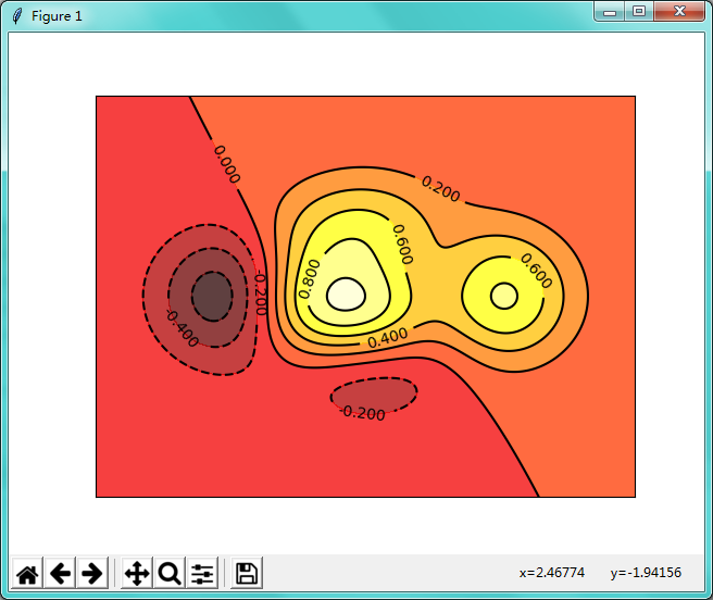
import matplotlib.pyplot as plt
import numpy as np

# 算等高线高度的函数
def f(x,y):
    # the height function
    return (1 - x / 2 + x**5 + y**3) * np.exp(-x**2 -y**2)

n = 256
x = np.linspace(-3, 3, n) # 生成图框 x有256个点
y = np.linspace(-3, 3, n) # 生成图框 y有256个点
X,Y = np.meshgrid(x, y)   # 定义X,Y的网格高度

plt.contourf(X, Y, f(X, Y), 8, alpha=.75, cmap=plt.cm.hot) # 设置颜色
C = plt.contour(X, Y, f(X, Y), 8, colors='black', ) # 画等高线的线
plt.clabel(C, inline=True, fontsize=10) # 数字 画在线上面
plt.xticks(())
plt.yticks(())

plt.show()
九、image图像
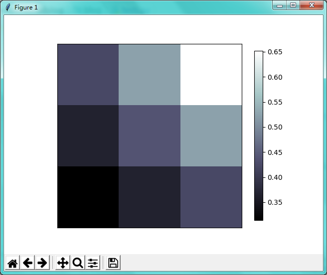
import matplotlib.pyplot as plt
import numpy as np

# image data
a = np.array([0.313660827978, 0.365348418405, 0.423733120134,
              0.365348418405, 0.439599930621, 0.525083754405,
              0.423733120134, 0.525083754405, 0.651536351379]).reshape(3,3)

"""
for the value of "interpolation", check this:
http://matplotlib.org/examples/images_contours_and_fields/interpolation_methods.html
for the value of "origin"= ['upper', 'lower'], check this:
http://matplotlib.org/examples/pylab_examples/image_origin.html
"""
plt.imshow(a, interpolation='nearest', cmap='bone', origin='lower')
plt.colorbar(shrink=.92)  # 右侧压缩一下
plt.xticks(())
plt.yticks(())

plt.show()
十、添加3D图像
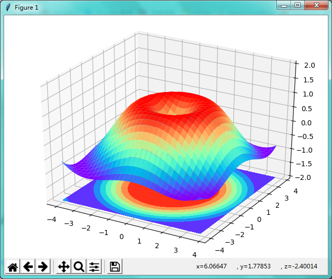
import matplotlib.pyplot as plt
import numpy as np
from mpl_toolkits.mplot3d import Axes3D

fig = plt.figure()
ax = Axes3D(fig)   # 添加3D图像
# X, Y value
X = np.arange(-4, 4, 0.25)
Y = np.arange(-4, 4, 0.25)
X, Y = np.meshgrid(X, Y)      # meshgrid把X和Y放到3D图像的面上去
R = np.sqrt(X ** 2 + Y ** 2)
# height value
Z = np.sin(R)    # 生成高度值

ax.plot_surface(X, Y, Z, rstride=1, cstride=1, cmap=plt.get_cmap('rainbow')) # cstride 颜色跨度
ax.contourf(X, Y, Z, zdir='z', offset=-2, cmap='rainbow')
ax.set_zlim(-2, 2)

plt.show()
十一、subplot 多合一显示
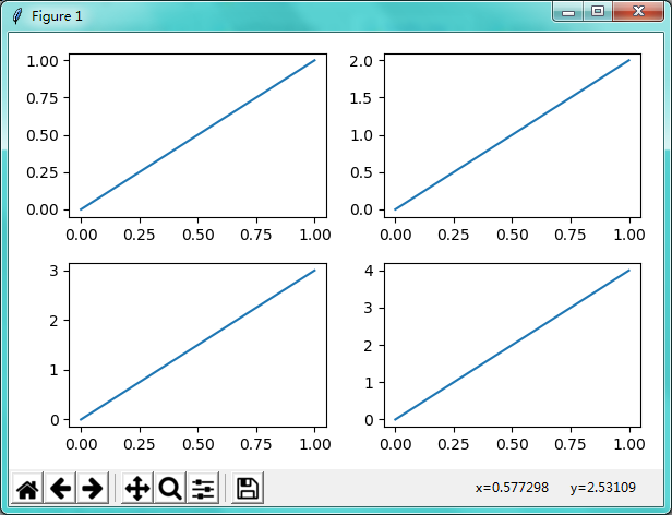
import matplotlib.pyplot as plt
import numpy as np

plt.figure(figsize=(6, 4))
# plt.subplot(n_rows, n_cols, plot_num)
plt.subplot(2, 2, 1)      # 分成两行两列,1表示第一张图
plt.plot([0, 1], [0, 1])

plt.subplot(222)
plt.plot([0, 1], [0, 2])

plt.subplot(223)
plt.plot([0, 1], [0, 3])

plt.subplot(224)
plt.plot([0, 1], [0, 4])

plt.tight_layout()

# example 2:
###############################
plt.figure(figsize=(6, 4))
# plt.subplot(n_rows, n_cols, plot_num)
plt.subplot(2, 1, 1)
# figure splits into 2 rows, 1 col, plot to the 1st sub-fig
plt.plot([0, 1], [0, 1])

plt.subplot(234)
# figure splits into 2 rows, 3 col, plot to the 4th sub-fig
plt.plot([0, 1], [0, 2])

plt.subplot(235)
# figure splits into 2 rows, 3 col, plot to the 5th sub-fig
plt.plot([0, 1], [0, 3])

plt.subplot(236)
# figure splits into 2 rows, 3 col, plot to the 6th sub-fig
plt.plot([0, 1], [0, 4])

plt.tight_layout()

plt.show()
十二、分格显示
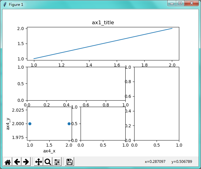
import matplotlib.pyplot as plt
import matplotlib.gridspec as gridspec

# method 1: subplot2grid
##########################
plt.figure()
# (3, 3):三行三列, (0, 0):起点, colspan=3:列跨3列
ax1 = plt.subplot2grid((3, 3), (0, 0), colspan=3)  # stands for axes
ax1.plot([1, 2], [1, 2])
ax1.set_title('ax1_title')
ax2 = plt.subplot2grid((3, 3), (1, 0), colspan=2)
ax3 = plt.subplot2grid((3, 3), (1, 2), rowspan=2)
ax4 = plt.subplot2grid((3, 3), (2, 0))
ax4.scatter([1, 2], [2, 2])
ax4.set_xlabel('ax4_x')
ax4.set_ylabel('ax4_y')
ax5 = plt.subplot2grid((3, 3), (2, 1))

# method 2: gridspec
#########################
plt.figure()
gs = gridspec.GridSpec(3, 3)
# use index from 0
ax6 = plt.subplot(gs[0, :])
ax7 = plt.subplot(gs[1, :2])
ax8 = plt.subplot(gs[1:, 2])
ax9 = plt.subplot(gs[-1, 0])
ax10 = plt.subplot(gs[-1, -2])

# method 3: easy to define structure
####################################
f, ((ax11, ax12), (ax13, ax14)) = plt.subplots(2, 2, sharex=True, sharey=True)
ax11.scatter([1,2], [1,2])

plt.tight_layout()
plt.show()
十三、图中图
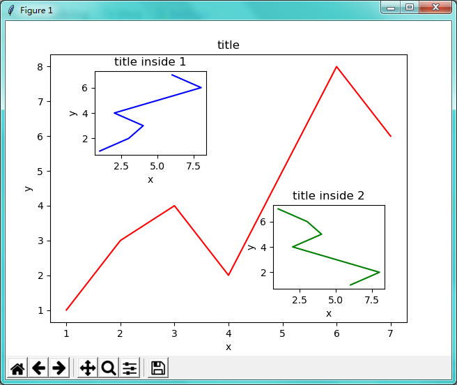
import matplotlib.pyplot as plt
import matplotlib.gridspec as gridspec

fig = plt.figure()
x = [1, 2, 3, 4, 5, 6, 7]
y = [1, 3, 4, 2, 5, 8, 6]

# below are all percentage
left, bottom, width, height = 0.1, 0.1, 0.8, 0.8
ax1 = fig.add_axes([left, bottom, width, height])  # main axes 主要的长宽
ax1.plot(x, y, 'r')
ax1.set_xlabel('x')
ax1.set_ylabel('y')
ax1.set_title('title')

ax2 = fig.add_axes([0.2, 0.6, 0.25, 0.25])  # inside axes 0.2离左边20%, 0.6离底边60%, 0.25方框宽为底边25%, 0.25...
ax2.plot(y, x, 'b')
ax2.set_xlabel('x')
ax2.set_ylabel('y')
ax2.set_title('title inside 1')


# different method to add axes
####################################
plt.axes([0.6, 0.2, 0.25, 0.25])
plt.plot(y[::-1], x, 'g')
plt.xlabel('x')
plt.ylabel('y')
plt.title('title inside 2')

plt.show()
十四、次坐标轴
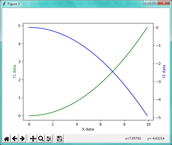
import matplotlib.pyplot as plt
import numpy as np

x = np.arange(0, 10, 0.1)
y1 = 0.05 * x**2
y2 = -1 *y1

fig, ax1 = plt.subplots()

ax2 = ax1.twinx()    # mirror the ax1 # 把x1的数据反过来
ax1.plot(x, y1, 'g-')
ax2.plot(x, y2, 'b-')

ax1.set_xlabel('X data')
ax1.set_ylabel('Y1 data', color='g')
ax2.set_ylabel('Y2 data', color='b')

plt.show()
十五、动画 animation
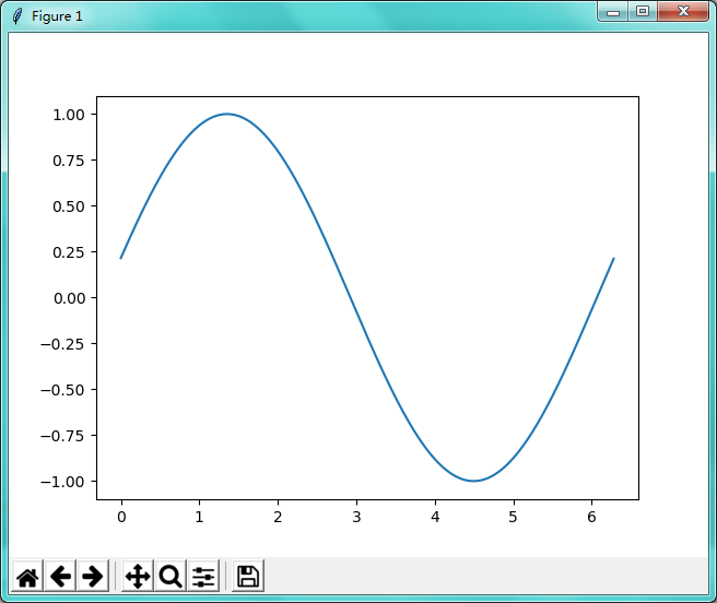
import numpy as np
from matplotlib import pyplot as plt
from matplotlib import animation

fig, ax = plt.subplots()           # 生成对象

x = np.arange(0, 2*np.pi, 0.01)
line, = ax.plot(x, np.sin(x))     # sin图像

def animate(i):
    line.set_ydata(np.sin(x + i/10.0))  # update the data
    return line,

def init():
    line.set_ydata(np.sin(x))
    return line,

# frames 100 个时间点;init_func最开始的那一帧;interval频率;blit是否更新整张图,还是变化的点
ani = animation.FuncAnimation(fig=fig, func=animate, frames=100, init_func=init,
                              interval=20, blit=False)

plt.show()
学习来源: 油管 莫烦 python 数据可视化教学教程