039--CSS
一、CSS定义
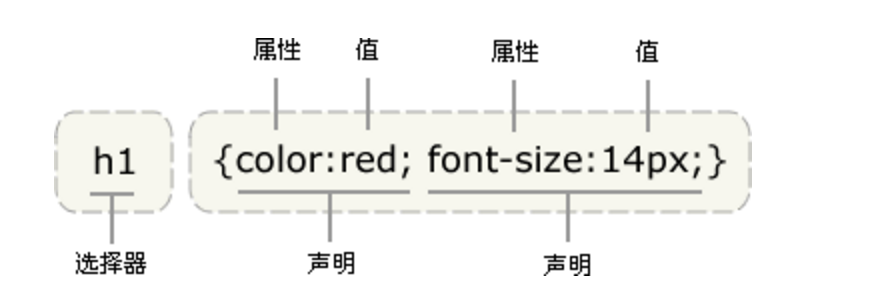
CSS 规则由两个主要的部分构成:选择器,以及一条或多条声明。
'''
        selector {
                  property: value;
                  property: value;
             ...  property: value

          }

'''
二、CSS选择器四种引入方式
1.行内式
行内式是在标签的style属性中设定CSS样式。这种方式没有体现出CSS的优势,不推荐使用。
<p style="background-color: rebeccapurple">hello galileo</p>
2.嵌入式(次要)
嵌入式是将CSS样式集中写在网页的<head></head>标签对的<style></style>标签对中。格式如下:
<head>
    <meta charset="UTF-8">
    <title>Title</title>
    <style>
        p{
            background-color: red;
        }
    </style>
</head>
3.链接式(重要)
将一个.css文件引入到HTML文件中
<link href="mystyle.css" rel="stylesheet" type="text/css"/>
4.导入式
将一个独立的.css文件引入HTML文件中,导入式使用CSS规则引入外部CSS文件,<style>标记也是写在<head>标记中,使用的语法如下:
<style type="text/css">

          @import"mystyle.css"; 此处要注意.css文件的路径

</style>
注意:
导入式会在整个网页装载完后再装载CSS文件,因此这就导致了一个问题,如果网页比较大则会儿出现先显示无样式的页面,闪烁一下之后,再出现网页的样式。这是导入式固有的一个缺陷。使用链接式时与导入式不同的是它会以网页文件主体装载前装载CSS文件,因此显示出来的网页从一开始就是带样式的效果的,它不会象导入式那样先显示无样式的网页,然后再显示有样式的网页,这是链接式的优点。
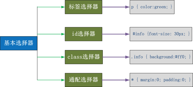
三、CSS选择器
1.基本选择器
2.组合选择器
E,F     多元素选择器,同时匹配所有E元素或F元素,E和F之间用逗号分隔      div,p { color:#f00; }

E F     后代元素选择器,匹配所有属于E元素后代的F元素,E和F之间用空格分隔 li a { font-weight:bold;}

E > F   子元素选择器,匹配所有E元素的子元素F            div > p { color:#f00; }

E + F   毗邻元素选择器,匹配所有紧随E元素之后的同级元素F  div + p { color:#f00; }

E ~ F   普通兄弟选择器(以破折号分隔)                 .div1 ~ p{font-size: 30px; }
3.属性选择器
E[att]          匹配所有具有att属性的E元素,不考虑它的值。(注意:E在此处可以省略。 比如“[cheacked]”。以下同。)   p[title] { color:#f00; }

E[att=val]      匹配所有att属性等于“val”的E元素   div[class=”error”] { color:#f00; }

E[att~=val]     匹配所有att属性具有多个空格分隔的值、其中一个值等于“val”的E元素  td[class~=”name”] { color:#f00; }

E[attr^=val]    匹配属性值以指定值开头的每个元素    div[class^="test"]{background:#ffff00;}

E[attr$=val]    匹配属性值以指定值结尾的每个元素    div[class$="test"]{background:#ffff00;}

E[attr*=val]    匹配属性值中包含指定值的每个元素    div[class*="test"]{background:#ffff00;}
四、伪类
1.anchor伪类:专用于控制链接的显示效果
'''
        a:link(没有接触过的链接),用于定义了链接的常规状态。

        a:hover(鼠标放在链接上的状态),用于产生视觉效果。

        a:visited(访问过的链接),用于阅读文章,能清楚的判断已经访问过的链接。

        a:active(在链接上按下鼠标时的状态),用于表现鼠标按下时的链接状态。

        伪类选择器 : 伪类指的是标签的不同状态:

                   a ==> 点过状态 没有点过的状态 鼠标悬浮状态 激活状态

        a:link {color: #FF0000} /* 未访问的链接 */

        a:visited {color: #00FF00} /* 已访问的链接 */

        a:hover {color: #FF00FF} /* 鼠标移动到链接上 */

        a:active {color: #0000FF} /* 选定的链接 */ 格式: 标签:伪类名称{ css代码; }

'''


<!DOCTYPE html>
<html lang="en">
<head>
    <meta charset="UTF-8">
    <title>Title</title>

    <style>

       .top{
           background-color: rebeccapurple;
           width: 100px;
           height: 100px;
       }
        .bottom{
            background-color: green;
            width: 100px;
            height: 100px;
        }

        .outer:hover .bottom{
            background-color: yellow;
        }

        注意:一定是outer:hover  控制outer里某一个标签,否则无效

        .top:hover .bottom{
            background-color: yellow;
        }
    </style>
</head>
<body>

<div class="outer">
    <div class="top">top</div>
    <div class="bottom">bottom</div>
</div>

</body>
</html>
2.before after伪类
 :before    p:before       在每个<p>元素之前插入内容
 :after     p:after        在每个<p>元素之后插入内容

例:p:before{content:"hello";color:red;display: block;}
五、CSS优先级
所谓CSS优先级,即是指CSS样式在浏览器中被解析的先后顺序。
样式表中的特殊性描述了不同规则的相对权重,它的基本规则是:
1 内联样式表的权值最高 style=""------------1000;
2 统计选择符中的ID属性个数。 #id --------------100
3 统计选择符中的CLASS属性个数。 .class -------------10
4 统计选择符中的HTML标签名个数。 p ---------------1
按这些规则将数字符串逐位相加,就得到最终的权重,然后在比较取舍时按照从左到右的顺序逐位比较。
1、文内的样式优先级为1,0,0,0,所以始终高于外部定义。

  2、有!important声明的规则高于一切。

  3、如果!important声明冲突,则比较优先权。

  4、如果优先权一样,则按照在源码中出现的顺序决定,后来者居上。

  5、由继承而得到的样式没有specificity的计算,它低于一切其它规则(比如全局选择符*定义的规则)。
六、CSS属性操作
1.文本属性
text-align 属性规定元素中的文本的水平对齐方式。
- left 把文本排列到左边。默认值:由浏览器决定。
- right 把文本排列到右边。
- center 把文本排列到中间。
- justify 实现两端对齐文本效果。
/*

font-size: 10px;

line-height: 200px;   文本行高 通俗的讲,文字高度加上文字上下的空白区域的高度 50%:基于字体大小的百分比

vertical-align:-4px  设置元素内容的垂直对齐方式 ,只对行内元素有效,对块级元素无效

text-decoration:none       text-decoration 属性用来设置或删除文本的装饰。主要是用来删除链接的下划线

font-family: 'Lucida Bright'

font-weight: lighter/bold/border/

font-style: oblique

text-indent: 150px;      首行缩进150px

letter-spacing: 10px;  字母间距

word-spacing: 20px;  单词间距

text-transform: capitalize/uppercase/lowercase ; 文本转换,用于所有字句变成大写或小写字母,或每个单词的首字母大写

*/
2.背景属性
background-color: cornflowerblue

background-image: url('1.jpg');

background-repeat: no-repeat;(repeat:平铺满)

background-position: right top(20px 20px);

示例: background:#ffffff url('1.png') no-repeat right top;
3.边框属性
border-style: solid;

border-color: chartreuse;

border-width: 20px;

示例: border: 30px rebeccapurple solid;

单独设置各边:

border-top-style:dotted;

border-right-style:solid;

border-bottom-style:dotted;

border-left-style:none;
4.列表属性
list-style-type     设置列表项标志的类型。
list-style-image    将图象设置为列表项标志。
list-style-position 设置列表中列表项标志的位置。
list-style          简写属性。用于把所有用于列表的属性设置于一个声明中

list-style-type     属性指定列表项标记的类型
ul { list-style-type: square; }
使用图像来替换列表项的标记:
ul {
     list-style-image: url('');
            }
5.display属性
none (隐藏某标签)
p{display:none;}
注意display:none和 visibility:hidden的区别:
visibility:hidden可以隐藏某个元素,但隐藏的元素仍需占用与未隐藏之前一样的空间。也就是说,该元素虽然被隐藏了,但仍然会影响布局。
display:none可以隐藏某个元素,且隐藏的元素不会占用任何空间。也就是说,该元素不但被隐藏了,而且该元素原本占用的空间也会从页面布局中消失。
block(内联标签设置为块级标签)
span {display:block;}
注意:一个内联元素设置为display:block是不允许有它内部的嵌套块元素。
inline(块级标签设置为内联标签)
li {display:inline;}
inline-block
display:inline-block可做列表布局,其中的类似于图片间的间隙小bug可以通过如下设置解决:
#outer{
            border: 3px dashed;
            word-spacing: -5px;
        }
七、外边距和内边距
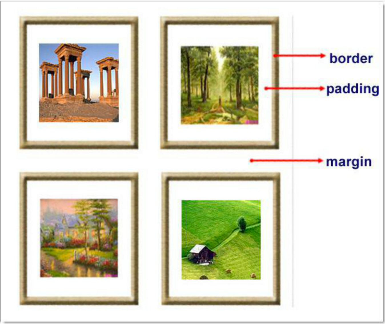
- margin: 用于控制元素与元素之间的距离;margin的最基本用途就是控制元素周围空间的间隔,从视觉角度上达到相互隔开的目的。
- padding: 用于控制内容与边框之间的距离;
- Border(边框): 围绕在内边距和内容外的边框。
- Content(内容): 盒子的内容,显示文本和图像。
margin(外边距):
margin-top:100px; margin-bottom:100px; margin-right:50px; margin-left:50px;
居中:margin:0auto;
margin:10px 20px 20px 10px;

        上边距为10px
        右边距为20px
        下边距为20px
        左边距为10px

margin:10px 20px 10px;

        上边距为10px
        左右边距为20px
        下边距为10px

margin:10px 20px;

        上下边距为10px
        左右边距为20px

margin:25px;

        所有的4个边距都是25px
padding(内边距)
单独使用填充属性可以改变上下左右的填充。缩写填充属性也可以使用,一旦改变一切都改变。
设置同margine;
<!DOCTYPE html>
<html lang="en">
<head>
    <meta charset="UTF-8">
    <title>Title</title>

    <style>
        .outer{
            margin: 0 auto;
            width: 60%;

        }

        .content{
            background-color: darkgrey;
            height: 500px;

        }

        a{
            /*去除下划线*/
            text-decoration: none;
        }

        .page-area{
            text-align: center;
            padding-top: 30px;
            padding-bottom: 30px;
            background-color: #f0ad4e;
        }

        .page-area ul li{
            /*设为内联标签,是页码从左到右*/
            display: inline-block;
        }

       .page-area ul li a ,.page-area ul li span{
            display: inline-block;
            color: #369;
            height: 25px;
            width: 25px;
            text-align: center;
            line-height: 25px;

            padding: 8px;
            margin-left: 8px;

            border: 1px solid #e1e1e1;
            border-radius: 15%;
        }

       .page-area ul li .page-next{
           width: 70px;
           border-radius:0
       }

       .page-area ul li span.current_page{
           border: none;
           color: black;
           font-weight:900;
       }

       .page-area ul li a:hover{
           color: #fff;
           background-color: #2459a2;
       }

    </style>
</head>
<body>
    <div class="outer">
        <div class="content"></div>
        <div class="page-area">
             <ul>
                 <li><span class="current_page">1</span></li>
                 <li><a href="#" class="page-a">2</a></li>
                 <li><a href="#" class="page-a">3</a></li>
                 <li><a href="#" class="page-a">4</a></li>
                 <li><a href="#" class="page-a">5</a></li>
                 <li><a href="#" class="page-a">6</a></li>
                 <li><a href="#" class="page-a">7</a></li>
                 <li><a href="#" class="page-a">8</a></li>
                 <li><a href="#" class="page-a">9</a></li>
                 <li><a href="#" class="page-a">10</a></li>
                 <li><a href="#" class="page-a page-next">下一页</a></li>
             </ul>
        </div>
    </div>
</body>
</html>
问题一:body的外边距
边框在默认情况下会定位于浏览器窗口的左上角,但是并没有紧贴着浏览器的窗口的边框,这是因为body本身也是一个盒子(外层还有html),在默认情况下, body距离html会有若干像素的margin,具体数值因各个浏览器不尽相同,所以body中的盒子不会紧贴浏览器窗口的边框了,为了验证这一点,加上:
body{
    border: 1px solid;
    background-color: cadetblue;
}
#解决方法
body{
    margin: 0;
}
问题二:margin collapse(边界塌陷或者说边界重叠)
1、兄弟div:
上面div的margin-bottom和下面div的margin-top会塌陷,也就是会取上下两者margin里最大值作为显示值
2、父子div:
if 父级div中没有border,padding,inlinecontent,子级div的margin会一直向上找,直到找到某个标签包括border,padding,inline content中的其中一个,然后按此div 进行margin;
<!DOCTYPE html>
<html lang="en" style="padding: 0">
<head>
    <meta charset="UTF-8">
    <title>Title</title>
    <style>

        body{
            margin: 0;
        }

        .div1{
            background-color: rebeccapurple;
            width: 300px;
            height: 300px;
            overflow: hidden;

        }
        .div2{
            background-color: green;
            width: 100px;
            height: 100px;
            margin-bottom: 40px;
            margin-top: 20px;
        }
        .div3{
            background-color:teal;
            width: 100px;
            height: 100px;
            margin-top: 20px;
        }
    </style>
</head>
<body>
    <div style="background-color: bisque;width: 300px;height: 300px"></div>
    <div class="div1">
       <div class="div2"></div>
       <div class="div3"></div>
    </div>
</body>

</html>
解决方法:overflow: hidden;
八、float属性
基本浮动规则
先来了解一下block元素和inline元素在文档流中的排列方式。
block元素通常被现实为独立的一块,独占一行,多个block元素会各自新起一行,默认block元素宽度自动填满其父元素宽度。block元素可以设置width、height、margin、padding属性;
inline元素不会独占一行,多个相邻的行内元素会排列在同一行里,直到一行排列不下,才会新换一行,其宽度随元素的内容而变化。inline元素设置width、height属性无效
- 常见的块级元素有 div、form、table、p、pre、h1~h5、dl、ol、ul 等。
- 常见的内联元素有span、a、strong、em、label、input、select、textarea、img、br等
所谓的文档流,指的是元素排版布局过程中,元素会自动从左往右,从上往下的流式排列。
脱离文档流,也就是将元素从普通的布局排版中拿走,其他盒子在定位的时候,会当做脱离文档流的元素不存在而进行定位。
假如某个div元素A是浮动的,如果A元素上一个元素也是浮动的,那么A元素会跟随在上一个元素的后边(如果一行放不下这两个元素,那么A元素会被挤到下一行);如果A元素上一个元素是标准流中的元素,那么A的相对垂直位置不会改变,也就是说A的顶部总是和上一个元素的底部对齐。此外,浮动的框之后的block元素元素会认为这个框不存在,但其中的文本依然会为这个元素让出位置。 浮动的框之后的inline元素,会为这个框空出位置,然后按顺序排列。
<!DOCTYPE html>
<html lang="en">
<head>
    <meta charset="UTF-8">
    <title>Title</title>
    <style>
        *{
            margin: 0;
        }

        .r1{
            width: 300px;
            height: 100px;
            background-color: #7A77C8;
            float: left;
        }
        .r2{
            width: 200px;
            height: 200px;
            background-color: wheat;
            float: left;

        }
        .r3{
            width: 100px;
            height: 200px;
            background-color: darkgreen;
            float: left;
        }
    </style>
</head>
<body>

    <div class="r1"></div>
    <div class="r2"></div>
    <div class="r3"></div>

</body>
</html>
非完全脱离文档流
左右结构div盒子重叠现象,一般是由于相邻两个DIV一个使用浮动一个没有使用浮动。一个使用浮动一个没有导致DIV不是在同个“平面”上,但内容不会造成覆盖现象,只有DIV形成覆盖现象。
<!DOCTYPE html>
<html lang="en">
<head>
    <meta charset="UTF-8">
    <title>Title</title>
    <style>
        *{
            margin: 0;
        }

        .r1{
            width: 100px;
            height: 100px;
            background-color: #7A77C8;
            float: left;
        }
        .r2{
            width: 200px;
            height: 200px;
            background-color: wheat;
        }
    </style>
</head>
<body>

    <div class="r1"></div>
    <div class="r2">region2</div>

</body>
</html>
解决方法:要么都不使用浮动;要么都使用float浮动;要么对没有使用float浮动的DIV设置margin样式。
父级坍塌现象
<!DOCTYPE html>
<html lang="en">
<head>
    <meta charset="UTF-8">
    <title>Title</title>
<style type="text/css">
         * {
             margin:0;padding:0;
         }
        .container{
            border:1px solid red;
            width:300px;
            /*解决父级坍塌*/
            overflow: hidden;
        }
        #box1{
            background-color:green;
            float:left;
            width:100px;
            height:100px;
        }
        #box2{
            background-color:deeppink;
            float:right;
            width:100px;
            height:100px;
        }
         #box3{
             background-color:pink;height:40px;
         }

</style>
</head>
<body>
    <div class="container">
            <div id="box1">box1 向左浮动</div>
            <div id="box2">box2 向右浮动</div>
    </div>
    <div id="box3">box3</div>
</body>
</html>
例子如上:.container和box3的布局是上下结构,上图发现box3跑到了上面,与.container产生了重叠,但文本内容没有发生覆盖,只有div发生覆盖现象。这个原因是因为第一个大盒子里的子元素使用了浮动,脱离了文档流,导致.container没有被撑开。box3认为.container没有高度(未被撑开),因此跑上去了。
>>>>解决方法:
1、固定高度
给.container设置固定高度,一般情况下文字内容不确定多少就不能设置固定高度,所以一般不能设置“.container”高度(当然能确定内容多高,这种情况下“.container是可以设置一个高度即可解决覆盖问题。
或者给.container加一个固定高度的子div:
<div class="container">
                <div id="box1">box1 向左浮动</div>
                <div id="box2">box2 向右浮动</div>
                <div id="empty" style="height: 100px"></div>
</div>
<div id="box3">box3</div>
但是这样限定固定高度会使页面操作不灵活,不推荐!
2、清除浮动(推荐)。
clear语法:
clear : none | left | right | both
取值:
none : 默认值。允许两边都可以有浮动对象
left : 不允许左边有浮动对象
right : 不允许右边有浮动对象
both : 不允许有浮动对象
但是需要注意的是:clear属性只会对自身起作用,而不会影响其他元素。
<!DOCTYPE html>
<html lang="en">
<head>
    <meta charset="UTF-8">
    <title>Title</title>
    <style>
        *{
            margin: 0;
        }

        .r1{
            width: 300px;
            height: 100px;
            background-color: #7A77C8;
            float: left;
        }
        .r2{
            width: 200px;
            height: 200px;
            background-color: wheat;
            float: left;
            clear: left;

        }
        .r3{
            width: 100px;
            height: 200px;
            background-color: darkgreen;
            float: left;
            clear: left;
        }
    </style>
</head>
<body>

    <div class="r1"></div>
    <div class="r2"></div>
    <div class="r3"></div>

</body>
</html>
把握住两点:1、元素是从上到下、从左到右依次加载的。
2、clear: left;对自身起作用,一旦左边有浮动元素,即切换到下一行来保证左边元素不是浮动的,依据这一点解决父级塌陷问题。
思考:
<!DOCTYPE html>
<html lang="en">
<head>
    <meta charset="UTF-8">
    <title>Title</title>
    <style>
        *{
            margin: 0;
        }

        .r1{
            width: 300px;
            height: 100px;
            background-color: #7A77C8;
            float: left;
        }
        .r2{
            width: 200px;
            height: 200px;
            background-color: wheat;
            float: left;
            /*绿色能贴上来的原因是clear只能对自身起作用,在加载r2的时候,左边有浮动元素,右边没有,
            故绿色加载的时候自然就贴上来了*/
            clear: both;

        }
        .r3{
            width: 100px;
            height: 200px;
            background-color: darkgreen;
            float: left;
        }
    </style>
</head>
<body>

    <div class="r1"></div>
    <div class="r2"></div>
    <div class="r3"></div>

</body>
</html>
'''

    .clearfix:after {             <----在类名为“clearfix”的元素内最后面加入内容;
    content: ".";                 <----内容为“.”就是一个英文的句号而已。也可以不写。
    display: block;               <----加入的这个元素转换为块级元素。
    clear: both;                  <----清除左右两边浮动。
    visibility: hidden;           <----可见度设为隐藏。注意它和display:none;是有区别的。
                                       visibility:hidden;仍然占据空间,只是看不到而已;
    line-height: 0;               <----行高为0;
    height: 0;                    <----高度为0;
    font-size:0;                  <----字体大小为0;
    }

    .clearfix { *zoom:1;}         <----这是针对于IE6的,因为IE6不支持:after伪类,这个神
                                       奇的zoom:1让IE6的元素可以清除浮动来包裹内部元素。


整段代码就相当于在浮动元素后面跟了个宽高为0的空div,然后设定它clear:both来达到清除浮动的效果。
之所以用它,是因为,你不必在html文件中写入大量无意义的空标签,又能清除浮动。
<div class="head clearfix"></div>

'''
3、overflow:hidden
overflow:hidden的含义是超出的部分要裁切隐藏,float的元素虽然不在普通流中,但是他是浮动在普通流之上的,可以把普通流元素+浮动元素想象成一个立方体。如果没有明确设定包含容器高度的情况下,它要计算内容的全部高度才能确定在什么位置hidden,这样浮动元素的高度就要被计算进去。这样包含容器就会被撑开,清除浮动。
九、position(定位)
1 static
static 默认值,无定位,不能当作绝对定位的参照物,并且设置标签对象的left、top等值是不起作用的的。
2 position: relative/absolute
relative: 相对定位。
相对定位是相对于该元素在文档流中的原始位置,即以自己原始位置为参照物。有趣的是,即使设定了元素的相对定位以及偏移值,元素还占有着原来的位置,即占据文档流空间。对象遵循正常文档流,但将依据top,right,bottom,left等属性在正常文档流中偏移位置。而其层叠通过z-index属性定义。
注意:position:relative的一个主要用法:方便绝对定位元素找到参照物。
absolute: 绝对定位。
定义:设置为绝对定位的元素框从文档流完全删除,并相对于最近的已定位祖先元素定位,如果元素没有已定位的祖先元素,那么它的位置相对于最初的包含块(即body元素)。元素原先在正常文档流中所占的空间会关闭,就好像该元素原来不存在一样。元素定位后生成一个块级框,而不论原来它在正常流中生成何种类型的框。
重点:如果父级设置了position属性,例如position:relative;,那么子元素就会以父级的左上角为原始点进行定位。这样能很好的解决自适应网站的标签偏离问题,即父级为自适应的,那我子元素就设置position:absolute;父元素设置position:relative;,然后Top、Right、Bottom、Left用百分比宽度表示。
另外,对象脱离正常文档流,使用top,right,bottom,left等属性进行绝对定位。而其层叠通过z-index属性定义。
示例代码:
<!DOCTYPE html>
<html lang="en">
<head>
    <meta charset="UTF-8">
    <title>Title</title>
    <style>
        *{
            margin: 0;
        }
        .outet{
            /*position: relative;*/

        }
        .item{
            width: 200px;
            height:200px ;
        }
        .r1{
            background-color: #7A77C8;
        }
        .r2{
            background-color: wheat;
            /*相对定位不会从文档流删除,还占着位置*/
            position: relative;
            /*绝对定位会从文档流删除*/
            /*position: absolute;*/
            top: 200px;
            left: 200px;
        }
        .r3{
            background-color: darkgreen;
        }
    </style>
</head>
<body>

    <div class="item r1">r1</div>
    <div class="outet">
        <div class="item r2">r2</div>
        <div class="item r3">r3</div>
    </div>

</body>
</html>
总结:参照物用相对定位,子元素用绝对定位,并且保证相对定位参照物不会偏移即可。
3 position:fixed
fixed:对象脱离正常文档流,使用top,right,bottom,left等属性以窗口为参考点进行定位,当出现滚动条时,对象不会随着滚动。而其层叠通过z-index属性 定义。 注意点: 一个元素若设置了 position:absolute | fixed; 则该元素就不能设置float。这 是一个常识性的知识点,因为这是两个不同的流,一个是浮动流,另一个是“定位流”。但是 relative 却可以。因为它原本所占的空间仍然占据文档流。
在理论上,被设置为fixed的元素会被定位于浏览器窗口的一个指定坐标,不论窗口是否滚动,它都会固定在这个位置。
示例代码:
<!DOCTYPE html>
<html lang="en">
<head>
    <meta charset="UTF-8">
    <title>Title</title>
    <style>
        *{
            margin: 0;
        }
        .back{
            background-color: wheat;
            width: 100%;
            height: 1200px;
        }
        span{
            display: inline-block;
            width: 80px;
            height: 50px;
            position: fixed;
            bottom: 20px;
            right: 20px;
            background-color: rebeccapurple;
            color: white;
            text-align: center;
            line-height: 50px;

        }
    </style>
</head>
<body>

    <div class="back">
        <span>返回顶部</span>
    </div>
</body>
</html>