六、使用media实现响应式布局
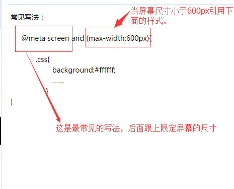
常见写法:
下面总结常见的响应式布局的分类:
@media screen and (max-width:320px){
  #talkFooter .editArea{…… }
}
@media screen and (min-width:321px) and (max-width:375px){
    #talkFooter .editArea{…… }
}
@media screen and (min-width:376px) and (max-width:414px){
 #talkFooter .editArea{…… }
}
@media screen and (min-width:415px) and (max-width:639px){
 #talkFooter .editArea{……}
}
@media screen and (min-width:640px) and (max-width:719px){
 #talkFooter .editArea{……}
}
@media screen and (min-width:720px) and (max-width:749px){
 #talkFooter .editArea{……}
}
@media screen and (min-width:750px) and (max-width:799px){
 #talkFooter .editArea{……}
}
@media screen(min-width:800px){}
每天将自己工作和学习中遇到的问题和好的方法写下来,作为积累,养成一个好习惯,从此刻开始~

 浙公网安备 33010602011771号