

matpb画图_折线图.ipynb
In [1]:
import numpy as np
import matplotlib.pyplot as plt
from matplotlib import font_manager
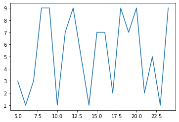
y = [np.random.randint(10) for x in range(20)]
z = np.random.randint(1,10,size=10)
x = range(5,25)
print(x,y,z,sep='\n')
plt.plot(x,y)
Out [1]:
range(5, 25)
[3, 1, 3, 9, 9, 1, 7, 9, 5, 1, 7, 7, 2, 9, 7, 9, 2, 5, 1, 9]
[6 6 6 2 9 1 1 2 9 8]
Out [1]:
[<matplotlib.lines.Line2D at 0x2167dac1780>]
In [2]:
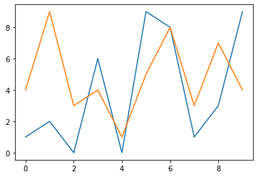
import pandas as pd
arr = pd.DataFrame(np.random.randint(0,10,size=(10,2)))
arr
Out [2]:
| 0 | 1 | |
|---|---|---|
| 0 | 1 | 4 |
| 1 | 2 | 9 |
| 2 | 0 | 3 |
| 3 | 6 | 4 |
| 4 | 0 | 1 |
| 5 | 9 | 5 |
| 6 | 8 | 8 |
| 7 | 1 | 3 |
| 8 | 3 | 7 |
| 9 | 9 | 4 |
In [3]:
plt.plot(arr,'')
Out [3]:
[<matplotlib.lines.Line2D at 0x2167e813b38>,
 <matplotlib.lines.Line2D at 0x2167e813ba8>]
In [4]:
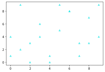
plt.plot(arr,'^',color=(0.1,0.9,0.9,0.6))
Out [4]:
[<matplotlib.lines.Line2D at 0x2167e882400>,
 <matplotlib.lines.Line2D at 0x2167e882390>]
总结:
plt.plot(【x】,y,'',data = arr,color=(0.1,0.9,0.9,0.6))
【x】:可选项
y:必选项,
'':控制条形图的形状,
data = arr:传入一个datefram的数据
color=(0.1,0.9,0.9,0.6):控制线条颜色,由四个数的元组构成。
设置线条样式
In [5]:
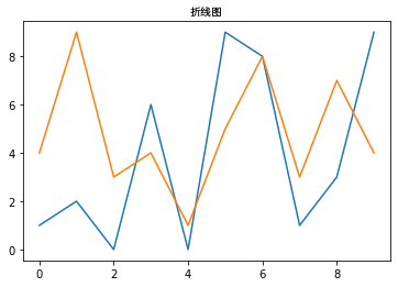
font = font_manager.FontProperties(fname=r"C:\Windows\Fonts\Dengb.ttf",size=10)
plt.plot(arr)
plt.title("折线图",fontproperties =font)
Out [5]:
Text(0.5, 1.0, '折线图')
设置坐标轴、标题的样式
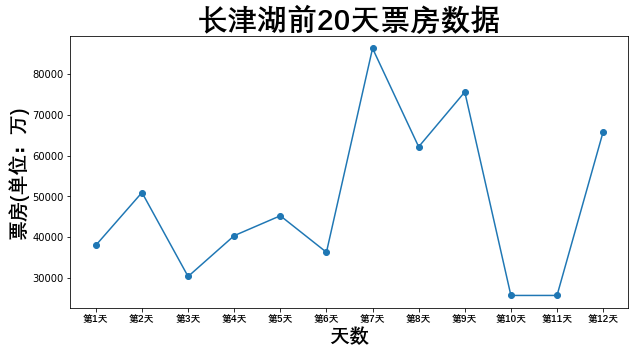
In [6]:
font = font_manager.FontProperties(fname=r"C:\Windows\Fonts\Dengb.ttf",size=10)
avg = [37974.4,50918.4,30303.0,40329.5,45215,36258,86325,62154,75614,25648,25648,65824]
#avg = np.sort(avg)
plt.figure(figsize=(10,5))
plt.plot(avg,marker="o")
plt.xticks(range(12),["第%d天"%x for x in range(1,13)],fontproperties =font)
font.set_size(20)
plt.xlabel("天数",fontproperties =font)
plt.ylabel("票房(单位:万)",fontproperties =font)
font.set_size(30)
plt.title("长津湖前20天票房数据",fontproperties =font)
#plt.grid(True)
plt.show()
out [6]:
设置坐标点的样式
markerfacecolor:坐标点的颜色
markersize:坐标点的大小
markeredgecolor:坐标点的边界颜色
In [12]:
plt.style.use("ggplot")
x = np.linspace(0,20,150)
y = np.sin(x)
plt.plot(x,y,marker="o",markerfacecolor='g',markersize=10,markeredgecolor='b')
font.set_size(30)
plt.title("sin图像显示",fontproperties =font)
Out [12]:
Text(0.5, 1.0, 'sin图像显示')
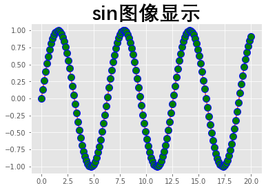
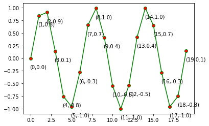
设置数据标签
annotate是用来注释文本的:
In [8]:
y = np.sin(np.arange(20))
plt.plot(y,marker = 'o',color = 'g',markerfacecolor='r')
#plt.grid()
for index,value in enumerate(y):
    plt.annotate("(%d,%.1f)"%(index,value),xy=(index,value),xytext=(index-0.1,value-0.2))
out [8]:
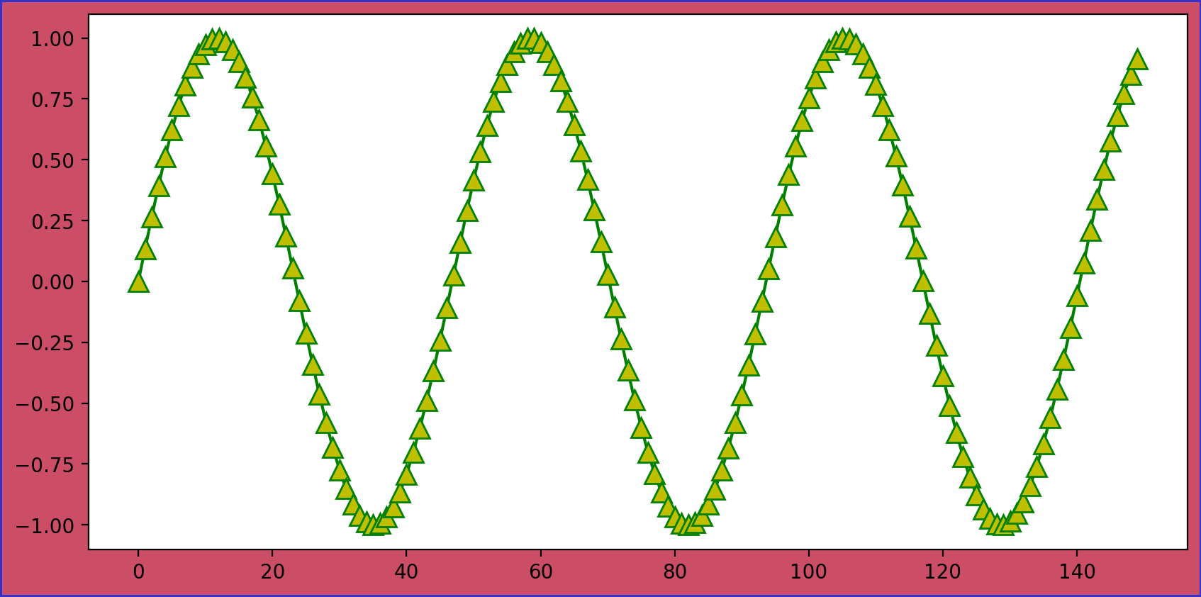
设置画板的样式
figsize:画板大小,(宽度,高度)
facecolor:画板颜色
dpi:分辨率,默认为100
edgecolor:边框颜色,默认宽度是0,如果想要看到边框,则需要设置linewidth=2
In [9]:
plt.figure(figsize=(10,5),facecolor=(0.8,0.3,0.4),dpi=200,edgecolor=(0.2,0.2,0.8),linewidth=2)
plt.plot(np.sin(np.linspace(0,20,150)),marker = '^',color = 'g',markerfacecolor='y',markersize=10)
plt.savefig("G:\matlib文件\保存用例.png")
plt.show()
out [9]:
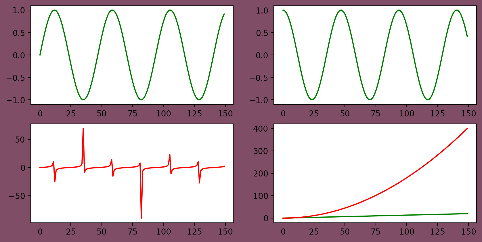
绘制多个图像
plt.subplot(221):几行几列,最后一个数是代表你当前绘制的是哪一个图
plt.style.use("ggplot")设置样式
In [10]:
plt.figure(figsize=(10,5),facecolor=(0.5,0.3,0.4),dpi=200)
plt.subplot(221)
plt.plot(np.sin(np.linspace(0,20,150)),color = 'g')
plt.subplot(222)
plt.plot(np.cos(np.linspace(0,20,150)),color = 'g')
plt.subplot(223)
plt.plot(np.tan(np.linspace(0,20,150)),color = 'r')
plt.subplot(224)
plt.plot(np.linspace(0,20,150),color = 'g')
plt.plot(np.linspace(0,20,150)**2,color = 'r')
plt.savefig("G:\matlib文件\subplot用例.png")
out [10]:
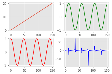
In [11]:
plt.figure(figsize=(10,5),facecolor=(0.5,0.3,0.4),dpi=200)
value = np.linspace(0,20,150)
plt.style.use("ggplot")
fig,axes = plt.subplots(2,2)
axe1 = axes[0,0]
axe1.plot(value)
axe2 = axes[0,1]
axe2.plot(np.sin(value),color = 'g')
axe3 = axes[1,0]
axe3.plot(np.cos(value),color = 'r')
axe4 = axes[1,1]
axe4.plot(np.tan(value),color = 'b')
Out [11]:
[<matplotlib.lines.Line2D at 0x216080dec18>]
Out [11]:
<Figure size 2000x1000 with 0 Axes>
志同道合一起学习,欢迎加入QQ群:878749917
