

前言
flex弹性布局是最重要、最常用和最特殊的display,独特到有一堆为它单独服务的属性。并且常用到甚至可以拿一篇博客单独讲它。可说是有了flex可以满足90%的布局需求,它的核心思想就是弹性,可以通过它去动态调整内部子元素的位置。
flex的基本属性
CSS 中提供了以下属性来实现 Flex 布局:
| 属性 | 描述 |
|---|---|
| display | 指定 HTML 元素的盒子类型 |
| flex-direction | 指定弹性盒子中子元素的排列方式 |
| flex-wrap | 设置当弹性盒子的子元素超出父容器时是否换行 |
| flex-flow | flex-direction 和 flex-wrap 两个属性的简写 |
| justify-content | 设置弹性盒子中元素在主轴(横轴)方向上的对齐方式 |
| align-items | 设置弹性盒子中元素在侧轴(纵轴)方向上的对齐方式 |
| align-content | 修改 flex-wrap 属性的行为,类似 align-items,但不是设置子元素对齐,而是设置行对齐 |
| order | 设置弹性盒子中子元素的排列顺序 |
| align-self | 在弹性盒子的子元素上使用,用来覆盖容器的 align-items 属性 |
| flex | 设置弹性盒子中子元素如何分配空间 |
| flex-grow | 设置弹性盒子的扩展比率 |
| flex-shrink | 设置弹性盒子的收缩比率 |
| flex-basis | 设置弹性盒子伸缩基准值 |
排列方式flex-direction
flex-direction 属性用来决定主轴的方向(即项目的排列方向),属性的可选值如下
| 值 | 描述 |
|---|---|
| row | 默认值,主轴沿水平方向从左到右 |
| row-reverse | 主轴沿水平方向从右到左 |
| column | 主轴沿垂直方向从上到下 |
| column-reverse | 主轴沿垂直方向从下到上 |
| initial | 将此属性设置为属性的默认值 |
| inherit | 从父元素继承此属性的值 |
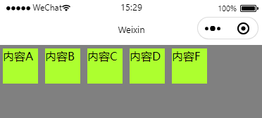
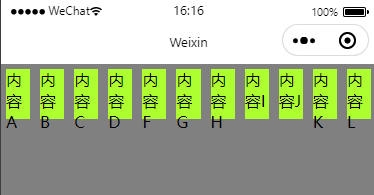
row
wxml
<!--pages/main/main.wxml-->
<view class="myParentBox">
    <view class="myChildBox">内容A</view>
    <view class="myChildBox">内容B</view>
    <view class="myChildBox">内容C</view>
    <view class="myChildBox">内容D</view>
    <view class="myChildBox">内容F</view>
</view>
wxss
Page {
    width: 100%;
    height: 100%;
    background-color: gray;
}

.myParentBox {
    width: 100%;
    height: 100%;
    background-color: grey;
    display: flex;
    /* 这里将flex-direction 设置成 row */
    flex-direction: row	;
}

.myChildBox {
    width: 50px;
    height: 50px;
    margin: 5px;
    background-color: greenyellow;
}
效果图
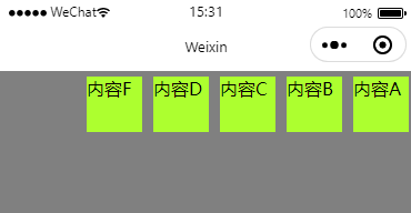
row-reverse
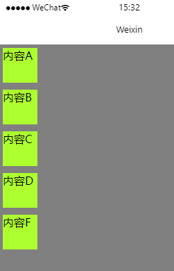
column
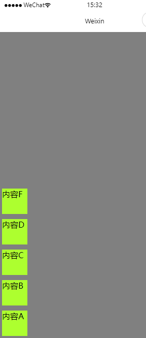
column-reverse
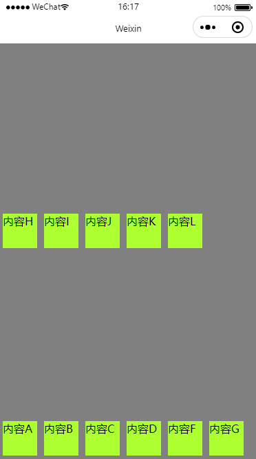
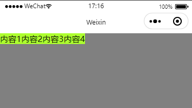
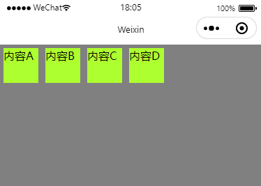
内容换行flex-wrap
| 值 | 描述 |
|---|---|
| nowrap | 不换行 |
| wrap | 换行 |
| wrap-reverse | 从后到前换行 |
| inherit | 从父元素继承此属性的值 |
| initial | 将此属性设置为属性的默认值 |
| unset | 未设置 |
nowrap
wxml
<view class="myParentBox">
    <view class="myChildBox">内容A</view>
    <view class="myChildBox">内容B</view>
    <view class="myChildBox">内容C</view>
    <view class="myChildBox">内容D</view>
    <view class="myChildBox">内容F</view>
    <view class="myChildBox">内容G</view>
    <view class="myChildBox">内容H</view>
    <view class="myChildBox">内容I</view>
    <view class="myChildBox">内容J</view>
    <view class="myChildBox">内容K</view>
    <view class="myChildBox">内容L</view>
</view>
wxss
Page {
    width: 100%;
    height: 100%;
    background-color: gray;
}

.myParentBox {
    width: 100%;
    height: 100%;
    background-color: grey;
    display: flex;
    flex-direction: row;
    flex-wrap: nowrap;
}

.myChildBox {
    width: 50px;
    height: 50px;
    margin: 5px;
    background-color: greenyellow;
}
效果图
wrap
wrap-reverse
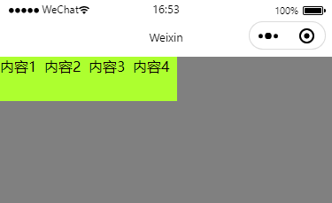
横轴对齐方式justify-content
| 值 | 描述 |
|---|---|
| flex-start | 默认值,左对齐 |
| flex-end | 右对齐 |
| center | 居中 |
| space-between | 两端对齐,项目之间的间隔是相等的 |
| space-around | 每个项目两侧的间隔相等 |
| initial | 将此属性设置为属性的默认值 |
| inherit | 从父元素继承属性的值 |
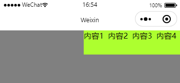
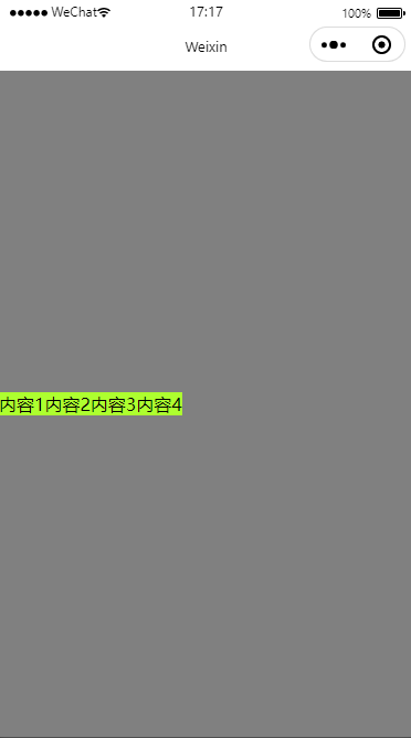
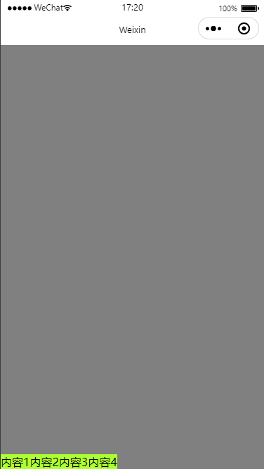
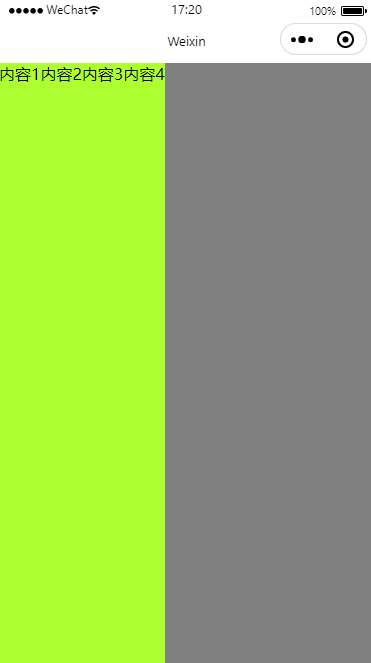
flex-start
wxml
<view class="myParentBox">
    <view class="myChildBox">内容1</view>
    <view class="myChildBox">内容2</view>
    <view class="myChildBox">内容3</view>
    <view class="myChildBox">内容4</view>
</view>
wxss
Page {
    width: 100%;
    height: 100%;
    background-color: gray;
}

.myParentBox {
    width: 100%;
    height: 100%;
    background-color: grey;
    display: flex;
    /* justify-content 设置成flex-start */
    justify-content: flex-start;
}

.myChildBox {
    width: 50px;
    height: 50px;
    background-color: greenyellow;
}
效果图
flex-end
center
space-between

space-around
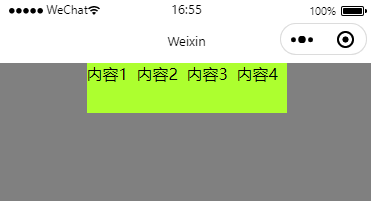
竖轴对齐方式align-items
| 值 | 描述 |
|---|---|
| stretch | 默认值,项目将被拉伸以适合容器 |
| center | 项目位于容器的中央 |
| flex-start | 项目位于容器的顶部 |
| flex-end | 项目位于容器的底部 |
| baseline | 项目与容器的基线对齐 |
| initial | 将此属性设置为属性的默认值 |
| inherit | 从父元素继承属性的值 |
flex-start
wxml
<view class="myParentBox">
    <view class="myChildBox">内容1</view>
    <view class="myChildBox">内容2</view>
    <view class="myChildBox">内容3</view>
    <view class="myChildBox">内容4</view>
</view>
wxss
Page {
    width: 100%;
    height: 100%;
    background-color: gray;
}

.myParentBox {
    width: 100%;
    height: 100%;
    background-color: grey;
    display: flex;
    /* align-items 设置成flex-start */
    align-items: flex-start;
}

.myChildBox {
    background-color: greenyellow;
}
效果图
center
flex-end
stretch
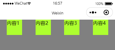
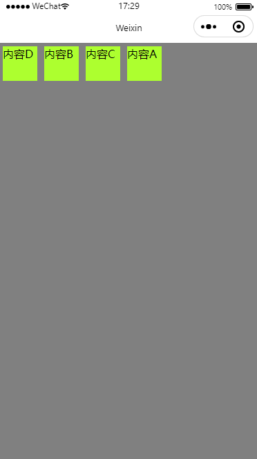
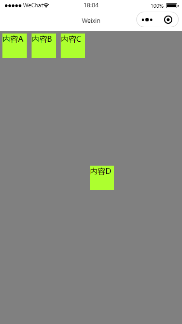
自定义排序位置order
请注意,此属性是给子元素使用的,下面的代码中,实现将内容A和内容D的位置互换的效果
wxml
<view class="myParentBox">
    <view class="myChildBox4">内容A</view>
    <view class="myChildBox2">内容B</view>
    <view class="myChildBox3">内容C</view>
    <view class="myChildBox1">内容D</view>
</view>
wxss
Page {
    width: 100%;
    height: 100%;
    background-color: gray;
}

.myParentBox {
    width: 100%;
    height: 100%;
    background-color: grey;
    display: flex;
}

.myChildBox1 {
    width: 50px;
    height: 50px;
    background-color: greenyellow;
    margin: 5px;
    order: 1;
}

.myChildBox2 {
    width: 50px;
    height: 50px;
    background-color: greenyellow;
    margin: 5px;
    order: 2;
}

.myChildBox3 {
    width: 50px;
    height: 50px;
    background-color: greenyellow;
    margin: 5px;
    order: 3;
}

.myChildBox4 {
    width: 50px;
    height: 50px;
    background-color: greenyellow;
    margin: 5px;
    order: 4;
}
效果图
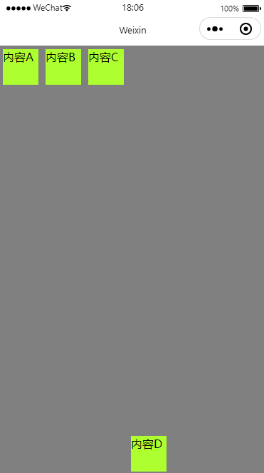
子元素竖轴位置align-self
此属性也是给子元素使用的,用于控制某个子元素的竖轴位置,下面是它可以设置的属性:
| 值 | 描述 |
|---|---|
| auto | 默认值,表示元素将继承其父容器的 align-items 属性值,如果没有父容器,则为“stretch” |
| stretch | 项目将被拉伸以适合容器 |
| center | 项目位于容器的中央 |
| flex-start | 项目位于容器的顶部 |
| flex-end | 项目位于容器的底部 |
| baseline | 项目与容器的基线对齐 |
| initial | 将此属性设置为属性的默认值 |
| inherit | 从父元素继承属性的值 |
Center
wxml
<view class="myParentBox">
    <view class="myChildBox1">内容A</view>
    <view class="myChildBox1">内容B</view>
    <view class="myChildBox1">内容C</view>
    <view class="myChildBox2">内容D</view>
</view>
wxss
Page {
    width: 100%;
    height: 100%;
    background-color: gray;
}

.myParentBox {
    width: 100%;
    height: 100%;
    background-color: grey;
    display: flex;
}

.myChildBox1 {
    width: 50px;
    height: 50px;
    background-color: greenyellow;
    margin: 5px;
}

.myChildBox2 {
    width: 50px;
    height: 50px;
    background-color: greenyellow;
    margin: 5px;
    /* 这里将align-self设置成conter */
    align-self: center;
}
效果图
flex-start
flex-end
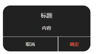
flex-grow属性 用于item的宽度或者高度的均分
效果图:
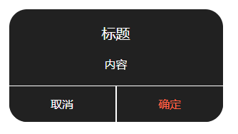
这里关注 取消 与 确定 按钮的宽度均分
.wxml
      <view class="dialogButtonParent">
        <view bindtap="onClickCancel" class="dialogButton1">取消</view>
        <view class="dialogLine2"/>
        <view bindtap="onClickPositive" class="dialogButton2">确定</view>
      </view>
.wxss
.dialogButtonParent{
  display: flex;
  flex-direction: row;
  width: 100%;
  height: 100rpx;
}

.dialogLine2{
  width: 2px;
  height: 100%;
  background-color: #FFFFFF;
}

.dialogButton1{
  text-align: center;
  color: white;
  background-color: #212121;
  line-height: 100rpx;
  border-bottom-left-radius: 50rpx;
  flex-grow: 1;
}

.dialogButton2{
  height: 100rpx;
  text-align: center;
  background-color: #212121;
  color: tomato;
  line-height: 100rpx;
  border-bottom-right-radius: 50rpx;
  flex-grow: 1;
}
将取消按钮的flex-grow 设置为2的效果
flex-basis 属性
flex-basis其实就是width或者height(取决于你设置的display)两者的功能一样。但是flex-basis设置后width或者height就会失效
box-sizing 属性
首先box-sizing是在子元素里添加的属性
你对一个元素所设置的 width 与 height 只会应用到这个元素的内容区。如果这个元素有任何的 border 或 padding ,绘制到屏幕上时的盒子宽度和高度会加上设置的边框和内边距值。这意味着当你调整一个元素的宽度和高度时需要时刻注意到这个元素的边框和内边距。 而box-sizing属性可以让你不用考虑 border 或 padding的 数值影响宽高。
content-box是默认值。如果你设置一个元素的宽为 100px,那么这个元素的内容区会有 100px 宽,并且任何边框和内边距的宽度都会被增加到最后绘制出来的元素宽度中。border-box告诉浏览器:你想要设置的边框和内边距的值是包含在 width 内的。也就是说,如果你将一个元素的 width 设为 100px,那么这 100px 会包含它的 border 和 padding,内容区的实际宽度是 width 减去 (border + padding) 的值。大多数情况下,这使得我们更容易地设定一个元素的宽高。
效果图:
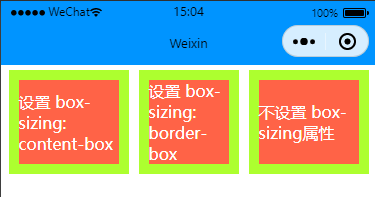
上面可以看到在添加了box-sizing: border-box; 属性后,边框与实际设置的宽度为一体的,不额外增加border的宽度
代码
.childView1 {
    display: flex;
    align-items: center;
    justify-content: center;
    background-color: tomato;
    color: white;
    flex-basis: 100px;
    box-sizing: content-box;
    border: 10px solid greenyellow;
    margin: 5px;

}

.childView2 {
    display: flex;
    align-items: center;
    justify-content: center;
    background-color: tomato;
    color: white;
    flex-basis: 100px;
    box-sizing: border-box;
    border: 10px solid greenyellow;
    margin: 5px;
}

.childView3 {
    display: flex;
    align-items: center;
    justify-content: center;
    background-color: tomato;
    color: white;
    flex-basis: 100px;
    border: 10px solid greenyellow;
    margin: 5px;
}
flex-flow 将flex-direction与flex-wrap组合在一起简写
你可以将两个属性 flex-direction 和 flex-wrap 组合为简写属性 flex-flow。第一个指定的值为 flex-direction ,第二个指定的值为 flex-wrap.
.myFlexView {
    display: flex;
    flex-flow: row wrap;
    justify-content:center;
}
End
本文来自博客园,作者:观心静 ,转载请注明原文链接:https://www.cnblogs.com/guanxinjing/p/17293425.html

 浙公网安备 33010602011771号