暖男大白的网页版实现--一个只包含HTML和CSS的小前端项目
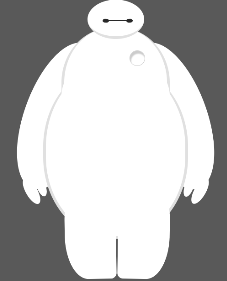
使用纯粹的HTML和CSS写出一个网页版的暖男大白,只需要了解的知识点是div布局,css相对定位以及css各种属性的应用。首先我们通过 div 定义大白身体的各个部位,就像写一个网页的框架一样,我们将大白身体的各部位都用 div 来给出定义。由于「大白」是白色的,为了更容易辨识,我们把背景设为深色。然后是头部、眼睛、嘴巴、躯干、腹部、心脏、手臂、手指、腿。
运用css动画让大白的眼睛动起来
只需要操作 eye 和 eye2 的样式即可,旋转变换产生的效果更像是眨眼,所以我们使用 css 3d 转换来完成:
@keyframes blink {
  40% {
    transform: rotateX(80deg);
  }
}
应用到eye和eye2的样式中:
/* 在原来的样式代码基础上添加我们定义的动画animation:blink 1s ease-in-out infinite alternate; */
#eye,
#eye2 {
  width: 11px;
  height: 13px;
  background: #282828;
  border-radius: 50%;
  position: relative;
  top: 30px;
  left: 27px;

  /*旋转该元素*/
  transform: rotate(8deg);
  animation: blink 1s ease-in-out infinite alternate;
}
最终代码如下
<!DOCTYPE html>
<html lang="en">

<head>
    <meta charset="UTF-8">
    <meta name="viewport" content="width=device-width, initial-scale=1.0">
    <title>Document</title>
    <style>
        body {
            background: #595959;
        }

        #baymax {
            /*设置为 居中*/
            margin: 0 auto;

            /*高度*/
            height: 600px;

            /*隐藏溢出*/
            overflow: hidden;
        }

        #head {
            height: 64px;
            width: 100px;

            /*以百分比定义圆角的形状*/
            border-radius: 50%;

            /*背景*/
            background: #fff;

            margin: 0 auto;
            margin-bottom: -20px;

            /*设置下边框的样式*/
            border-bottom: 5px solid #e0e0e0;

            /*属性设置元素的堆叠顺序;
               拥有更高堆叠顺序的元素总是会处于堆叠顺序较低的元素的前面*/
            z-index: 100;

            /*生成相对定位的元素*/
            position: relative;
        }

        @keyframes blink {
            40% {
                transform: rotateX(80deg);
            }
        }

        #eye,
        #eye2 {
            width: 11px;
            height: 13px;
            background: #282828;
            border-radius: 50%;
            position: relative;
            top: 30px;
            left: 27px;

            transform: rotate(8deg);
            animation: blink 2s ease-in-out infinite alternate;
        }

        #eye2 {
            transform: rotate(-8deg);
            left: 69px;
            top: 17px;
        }

        #mouth {
            width: 38px;
            height: 1.5px;
            background: #282828;
            position: relative;
            left: 34px;
            top: 10px;
        }

        #torso,
        #belly {
            margin: 0 auto;
            height: 200px;
            width: 180px;
            background: #fff;
            border-radius: 47%;
            border: 5px solid #e0e0e0;
            border-top: none;
            z-index: 1;
        }

        #belly {
            height: 300px;
            width: 245px;
            margin-top: -140px;
            z-index: 5;
        }

        #cover {
            width: 190px;
            background: #fff;
            height: 150px;
            margin: 0 auto;
            position: relative;
            top: -20px;
            border-radius: 50%;

        }

        #heart {
            width: 25px;
            height: 25px;
            border-radius: 50%;
            position: relative;
            box-shadow: 2px 5px 2px #ccc inset;

            right: -115px;
            top: 40px;
            z-index: 111;
            border: 1px solid #ccc;
        }

        #left-arm,
        #right-arm {
            height: 270px;
            width: 120px;
            border-radius: 50%;
            background: #fff;
            margin: 0 auto;
            position: relative;
            top: -350px;
            left: -100px;
            transform: rotate(20deg);
            z-index: -1;
        }

        #right-arm {
            transform: rotate(-20deg);
            left: 100px;
            top: -620px;
        }

        #l-bigfinger,
        #r-bigfinger {
            height: 50px;
            width: 20px;
            border-radius: 50%;
            background: #fff;
            position: relative;
            top: 250px;
            left: 50px;
            transform: rotate(-50deg);
        }

        #r-bigfinger {
            left: 50px;
            transform: rotate(50deg);
        }

        #l-smallfinger,
        #r-smallfinger {
            height: 35px;
            width: 15px;
            background: #fff;
            border-radius: 50%;
            position: relative;
            top: 195px;
            left: 66px;
            transform: rotate(-40deg);
        }

        #r-smallfinger {
            transform: rotate(40deg);
            left: 37px;
        }

        #left-leg,
        #right-leg {
            height: 170px;
            width: 90px;
            background: #fff;
            border-radius: 40% 30% 10px 45%;
            position: relative;
            top: -640px;
            left: -45px;
            transform: rotate(-1deg);
            margin: 0 auto;

        }

        #right-leg {
            top: -810px;
            left: 50px;
            transform: rotate(1deg);
            border-radius: 30% 40% 45% 10px;
        }
    </style>
</head>

<body>
    <div id="baymax">
        <!-- 定义头部,包括两个眼睛、嘴 -->
        <div id="head">
            <div id="eye"></div>
            <div id="eye2"></div>
            <div id="mouth"></div>
        </div>

        <!-- 定义躯干,包括心脏 -->
        <div id="torso">
            <div id="heart"></div>
        </div>

        <!-- 定义肚子腹部,包括 cover(和躯干的连接处) -->
        <div id="belly">
            <div id="cover"></div>
        </div>

        <!-- 定义左臂,包括一大一小两个手指 -->
        <div id="left-arm">
            <div id="l-bigfinger"></div>
            <div id="l-smallfinger"></div>
        </div>

        <!-- 定义右臂,同样包括一大一小两个手指 -->
        <div id="right-arm">
            <div id="r-bigfinger"></div>
            <div id="r-smallfinger"></div>
        </div>

        <!-- 定义左腿 -->
        <div id="left-leg"></div>

        <!-- 定义右腿 -->
        <div id="right-leg"></div>
    </div>
</body>

</html>
效果如图所示