
浅析css3属性mix-blend-mode背景颜色混合模式制作不同复杂渲染效果
一、mix-blend-mode 了解
1、什么是混合模式?
熟悉PS的人都应该知道混合模式:
SVG以及Canvas中也有混合模式,本质上都是一样的。
2、该CSS属性作用是让元素内容和这个元素的背景以及下面的元素发生“混合”。
{
  mix-blend-mode: normal;         // 正常
  mix-blend-mode: multiply;       // 正片叠底
  mix-blend-mode: screen;         // 滤色
  mix-blend-mode: overlay;        // 叠加
  mix-blend-mode: darken;         // 变暗
  mix-blend-mode: lighten;        // 变亮
  mix-blend-mode: color-dodge;    // 颜色减淡
  mix-blend-mode: color-burn;     // 颜色加深
  mix-blend-mode: hard-light;     // 强光
  mix-blend-mode: soft-light;     // 柔光
  mix-blend-mode: difference;     // 差值
  mix-blend-mode: exclusion;      // 排除
  mix-blend-mode: hue;            // 色相
  mix-blend-mode: saturation;     // 饱和度
  mix-blend-mode: color;          // 颜色
  mix-blend-mode: luminosity;     // 亮度

  mix-blend-mode: initial;
  mix-blend-mode: inherit;
  mix-blend-mode: unset;
}
-
multiply混合后通常颜色会加深,多用在白色背景图片和其他元素的混合,以及彩色纹理的合并上。
-
screen混合后颜色会减淡,非常适合实现霓虹灯光效果,适合黑色背景素材和其他元素混合,非常实用。
-
overlay在颜色值暗的时候,采用了类似“正片叠底”的算法,而颜色亮的时候,采用了类似“滤色”的算法。此混合模式比较适合实现文字水印效果。
-
darken表示哪个颜色暗使用哪个颜色,在web开发中,给图形或文字着色会很实用。
-
lighten是哪个颜色浅就表现为哪个颜色,在web开发中,给图形或文字着色会很实用。
-
color-dodge颜色减淡混合模式可以用来保护底图的高光,适合处理高光下的人物照片。
-
color-burn颜色加深混合模式可以用来保护底图的阴影,适合处理幽深秘境一类的照片,通过和特定的色彩进行混合,可以营造更加幽深的意境。
-
hard-light的效果是强光,最终的混合效果就好像耀眼的聚光灯照射过来,表现为图像亮的地方更亮,暗的地方更暗。多用在图像表现处理上。
-
soft-light的效果是柔光,最终的混合效果就好像发散的光源弥漫过来,表现效果和hard-light有类似之处,只是表现没有那么强烈。给图像着色的时候常用此混合模式。
-
difference是差值效果,可以实现颜色的反色效果。
-
exclusion的效果是排除,最终的混合效果和difference模式是类似的,区别在于exclusion的对比度要更低一些。
接下来要介绍的4种混合模式都属于颜色系混合模式,在web开发中不常用,还是传统的图像表现处理领域用的较多。 -
hue表示色调混合,最终的效果是混合后的颜色使用底层元素的亮度和饱和度,而使用上层元素的色调。
-
saturation表示饱和度混合,混合后的颜色保留底图的亮度和色调,使用顶图的饱和度。
-
color表示颜色混合,混合后的颜色保留底图的亮度,使用顶图的色调和饱和度。
-
luminosity表示亮度混合,混合后的颜色保留底图的色调和饱和度,使用顶图的亮度,和color模式正好是相反的。
二、案例理解
<!DOCTYPE html>
<html lang="en">
<head>
<meta charset="UTF-8">
<meta name="viewport" content="width=device-width, initial-scale=1.0">
<title>Document</title>
<style>
.mode{
position: relative;
}
.text{
position: absolute;
top: 20px;
left: 20px;
bottom: 20px;
right: 20px;
background: rgb(108, 124, 15);
font: bolder 100px 'Alfa Slab One';
color: #fff;
text-align: center;
padding-top: 10px;
}
</style>
</head>
<body>
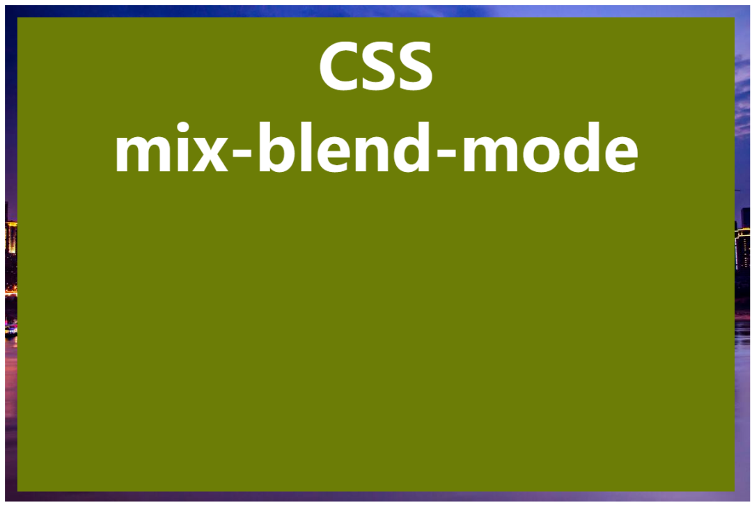
<div class="mode">
<div class="text" :style="{'mix-blend-mode': value}">
CSS<br />mix-blend-mode
</div>
<img src="https://www.dengzhanyong.com/PHP/images/1606961604.jpg" />
</div>
</body>
</html>
正常情况下是这种效果
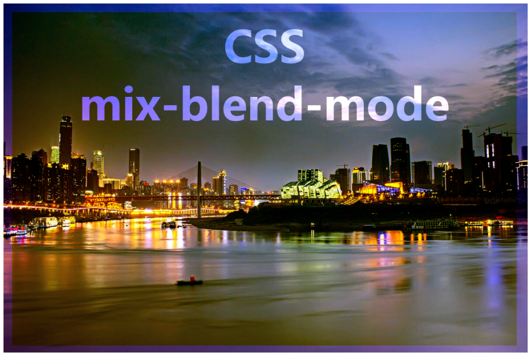
mix-blend-mode: overlay; 叠加效果
更多效果可见这篇文章《【你不知道的CSS】mix-blend-mode》https://blog.csdn.net/dengzy926/article/details/110644368

 浙公网安备 33010602011771号