CSS实现圆形进度条及conic-gradient学习
一、conic-gradient
conic-gradient:圆锥形渐变,它的两个兄弟line-gradient(线性渐变)、radial-gradient(径向渐变),算是最早认识的渐变属性。
1、特点:圆锥渐变的起始点是图形中心,渐变方向以顺时针方向绕中心旋转实现渐变效果。
2、兼容性:
根据 can i use,目前只在chrome 69及以上支持。
可以使用polyfill垫片库,解决兼容性问题。垫片库会根据css语法,生成对应的圆锥渐变图案,并且转化为 base64 代码。
// 需加入的js库
<script src="//cdnjs.cloudflare.com/ajax/libs/prefixfree/1.0.7/prefixfree.min.js"></script>
<script src="//leaverou.github.io/conic-gradient/conic-gradient.js"></script>
实测,不能解决兼容性问题
3、案例
<section class="color1"></section>
<section class="color2"></section>
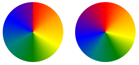
    /* 起始处与结尾处衔接不够自然 */
    .color1 {
      width: 200px;
      height: 200px;
      border-radius: 50%;
      background: conic-gradient(red, orange, yellow, green, teal, blue, purple)
    }
     /* 起始处与结尾处衔接不够自然,解决:在结尾加入开始的颜色 */
    .color2 {
      width: 200px;
      height: 200px;
      border-radius: 50%;
      background: conic-gradient(red, orange, yellow, green, teal, blue, purple, red);
    }
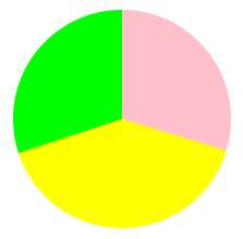
    <section class="pie"></section>

    .pie {
      width: 200px;
      height: 200px;
      border-radius: 50%;
      /* 百分比 写法一 */
       background: conic-gradient(pink 0, pink 30%, yellow 30%, yellow 70%, lime 70%, lime 100%);
      /* 写法二 不支持 chrome69 */
      /* background: conic-gradient(pink 0 30%, yellow 0 70%, lime 0 100%); */
    }
二、圆形进度条
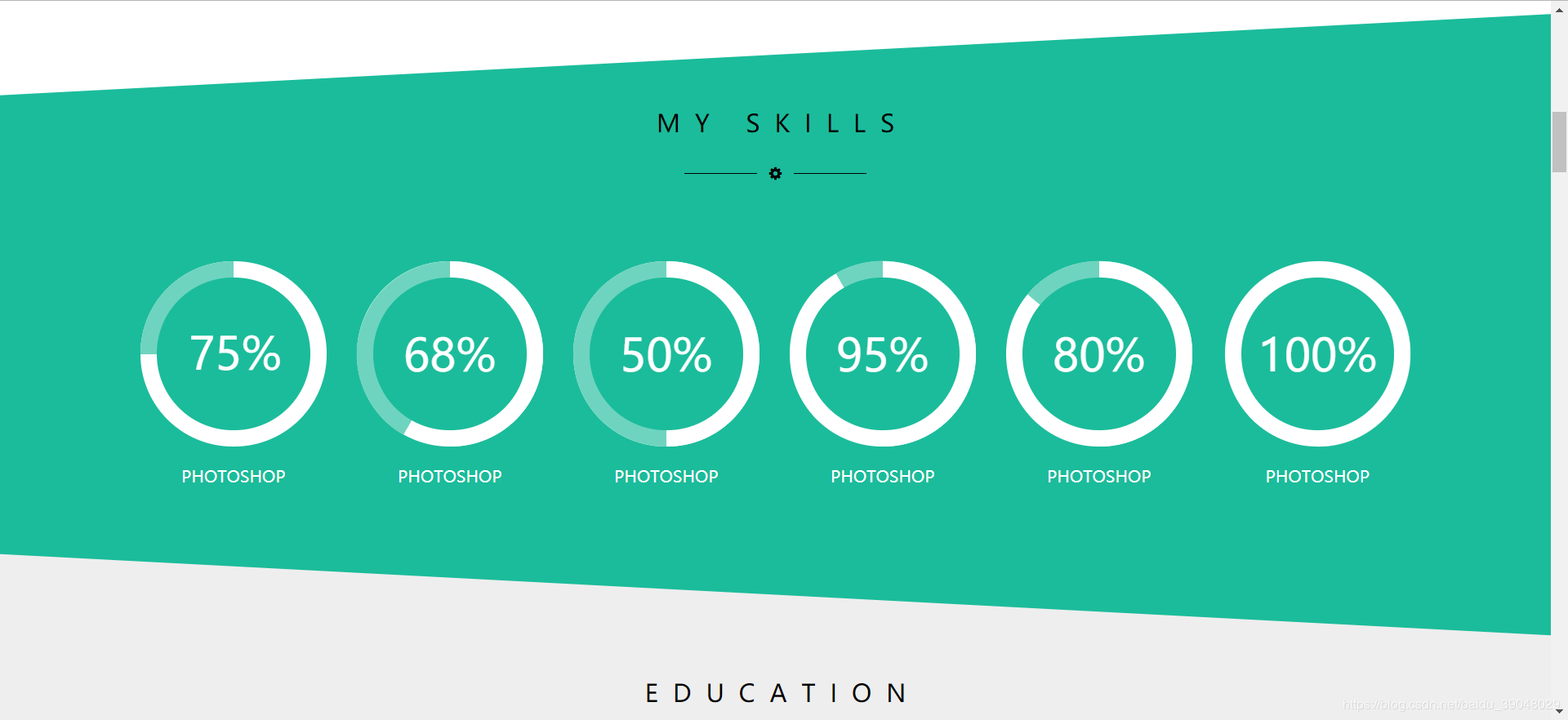
具体实现步骤:
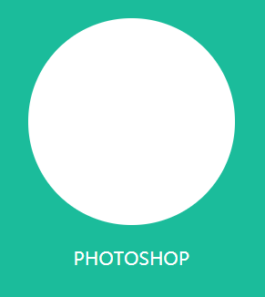
1、先画一个大圆,底色为#ffffff;
<div class="third"> </div>
.third{
    background-color: #FFFFFF;
    width: 182px;
    height: 182px;
    border-radius: 50%;
    position: relative;
}
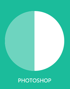
2、再画2个半圆:一个浅绿色的半圆和一个白色的半圆
<div class="third">
    <div class="second"></div>
    <div class="first"></div>
</div>
.second{
    background-color: #6ED4BF;
    width: 182px;
    height: 182px;
    border-radius: 50%;
    clip:rect(0,91px,auto,0);
    position: absolute;
}
.first{
    background-color: #FFFFFF;
    width: 182px;
    height: 182px;
    border-radius: 50%;
    clip:rect(0,auto,auto,91px);
}
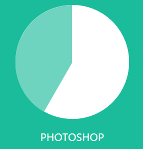
3、将second圆根据百分比旋转
.second{
    background-color: #6ED4BF;
    width: 182px;
    height: 182px;
    border-radius: 50%;
    clip:rect(0,91px,auto,0);
    position: absolute;
    transform: rotate(30deg);  //旋转30度
}
4、最后再画一个小圆,写上百分比
<div class="third">
          <div class="second"></div>
          <div class="first"></div>
          <div class="mask">
               <span>68%</span>
          </div>
</div>

.third *{
    position: absolute;
    top: 0;
    right: 0;
    bottom: 0;
    left: 0;
}
.mask>span{
    display: block;
    font-size: 44px;
    color: white;
    line-height: 150px;
}

 浙公网安备 33010602011771号