CSS3学习笔记-元素定位
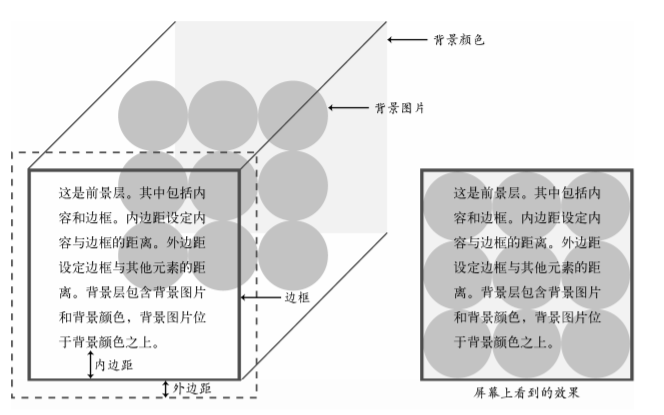
内边距 边框 外边距
border
border三个属性
border-wdith 默认值medium
border-style 默认值none
border-color 默认值 black
border-radius小于border-width,元素内角为直角,大于时,元素内角的半径为两个值的差
制作圆形
 .circle{
    width: 100px;
    height: 100px;
    border-radius: 50%;
  }
制作半圆
.top{
    width: 100px;
    height: 50px;
    border-radius: 50px 50px 0px 0px;
  }
  .right{
    width: 50px;
    height: 100px;
    border-radius: opx 50px 50px 0px;
  }
制作扇形
.sector{
    width: 100px;
    height: 100px;
    border-radius: 100px 0px 0px 0px;
  }
制作椭圆
.hov{
    width: 100px;
    height: 50px;
    border-radius: 100px/50px;
  }
box-shadow
box-shadow 只设置spread-radius值和设置border-width效果一样,且不位于盒模型中
resize
允许用户改变元素的大小,textarea默认的resize属性是both
horizontal(水平) | vertical(竖直)| both(都能改变)
outline
外轮廓,获取焦点时或被激活时显示,属性类似于border,唯一区别在于offset属性用来设置元素向外或向内的偏移量,不会影响文档流
overflow
auto(内容超出元素显示滚动条)| scroll(一直显示滚动条)
notice
(1)margin padding 简写顺序:顺时针方向。未声明的一边会应用对边的值
(2)写代码时最好先声明*{margin:0px;padding:0px}
(3)在设置两个元素间的垂直外边距时,同一个外边距只会采用margin较大的那个值,不会叠加。而水平外边距会叠加。
(4)文本元素的边距通常上下边距使用em,左右边距使用px
CSS盒模型
(1)没有设置宽度的元素始终会拓展到和其父元素宽度相同为止
(2)有设置宽度的元素设置内边距,边框,外边距都会增加元素的宽度
注:border-box 默认是content-box ,设置为box-sizing可以实现content-box的效果
浮动
浮动元素会脱离文档流,实现的效果就是尽可能的向左上角或者右上角迁移
有父元素的控制方式:
(1)设置overflow:hidden,可靠的使父元素包含浮动的子元素
(2)设置父元素也浮动,同时设置父元素的兄弟元素clear:left,这样父元素的兄弟元素不会与父元素并排在同一行
(3)在父元素的最后添加一个非浮动的子元素,clear:left。或者应用.clearfix规则

.clearfix:after{
content:'.',
display:block,
visibility:hidden,
clear:both,
height:0
}
注:句点是最小的内容。可以使用clear:both来设置,同时包含了left和right的情况
notice
(1)在没有父元素的情况下,使用clearfix规则,最合适。
(2)浮动非图片元素时必须设置宽度,图片有自身的默认宽度因而不用设置
定位position
(1)默认值static
(2)相对定位relative:相对的是原来它在文档流中的位置
(3)绝对定位absolute:相对body元素进行定位。在未设置父元素的position属性时,设置父元素的postion之后,子元素会相对于父元素进行定位
(4)固定定位fixed:相对上下问的视口定位
显示属性display
(1)块级元素变内联元素:display:inline 反之:display:block
(2)inline元素的宽度随内容变化,无法设置width和height,也无法设置除了左右之外的边距
(3)inline-block 相当于将block元素inline展示,可以设置宽高及上下边距
垂直方向的居中可以如下设置:
display:table-cell; /*借用表格的行为*/
vertical-align:middle; /*垂直居中*/
text-align:center; /*水平居中*/
notice
inline-block可以包围浮动元素。在其父元素上应用text-align:center可以使其居中
背景
background-image:url(path/filename) 修改平铺方式background-repeat 修改平铺起点background-position
background-repeat: repeat-x repeat-y no-repeat round 通过调整图片大小来适应背景区域 space通过在图片间添加空白来适应背景区域
通过设置
background-positon:50% 50%;
background-repeat:no-repeat;
实现背景图片的居中效果,表示图片50% 50%的位置和元素50% 50%的位置对齐
background-attachment 表示背景图片是否随着元素的滚动而移动
background简写
background: url() position color repeat size attachment
添加多张背景图片
background:
 url(images/turq_spiral.png) 30px -10px no-repeat,
 url(images/pink_spiral.png) 145px 0px no-repeat,
 url(images/gray_spiral.png) 140px -30px no-repeat, #ffbd75;
先列处的图片显示在上方
background-origin : border-box | padding-box | content-box背景起始位置
background-clip:border-box | padding-box | content-box 默认border-box背景裁切属性
background-size:cover 要和background-position:center配合使用 cover撑满整个元素 contain只会在水平方向拉满
notice
border-color的颜色在未设置的情况下会等于color
在设置background-position最好使用百分比

 浙公网安备 33010602011771号