本文转自http://www.codeproject.com/KB/list/ObjectListView.aspx
- Download everything (includes ObjectListView source and demo, ListViewPrinter source and demo, and unit tests) - 1024 KB
- Download ObjectListView source and DLL - 419 KB
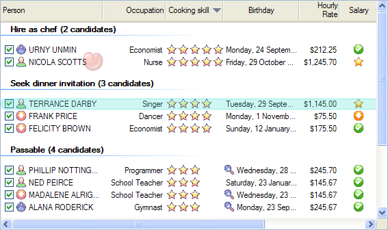
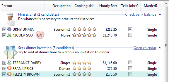
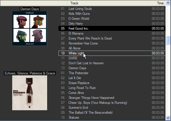
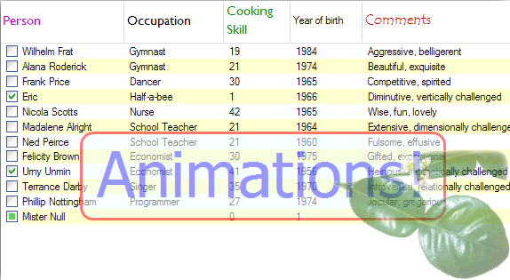
[For those who noted that the above graphic lacks one of the fundamental requirements for an animation (namely animated-ness), CodeProject doesn't support animations within a page, so click here to see the actual animation.]
Foreword
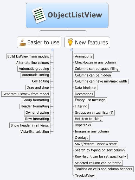
All projects suffer creeping featurism. Things that start simple and elegant end up as the "before" image in a weight-loss ad. This control has grown considerably since it was first written. If you want to do something with a ListView, this code probably has some code to help you do it. For those in a hurry, this control has the following major features:
- It easily transforms a collection of model objects in a fully functional
ListView, including automatically sorting and grouping. - It can easily edit the values shown in the
ListView. - It supports tri-state check-boxes (on, off, indeterminate), even in virtual mode, and on subitems.
- It supports heavily customisable tool tips for both cells and column headers.
- It can trivially produce nice reports from the
ListView. - It supports all
ListViewviews (report, tile, large and small icons). - It supports owner drawing, including rendering animated GIFs.
- Its columns can be fixed-width or limited to a minimum/maximum.
- It shows a highly customisable "list is empty" message when the list is empty (obviously).
- Its row height can be explicitly set.
- It supports user selection of visible columns by right clicking on the header.
- It supports columns that automatically resize to fill any unoccupied width.
- It supports hot tracking, with text font/color changes and with decorations.
- It supports image and text overlays, as well as arbitrary overlays (the personal information box) and decorations (the love hearts).
- It has builtin support for drag and drop.
- It supports hyperlinks in cells.
- It supports column headers being styled (normal, hot and pressed states), plus having images and even vertical text. [v2.4.1]
- It supports many group formatting options, including collapsible groups. Groups can be shown on virtual lists!
- It has a version (
TreeListView) which combines a tree structure with the columns of aListView. - It has a version (
VirtualObjectListView) that supports millions of rows. - It has a version (
FastObjectListView) that can build a list of 10,000 objects in less than 0.1 seconds. - It has a version (
DataListView) that supports data binding. - It makes implementing your own virtual list simple through the
IVirtualListDataSourceinterface. - It supports filtering, including showing only rows that match a given string (including regex and prefix match) [v2.4]
- It supports animations on a cell, row or the whole list. [v2.4]
This control has its own website, hosted by SourceForge: ObjectListView - How I Learned To Stop Worrying and Love .NET's ListView (made using the cool Sphinx documentation tool). This is not an empty shell site. It actually has lots of useful information. There you can find a step by step tutorial to help you get started, as well as a cookbook showing you how to accomplish common tasks. This article is only really an introduction.
Those who aren't in a hurry can now read the rest of the article. :-)
Introduction
Larry Wall, the author of Perl, once wrote that the three essential character flaws of any good programmer were sloth, impatience and hubris. Good programmers want to do the minimum amount of work (sloth). They want their programs to run quickly (impatience). They take inordinate pride in what they have written (hubris). It is in the interests of encouraging "slothfulness" that I wrote this control.
The ListView "problem"
I often find that I have a collection of objects which I want to present to the user in some sort of tabular format. It could be the list of clients for a business, a list of known FTP servers or even something as mundane as a list of files in a directory. User interface-wise, the ListView is the perfect control for these situations. However, I find myself groaning at the thought of using the ListView and secretly hoping that I can use a ListBox instead.
The reason for wanting to avoid the ListView is all the boilerplate code it needs to work: make the ListViewItems, add all the SubItems, catch the header click events and sort the items depending on the data type. Each of these tasks is slightly different for each instance of a ListView. If you want to support grouping, there's an even bigger chunk of boilerplate code to copy and then modify slightly.
For a basically lazy person, this is far too much work. ObjectListView was born to relieve this workload.
Features
An ObjectListView provides two groups of functionality. The first group is designed to make a ListView much easier to use. This group ranges from automatically converting a list of model objects into a fully functional ListView, to making drag and drop and cell editing much easier to use. The second group adds new features to a ListView, such as image overlays and customisable tooltips.
1. Basics of Using an ObjectListView
1.1 First Steps
There are two ways to use an ObjectListView in your project:
1. Use the ObjectListView project
- Download the
ObjectListViewproject. - Add the
ObjectListViewproject to your project (right click on your solution; choose "Add...", "Existing Project", then choose the ObjectListView.csproj). - In your project, add a reference to the
ObjectListViewproject (right click on your project; choose "Add Reference...", choose "Projects" tab; then double click on theObjectListViewproject). - Build your project. If you get an error saying that NUnit could not be found, simply remove the "Tests2008" (or the "Tests") project from the solution.
Once your project has been built, there should now be a new section in your Toolbox, "ObjectListView Components". In that section should be ObjectListView and its friends. You can then drag an ObjectListView onto your window, and use it as you would a standard ListView control.
2. Use ObjectListView.dll
If you don't want to add the ObjectListView project to your project, you can also just add the ObjectListView.dll file.
- Download or build the ObjectListView.dll file.
- In your project, add a reference to the ObjectListView.dll (right click on your project; choose "Add Reference...", choose "Browse" tab; navigate to the ObjectListView.dll file and double click on it).
Adding the DLL does not automatically add any new components into your toolbox. You will need to add them manually after you have added the DLL to your project.
Note for VS 2010 users: Apparently, the ObjectListView.dll will not work directly in .NET 4.0 project. You will have to download the ObjectListView project instead. Thanks to johnmandre.
1.2 Making it go
"Simple things should be simple. Complex things should be possible." The major design goal of ObjectListView was to make the programmer's life simpler. The control provides a lot of functionality, and it can be overwhelming if you try to absorb it all at once. It's best to start with the foundational ability of an ObjectListView: it generates a fully functional ListView from a list of model objects. Usually the control is configured within the IDE (setting properties and creating columns) and then, with a single line of code, it is put into action like this:
this.objectListView1.SetObjects(allPeople);
And that is it!
Simple, fast, uncomplicated, non-fattening and without a single line of boilerplate code. Without further work, this ObjectListView is a fully functional ListView and will handle drag and drop, alternate line colouring, column-click sorting, data formatting, grouping and possibly editing too. The "Simple Example" tab in the demo project shows what is possible with only IDE configuration and this one line of code.
2. Giving a Little More Detail
2.1 Behind SetObjects()
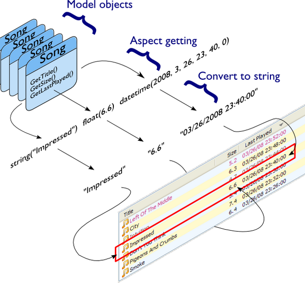
What is actually happening here? When you call SetObjects(), the ObjectListView runs through the given list of model objects, extracts the aspect nominated for each column, converts that aspect to a string, and then puts those strings together to make a row in the ListView. For those who think in pictures, you can visualize the process like this:
2.2 Unlearn You Must
For those of you who have struggled with a ListView before, you must unlearn. An ObjectListView is not a drop in replacement for a ListView. If you have an existing project, you cannot simply create an ObjectListView instead of creating a ListView. An ObjectListView needs a different mindset. If you can perform the mind-mangling step of changing your thinking, ObjectListView will be your best friend.
An ObjectListView is much more active than a plain ListView. A normal ListView is essentially passive: it sits there, and you poke and prod it and eventually it looks like you want. With an ObjectListView you tell it what you want done and the ObjectListView does it for you. More formally: An ObjectListView is used declaratively. You configure the ObjectListView, give it your collection of model objects, and the ObjectListView builds the ListView for you.
The crucial part of using an ObjectListView is configuring it. Most of this configuration can be done within the IDE by setting properties on the ObjectListView itself or on the columns that are used within the list. Some configuration cannot be done through properties: these more complex configurations are done by responding to events or by installing delegates (more on this later). Once the columns and control are configured, putting it into action is simple, as you have already seen, a single call to SetObjects().
Beware of ListViewItems. You never need to add ListViewItems to an ObjectListView. If you find yourself adding things to the Items collection, creating ListViewItems, or adding sub-items to anything, then you need to stop — you are being seduced to the dark side. An ObjectListView does all that work for you. It owns the ListViewItems, and destroys, changes and builds them as required from the information you have given. Resist the temptation to add/edit/sort or otherwise mess with ListViewItems — it will not work.
There is also no need to hide information in a ListViewItem. Old style ListView programming is often required attaching a key of some sort to each ListViewItem, so that when the user did something with a row, the programmer would know which model object that row was related to. This attaching was often done by creating one or more zero-width columns, or by setting the Tag property on the ListViewItem. With an ObjectListView, you do not need to do this anymore. The ObjectListView already knows which model object is behind each row. In many cases, the programmer simply uses the SelectedObjects property to find out which model objects the user wants to do something to.
2.3 Adding Complexity: Images
A single call to SetObjects() is all well and good, but real-world applications need more than just sorting and grouping. They need at least a little image in the first column.
The obvious first enhancement to this simple example is to display images in the ListView. To do that, we need to configure the ObjectListView so it knows what image to show against each row. This normally cannot be done within the IDE. Very often the image to be shown depends on the model object being displayed. To decide on an image, we need a more complex type of configuration: installing a delegate.
A delegate is basically a piece of code that you give to an ObjectListView saying, "When you need to do this, call this piece of code" where this can be any of several tasks. In this case, we install an ImageGetter delegate, which tells the ObjectListView, "When you need to figure out the image for this model object, call this piece of code." [If the word "delegate" worries you, think of them as function pointers where the parameter and return types can be verified. If that makes no sense to you, just keep reading. It will (possibly) become clear with some examples.]
First, you need a method that matches the ImageGetterDelegate signature: it must accept a single object parameter and returns an object. The value returned from the ImageGetter delegate is used as an index into the ObjectListView's SmallImageList. As such, the ImageGetter can return either a string or an int. (If the ObjectListView is owner-drawn, the ImageGetter can also return an Image).
A somewhat frivolous example follows:
object PersonColumnImageGetter (object rowObject) {
    // People whose names start with a vowel get a star,
    // otherwise the first half of the alphabet gets hearts
    // and the second half gets music
    Person p = (Person)rowObject;
    if ("AEIOU".Contains(p.Name.Substring(0, 1)))
        return 0; // star
    else if (p.Name.CompareTo("N") < 0)
        return 1; // heart
    else
        return 2; // music
};
To install it, you do this:
this.personColumn.ImageGetter = new
    ImageGetterDelegate(this.PersonColumnImageGetter);
In VB:
this.personColumn.ImageGetter = New
    ImageGetterDelegate(AddressOf PersonColumnImageGetter)
.NET 2.0 added the convenience of anonymous delegates (to C# at least - VB programmers still have to write separate functions). In an anonymous delegate, the code for the function is inlined, like this:
this.personColumn.ImageGetter = delegate (object rowObject) {
    Person p = (Person)rowObject;
    if ("AEIOU".Contains(p.Name.Substring(0, 1)))
        return 0; // star
    else if (p.Name.CompareTo("N") < 0)
        return 1; // heart
    else
        return 2; // music
};
Anonymous delegates save you from having to add lots of little methods to your class. However, if the anonymous delegates start to become too big or if you find yourself copying them verbatim from one place to another, it's a good sign that you need to put some new methods on your model class.
[v2.3] If your model class has a property which can return the name or the index of the image that should be shown, you don't need to install a delegate. You can set the ImageAspectName property to the name of that property. But this is crossing the line between model and view, so I'm not encouraging this practice, just pointing out that it's possible.
2.4 Other Customizations
ObjectListView uses a combination of events and delegates allow further, more complex customizations. All of the following can be customized:
- The way the aspect is extracted from the model object of the row:
OLVColumn.AspectGetter. If there is no method or property on the model that will give the data that you want to show, you can install anAspectGetterdelegate to calculate the information. - The way the aspect is converted to a
string:OLVColumn.AspectToStringConverter. Without an installed delegate, this is done using theToString()method. The delegate can do whatever it likes. - The way the group key for this row is calculated:
OLVColumn.GroupKeyGetter. A group key is simply a value used to partition all of the model objects into groups. All of the model objects with the same group key are put into the same group. - The way a group key is converted into a group title:
OLVColumn.GroupKeyToTitleConverter. - The way edited values are written back into the model objects:
OLVColumn.AspectPutter. - The way check boxes are calculated and stored:
OLVColumn.CheckStateGetterandCheckStatePutter. - The text that is shown in the tooltip for a cell (
ObjectListView.CellToolTipGetterdelegate) or for a header (ObjectListView.HeaderToolTipGetterdelegate). You can listen forCellToolTipShowingandHeaderToolTipShowingevents, which allow a lot more flexibility in the way tool tips are shown. - There are
FormatRowandFormatCellevents which triggered when each row and cell is added to the control. These give the programmer the chance to format the row or cell as they desire. They are an improvement over theRowFormatterdelegate in that they know where they are going to be in the list, whereas theRowFormatterdid not.
The complex example tab in the demo project has examples of using all of these delegates. For example, turn on "Show Groups" and click on the "Cooking Skill" or "Hourly Rate" column to see what's possible.
2.5 Data Unaware
The control is written to be data-agnostic. It doesn't care what type of data it is working on. The only requirement is that the object passed to the SetObjects method must support the IEnumerable interface, which isn't too heavy a requirement. This means that it works equally well with an ArrayList, a DataTable or a list of compiler errors returned from CompilerResults.Errors. For example, to display information from DataTable, you could install AspectGetter delegates like this:
columnName.AspectGetter =
    delegate(object row) { return ((DataRow)row)["Name"]; };
columnCompany.AspectGetter =
    delegate(object row) { return ((DataRow)row)["Company"]; };
columnAge.AspectGetter =
    delegate(object row) { return ((DataRow)row)["Age"]; };
Then install the table like this:
this.objectListView1.SetObjects(ds1.Tables["Persons"].Rows);
Note that this code installed the Rows, not the DataTable itself.
[v2.1] As of this version, you would not have to define AspectGetters in this manner. It would be enough to set columnName.AspectName to "Name" and the ObjectListView would be able to extract the indexed property from the DataRow. But the example still works as it stands.
3. Flavours of ObjectListView
3.1 A little more data aware — DataListView
In response to intense public demand — OK, a couple of people asked for it — there is a DataListView class. This is a data-bindable version of ObjectListView which accepts various kinds of data sources and populates the list with data from that source.
For those programmers for whom even one line of code is too much, DataListView can be configured completely within the IDE. Give it a DataSource, set up the columns and it will simply work. DataListView also listens for ListChanged events on its data source and uses those to keep its list in sync with the contents of the data source. Add a new row to the data table and it will automatically appear in the ListView! Edit a value in the DataListView and the change automatically appears in the DataTable!
The DataListView can accept several types of objects as data sources:
DataViewDataTableDataSetDataViewManagerBindingSource
To use DataListView, you give each column the name of the data column you want it to display in the AspectName property. Then set the DataSource member to your data source. That's it! Even more slothfulness! So, we could accomplish the same thing as the "data unaware" example above by configuring AspectNames for the columns and then setting the data table directly, like this:
this.dataListView1.DataSource = ds1.Tables["Persons"];
Alternatively, for the monumentally slothful, the whole thing could be done through IDE configuration. Set the AspectName property on the columns; set the DataSource property to the appropriate dataset and then set the DataMember property to tell which table from the dataset you want to show. Hey, presto, a fully functional data set viewer. All without writing a single line of code.
3.2 You want how many rows in that ListView?! — VirtualObjectListView
If you've ever wanted to thoroughly overwhelm your users with 10 million rows of data, then go ahead and knock them out with VirtualObjectListView.
Let's get this out of the way first: ListViews are NOT good interfaces for large number of items. There aren't any. If you are trying to show a ListView that has 10 million rows, you need to rethink your interface. However, if you really have to use a ListView with that many rows, then VirtualObjectListView is your answer.
Normally ObjectListView keeps a list of model objects that it can read, sort or group at will. An VirtualObjectListView does not keep such a list. Instead, it only fetches model objects when they need to be displayed. For large lists, this is a massive reduction in resources. If the user never looks at the 4-millionth row, the VirtualObjectListView will never ask for it, so the program will never have to create it.
To use a VirtualObjectListView, you must implement an IVirtualListDataSource and give that data source to the virtual list (via the DataSource property). Using that interface, the virtual list can then function just like a full-fledged ObjectListView. The only things a virtual list still can't do are: it can't show groups and it can't use tile view. But otherwise they should operate in the same way as a normal ObjectListView, including sorting, check boxes, and searching through typing.
If you don't want to implement all the methods of IVirtualListDataSource, you can subclass AbstractVirtualListDataSource which is a “do-nothing” implementation of that interface. At very least, you must implement GetObjectCount() and GetNthObject(), otherwise nothing will appear in the list.
3.3 A much faster ListView — FastObjectListView
So far, ObjectListView has been catering to the slothful, those of us who want to do the least work and get the most results. If impatience is more your key character flaw, then the FastObjectListView is for you. In exchange for losing a few features, you gain a great amount of speed.
How fast is it? On my mid-range laptop, a normal ObjectListView builds a list of 10,000 objects in about 10-15 seconds. A FastObjectListView builds the same list in less than 0.1 seconds.
What do you lose? With a FastObjectListView, you cannot use Tile view and if you are on XP, you cannot show groups. Apart from that, all features of ObjectListView are available in the FastObjectListView. From v2.3 onwards, when running on Vista or later, FastObjectListViews can show groups. Simply set ShowGroups to true, and the control will handle groups in the same fashion as a normal ObjectListView.
3.4 Tree hugging — TreeListView
From time to time, there are situations when you want to show a tree structure (like a TreeView), but you also want to show more than information about the items than just their name (like a ListView). Enter the TreeListView. It shows a tree structure with its nice ability to expand and collapse, but also shows information in columns:
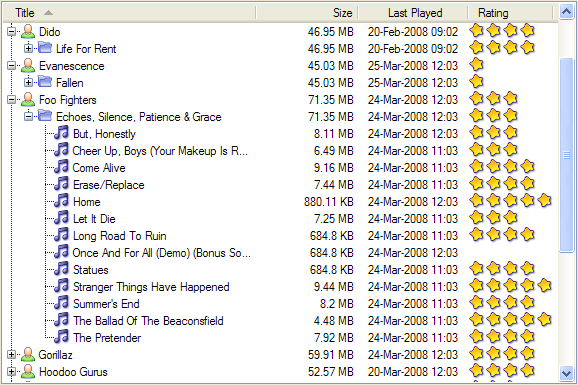
Like all the other ObjectListViews, TreeListView relies on delegates. The two essential delegates for using a TreeListView are: one to know if a given model can be expanded (CanExpandGetter delegate), and the second to get the children of a model when it is expanded (ChildrenGetter delegate).
In the demo, there is an Explorer like example, which navigates the disks on the local computer. The tree list view in that demo is configured like this:
this.treeListView.CanExpandGetter = delegate(object x) {
    return (x is DirectoryInfo);
};


this.treeListView.ChildrenGetter = delegate(object x) {
    DirectoryInfo dir = (DirectoryInfo)x;
    return new ArrayList(dir.GetFileSystemInfos());
};
In this example, the CanExpandGetter delegate ensures that only directories can be expanded.
The ChildrenGetter delegate returns the contents of a directory when that directory is expanded. ChildrenGetter delegates are only ever called if CanExpandGetter returns true. So in this case, the ChildrenGetter delegate knows that the parameter x must be a DirectoryInfo instance.
To make it work, you must add some "roots" (top level objects). You can do this either by setting the Roots property to a collection of model objects, or you can just call SetObjects() like normal. On a TreeListView, SetObjects(), AddObject() and RemoveObject() all apply to the collection of roots.
To refresh the list of children under a model, you call RefreshObject() on the parent.
TreeListView works best when there is a significant overlap of information between branches and the leaf nodes. They have to share the same columns. They also work when the branches have no information apart from their name and the columns are really only used for the leaf nodes. They do not work so well when you want to show several bits of information about branches and other bits of information about leaf nodes, with little overlap between the two. They look silly because of all the empty cells.
3.5 Casting out the casts — TypedObjectListView
One annoyance with ObjectListView is all the casting that is needed. Because the ObjectListView makes no assumptions about what sort of model objects you will be using, it handles all models as objects and it's up to you to cast them to the right type when you need to. This leads to many delegates starting with a cast like this:
this.objectListView1.SomeDelegate = delegate(object x) {
    MyModelObject model = (MyModelObject)x;
    ...
}
which becomes tiresome after a while. It would be nice if you could tell the ObjectListView that it would always be displaying, say, Person objects. Something like:
this.objectListView1 = new ObjectListView<Person>();
this.objectListView1.SomeDelegate = delegate(Person model) {
    ...
}
Unfortunately, the designer in Visual Studio cannot handle parameterized controls like that. [I remember reading that in an Microsoft blog somewhere, but I can't find it again. There are a couple of knowledgeable people who says that it can't - here for example. If someone knows if this is a documented decision, could you please let me know.] There are a couple of tricks to get around some of the most obvious problems, but they all hit a wall with the code generation.
So, in the meantime, we now have a TypedObjectListView class. This is not another ObjectListView subclass, but rather it's a typed wrapper around an existing ObjectListView. To use one, you create an ObjectListView within the IDE as normal. When it is time to implement your delegates, you create a TypedObjectListView wrapper around your list view, and declare your delegates against that wrapper. It's easier to use than it is to explain, so look at this example:
TypedObjectListView<Person> tlist = new TypedObjectListView<Person>(this.listViewSimple);
tlist.BooleanCheckStateGetter = delegate(Person x) {
    return x.IsActive;
};
tlist.BooleanCheckStatePutter = delegate(Person x, bool newValue) {
    x.IsActive = newValue;
    return newValue;
};
Look ma! No casts! The delegates are declared against the typed wrapper, which does know what model objects are being used.
You can also use the TypedObjectListView for typed access to the delegates on your columns:
tlist.GetColumn(0).AspectGetter = delegate(Person x) { return x.Name; };
tlist.GetColumn(1).AspectGetter = delegate(Person x) { return x.Occupation; };
If you don't like referring to columns by their index, you can create TypedColumn objects around a given ColumnHeader object:
TypedColumn<Person> tcol = new TypedColumn<Person>(this.columnHeader16);
tcol.AspectGetter = delegate(Person x) { return x.GetRate(); };
tcol.AspectPutter = delegate(Person x, object newValue) { x.SetRate((double)newValue); };
The final feature of a TypedObjectListView is that it can automatically generate an AspectGetter for a column from its AspectName. So, rather than hand-coding AspectGetters like we have done above, you simply configure the AspectName in the IDE, and then call tlist.GenerateAspectGetters(). This can (should?) handle aspects of arbitrary complexity, like "Parent.HomeAddress.Phone.AreaCode".
4. Other Features
4.1 Fixed-width and Restricted-width Columns
Sometimes it makes no sense to allow the user to resize a column. A column that simply shows a 16x16 status icon has no reason to be resizable. Extending this idea one step further, you can imagine cases where a column should not be less than a given size or wider than a maximum size. So, it would be good if we could give columns a minimum and a maximum width. Setting the same value for both would give a fixed-sized column.
However, controlling the resizing of columns turns out to be a non-trivial problem. It is easy to find examples of fixing the width of all columns in a ListView: Chris Morgan has a nice implementation available here. Unfortunately, that technique cannot be used to restrict individual column widths. In fact, I could not find any example anywhere of how to restrict a column width to be within a given range.
Regardless, columns can be given a MinimumWidth and a MaximumWidth. Even within the IDE, these settings will prevent the user from setting the width of the column to outside of the given values. See below for a more detailed discussion of the complexities and potential limitations of my implementation.
4.2 Auto-resizing Columns
There are situations where it would be nice if a column (normally the rightmost one) would expand as the listview expands, so that as much of the column was visible as possible without having to scroll horizontally (you should never, ever make your users scroll anything horizontally!). A free space filling column does exactly that. The "Comments" column in the Simple tab of the demo shows this in action.
When an ObjectListView is resized, the space occupied by all the fixed width columns is totaled. The difference between that total and the width of the control is then shared between the free space filling columns. If you only have one such column, it is given all the space; if you have two, each is given half the space.
Be a little cautious with these space filling columns. Their behaviour is not standard and can sometimes be quite surprising, especially if the columns aren't the right most columns. One surprise is that these columns cannot be resized by dragging their divider — their size depends on the free space available in the listview.
4.3 Reports from ListViews
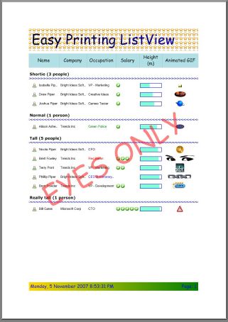
Now that you've gone to all that work to make a very pretty ListView, wouldn't it be nice if you could just print it? Yes, I know there is always the PrntScrn key, but I have noticed that some upper management do not think very highly of that as a reporting solution.
The ListViewPrinter is the answer to your printing problem. Configure an instance of it in the IDE (the ListView property controls which list is printed) and then call:
this.listViewPrinter1.PrintPreview();
Thus, for nothing you can have a very pretty report that looks like this one.
Admittedly, the formatting in this example is too much, but you can modify all the formatting to suit your tastes. See the demo for some more sedate examples and read the code to see how to make it work. It really is very cool.
This is a logically separate piece of code, so it lives in its own project. If you want to use it, you will need to add to your project either the ListViewPrinter project itself or the ListViewPrinter.dll file. The procedure is the same as for the ObjectListView project given in the First Steps section above.
4.4 Cell Editing
ListViews are normally used for displaying information. The standard ListView allows the value at column 0 (the primary cell) to be edited, but nothing beyond that. ObjectListView allows all cells to be edited. Depending on how the data for a cell is sourced, the edited values can be automagically written back into the model object.
The "editability" of an ObjectListView is controlled by the CellEditActivation property. This property can be set to one of the following values:
CellEditActivateMode.None- TheObjectListViewcannot be edited (this is the default).CellEditActivateMode.SingleClick- Subitem cells will be edited when the user single clicks on the cell. Single clicking on the primary cell does not start an edit operation - it selects the row, just like normal. Editing the primary cell only begins when the user presses F2.CellEditActivateMode.DoubleClick- Double clicking on any cell, including the primary cell, will begin an edit operation. In addition, pressing F2 will begin an edit operation on the primary cell.CellEditActivateMode.F2Only- Pressing F2 begins an edit operation on the primary cell. Clicking or double clicking on subitem cells does nothing.
Individual columns can be marked as editable via the IsEditable property (default value is true), though this only has meaning once the ObjectListView itself is editable. If you know that the user should not be allowed to change cells in a particular column, set IsEditable to false. Be aware, though, that this may create some UI surprises (resulting in complaints like "How come I can't edit this value by clicking on it like I can on all the other cells?"). You have been warned.
Once a cell editor is active, the normal editing conventions apply:
- Enter or Return finishes the edit and commits the new value to the model object.
- Escape cancels the edit.
- Tab commits the current edit, and starts a new edit on the next editable cell. Shift-Tab edits the previous editable cell.
4.4.1 How cells are edited and how you can customise it
The default processing creates a cell editor based on the type of the data in the cell. It can handle bool, int, string, DateTime, float and double data types. When the user has finished editing the value in the cell, the new value will be written back into the model object (if possible).
To do something other than the default processing, you can listen for two events: CellEditStarting and CellEditFinishing.
The CellEditStarting event is triggered after the user has requested to edit a cell but before the cell editor is placed on the screen. This event passes a CellEditEventArgs object to the event handlers. In the handler for this event, if you set e.Cancel to true, the cell editing operation will not begin. If you don't cancel the edit operation, you will almost certainly want to play with the Control property of CellEditEventArgs. You can use this to customise the default editor, or to replace it entirely.
For example, if your ObjectListView is showing a Color in a cell, there is no default editor to handle a Color. You could make your own ColorCellEditor, set it up correctly, and then set the Control property to be your color cell editor. The ObjectListView would then use that control rather than the default one. If your cell editor has a read/write property called Value, ObjectListView will use that to get and put the cell value into the control. If it doesn't, the Text property will be used instead.
When the user wants to finish the edit operation, a CellEditFinishing event is triggered. If the user has cancelled the edit (e.g. by pressing Escape), the Cancel property will already be set to true. In that case, you should simply cleanup without updating any model objects. If the user hasn't cancelled the edit, you can by setting Cancel to true — this will force the ObjectListView to ignore any value that the user has entered into the cell editor.
No prizes for guessing that you can refer to the Control property to extract the value that the user has entered and then use that value to do whatever she or he wants. During this event, you should also undo any event listening that you have setup during the CellEditStarting event.
You can prevent the cell edit operation from finishing (e.g. if the value the user has entered isn't acceptable) by listening for the CellEditValidating event. If the handler for this event sets Cancel to true, the edit operation will NOT finish and the editor will remain on the screen. Please make sure you have made it clear to the user why the edit operation hasn't finished.
You can look in the demo at listViewComplex_CellEditStarting() and listViewComplex_CellEditFinishing() to see an example of handling these events.
4.4.2 Updating the model object
Once the user has entered a new value into a cell and pressed Enter, the ObjectListView tries to store the modified value back into the model object.
There are three ways this can happen:
- You create an event handler for the
CellEditFinishingevent, write the code to get the modified value from the control, put that new value into the model object, and setCanceltotrueso that theObjectListViewknows that it doesn't have to do anything else. You will also need to call at leastRefreshItem()orRefreshObject(), so that the changes to the model object are shown in theObjectListView. There are cases where this is necessary, but as a general solution, it doesn't fit my philosophy of slothfulness. - You give the corresponding
OLVColumnanAspectPutterdelegate. If supplied, this callback will be invoked with the model object and the new value that the user entered. This is a neat solution. - If the column's
AspectNameis the name of a writable property, theObjectListViewwill try to write the new value into that property. This requires no coding and certainly qualifies as the most slothful solution. But it only works ifAspectNamecontains the name of a writable property. If theAspectNameis dotted (e.g.Owner.Address.Postcode) only the last property needs to be writable.
If none of these three things happen, the user's edit will be discarded. The user will enter her or his new value into the cell editor, press Enter, and the old value will be still be displayed. If it seems as if the user cannot update a cell, check to make sure that one of the three things above is occurring.
All aspects of cell editing are described in further details on this page.
4.5 (Owner) Drawn and Quartered
Remember that can of worms I didn't want to open? Owner drawing the ListView? Well, one afternoon when I had too little to do (ha!), I decided that it really couldn't be too bad and I got out my can opener. Several evenings later, I could only confirm my original estimate: owner drawing is a can of worms. It should be easy. It should just work. But it doesn't.
Regardless, ObjectListViews can now be owner-drawn and it is owner drawing on steroids! Like most of ObjectListView, owner drawing is accomplished by installing a delegate. Inside the renderer delegate, you can draw whatever you like:
columnOD.RendererDelegate = delegate(DrawListViewSubItemEventArgs e,
    Graphics g, Rectangle r, Object rowObject) {
    g.FillRectangle(new SolidBrush(Color.Red), r);
    g.DrawString(((Person)rowObject).Name, objectListView1.Font,
        new SolidBrush(Color.Black), r.X, r.Y);
}
Installing a delegate works fine, but there are numerous utility methods that are useful within such a delegate. Is the row currently selected? What colour should the background be? The BaseRenderer class encapsulates these utilities. To make your own Renderer class, you must subclass BaseRenderer, override the Render(Graphics g, Rectangle r) method and again draw whatever you like, only this time you have a lot of nice utility methods available to you. There are a couple of subclasses of BaseRenderer already available for use.
| Class | Purpose | Example |
BarRenderer |
This is a simple-minded horizontal bar. The row's data value is used to proportionally fill a "progress bar." |  |
MultiImageRenderer |
This renderer draws 0 or more images based on the row's data value. The 5-star "My Rating" column on iTunes is an example of this type of renderer. |  |
MappedImageRenderer |
This renderer draws an image decided from the row's data value. Each data value has its own image. A simple example would be a Boolean renderer that draws a tick for true and a cross for false. This renderer also works well for enums or domain-specific codes. |
 |
ImageRenderer |
This renderer tries to interpret its row's data value as an image or as a collection of images. Most typically, if you have stored Images in your database, you would use this renderer to draw those images. If the cells data value is an ICollection that contains strings, ints or Images, then all those images will be drawn. |
 |
FlagsRenderer |
This renderer draws 0 or more images within its cell. The cells data value should be a collection of bitwise flags, that indicate which images should be drawn. See the demo for an example of how to use it. |  |
To use any of these renderers or your own custom subclass, you assign an instance of them to a column's Renderer property, like this:
colCookingSkill.Renderer = new MultiImageRenderer(Resource1.star16, 5, 0, 40);
This means that the cooking skill column will draw up to 5 of the star16 images, depending on the data value. The renderer expects data values in the range 0 to 40. Values of 0 or less will not draw any stars. Values of 40 or more will draw 5 stars. Values in between will draw a proportional number of stars.
As of v2.0, Renderers are now Components, which means they can created and manipulated within the IDE. So, to use a MultiImageRenderer like the above, you would create one within the IDE, configure its properties to be as you can, and then assign it to the column's Renderer property.
4.5.1 Things to remember about owner drawing
Owner drawing only happens when you turn on the OwnerDrawn mode. So, you can only see your custom renderer when the ObjectListView is in owner-drawn mode.
Rows in list views are always of fixed height and calculated from the ListView font and/or the height of the image lists. Row height can be set using the RowHeight property. You cannot have rows of differing heights — it simply cannot be done with a ListView.
It is obvious, but easily overlooked, that owner drawing is slower than non-owner drawing. Owner drawing requires a lot more work than native drawing. Again, for small lists, the difference is not significant. However, it can be noticeable when a large number of redraws is necessary. For example, go to the "Virtual List" tab on the demo and drag the scroll thumb down to the bottom. Now turn on OwnerDraw and do it again. Quite a difference!
4.6 Taking the Drag out of drag and drop
As of v2.2, ObjectListView now has reasonably sophisticated support for drag and drop operations.
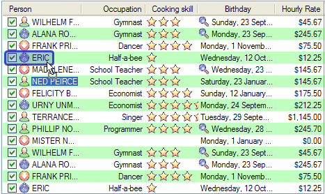
4.6.1 Using an ObjectListView as a drag source
If you want the user to be able to drag rows out of an ObjectListView, you set the DragSource property. This property accepts an object that implements the IDragSource interface. It will often be enough to use an instance of SimpleDragSource:
this.objectListView1.DragSource = new SimpleDragSource();
This drag source remembers the currently selected rows, and equips the drag data object with text and HTML versions of those rows. With that simple drag source, you can select 10 rows from an ObjectListView and drag them onto Microsoft Word to create a formatted table of those rows. You can also drag rows onto other ObjectListViews, which will normally be what you want.
From within the IDE, you can set IsSimpleDragSource to true to make your ObjectListView into a drag source using a SimpleDragSource.
4.6.2 Using an ObjectListView as a drop sink
Accepting drops from other sources is a little more complicated, but is handled in similar manner. If you want the user to be able to drop stuff onto an ObjectListView, you set the DropSink property. This property accepts an object that implements the IDropSink interface. In many cases, you will use an instance of SimpleDropSink.
this.objectListView1.DropSink = new SimpleDropSink();
From within the IDE, you can set IsSimpleDropSink to true to do make your ObjectListView into a drop sink. A DragSource needs no further information, but a DropSink needs to know at least two other things:
- Can the currently dragged objects be dropped at the current location?
- If the objects are dropped, what should happen next?
If you use a SimpleDropSink, the ObjectListView will trigger two events to handle these situations: a CanDrop event and a Dropped event. To actually be useful, you need to handle these events. You can set up handlers for these events within the IDE, like normal.
You can alternatively listen for the ModelCanDrop and ModelDropped events. This second pair of events are triggered when the source of the drag is another ObjectListView. These events work the same as the CanDrop and Dropped events except that the argument block includes more information:
- The
ObjectListViewthat initiated the drag - The model objects are being dragged
- The model object is current target of the drop
A SimpleDropSink is actually quite sophisticated. It can be configured in several ways. Have a look at the code to see more options.
|
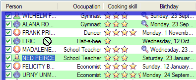
Allow drops on the background: myDropSink.CanDropBetween =
true; |
 |
|
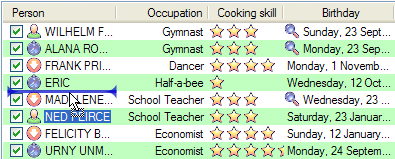
Allow drops between items: myDropSink.CanDropBetween =
true; |
 |
|
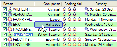
You can even drop on subitems: myDropSink.CanDropOnSubItems =
true; |
 |
|
And change highlight colour just to be different: myDropSink.FeedbackColor =
Color.IndianRed; |
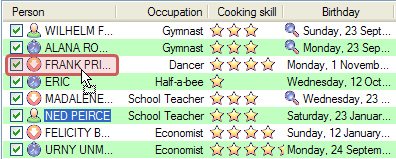 |
You can learn more about drag and drop, including how to write your own drop sink from scratch on this page.
4.7 Collapsible groups
The most frequently requested feature is collapsible groups. I want it; you want it; your great aunt Mildrid who lives in Wollongong wants it. Unfortunately, with the current ListView it is just not possible: groups cannot be collapsed — on XP. But on Vista, this most commonly requested feature is a reality. It is enabled by default, so under Vista, groups are automatically collapsible. If you don't want your groups to be collapsible, set HasCollapsibleGroups to false. Thanks to Crustyapplesniffer who implemented this feature.
4.8 Groups on steroids
In v2.3, groups received a major overhaul. No longer content with just being collapsible, groups can now have a title image, a subtitle, a task (that clickable link on the right), and footers. When done well, this can make your listview look very nice indeed:
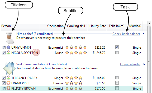
This extended formatting can be setup during the AboutToCreateGroup event. Alternatively, you can use the extended version of the MakeGroupies() method, which allows all these new properties to be configured. The above screenshot was configured with one MakeGroupies() call:
this.columnCookingSkill.MakeGroupies(
    new object[]{10, 20, 30, 40},
    new string[] {"Pay to eat out", "Suggest take-away", "Passable",
		"Seek dinner invitation", "Hire as chef"},
    new string[] { "emptytoast", "hamburger", "toast", "dinnerplate", "chef" },
    new string[] {
        "Pay good money -- or flee the house -- rather than eat their homecooked food",
        "Offer to buy takeaway rather than risk what may appear on your plate",
        "Neither spectacular nor dangerous",
        "Try to visit at dinner time to wrangle an invitation to dinner",
        "Do whatever is necessary to procure their services" },
    new string[] { "Call 911", "Phone PizzaHut", "", "Open calendar",
		"Check bank balance" }
);
These group formatting facilities are only available on Vista and later. On XP, groups can only have a header.
4.9 Customisable "List is empty" message
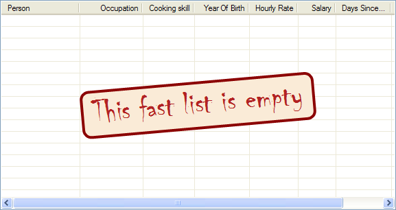
When an ObjectListView is empty, it can display a "this list is empty" type message. The EmptyListMsg property holds the string that appears when an ObjectListView is empty. This string is rendered using the EmptyListMsgFont. Both of these properties can be configured within in the IDE.
But if you want to write a little bit of code, you can have much more interesting messages. The empty msg list is actually implemented as an overlay. You can access that overlay though the EmptyListMsgOverlay property. By default, this is a TextOverlay that you can customise to your hearts content:
TextOverlay textOverlay = this.objectListView1.EmptyListMsgOverlay as TextOverlay;
textOverlay.TextColor = Color.Firebrick;
textOverlay.BackColor = Color.AntiqueWhite;
textOverlay.BorderColor = Color.DarkRed;
textOverlay.BorderWidth = 4.0f;
textOverlay.Font = new Font("Chiller", 36);
textOverlay.Rotation = -5;
Doing this gives a message like this:
4.10 Hyperlinks
ObjectListViews can now treat cells as hyperlinks. To do this, set UseHyperlinks to true of the ObjectListView, and then set Hyperlink property of OLVColumn to true to make all the cells in that column behaves as hyperlinks.
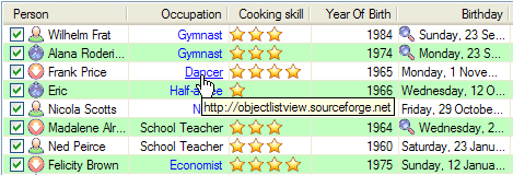
If you don't want all cells to be hyperlinks, you can listen for the IsHyperlink event (in the above shot, occupation that start with "s" are not hyperlinks). In this event, you can specify what URL will be attached to that cell. By default, the URL is the text of the cell. If you set the URL to null that cell will not be treated as a hyperlink. If you are already listening for the FormatCell you could set up the URL in that event too.
The formatting of the hyperlinks is controlled by the HyperlinkStyle property of ObjectListView. You can create and configure a HyperLinkStyle within the IDE, and then assign it to your ObjectListView. The same style can be assigned to multiple ObjectListViews. In 95% of cases, the default styling will suffice.
When a hyperlink is clicked, a HyperlinkClicked event is triggered. If you handle this yourself, set Handled to true to prevent the default processing from occurring. If you don’t handle it, the default processing is to try and open the associated URL.
Be careful about making column 0 to be a hyperlink. If it is, every time a user clicks a row trying to select it, it will open a browser window, which would become annoying very quickly.
4.11 Header formatting
In v2.4, the headers of an ObjectListView became fully style-able. If ObjectListView.HeaderUsesTheme is true (the default), the header will be drawn according to the OS's current theme and will ignore any header style. If this is false, the headers will be formatted according to their given header format style.
You can set the style for all columns at once (through ObjectListView.HeaderFormatStyle) or for just one column (through OLVColumn.HeaderFormatStyle). A style given to a specific column takes presidence over one given to the control as a whole. Like other styles, HeaderFormatStyles can be created, configured and assigned within the IDE.
Header styles allow a different appearance for each state of the header:
Normalcontrols how the header appears when nothing else is happening to it.Hotcontrols how the header appears when the mouse is over the header. This should be a slight, but still noticeable, shift from the normal state.Pressedcontrols how the header appears when the user has pressed the mouse button on the header, but not yet released the button. This should be a clear visual change from both the normal and hot states.
For each state, the header format allows the font, font color, background color and frame to be specified. If you combine these attributes badly, you can produce some truly dreadful designs, but when well used, the effect can be pleasant.
| Scheme | Normal | Hot | Pressed |
|---|---|---|---|
|
| |||
| XP Theme |
 | ||
|
| |||
| House of cool |
|||
There is also HeaderWordWrap on ObjectListView which allows the text within a header to be word wrapped. So, if you are feeling sadistic, you can inflict something like this on your users:

4.12. Generating an ObjectListView without the IDE
One fundamental of good design is separation of presentation from model. Model classes should not know how they are being presented to the user.
But there are development situations when speed of development is everything (Merchant banks and stock brokers often seem to be in this camp). In such cases, placing some sort of user interface into the model classes themselves is an acceptable trade off.
It is with a nod to such development that ObjectListView now has Generator class and OLVColumn attributes. The idea with these classes is that, in your model classes, you decide which properties you want to appear in the ObjectListView, and then you give those properties an OLVColumn attribute. In these attribute, you specify some of the characteristics that you would normal give through the IDE (e.g. column title, alignment, image getter, format string). Then, when you are ready to show your list of models, you generate the columns from the model and then show the models:
List<ForexPurchase> purchases = this.GetForexPurchasesToShow();
Generator.GenerateColumns(this.olv, purchases);
this.olv.Objects = purchases;
In this example, this.olv is a completely unconfigured ObjectListView. Nothing was done to it in the IDE, except for placing it on the form: no columns were created or configured. The Generator uses the information that was given in the OLVColumn attributes to build a fully functional ObjectListView.
When the user later wants to see the foreign exchange sales that were made today, she clicks the “Sales” button, and some code like this might be executed:
List<ForexSale> sales = this.GetForexSalesToShow();
Generator.GenerateColumns(this.olv, sales);
this.olv.Objects = sales;
This reuses the same ObjectListView control, but now it is a fully functional ObjectListView showing information about Forex sales.
[Thanks to John Kohler for this idea and the original implementation]
4.13 Filtering
In v2.4, ObjectListViews became filterable. If you set the ModelFilter or ListFilter properties, only model objects that match those filters will be shown in the list.
A ModelFilter is the most commonly used filter. It takes a delegate as a construction parameter, and that delegate decides if the given model object should be included. To filter a list of phone calls to only show emergency calls, you could install filter like this:
this.olv1.ModelFilter = new ModelFilter(delegate(object x) {
    return ((PhoneCall)x).IsEmergency;
});
You can, of course, make your own filters, by implementing the IModelFilter or the IListFilter interface. You could, for example, show only emergency calls like this:
public class OnlyEmergenciesFilter : IModelFilter
{
    public bool Filter(object modelObject) {
        return ((PhoneCall)x).IsEmergency;
    }
}
...
this.olv1.ModelFilter = new OnlyEmergenciesFilter();
4.13.1 Text filtering
One very common filtering task is to only show rows that contain a certain string. iTunes does this with its "Search" box. ObjectListView makes it very easy to implement this text filtering via a TextMatchFilter. You use it thus::
this.olv1.ModelFilter = new TextMatchFilter(this.olv1, "search");
After executing this line, the ObjectListView will only show rows where the text "search" occurs in at least one cell of that row.
As a bonus, if your filtered ObjectListView is owner drawn, you can pair this text searching with a special renderer, HighlightTextRenderer. This renderer draws a highlight box around any substring that matches its given text. So:
TextMatchFilter filter = new TextMatchFilter(this.olv1, "er");
this.olv1.ModelFilter = filter;
this.olv1.DefaultRenderer = new HighlightTextRenderer(filter);
would give something that looks like this:
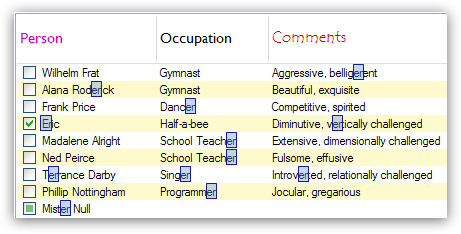
You can change the highlighting by playing with the CornerRoundness, FramePen and FillBrush properties on the HighlightTextRenderer.
Remember: the list has to be owner drawn for the renderer to have any effect.
4.14 Animations
Haven't you always wanted to put those little snazzy bits of moving eye candy into your applications? You know, a flashing border around some cell, or a spinning star right in the middle of the list?
In v2.4, ObjectListView now integrates with the Sparkle animation library. This library lets you put animations over the top of existing Controls. Due to the way .NET ListViews work, that library cannot work with plain ListViews. However, through the extendibility of ObjectListViews decorations, it now works seemlessly with ObjectListViews.
4.14.1 Understanding Sparkle
To learn about the Sparkle library, you should read this article -- and of course look at the code. But briefly, the design goals of the library were:
- Short-lived animations on any control. The Sparkle library is designed to draw short animations over the top of existing Controls. Out of the box, it only supports Controls that use a Paint event, but it has been adapted to work with ObjectListView.
- Declarative. The Sparkle library is declarative. You say what you want the animation to do, and then you run the animation. The animation is completely defined before it begins.
- Non-interactive. The Sparkle library does not do user interaction -- it does not listen to mouse moves, clicks or drags. It doesn't do collision detection or physics models. It just draws eye candy.
To use the library itself, you'll need to grasp its four major concepts:
- Animations. An animation is the canvas upon which sprite are placed. It is the white board upon which things are drawn.
- Sprites. Sprites are things that can be drawn. There are several flavours of sprites -- one for images, another for text, still another for shapes. It is normal to make your own types of sprites by subclassing
Sprite(or implementingISprite). - Effects. Effects are things that make changes to sprites over time. They are the "movers and shakers" in the library, who actually do things. Sprites sit there, completely passive, looking pretty, but the effects push them around, change their visibility, spin or size. Again, you can use existing
Effects, or implement your own through theIEffectinterface. - Locators. Locators are things that known how to calculate a point or a rectangle. Rather than saying "Put this sprite at (10, 20)," they allow you to say "Put this sprite at the bottom right corner of this other sprite." This idea can be tricky to get your mind around, but once you have grasped it, it is powerful.
The workflow for creating a Sparkle animation is:
- Decide where the animation will appear. That is your
Animation. - Think about what you want to show. They are your
Sprites. - Think about what you want each Sprite to do. They are your
Effects. - Whenever an
Effectneed a "where", that's when you needLocators.
4.14.2 Simple example
OK, OK. Just show me the code. Let's put a spinning, fading star in the middle of an ObjectListView.
To put animations onto an ObjectListView, you use AnimatedDecoration class. Depending on the constructor used, this will create an animation for the whole list, for a row, or for just one cell:
AnimatedDecoration listAnimation = new AnimatedDecoration(this.olvSimple);
AnimatedDecoration rowAnimation = new AnimatedDecoration(this.olvSimple, myModel);
AnimatedDecoration cellAnimation = new AnimatedDecoration(this.olvSimple, myModel, olvColumn);
We want an animation that can draw on the whole list so we use this form:
AnimatedDecoration listAnimation = new AnimatedDecoration(this.olvSimple);
Animation animation = listAnimation.Animation;
Now we have an Animation, we can make our Sprites. We only need one sprite and we want it to show an image, so we use an ImageSprite. There is also a TextSprite for drawing bordered/backgrounded text, and ShapeSprite for drawing regular shapes.
Sprite image = new ImageSprite(Resource1.largestar);
We have our sprite. Now we want it to do something. Whenever we want a sprite to do something, we need an Effect. For this example, we want the image to spin in the centre of the list, and to fade out while it does so. We add the Effects to the Sprite, saying when the effect should start and how long it will last.
image.Add(0, 2000, Effects.Rotate(0, 360 * 2.0f));
image.Add(1000, 1000, Effects.Fade(1.0f, 0.0f));
This says, during the first 2000 milliseconds after the sprite begins in the animation, the image should spin completely twice. The second statement says that 1000 milliseconds after the sprite begins, the sprite should take 1000 milliseconds to gradually fade completely from sight.
Most Sprites have some sort of MoveEffect given to them to move them around. However, we want this sprite to just stay in the centre of the list, so we give it a FixedLocation:
image.FixedLocation = Locators.SpriteAligned(Corner.MiddleCenter);
This says the images MiddleCenter will always be aligned to the MiddleCenter of the animation (which in this case is on the whole of the list).
The final steps are to add the Sprite to the Animation:
animation.Add(0, image);
This says to begin running the image sprite 0 milliseconds after the animation starts (i.e. immediately). Often the sprites would not start until some time after the animation begins, but in this case, there's only one sprite so it may as well start immediately.
The animation is now fully configured and all that remains is to run it:
animation.Start();
All being well, this should produce an animation on the ObjectListView that looks something like this:
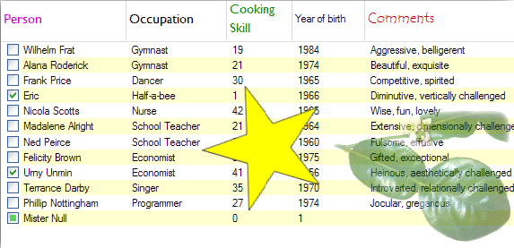
Again, CodeProject doesn't support animations within a page, so click here to see the actual animation.
In eight lines of code, you've put a spinning, fading star (a la Picasa) onto your otherwise static ListView.
5. Interesting Bits of Code
5.1 Reflection
Reflection is used in a couple of ways: to get data from the model objects, to put data into cell editors, and to put data into the model objects.
5.1.1 Getting information dynamically
Getting data from the model object uses reflection to dynamically invoke a method, property or field by its name.
protected object GetAspectByName(object rowObject) {
    if (String.IsNullOrEmpty(this.aspectName))
        return null;

    BindingFlags flags = BindingFlags.Public | BindingFlags.Instance |
                         BindingFlags.InvokeMethod |
                         BindingFlags.GetProperty | BindingFlags.GetField;
    try {
        return rowObject.GetType().InvokeMember(this.aspectName,
            flags, null, rowObject, null);
    }
    catch (System.MissingMethodException) {
        return String.Format("Missing method: {0}",
            this.aspectName);
    }
}
Things to note in this code:
- There is no point in trying to invoke anything if the aspect name is
nullor empty. BindingFlags say to only invokepublicinstance methods, properties or fields.Staticmethods andprotectedorprivatemethods will not be called.- The
InvokeMember()method is called on the "type," not on the "object". - Catching
MissingMethodExceptionis necessary, since the method or property name could be wrong.
Reflection is easier to code, but you pay the penalty in speed. On my machine, reflection is 5-10x slower than using delegates. On a list of only 10-20 items, it doesn't matter. However, if your list has hundreds of items, it's worth installing AspectGetter delegates.
If you look at the code in OLVColumn, you will find that the code is actually slightly more complicated, since it supports using a dot notation to access sub-properties. It is valid to have several method or property names, joined by dots, as an aspect name. Each method or property name is de-referenced and the result of that de-referencing is used as the target for the next method or property. It's more intuitive to use than it is to explain :-)
For example, Owner.Address.Postcode is a valid aspect name. This will fetch the Owner property from the initial model object and then ask that owner object for its Address. Then it will ask that address for its Postcode.
5.1.2 Putting a value into a cell editor
When we put a cell editor onto the screen, we need to get the value from the cell and somehow give it to the control. Unfortunately, there is no standard way for giving a Control a value. Some controls have a Value property, which is exactly what we want, but others do not. Where there is Value property, we want to use it, but where there isn't, the best we can do is use the Text method.
protected void SetControlValue(Control c, Object value, String stringValue)
{
    // Look for a property called "Value". We have to look twice
    // since the first time we might get an ambiguous result
    PropertyInfo pinfo = null;
    try {
        pinfo = c.GetType().GetProperty("Value");
    } catch (AmbiguousMatchException) {
        // The lowest level class of the control must have overridden
        // the "Value" property.
        // We now have to specifically  look for only public instance properties
        // declared in the lowest level class.
        BindingFlags flags = BindingFlags.DeclaredOnly |
            BindingFlags.Instance | BindingFlags.Public;
        pinfo = c.GetType().GetProperty("Value", flags);
    }

    // If we found it, use it to assign a value, otherwise simply set the text
    if (pinfo == null)
        c.Text = stringValue;
    else {
        try {
            pinfo.SetValue(c, value, null);
        } catch (ArgumentException) {
            c.Text = stringValue;
        }
    }
}
So, what's going on here?
Firstly, we use GetProperty to try and get information about the Value property on the control. We have to allow for ambiguous matches, which will occur if the controls immediate class has overridden the base class's Value property. In that case, we use some BindingFlags to say that we want the Value property that was declared in the lowest level class. To any language lawyers, yes, I know it's not foolproof, but it works in almost all cases.
Once we have the property info, we can simply call the SetValue method. We have to catch the ArgumentException just in case the value can't be set.
If any of this has gone wrong, we simply use the Text method to put the value into the control and hope that it does what we want.
5.2 Showing Images on ListView subitems
ObjectListView was written to make a ListView easier to use, not to add swathes of new functionality. Initially, sub-item images were the only additional functionality. A plain vanilla ListView only supports images in the first column. ObjectListView doesn't have this restriction; any column can show images. To show images on sub-items, there are basically two strategies:
- Owner-draw the sub-items
- Force the underlying
ListViewcontrol to draw them
Owner drawing is a can of worms that I did not want to open, so I initially chose the second option. The ListView control in Windows has the ability to draw images against sub-items, but that functionality was not exposed in .NET. We can send messages to the underlying ListView control to make it show the images. Remember that these tricks rely on the underlying ListView control, so they may not work in future versions of Windows. It's certain that they will not work on non-Microsoft platforms. To make the ListView control draw sub-item images, we need to:
- Set the extended style
LVS_EX_SUBITEMIMAGESon theListViewcontrol itself - Tell the
ListViewcontrol which image to display against which sub-item
Setting the extended style would be simple except that .NET doesn't expose the extended styles flag. So, we have to pull in the SendMessage() function and define the constants we want to use.
[DllImport("user32.dll", CharSet=CharSet.Auto)]
private static extern IntPtr SendMessage(IntPtr hWnd, int msg,
    int wParam, int lParam);

private const int LVM_SETEXTENDEDLISTVIEWSTYLE = 0x1000 + 54; // LVM_FIRST+54

private const int LVS_EX_SUBITEMIMAGES         = 0x0002;
Then, at some convenient point, you turn on the flag:
SendMessage(this.Handle, LVM_SETEXTENDEDLISTVIEWSTYLE,
    LVS_EX_SUBITEMIMAGES, LVS_EX_SUBITEMIMAGES);
This would be enough, except that .NET Framework erases all unknown extended styles when an extended style is set. Examples are FullRowSelect and GridLines. So, the above code will have to be called after all other initialization is complete.
Our second task is to tell the ListView control which sub-item will show which image. To do this, we need a new structure, LVITEM, and some more constants. We don't use most of the LVIF_ constants, but they're included for completeness.
private const int LVM_SETITEM = 0x1000 + 76; // LVM_FIRST + 76

private const int LVIF_TEXT        = 0x0001;
private const int LVIF_IMAGE       = 0x0002;
private const int LVIF_PARAM       = 0x0004;
private const int LVIF_STATE       = 0x0008;
private const int LVIF_INDENT      = 0x0010;
private const int LVIF_NORECOMPUTE = 0x0800;

[StructLayout(LayoutKind.Sequential, CharSet=CharSet.Auto)]
private struct LVITEM
{
    public int     mask;
    public int     iItem;
    public int     iSubItem;
    public int     state;
    public int     stateMask;
    [MarshalAs(UnmanagedType.LPTStr)]
    public string  pszText;
    public int     cchTextMax;
    public int     iImage;
    public int     lParam;
    // These are available in Common Controls >= 0x0300
    public int     iIndent;
    // These are available in Common Controls >= 0x056
    public int     iGroupId;
    public int     cColumns;
    public IntPtr  puColumns;
};
We also need to import SendMessage a second time, but with a slightly different signature. We use the parameter EntryPoint to import a function using a name other than the C# function name.
[DllImport("user32.dll", EntryPoint="SendMessage", CharSet=CharSet.Auto)]
private static extern IntPtr SendMessageLVI(IntPtr hWnd, int msg,
    int wParam, ref LVITEM lvi);
Finally, we can set up the sub-item images using a method like this:
public void SetSubItemImage(int itemIndex, int subItemIndex, int imageIndex)
{
    LVITEM lvItem = new LVITEM();
    lvItem.mask = LVIF_IMAGE;
    lvItem.iItem = itemIndex;
    lvItem.iSubItem = subItemIndex;
    lvItem.iImage = imageIndex;
    SendMessageLVI(this.Handle, LVM_SETITEM, 0, ref lvItem);
}
In the above member, itemIndex is the 0-based index of the row in question. subItemIndex is the 1-based index of the sub-item and imageIndex is the 0-based index into the image list associated with the listview.
5.3 IDE Integration
Once we have our nice new UI widget, we still have one more important step: make it work within the IDE. The whole point of this ListView is that it should make the programmer's life easier. That means it has to integrate well with the development environment, which drops us into the scary world of attributes and metadata.
One problem with figuring out how to integrate with the IDE is that it is not well-documented. That is, some pieces are documented, but it is usually not clear what we should do with those pieces. You might read that you can use EditorAttribute to control how a particular property is edited, but it is hard to see how to use that information to put the right sort of editors onto your custom DataSource and DataMember properties.
That is where the quasi-magical Lutz Roeder's .NET Reflector is so useful [this has been bought by RedGate, but is still free]. It disassembles the .NET libraries themselves, showing all the classes — not just the public ones — and all the methods of each class. It then reverse-engineers the source code for the methods. It's an amazing and amazingly useful piece of software. Using the Reflector, it turns out that the right incantation for our DataSource property is the relatively simple, if unintuitive:
[AttributeProvider(typeof(IListSource))]
public Object DataSource { ... }
However, for the DataMember property, we need to invoke this spell:
[Editor("System.Windows.Forms.Design.DataMemberListEditor, System.Design,
    Version=2.0.0.0, Culture=neutral, PublicKeyToken=b03f5f7f11d50a3a",
    typeof(UITypeEditor))]
public string DataMember { ... }
This has to be considered at least non-obvious given that DataMemberListEditor is not even mentioned in the SDK documentation.
5.4 Implementing restricted-width Columns
To limit the widths of columns, we have to find some way to intercept attempts to modify them. There are three UI mechanisms to change the width of a column:
- Drag the divider with the mouse
- Double-click the divider to autosize the column
- Press Ctrl-NumPad+ to autosize all columns
Fortunately, all three of these mechanisms ultimately use the same HDN_ITEMCHANGING message. We only need to catch that message and everything should be fine. The first part of the solution requires the handling of WM_NOTIFY events, like this:
protected override void WndProc(ref Message m) {
    switch (m.Msg) {
        case 0x4E: // WM_NOTIFY
        if (!this.HandleNotify(ref m))
            base.WndProc(ref m);
        break;
    default:
        base.WndProc(ref m);
        break;
    }
}
Then we can handle the HDN_ITEMCHANGING message. If the change would make the column wider or thinner than it should be, we simply veto the change by returning a result of 1.
private bool HandleNotify(ref Message m) {

    bool isMsgHandled = false;

    const int HDN_FIRST = (0 - 300);
    const int HDN_ITEMCHANGINGA = (HDN_FIRST - 0);
    const int HDN_ITEMCHANGINGW = (HDN_FIRST - 20);

    NMHDR nmhdr = (NMHDR)m.GetLParam(typeof(NMHDR));

    if (nmhdr.code == HDN_ITEMCHANGINGW) {
        NMHEADER nmheader = (NMHEADER)m.GetLParam(typeof(NMHEADER));
        if (nmheader.iItem >= 0 && nmheader.iItem < this.Columns.Count) {
            HDITEM hditem = (HDITEM)Marshal.PtrToStructure(
                nmheader.pHDITEM, typeof(HDITEM));
            OLVColumn column = this.GetColumn(nmheader.iItem);
            if (IsOutsideOfBounds(hditem, column) {
                m.Result = (IntPtr)1; // prevent the change
                isMsgHandled = true;
            }
        }
    }

    return isMsgHandled;
}

private bool IsOutsideOfBounds(HDITEM hditem, OLVColumn col) {
    // Check the mask to see if the width field is valid,
    if ((hditem.mask & 1) != 1)
        return false;

    // Now check that the value is in range
    return (hditem.cxy < col.MinimumWidth ||
           (col.MaximumWidth != -1 && hditem.cxy > col.MaximumWidth));
}
The solution does not appear very complicated. However, reality is rarely so simple. For example, those of you with some knowledge about the header control might be thinking, "Hey! What about HDN_TRACK and its friends? Why don't you do anything about them?"
Well, according to KB article #183258, Microsoft states that when a header control has the HDS_FULLDRAG style, it will receive HDN_ITEMCHANGING messages rather than HDN_TRACK messages. Since version 4.71 of common controls, header controls always receive the HDS_FULLDRAG style. So, still it seems that we only have to handle the HDN_ITEMCHANGING message.
The trouble is that this is not always true. Under XP SP2 (at least), header controls with the HDS_FULLDRAG style do not always send HDN_ITEMCHANGING messages rather than HDN_TRACK messages. This may be why Microsoft has withdrawn that particular KB article. On some machines, header controls send HDN_ITEMCHANGING events as they should, but on others, the header controls send the old sequence of messages: HDN_BEGINTRACK, HDN_TRACK, HDN_ENDTRACK, HDN_ITEMCHANGING, HDN_ITEMCHANGED.
After quite a bit of digging, the crucial setting seems to be the Explorer option "Show Window Contents While Dragging." In an example of "truly bizarre side effects," if this option is turned on, the header will send HDN_ITEMCHANGING messages instead of HDN_TRACK messages (as it should). However, if it is turned off, the header sends lots of HDN_TRACK messages and only one HDN_ITEMCHANGING message at the very end of the process.
Having two possible sequences of events complicates my simple plan. If the "Show Window Contents While Dragging" option is turned on, the current code works perfectly. If it is off, things are uglier.
On the whole, if we receive multiple HDN_TRACK messages and only one HDN_ITEMCHANGING message, it's harder to control the resizing process. The reason is that there is no way to cancel just one HDN_TRACK message. If we return a result of 1 from a HDN_TRACK message, we cancel the whole drag operation, not just that particular track event. From the user's point of view, it would appear that when they dragged the column to its minimum or maximum width, the drag operation would simply stop, even when they hadn't released the mouse. This is clearly not what we want.
[v2.0] As of v2.0, ObjectListView modifies the HDN_TRACK message itself, changing the size of the column in place, which is the best solution.
5.5 Strange Bug in ListView
Just in case someone else runs into this problem, there is a strange bug in the ListView code. The effect of this bug is that in between a BeginUpdate() and EndUpdate() pair, iterating over the Items collection and calling Items.Clear() does not work reliably if the ListView handle has not been created. For example, if you call the following method before the handle for listView1 has been created, nothing will be written to the debugging output:
private void InitListView1()
{
    this.listView1.BeginUpdate();
    this.listView1.Items.Add("first one");
    this.listView1.Items.Add("second one");
    foreach (ListViewItem lvi in this.listView1.Items)
        System.Diagnostics.Debug.WriteLine(lvi);
    this.listView1.EndUpdate();
}
If you remove the BeginUpdate() and EndUpdate() pair or call the method after the handle has been created, the method will work as expected.
The source of this bug is that, deep in the bowels of the ListView code, when BeginUpdate() is called, the ListView begins caching list updates. When EndUpdate() is called, the cache is flushed. However, GetEnumerator() does not flush the cache or take it into account. So, iterating over Items between calls to BeginUpdate() and EndUpdate() will only return the items that were present before BeginUpdate(). There are at least two easy ways around this bug:
- Don't use a
BeginUpdate()/EndUpdate()pair. - Make a call to
Items.Count, which does flush the cache, before iterating over the collection.
Thanks to ereigo for helping me track down this bug.
5.6 Implementing an Image Watermark
I like pictures. I think it's neat that in Explorer you can put a little graphic in the bottom right of the listview. I wanted to do the same thing with an ObjectListView. Surely, it can't be that difficult. But it was.
What did I specifically want from this feature? I wanted a background image on the ObjectListView. It had to stay fixed in place, not scrolling when the ListView scrolls. It had to work on XP and Vista. It had to be easy to custom, ideally just setting an image within the IDE. If the image could be positioned in whatever corner, or have a varying level of transparency, those would be bonuses. And obviously, I wanted it to work flawlessly — though I would be content with working spectacularly well.
5.6.1 WM_ERASEBKGROUND
The classic solution is to intercept the WM_ERASEBKGROUND message, erase the ClientRectangle, draw whatever you want, and the rest of the control then draws over what you've already drawn. Easy.
But it doesn't work. Actually, it works, so long as you don't double buffer the ListView. While the ListView is unbuffered, the image drawn in the WM_ERASEBKGROUND handler appears fine. But, when the control is double buffered, it doesn't work. When DoubleBuffered is set to true, it also sets the style AllPaintingInWmPaint style, which means: don't use WM_ERASEBKGROUND, the paint handler will do everything, including erase the background. So, for a double-buffered ListView (which is what I want), drawing in the WM_ERASEBKGROUND handler doesn't work.
5.6.2 LVM_SETBKIMAGE
The second try was to use LVM_SETBKIMAGE. This WinSDK message tells a ListView to draw an image under the control. Exactly what I wanted. But life is rarely that easy.
The first difficulty was actually making it work. TortoiseSVN sometimes has a listview background image, and Stefan had kindly documented some of his troubles in getting it to work. Using the information there, I managed to put an image under the control! Excellent... well not really. It did put an image under the ListView, but with a number of unpleasant side-effects:
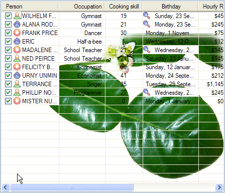
- With a background image in place, row background colours no longer worked.
- The background image was always hard pressed in the bottom right corner. The
LVBKIMAGEstructure has fields,xOffsetandyOffset, which supposedly allow you to change this, but as far as I could see, they had no effect. - Under XP, background images with transparent areas do not draw transparently - the transparent area is always coloured blue. This is even when
LVBKIF_FLAG_ALPHABLENDflag is set. - Grid lines were drawn over the top of the image, which looked odd.
- Icons on subitems made the subitem cell draw over the image.
- Owner drawn cells always erased the image (I suspect this could be fixed).
The show stopper was with Details view. Column 0 always erased the image. I could live with the other problems but what's the good of a underlay image when column 0 wipes it out? I checked to see if Stefan had found a solution for this one, but he hadn't.
5.6.3 Layered Window API
I eventually decided on using the Layered Window API, which .NET exposes through the Opacity and TransparencyKey properties of Form.
The idea was to place a completely transparent form over the top of ObjectListView, and then draw onto that form (Mathieu Jacques did the same thing with his LoadingCurtain idea). From the user's point of view, the image appears to be draw onto the ObjectListView, but from the ObjectListView point of view, the overlays are not there.
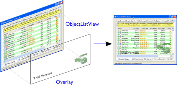
This idea was a good one, but there were many other complications before it actually worked. See here for the overly-detailed version of the story.
5.6.4 Just do it
But it did eventually work. So, as of v2.2, ObjectListViews support overlays, which are non-scrolling, translucent images or text drawn over the top of the list contents.
The overlays scheme is extensible, but the two most common overlays are image overlays and text overlays.
ImageOverlaydraws an image over theObjectListViewTextOverlayis a highly configurable overlay that can draw bordered, colored and backgrounded text. The text can be rotated.
These two overlays are so common that ObjectListView comes with one of each predefined: OverlayImage and OverlayText properties. These predefined overlays are exposed to the IDE, and can be configured directly from there. So, for the majority of cases, this is the only understanding of overlays that you will need.
6. Conclusion
I have written this control in two other languages — Smalltalk and Python — and it is always one of the most useful items in my toolbox. I have used it in every project I have had in those languages and I'm sure it is just as useful here. I hope that the code encourages more "slothfulness" and gives programmers time to improve some other parts of their project, thus encouraging hubris as well.
7. Note to Visual Studio 2005 Users
During the development of v2.4, my only copy of Visual Studio 2005 was wiped out by a hard disk crash. I can no longer test my code against Visual Studio 2005. However, I have continued to write my code with VS 2005 and .NET 2.0 in mind. So, to make the library compile with VS 2005, it should be enough to add any missing files to the project (Filters.cs is the only new file). With this file added, the library should compile without problem.
However, the Sparkle animation library was written with .NET 3.5 in mind. The ObjectListView control does not use this library directly, but the demo does. To run the demo, you will have to:
- remove the Sparkle animation library from the solution
- comment out any reference to
AnimatedDecorationclass in MainForm.cs - remove the AnimatedDecoration.cs file from the demo project
Once these steps are done, ObjectListView will work again under VS 2005.
8. Future Directions
The next full version, 2.5, should add the following new features:
- Virtual
DataListView, aiming to handle 100,000 row datasets with good performance - Excel-like automatic user-interface for filters (right click on header to allow a filter to be given on values in that column)
- Any other great ideas that people suggest
v2.5.1 will bug fix and tweak v2.5.
v3.0 will be a big change. Until now, each version has striven to maintain strict backwards compatibility. v3.0 will not have this as a strict goal. It will be backwards compatible where possible, but will drop properties, events and methods where they do not fit within the new scheme. In particular, features that were a moment of design weakness (I'm looking at you AlwaysGroupByColumn and your friends) will disappear.
- Support for .NET 2.0 will be dropped. .NET 3.5 will become the minimum.
- Most delegates will be replaced by events (events are actually faster than delegates).
- All styling (cell, header, tool tips) will be unified, and will include custom renderers and hit detection.
- General cleanup/refactor
There is no definite timetable for these versions.
9. History
31 August 2010 - Version 2.4.1
New features
- Column header improvements: they can be rendered vertically; they can show an image; they can be aligned differently to the cell’s contents (use
OLVColumn.HeaderTextAlignproperty). - Group sorting can now be completely customised, as can item ordering within. See this recipe.
- Improved text filtering to allow for prefix matching and full regex expressions.
- Subitem checkboxes improvements: check boxes now obey
IsEditablesetting on column, can be hot, can be disabled. - Added
EditingCellBorderDecorationto make it clearer which cell is being edited. - Added
OLVColumn.Wrapto easily word wrap a columns cells.
Small tweaks
- No more flickering of selection when tabbing between cells.
- Added
ObjectListView.SmoothingModeto control the smoothing of all graphics operations. - DLLs are now signed.
- Invalidate the control before and after cell editing to make sure it looks right.
BuildList(true)now maintains vertical scroll position even when showing groups.CellEditvalidation and finish events now haveNewValueproperty.- Moved
AllowExternalfromRearrangableDropSinkup the hierarchy toSimpleDropSinksince it could be generally useful. - Added
ObjectListView.HeaderMaximumHeightto limit how tall the header section can become.
Bug fixes
- Avoid bug in standard
ListViewwhere virtual lists would send invalid item indices for tool tip messages when in non-Details views. - Fixed bug where
FastObjectListViewwould throw an exception when showing hyperlinks in any view except Details. - Fixed bug in
ChangeToFilteredColumns()that resulted in column display order being lost when a column was hidden. - Fixed long standing bug where having 0 columns caused an
InvalidCastexception. - Columns now cache their group item format strings so that they still work as grouping columns after they have been removed from the listview. This cached value is only used when the column is not part of the listview.
- Correctly trigger a
Clickevent when the mouse is clicked. - Right mouse clicks on checkboxes no longer confuses them.
- Fixed bugs in
FastObjectListViewandTreeListViewthat prevented objects from being removed (or at least appeared to). - Avoid checkbox munging bug in standard
ListViewwhen shift clicking on non-primary columns whenFullRowSelectistrue. OLVColumn.ValueToString()now always returns aString(as it always should have)
10 April 2010 - Version 2.4
New features
- Filtering.
- Animations on cells, rows, or the whole list (so easy to say, so much work to do).
- Header styles. This makes
HeaderFontandHeaderForeColorproperties unnecessary. They will be marked obsolete in the next version and removed after that. - [Minor] Ctrl-A now selects all rows (no surprises there). Set
SelectAllOnControlAtofalseto disable. - [Minor] Ctrl-C copies all selected rows to the clipboard (as it always did), but this can now be disabled by setting
CopySelectionOnControlCtofalse. - [Minor]
OLVColumnattribute (used with Generator) now allows theNameof the created column to be given.
Bug fixes
- Changed object checking so that objects can be pre-checked before they are added to the list. Normal
ObjectListViewsmanage "checkedness" in theListViewItem, so you still can't check object before they are added (unless check state getters and putters have been installed). It will work on virtual lists (thus fast lists and tree views) since they manage their own check state. - Overlays can be turned off (set
UseOverlaystofalse). They also only draw themselves on 32-bit displays. ObjectListViews' overlays now play nicer with MDI, but it's still not great. When anObjectListViewoverlay is used within an MDI application, it doesn't crash any more, but it still doesn't handle overlapping windows. Overlays from oneObjectListVieware drawn over other controls too. Current advice: don't use overlays within MDI applications.F2key presses are no longer silently swallowed.ShowHeaderInAllViewsis better but not perfect. Setting it before the control is created or setting it totruework perfectly. However, if it is set tofalse, the primary checkboxes disappear! I could just ignore changes once the control is created, but it's probably better to let people change it on the fly and just document the idiosyncrasies.- Fixed bug in group sorting so that it actually uses
GroupByOrderas it should always have done (thank to Michael Ehrt). - Destroying the
ObjectListViewduring an mouse event (for example, closing a form in a double click handler) no longer throws a "disposed object" exception. - Avoid checkbox munging bug in standard
ListViewthat shows itself when shift clicking on non-primary columns andFullRowSelectistrue.
12 October 2009 - Version 2.3
This release focused on formatting – giving programmers more opportunity to play with the appearance of the ObjectListView.
Decorations
Decorations allow you to put pretty images, text and effects over the top of your ObjectListView.
Group header formatting
Groups have been overhauled for this release. Groups under XP remain unchanged, but under Vista and Windows 7, many more formatting options are now available.
Hyperlinks
ObjectListViews can now have cells that are hyperlinks.
Header formatting
The font and text color of the ObjectListView header can now be changed. You can also word wrap the header text.
FormatRow and FormatCell events
In previous version, RowFormatter was the approved way to change the formatting (font/text color/background color) of a row or cell. But it had some limitations:
- It did not play well with
AlternateBackgroundColorsproperty - It was called before the
OLVListItemhad been added to theObjectListView, so many of its properties were not yet initialized. - It was painful to use it to format only one cell.
- Perhaps most importantly, the programmer did not know where in the
ObjectListViewthe row was going to appear so they could not implement more sophisticated versions of the row alternate background colors scheme.
To get around all these problems, there is now a FormatRow event. This is called after the OLVListItem has been added to the control. Plus it has a DisplayIndex property specifying exactly where the row appears in the list (this is correct even when showing groups).
There is also a FormatCell event. This allows the programmer to easily format just one cell.
Generator
By using compiler attributes, ObjectListViews can now be generated directly from model classes. [Thanks to John Kohler for this idea and the original implementation.]
Groups on virtual lists
When running on Vista and later, virtual lists can now be grouped! FastObjectListView supports grouping out of the box. For your own VirtualObjectListView, you must do some more work yourself.
[This was more of a technical challenge for myself than something I thought would be wildly useful. If you do actually use groups on virtual lists, please let me know.]
Small changes
- Added
UseTranslucentSelectionproperty which mimics the selection highlighting scheme used in Vista. This works fine on Vista and on XP when the list isOwnerDrawn, but only moderately well when non-OwnerDrawn, since the native control insists on drawing its normal selection scheme, in addition to the translucent selection. - Added
ShowHeaderInAllViewsproperty. When this is true, the header is visible in all views, not just Details, and can be used to control the sorting of items. - Added
UseTranslucentHotItemproperty which draws a translucent area over the top of the current hot item. - Added
ShowCommandMenuOnRightClickproperty which istrueshows extra commands when a header is right clicked. This isfalseby default. - Added
ImageAspectNamewhich the name of a property that will be invoked to get the image that should be shown on a column. This allows the image for a column to be retrieved from the model without having to install anImageGetterdelegate. - Added
HotItemChangedevent andHot*properties to allow programmers to perform actions when the mouse moves to a different row or cell. - Added
UseExplorerThemeproperty, which when true forces theObjectListViewto use the same visual style as the explorer. On XP, this does nothing, but on Vista it changes the hot item and selection mechanisms. Be warned: setting this messes up several other properties. See 30. Can the ObjectListView use a selection scheme like Vista? - Added
OLVColumn.AutoCompleteEditorwhich allows you to turn off autocompletion on cell editors. OlvHitTest()now works correctly even whenFullRowSelectis false. There is a bug in the .NET ListView whereHitTest()for a point that is in column 0 but not over the text or icon will fail (i.e. fail to recognize that it is over column 0).OlvHitTest()does not have that failure.- Added
OLVListItem.GetSubItemBounds()which correctly calculates the bounds of cell even for column 0. In .NET ListView the bounds of any subitem 0 are always the bounds of the whole row. - Column 0 now follows its
TextAlignsetting, but only whenOwnerDrawn. On a plain ListView, column 0 is always left aligned. ** This feature is experimental. Use it if you want. Don't complain if it doesn't work :) ** - Renamed
LastSortColumnto bePrimarySortColumn, which better indicates its use. SimilarLastSortOrderbecamePrimarySortOrder. - Cell editors are no longer forcibly disposed after being used to edit a cell. This allows them to be cached and reused.
- Reimplemented
OLVListItem.Boundssince the base version throws an exception if the given item is part of a collapsed group. - Removed even token support for Mono.
- Removed
IncrementalUpdate()method, which was marked as obsolete in February 2008.
4 August - Version 2.2.1
This is primarily a bug fix release.
New features
- Added cell events (
CellClicked,CellOver,CellRightClicked). - Made
BuildList(),AddObject()andRemoveObject()thread-safe.
Bug fixes
- Avoided bug in .NET framework involving column 0 of owner drawn listviews not being redrawn when the listview was scrolled horizontally (this was a LOT of work to track down and fix!)
- Subitem edit rectangles always allowed for an image in the cell, even if there was none. Now they only allow for an image when there actually is one.
- The cell edit rectangle is now correctly calculated when the listview is scrolled horizontally.
- If the user clicks/double clicks on a tree list cell, an edit operation will no longer begin if the click was to the left of the expander. This is implemented in such a way that other renderers can have similar "dead" zones.
CalculateCellBounds()messed with theFullRowSelectproperty, which confused the tooltip handling on the underlying control. It no longer does this.- The cell edit rectangle is now correctly calculated for owner-drawn, non-Details views.
- Space bar now properly toggles checkedness of selected rows.
- Fixed bug with tooltips when the underlying Windows control was destroyed.
CellToolTipShowingevents are now triggered in all views.
15 May 2009 - Version 2.2
The two big features in this version are drag and drop support and image overlays.
Drag and drop support
ObjectListViews now have sophisticated support for drag and drop operations. An ObjectListView can be made a source for drag operations by setting the DragSource property. Similarly, it can be made a sink for drop actions by setting the DropSink property. The dragging is based on the IDragSource interface, and the drop handling revolves around the IDropSink interface. SimpleDragSource and SimpleDropSink provide reasonable default implementations for these interfaces.
Since the whole goal of ObjectListView is to encourage slothfulness, for most simple cases, you can ignore these details and just set the IsSimpleDragSource and IsSimpleDropSink properties to true, and then listen for CanDrop and Dropped events.
Rearrangable lists are supported through the RearrangeableDropSink class.
Image and text overlays
This version added the ability to draw translucent images and text over the top over the ObjectListView contents. These overlays do not scroll when the list contents scroll. These overlays works in all Views. You can set an overlay image within the IDE using the OverlayImage and OverlayText properties. The overlay design is extensible, and you can add arbitrary overlays through the AddOverlay() method.
Other new features
- The most requested feature ever — collapsible groups — is now available (but only on Vista).
- The tool tip controls that are used to show cell tool tips and header tool tips are now exposed through the
CellToolTipControlandHeaderToolTipControlproperties. Through these properties, you can customise the way your tool tips are shown. You can also listen forCellToolTipShowingandHeaderToolTipShowingevents to customise tool tips on an individual cell basis. - Added
SelectedColumnproperty, which puts a slight tint over that column. When combined with theTintSortColumnandSelectedColumnTintproperties, the sorted column will automatically be tinted with whatever colour you want. - Added
Scrollevent (thanks to Christophe Hosten who implemented this) - The project no longer uses unsafe code, and can therefore be used in a limited trust environment.
- Made several properties localizable.
Bug fixes (not a complete list)
- Fix a long standing problem with flickering on owner drawn virtual lists. Apart from now being flicker-free, this means that grid lines no longer get confused, and drag-select no longer flickers. This means that
TreeListViewnow has noticeably less flicker (it is always an owner drawn virtual list). - Double-clicking on a row no longer toggles the checkbox (Why did MS ever include that?)
- Double-clicking on a checkbox no longer confuses the checkbox.
- Correctly renderer checkboxes when
RowHeightis non-standard - Checkboxes are now visible even when the
ObjectListViewdoes not have aSmallImageList.
23 February 2009 - Version 2.1
Complete overhaul of owner drawing
In the same way that 2.0 overhauled the virtual list processing, this version completely reworks the owner drawn rendering process. However, this overhaul was done to be transparently backwards compatible.
The only breaking change is for owner drawn non-details views (which I doubt that anyone except me ever used). Previously, the renderer on column 0 was double tasked for both rendering cell 0 and for rendering the entire item in non-detail view. This second responsibility now belongs explicitly to the ItemRenderer property.
- Renderers are now based on
IRendererinterface. - Renderers are now Components and can be created, configured, and assigned within the IDE.
- Renderers can now also do hit testing.
- Owner draw text now looks like native ListView
- The text AND bitmaps now follow the alignment of the column. Previously only the text was aligned.
- Added
ItemRendererto handle non-details owner drawing - Images are now drawn directly from the image list if possible. 30% faster than previous versions.
Other significant changes
- Added hot tracking
- Added checkboxes to subitems
- AspectNames can now be used as indexes onto the model objects – effectively something like this:
modelObject[this.AspectName]. This is particularly helpful forDataListViewsinceDataRowsandDataRowViewssupport this type of indexing. - Added
EditorRegistryto make it easier to change or add cell editors
Minor Changes
- Added
TriStateCheckBoxes,UseCustomSelectionColorsandUseHotItemproperties - Added
TreeListView.RevealAfterExpandproperty VirtualObjectListViews(includingFastObjectListViewsandTreeListViews) now triggerItemCheckandItemCheckedevents- When editing an enums in a cell, a ComboBox is created that shows all the possible values
- Changed model comparisons to use
Equals()rather than==. This allows the model objects to implement their own idea of equality ImageRenderercan now handle multiple images. This makesImagesRendererdefunctFlagsRenderer<T>is no longer generic. It is simplyFlagsRenderer
Bug fixes
RefreshItem()now correctly recalculates the background color- Fixed bug with simple checkboxes which meant that
CheckedObjectsalways returned empty. TreeListViewnow works when visual styles are disabledDataListViewnow handles boolean types better. It also now longer crashes when the data source is reseated.- Fixed bug with
AlwaysGroupByColumnwhere column header clicks would not resort groups. - The focused item is now preserved during
BuildList()if possible
10 January 2009 - Version 2.0.1
This version adds some small features and fixes some bugs in 2.0 release.
New or changed features
- Added
ObjectListView.EnsureGroupVisible() - Added
TreeView.UseWaitCursorWhenExpandingproperty - Made all public and protected methods virtual so they can be overridden in subclasses. Within
TreeListView, some classes were changed frominternaltoprotectedso that they can be accessed by subclasses - Made
TreeRendererpublic so that it can be subclassed ObjectListView.FinishCellEditing(),ObjectListView.PossibleFinishCellEditing()andObjectListView.CancelCellEditing()are now public- Added
TreeRenderer.LinePenproperty to allow the connection drawing pen to be changed
Bug fixes
- Fixed long-standing "multiple columns generated" problem. Thanks to pinkjones for his help with solving this one!
- Fixed connection line problem when there is only a single root on a
TreeListView - Owner drawn text is now rendered correctly when
HideSelectionistrue. - Fixed some rendering issues where the text highlight rect was miscalculated
- Fixed bug with group comparisons when a group key was null
- Fixed bug with space filling columns and layout events
- Fixed
RowHeightso that it only changes the row height, not the width of the images. TreeListViewnow works even when it doesn't have aSmallImageList
30 November 2008 - Version 2.0
Version 2.0 is a major change to ObjectListView.
Major changes
- Added
TreeListViewwhich combines a tree structure with the columns on aListView. - Added
TypedObjectListViewwhich is a type-safe wrapper around anObjectListView. - Major overhaul of
VirtualObjectListViewto now useIVirtualListDataSource. The new version ofFastObjectListViewand the newTreeListViewboth make use of this new structure. ObjectListViewbuilds to a DLL, which can then be incorporated into your .NET project. This makes it much easier to use from other .NET languages (including VB).- Large improvement in
ListViewPrinter'sinteraction with the IDE. AllPensandBrushescan now be specified through the IDE. - Support for tri-state checkboxes, even for virtual lists.
- Support for dynamic tool tips for cells and column headers, via the
CellToolTipGetterandHeaderToolTipGetterdelegates respectively. - Fissioned ObjectListView.cs into several files, which will hopefully makes the code easier to approach.
- Added many new events, including
BeforeSorting,AfterSorting, - Generate dynamic methods from
AspectNamesusingTypedObjectListView.GenerateAspectGetters(). The speed of hand-writtenAspectGetterswithout the hand-written-ness. This is the most experimental part of the release. Thanks to Craig Neuwirt for his initial implementation.
Minor changes
- Added
CheckedAspectNameto allow check boxes to be gotten and set without requiring any code. - Typing into a list now searches values in the sort column by default, even on plain vanilla
ObjectListViews. The behavior was previously on available on virtual lists, and was turned off by default. SetIsSearchOnSortColumntofalseto revert to v1.x behavior. - Owner drawn primary columns now render checkboxes correctly (previously checkboxes were not drawn, even when
CheckBoxesproperty was true).
Breaking changes
CheckStateGetterandCheckStatePutternow use onlyCheckState, rather than using bothCheckStateandbooleans. UseBooleanCheckStateGetterandBooleanCheckStatePutterfor behavior that is compatible with v1.x.FastObjectListViewscan no longer have aCustomSorter. In v1.x it was possible, if tricky, to get aCustomSorterto work with aFastObjectListView, but that is no longer possible in v2.0 In v2.0, if you want to custom sort aFastObjectListView, you will have to subclassFastObjectListDataSourceand override theSortObjects()method. See here for an example.
24 July 2008 - Version 1.13
Major changes
- Allow check boxes on
FastObjectListViews. .NET'sListViewcannot support checkboxes on virtual lists. We cannot get around this limit for plainVirtualObjectListViews, but we can forFastObjectListViews. This is a significant piece of work and there may well be bugs that I have missed. This implementation does not modify the traditionalCheckedIndicies/CheckedItemsproperties, which will still fail. It uses the newCheckedObjectsproperty as the way to access the checked rows. OnceCheckBoxesis set on aFastObjectListView, trying to turn it off again will throw an exception. - There is now a
CellEditValidatingevent, which allows a cell editor to be validated before it loses focus. If validation fails, the cell editor will remain. Previous versions could not prevent the cell editor from losing focus. Thanks to Artiom Chilaru for the idea and the initial implementation. - Allow selection foreground and background colors to be changed. Windows does not allow these colours to be customised, so we can only do these when the
ObjectListViewis owner drawn. To see this in action, set theHighlightForegroundColorandHighlightBackgroundColorproperties and then callEnableCustomSelectionColors(). - Added
AlwaysGroupByColumnandAlwaysGroupBySortOrderproperties, which force the list view to always be grouped by a particular column.
Minor improvements
- Added
CheckObject()and all its friends, as well asCheckedObjectandCheckedObjectsproperties - Added
LastSortColumnandLastSortOrderproperties. - Made
SORT_INDICATOR_UP_KEYandSORT_INDICATOR_DOWN_KEYpublic so they can be used to specify the image used on column headers when sorting. - Broke the more generally useful
CopyObjectsToClipboard()method out ofCopySelectionToClipboard().CopyObjectsToClipboard()could now be used, for example, to copy all checked objects to the clipboard. - Similarly, building the column selection context menu was separated from showing that context menu. This is so external code can use the menu building method, and then make any modification desired before showing the menu. The building of the context menu is now handled by
MakeColumnSelectMenu(). - Added
RefreshItem()toVirtualObjectListViewso that refreshing an object actually does something. - Consistently use copy-on-write semantics with
AddObject(s)/RemoveObject(s)methods. Previously, ifSetObjects()was given anArrayListthat list was modified directly by theAdd/RemoveObject(s)methods. Now, a copy is always taken and modifying, leaving the original collection intact.
Bug fixes (not a complete list)
- Fixed a bug with
GetItem()on virtual lists where the item returned was not always complete . - Fixed a bug/limitation that prevented
ObjectListViewfrom responding to right clicks when it was used within aUserControl(thanks to Michael Coffey). - Corrected bug where the last object in a list could not be selected via
SelectedObject. - Fixed bug in
GetAspectByName()where chained aspects would crash if one of the middle aspects returned null (thanks to philippe dykmans).
10 May 2008 - Version 1.12
- Added
AddObject/AddObjects/RemoveObject/RemoveObjectsmethods. These methods allow the programmer to add and remove specific model objects from theObjectListView. These methods work onObjectListViewandFastObjectListView. They have no effect onDataListViewandVirtualObjectListViewsince the data source of both of these is outside the control of the ObjectListView. - Non detail views can now be owner drawn. The renderer installed for primary column is given the chance to render the whole item. See
BusinessCardRendererin the demo for an example. In the demo, go to the Complex tab, turn on Owner Drawn, and switch to Tile view to see this in action. - BREAKING CHANGE. The signature of
RenderDelegatehas changed. It now returns abooleanto indicate if default rendering should be done. Thisdelegatepreviously returnedvoid. This is only important if your code usedRendererDelegatedirectly. Renderers derived fromBaseRendererare unchanged. - The
TopItemIndexproperty now works with virtual lists MappedImageRendererwill now render a collection of values- Fixed the required number of bugs:
- The column select menu will now appear when the header is right clicked even when a context menu is installed on the
ObjectListView - Tabbing while editing the primary column in a non-details view no longer tries to edit the new column's value
- When a virtual list that is scrolled vertically is cleared, the underlying
ListViewbecomes confused about the scroll position, and incorrectly renders items after that.ObjectListViewnow avoids this problem.
1 May 2008 - Version 1.11
- Added
SaveState()andRestoreState(). These methods save and restore the user modifiable state of anObjectListView. They are useful for saving and restoring the state of yourObjectListViewbetween application runs. See the demo for examples of how to use them. - Added
ColumnRightClickevent - Added
SelectedIndexproperty - Added
TopItemIndexproperty. Due to problems with the underlyingListViewcontrol, this property has several quirks and limitations. See the documentation on the property itself. - Calling
BuildList(true)will now try to preserve scroll position as well as the selection (unfortunately, the scroll position cannot be preserved while showing groups). ObjectListViewis now CLS-compliant- Various bug fixes. In particular,
ObjectListViewshould now be fully functional on 64-bit versions of Windows.
18 March 2008 - Version 1.10
- Added space filling columns. A space filling column fills all (or a portion) of the width unoccupied by other columns.
- Added some methods suggested by Chris Marlowe:
ClearObjects(),GetCheckedObject(),GetCheckedObjects(), a flavour ofGetItemAt()that returns the item and column under a point. Thanks for the suggestions, Chris. - Added minimal support for Mono. To create a Mono version, compile with conditional compilation symbol "MONO". The
Windows.Formssupport under Mono is still a work in progress — thelistviewstill has some serious problems (I'm looking at you, virtual mode). If you do have success with Mono, I'm happy to include any fixes you might make (especially from Linux or Mac coders). Please don't ask me Mono questions. - Fixed bug with subitem colors when using owner drawn lists and a
RowFormatter.
2 February 2008 - Version 1.9.1
- Added
FastObjectListViewfor all impatient programmers. - Added
FlagRendererto help with drawing bitwise-OR'ed flags (search forFlagRendererin the demo project to see an example) - Fixed the inevitable bugs that managed to appear:
- Alternate row colouring with groups was slightly off
- In some circumstances, owner drawn virtual lists would use 100% CPU
- Made sure that sort indicators are correctly shown after changing which columns are visible
16 January 2008 - Version 1.9
- Added ability to have hidden columns, i.e. columns that the
ObjectListViewknows about but that are not visible to the user. This is controlled byOLVColumn.IsVisible. I addedColumnSelectionFormto the demo project to show how it could be used in an application. Also, right clicking on the column header will allow the user to choose which columns are visible. SetSelectColumnsOnRightClicktofalseto prevent this behaviour. - Added
CopySelectionToClipboard()which pastes a text and HTML representation of the selected rows onto the Clipboard. By default, this is bound to Ctrl-C. - Added support for checkboxes via
CheckStateGetterandCheckStatePutterproperties. SeeColumnSelectionFormfor an example of how to use. - Added
ImagesRendererto draw more than one image in a column. - Made
ObjectListViewandOLVColumninto partial classes so that others can extend them. - Added experimental
IncrementalUpdate()method, which operates likeSetObjects()but without changing the scrolling position, the selection, or the sort order. And it does this without a single flicker. Good for lists that are updated regularly. [Better to use aFastObjectListViewand theObjectsproperty] - Fixed the required quota of small bugs.
30 November 2007 - Version 1.8
- Added cell editing — so easy to say, so much work to do
- Added
SelectionChangedevent, which is triggered once per user action regardless of how many items are selected or deselected. In comparison,SelectedIndexChangedevents are triggered for every item that is selected or deselected. So, if 100 items are selected, and the user clicks a different item to select just that item, 101SelectedIndexChangedevents will be triggered, but only oneSelectionChangedevent. Thanks to lupokehl42 for this suggestion and improvements. - Added the ability to have secondary sort column used when the main sort column gives the same sort value for two rows. See
SecondarySortColumnandSecondarySortOrderproperties for details. There is no user interface for these items — they have to be set by the programmer. ObjectListViewnow handlesRightToLeftLayoutcorrectly in owner drawn mode, for all you users of Hebrew and Arabic (still working on gettingListViewPrinterto work, though). Thanks for dschilo for his help and input.
13 November 2007 - Version 1.7.1
- Fixed bug in owner drawn code, where the text background color of selected items was incorrectly calculated.
- Fixed buggy interaction between
ListViewPrinterand owner drawn mode.
7 November 2007 - Version 1.7
- Added ability to print
ObjectListViewsusingListViewPrinter.
30 October 2007 - Version 1.6
- Major changes
- Added ability to give each column a minimum and maximum width (set the minimum equal to the maximum to make a fixed-width column). Thanks to Andrew Philips for his suggestions and input.
- Complete overhaul of
DataListViewto now be a fully functional, data-bindable control. This is based on Ian Griffiths' excellent example, which should be available here, but unfortunately seems to have disappeared from the Web. Thanks to ereigo for significant help with debugging this new code. - Added the ability for the
listviewto display a "this list is empty"-type message when theListViewis empty (obviously). This is controlled by theEmptyListMsgandEmptyListMsgFontproperties. Have a look at the "File Explorer" tab in the demo to see what it looks like.
- Minor changes
- Added the ability to preserve the selection when
BuildList()is called. This is on by default. - Added the
GetNextItem()andGetPreviousItem()methods, which walk sequentially through theListViewitems, even when the view is grouped (thanks to eriego for the suggestion). - Allow item count labels on groups to be set per column (thanks to cmarlow for the idea).
- Added the
SelectedItemproperty and theGetColumn()andGetItem()methods. - Optimized aspect-to-
stringconversion.BuildList()is 15% faster. - Corrected the bug with the custom sorter in
VirtualObjectListView(thanks to mpgjunky). - Corrected the image scaling bug in
DrawAlignedImage()(thanks to krita970). - Uses built-in sort indicators on Windows XP or later (thanks to gravybod for sample implementation).
- Plus the requisite number of small bug fixes.
- Added the ability to preserve the selection when
3 August 2007 - Version 1.5
ObjectListViews now have aRowFormatterdelegate. Thisdelegateis called whenever aListItemis added or refreshed. This allows the format of the item and its sub-items to be changed to suit the data being displayed, like red colour for negative numbers in an accounting package. TheDataViewtab in the demo has an example of aRowFormatterin action. Include any of these words in the value for a cell and see what happens: red, blue, green, yellow, bold, italic, underline, bk-red, bk-green. Be aware that usingRowFormatterand trying to have alternate coloured backgrounds for rows can give unexpected results. In general,RowFormatterandUseAlternatingBackColorsdo not play well together.ObjectListViewnow has aRowHeightproperty. Set this to an integer value and the rows in theListViewwill be that height. NormalListViews do not allow the height of the rows to be specified; it is calculated from the size of the small image list and theListViewfont. TheRowHeightproperty overrules this calculation by shadowing the small image list. This feature should be considered highly experimental. One known problem is that if you change the row height while the vertical scroll bar is not at zero, the control's rendering becomes confused.- Animated GIF support: if you give an animated GIF as an
Imageto a column that hasImageRenderer, the GIF will be animated. Like all renderers, this only works inOwnerDrawnmode. See theDataViewtab in the demo for an example. - Sort indicators can now be disabled, so you can put your own images on column headers.
- Better handling of item counts on groups that only have one member: thanks to cmarlow for the suggestion and sample implementation.
- The obligatory small bug fixes.
30 April 2007 - Version 1.4
- Owner drawing and renderers.
ObjectListViewnow supports allListView.Viewmodes, not justDetails. The tile view has its own support built in.- Column headers now show sort indicators.
- Aspect names can be chained using a "dot" syntax. For example,
Owner.Workgroup.Nameis now a validAspectName. Thanks to OlafD for this suggestion and a sample implementation. ImageGetterdelegates can now returnints,strings orImageobjects, rather than justints as in previous versions.ints andstrings are used as indices into the image lists. Images are only shown when inOwnerDrawnmode.- Added
OLVColumn.MakeGroupies()to simplify group partitioning.
5 April 2007 - Version 1.3
- Added
DataListView. - Added
VirtualObjectListView. - Added
Freeze()/Unfreeze()/Frozenfunctionality. - Added ability to hand off sorting to a
CustomSorterdelegate. - Fixed bug in alternate line coloring with unsorted lists: thanks to cmarlow for finding this.
- Handle
nullconditions better, e.g.SetObjects(null)or having zero columns. - Dumbed-down the sorting comparison strategy. Previous strategy was classic overkill: user extensible, handles every possible situation and unintelligible to the uninitiated. The simpler solution handles 98% of cases, is completely obvious and is implemented in 6 lines.
5 January 2007 - Version 1.2
- Added alternate line colors.
- Unset sorter before building list. 10x faster! Thanks to aaberg for finding this.
- Small bug fixes.
26 October 2006 - Version 1.1
- Added "Data Unaware" and "IDE Integration" article sections.
- Added model-object-level manipulation methods, e.g.
SelectObject()andGetSelectedObjects(). - Improved IDE integration.
- Refactored sorting comparisons to remove a nasty
if...elsecascade.
14 October 2006 - Version 1.0
License Note
This code is covered by GNU General Public License v3.
License
This article, along with any associated source code and files, is licensed under The GNU General Public License (GPLv3)


