


Contents
Introduction
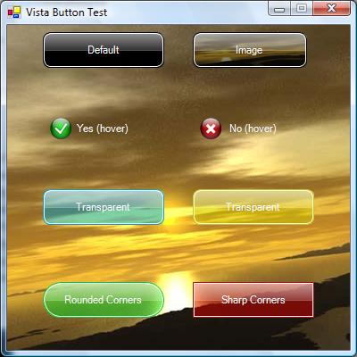
I have a habit of using the standard Windows controls as little as possible. If I can write my own control to do it then I will. It's kinda like reinventing the wheel but adding spinners. Anyways this is an article on a Vista Style button that I made. Unlike the progress bar control I wrote, I didn't create it in Photoshop first. I just designed it in code, as a result it's not quite as nice looking as the actual Vista buttons. The actual button itself can be made very un-Vista-ish if you want to by changing the colours but the default look for the button is the one in the top left.
Code
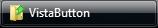
The actual concept for these buttons came from the Vista Taskbar 'Buttons' like this:
As you can see, my control vaguely resembles it if you squint and tip your head to the side. I hear that closing your eyes can sometimes make the similarities clearer too. Like the progress bar control I wrote, I organised my paint event into layers like this:
private void VistaButton_Paint(object sender, PaintEventArgs e)
{
    e.Graphics.SmoothingMode = SmoothingMode.AntiAlias;
    e.Graphics.InterpolationMode = InterpolationMode.HighQualityBicubic;
    DrawBackground(e.Graphics);
    DrawHighlight(e.Graphics);
    DrawImage(e.Graphics);
    DrawText(e.Graphics);
    DrawGlow(e.Graphics);
    DrawOuterStroke(e.Graphics);
    DrawInnerStroke(e.Graphics);
}
Let's have a look at each of the methods individually, from top to bottom starting with DrawBackground:
private void DrawBackground(Graphics g)
{
    if (this.ButtonStyle == Style.Flat && this.mButtonState == State.None){return;}
    int alpha = (mButtonState == State.Pressed) ? 204 : 127;
    Rectangle r = this.ClientRectangle;
    r.Width--; r.Height--;
    using (GraphicsPath rr =
        RoundRect(r, CornerRadius, CornerRadius, CornerRadius, CornerRadius))
    {
        using (SolidBrush sb = new SolidBrush(this.BaseColor))
        {
            g.FillPath(sb, rr);
        }
        SetClip(g);
        if (this.BackImage != null){g.DrawImage(this.BackImage, this.ClientRectangle);}
        g.ResetClip();
        (SolidBrush sb = new SolidBrush(Color.FromArgb(alpha, this.ButtonColor)))
        {
            g.FillPath(sb, rr);
        }
    }
}
The first line stops the background from drawing if the mouse is outside and the button state is set to flat. The second line sets the alpha value of the background based on whether the button is being pressed or not. The next three lines just draw the base colour using a rounded rectangle created using the RoundRect function. It accepts five arguments, the first being the bounds of the rectangle and the other four are the radius of the corners starting in the top left and going clockwise. The SetClip function sets a clip so that when the background is drawn it doesn't go over the edges of the rounded rectangle. The last line just draws the main colour over the top.
private void DrawHighlight(Graphics g)
{
    if (this.ButtonStyle == Style.Flat && this.mButtonState == State.None){return;}
    int alpha = (mButtonState == State.Pressed) ? 60 : 150;
    Rectangle rect = new Rectangle(0, 0, this.Width, this.Height / 2);
    using (GraphicsPath r = RoundRect(rect, CornerRadius, CornerRadius, 0, 0))
    {
        using (LinearGradientBrush lg = new LinearGradientBrush(r.GetBounds(),
                        Color.FromArgb(alpha, this.HighlightColor),
                        Color.FromArgb(alpha / 3, this.HighlightColor),
                        LinearGradientMode.Vertical))
        {
            g.FillPath(lg, r);
        }
    }
}
This bit draws the lighter gradient over the top half of the button, again using a different opacity depending on whether the button is currently pressed.
private void DrawImage(Graphics g)
{
    if (this.Image == null) {return;}
    Rectangle r = new Rectangle(8,8,this.ImageSize.Width,this.ImageSize.Height);
    switch (this.ImageAlign)
    {
        case ContentAlignment.TopCenter:
            r = new Rectangle(this.Width / 2 - this.ImageSize.Width / 2, 8,
                this.ImageSize.Width, this.ImageSize.Height);
            break;
        case ContentAlignment.TopRight:
            r = new Rectangle(this.Width - 8 - this.ImageSize.Width, 8,
                this.ImageSize.Width, this.ImageSize.Height);
            break;
        case ContentAlignment.MiddleLeft:
            r = new Rectangle(8, this.Height / 2 - this.ImageSize.Height / 2,
                this.ImageSize.Width, this.ImageSize.Height);
            break;
        case ContentAlignment.MiddleCenter:
            r = new Rectangle(this.Width / 2 - this.ImageSize.Width / 2,
                this.Height / 2 - this.ImageSize.Height / 2, this.ImageSize.Width,
                this.ImageSize.Height);
            break;
        case ContentAlignment.MiddleRight:
            r = new Rectangle(this.Width - 8 - this.ImageSize.Width,
                this.Height / 2 - this.ImageSize.Height / 2,
                this.ImageSize.Width, this.ImageSize.Height);
            break;
        case ContentAlignment.BottomLeft:
            r = new Rectangle(8, this.Height - 8 - this.ImageSize.Height,
                this.ImageSize.Width, this.ImageSize.Height);
            break;
        case ContentAlignment.BottomCenter:
            r = new Rectangle(this.Width / 2 - this.ImageSize.Width / 2,
                this.Height - 8 - this.ImageSize.Height,
                this.ImageSize.Width,
                this.ImageSize.Height);
            break;
        case ContentAlignment.BottomRight:
            r = new Rectangle(this.Width - 8 - this.ImageSize.Width,
                this.Height - 8 - this.ImageSize.Height,
                this.ImageSize.Width, this.ImageSize.Height);
            break;
    }
    g.DrawImage(this.Image,r);
}
This bit was tedious and evil to write and I hope I never have to do it again. It uses the ImageAlign property and draws the image in the right place.
private void DrawGlow(Graphics g)
{
    if (this.mButtonState == State.Pressed){return;}
    SetClip(g);
    using (GraphicsPath glow = new GraphicsPath())
    {
        glow.AddEllipse(-5,this.Height / 2 - 10, this.Width + 11, this.Height + 11);
        using (PathGradientBrush gl = new PathGradientBrush(glow))
        {
            gl.CenterColor = Color.FromArgb(mGlowAlpha, this.GlowColor);
            gl.SurroundColors = new Color[] {Color.FromArgb(0, this.GlowColor)};
            g.FillPath(gl, glow);
        }
    }
    g.ResetClip();
}
This bit draws the glow at the bottom of the button on mouse over. It stops processing if the button is pressed down. The first line sets the clip to stop the glow going over the edge because it's a radial glow and only the top half should be shown. It uses a PathGradientBrush to set the CenterColor and SurroundColor to make a radial gradient that starts off opaque in the centre and reaches transparent as it approaches the edge.
private void DrawOuterStroke(Graphics g)
{
    if (this.ButtonStyle == Style.Flat && this.mButtonState == State.None){return;}
    Rectangle r = this.ClientRectangle;
    r.Width -= 1; r.Height -= 1;
    using (GraphicsPath rr =
        RoundRect(r, CornerRadius, CornerRadius, CornerRadius, CornerRadius))
    {
        using (Pen p = new Pen(this.ButtonColor))
        {
            g.DrawPath(p, rr);
        }
    }
}
This procedure draws the outer line around the button.
private void DrawInnerStroke(Graphics g)
{
    if (this.ButtonStyle == Style.Flat && this.mButtonState == State.None){return;}
    Rectangle r = this.ClientRectangle;
    r.X++; r.Y++;
    r.Width -= 3; r.Height -= 3;
    using (GraphicsPath rr =
        RoundRect(r, CornerRadius, CornerRadius, CornerRadius, CornerRadius))
    {
        using (Pen p = new Pen(this.HighlightColor))
        {
            g.DrawPath(p, rr);
        }
    }
}
This procedure draws the inner line just inside the outer line.
Using the Code
 |
Using this is really just as easy as using any other control. Just add the VistaButton.cs file into your solution and build it. Then select VistaButton from the 'My User Controls' in the Toolbox. |
There are 12 properties with this control, none of them very complex in operation. They are as follows:
BaseColor- The colour drawn at the back. TheButtonColorproperty never draws with 100% opacity so use this if you want your button to be opaque.BackImage- This is the image that's drawn at the back of the control. It's drawn above the base colour.ButtonColor- This is the main colour of the button, the color that appears below the highlight.ButtonStyle- This property sets whether the background of the control is drawn when the mouse is outside of its client area.CornerRadius- The radius of the corners, shouldn't exceed half of the buttons height.GlowColor- The colour of the glow on mouse over.HighlightColor- The colour of the highlight on the top half of the button.Image- This is the image that is drawn on the button, see the tick and cross in the example image at the top.ImageAlign- This is the alignment of the image on the button relative to the client area.ImageSize- The size to draw the image.ButtonText- The text to display on the button.TextAlign- The alignment of the text, same asImageAlign.
Future Development
This bit is pretty much up to you guys. If anyone makes any valid suggestions, I'd be more than happy to implement them.
History
- Version 1.0 (23 June, 2007) - Initial release
- Version 1.1 (25 June, 2007) - Added resource disposal after suggestion
License
This article, along with any associated source code and files, is licensed under The Code Project Open License (CPOL)
