seaborn 可视化学习笔记
最近突然领悟到一个道理,做的再好的成果,如果不能直观的可视化给老大看明白,基本等于白做,因此数据分析and可视化太重要了
seaborn
seaborn是一个matplotlib的精简化的的工具,用起来也很香!懒人福音~
因为seaborn是基于matplotlib进行开发的,因此加载seaborn的同时还需要加载matplotlib包
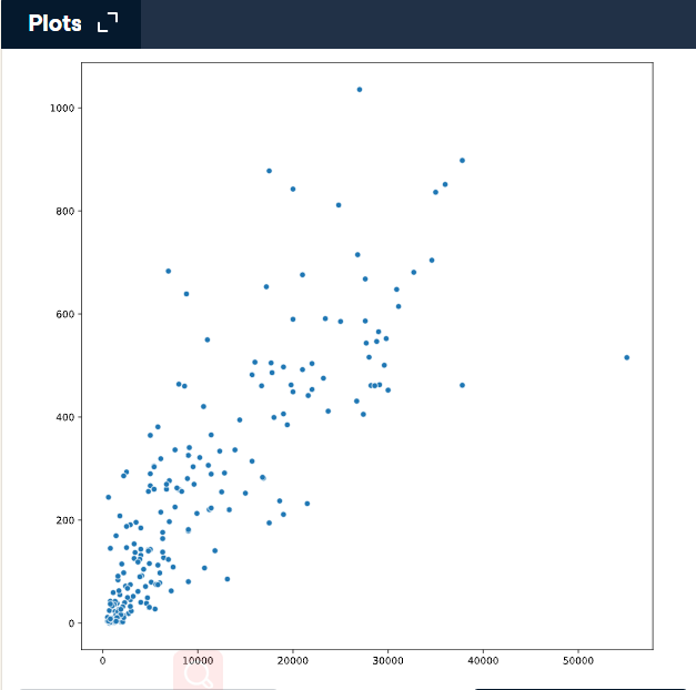
散点图
import matplotlib.pyplot as plt
import seaborn as sns

# Change this scatter plot to have percent literate on the y-axis
sns.scatterplot(x=gdp, y=phones) #更多参数参考官网解析

# Show plot
plt.show()
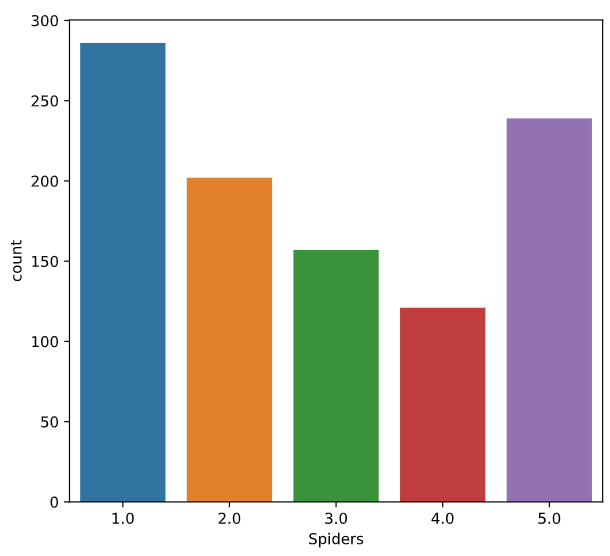
pandas with seaborn
pandas中的df一般是比较整齐的数据,因此对seaborn非常的友好
# Import Matplotlib, Pandas, and Seaborn
import matplotlib.pyplot as plt
import pandas as pd
import seaborn as sns

# Create a DataFrame from csv file
df = pd.read_csv(csv_filepath)

# Create a count plot with "Spiders" on the x-axis
sns.countplot(x="Spiders", data=df)

# Display the plot
plt.show()
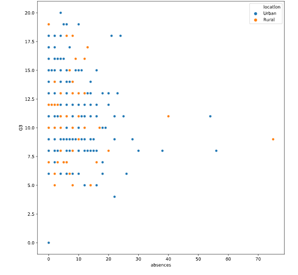
增加hue参数
hue也是用来分类的,可以指定颜色,根据需要diy
# Import Matplotlib and Seaborn
import matplotlib.pyplot as plt
import seaborn as sns

# Create a scatter plot of absences vs. final grade
sns.scatterplot(x="absences", y="G3",
                data=student_data,
                hue="location")

# Show plot
plt.show()
使用hue_order指定分类的顺序
# Import Matplotlib and Seaborn
import matplotlib.pyplot as plt
import seaborn as sns

# Change the legend order in the scatter plot
sns.scatterplot(x="absences", y="G3",
                data=student_data,
                hue="location",
                hue_order=["Rural", "Urban"])

# Show plot
plt.show()
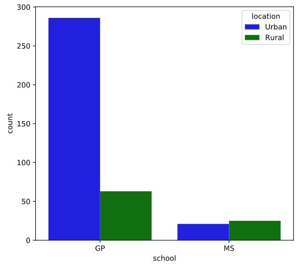
palette指定分类的颜色,字典的格式哦
# Import Matplotlib and Seaborn
import matplotlib.pyplot as plt
import seaborn as sns

# Create a dictionary mapping subgroup values to colors
palette_colors = {"Rural": "green", "Urban": "blue"}

# Create a count plot of school with location subgroups
sns.countplot(x="school", data=student_data,
              hue="location",
              palette=palette_colors)

# Display plot
plt.show()
Introduction to relational plots and subplots
相关关系图和子图
relplot
常用参数
x: x轴
y: y轴
hue: 用颜色区分某个维度
style: 在某一维度上, 用线的不同表现形式区分, 如 点线, 虚线等
size: 控制数据点大小或者线条粗细
col: 列上的子图
row: 行上的子图
kind: kind= ‘scatter’(默认值)
kind='line’时候,可以通过参数ci:(confidence interval)参数,来控制阴影部分,如,ci=‘sd’ (一个x有多个y值)
** 也可以关闭数据聚合功能(urn off aggregation altogether), 设置estimator=None即可**
data:一般时pandas的df
alpha:图的透明度
栗子:
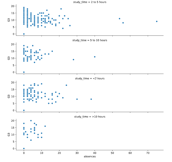
# Change this scatter plot to arrange the plots in rows instead of columns
sns.relplot(x="absences", y="G3",
            data=student_data,
            kind="scatter",
            row="study_time")

# Show plot
plt.show()
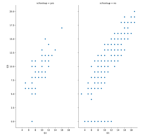
按照列分组的
# Adjust to add subplots based on school support
sns.relplot(x="G1", y="G3",
            data=student_data,
            kind="scatter",
            col="schoolsup",
            col_order=["yes", "no"])

# Show plot
plt.show()
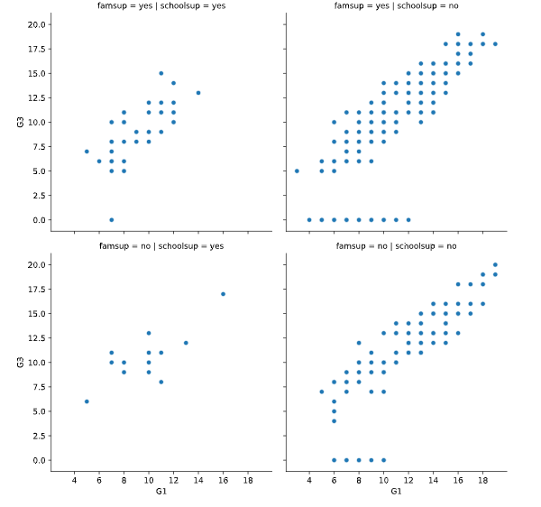
按照行和列分组的
# Adjust further to add subplots based on family support
sns.relplot(x="G1", y="G3",
            data=student_data,
            kind="scatter",
            col="schoolsup",
            col_order=["yes", "no"],
            row="famsup",
            row_order=["yes", "no"])

# Show plot
plt.show()
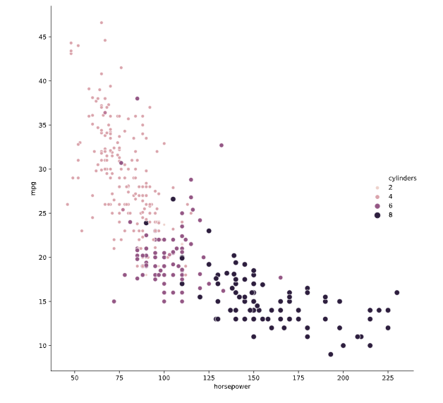
# Import Matplotlib and Seaborn
import matplotlib.pyplot as plt
import seaborn as sns

# Create scatter plot of horsepower vs. mpg
sns.relplot(x="horsepower", y="mpg",
            data=mpg, kind="scatter",
            size="cylinders", hue="cylinders")

# Show plot
plt.show()
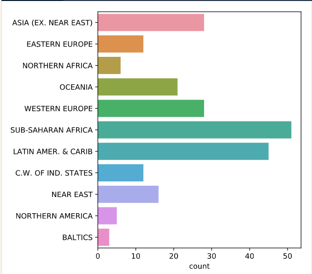
countplot
统计个数的柱状图
Count plots take in a categorical list and return bars that represent the number of list entries per category.
# Import Matplotlib and Seaborn
import matplotlib.pyplot as plt
import seaborn as sns

# Create count plot with region on the y-axis
sns.countplot(y=region)

# Show plot
plt.show()
catplot
是一个分类图的接口,通过改变kind参数得到不同的图形
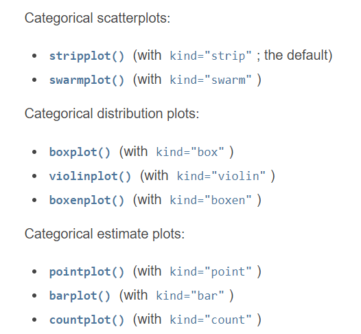
可以指定分类的变量以及图的类别
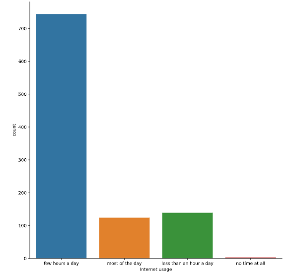
# Create count plot of internet usage
sns.catplot(x="Internet usage", data=survey_data,
            kind="count")

# Show plot
plt.show()
此时catplot等价于countplot
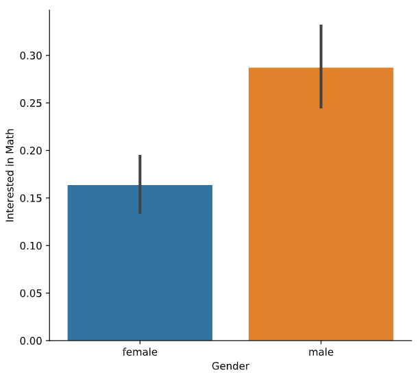
barplot
# Create a bar plot of interest in math, separated by gender
sns.catplot(x="Gender", y="Interested in Math",
            data=survey_data, kind="bar")

# Show plot
plt.show()
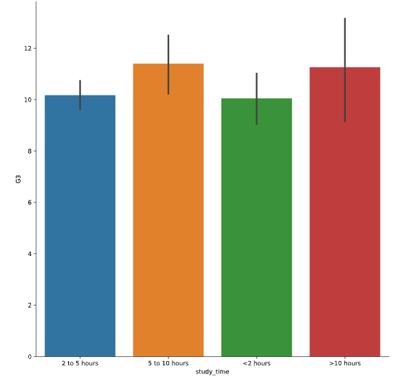
设置参数order给x轴范围,是个list的形式
# Rearrange the categories
sns.catplot(x="study_time", y="G3",
            data=student_data,
            kind="bar",
            order=["<2 hours",
                   "2 to 5 hours",
                   "5 to 10 hours",
                   ">10 hours"])

# Show plot
plt.show()
Box plots
# Create a box plot with subgroups and omit the outliers
sns.catplot(x="internet", y="G3",
            data=student_data,
            kind="box",
            hue="location",
            sym="")

# Show plot
plt.show()
需要忽略异常的离群值的时候,需要给sym参数赋值
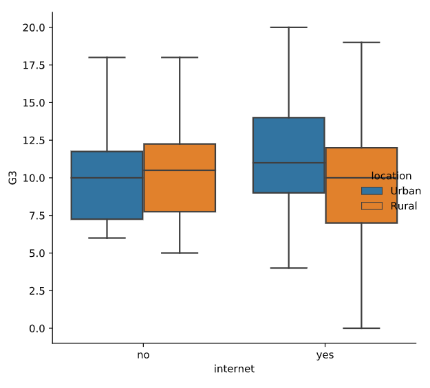
Adjust the code to make the box plot whiskers to extend to 0.5 * IQR. Recall: the IQR is the interquartile range.
主要来说一下常见的参数
x:指定要绘制箱线图的数据;
notch:是否是凹口的形式展现箱线图,默认非凹口;
sym:指定异常点的形状,默认为+号显示;
vert:是否需要将箱线图垂直摆放,默认垂直摆放;
whis:指定上下须与上下四分位的距离,默认为1.5倍的四分位差;
positions:指定箱线图的位置,默认为[0,1,2…];
widths:指定箱线图的宽度,默认为0.5;
patch_artist:是否填充箱体的颜色;
meanline:是否用线的形式表示均值,默认用点来表示;
showmeans:是否显示均值,默认不显示;
showcaps:是否显示箱线图顶端和末端的两条线,默认显示;
showbox:是否显示箱线图的箱体,默认显示;
showfliers:是否显示异常值,默认显示;
boxprops:设置箱体的属性,如边框色,填充色等;
labels:为箱线图添加标签,类似于图例的作用;
filerprops:设置异常值的属性,如异常点的形状、大小、填充色等;
medianprops:设置中位数的属性,如线的类型、粗细等;
meanprops:设置均值的属性,如点的大小、颜色等;
capprops:设置箱线图顶端和末端线条的属性,如颜色、粗细等;
whiskerprops:设置须的属性,如颜色、粗细、线的类型等;
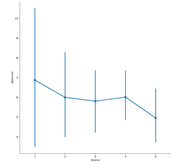
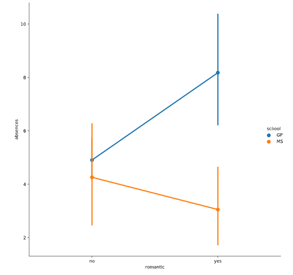
Point plots
A point plot represents an estimate of central tendency for a numeric variable by the position of scatter plot points and provides some indication of the uncertainty around that estimate using error bars.
Point plots can be more useful than bar plots for focusing comparisons between different levels of one or more categorical variables. They are particularly adept at showing interactions: how the relationship between levels of one categorical variable changes across levels of a second categorical variable. The lines that join each point from the same hue level allow interactions to be judged by differences in slope, which is easier for the eyes than comparing the heights of several groups of points or bars.
点图表示通过散点图点的位置对数值变量的中心趋势进行的估计,并使用误差线对该估计周围的不确定性进行指示。可以用来趋势估计,比较方便
点图可能比条形图更直观,用于集中比较一个或多个分类变量的不同级别。特别擅长显示交互作用:一个分类变量的级别之间的关系如何在第二个分类变量的级别之间变化。从同一色调水平连接每个点的线条允许通过斜率的差异来判断相互作用,这比比较几组点或条的高度更容易。
举个栗子
# Add caps to the confidence interval
sns.catplot(x="famrel", y="absences",
			data=student_data,
            kind="point")

# Show plot
plt.show()
# Create a point plot with subgroups
sns.catplot(x="romantic", y="absences",
			data=student_data,
            kind="point",
            hue="school")

# Show plot
plt.show()
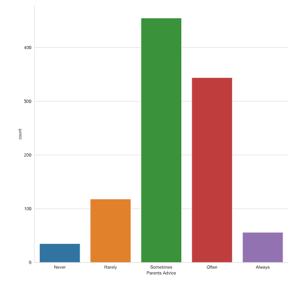
seaborn设置样式
设置每列的顺序
# Set the style to "whitegrid"
sns.set_style("whitegrid")

# Create a count plot of survey responses
category_order = ["Never", "Rarely", "Sometimes",
                  "Often", "Always"]

sns.catplot(x="Parents Advice",
            data=survey_data,
            kind="count",
            order=category_order)

# Show plot
plt.show()
设置样式和颜色
# Change the color palette to "RdBu"
sns.set_style("whitegrid")
sns.set_palette("RdBu")

# Create a count plot of survey responses
category_order = ["Never", "Rarely", "Sometimes",
                  "Often", "Always"]

sns.catplot(x="Parents Advice",
            data=survey_data,
            kind="count",
            order=category_order)

# Show plot
plt.show()
sns.set_context("poster")背景的样式
seaborn预定义了4种图表的样式定义,分别是:paper、notebook、talk和poster,默认是notebook
设置题目和轴标签信息
这样对于一些图读起来是更方便的
把seaborn的图打印下来是一个网格的画布
<class 'seaborn.axisgrid.FacetGrid'>,因此可以美化画布
设置题目
设置整个标题的题目和设置子标题的题目
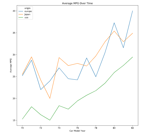
# Create line plot
g = sns.lineplot(x="model_year", y="mpg_mean",
                 data=mpg_mean,
                 hue="origin")

# Add a title "Average MPG Over Time"
g.set_title("Average MPG Over Time")

# Show plot
plt.show()
# Create scatter plot
g = sns.relplot(x="weight",
                y="horsepower",
                data=mpg,
                kind="scatter")

# Add a title "Car Weight vs. Horsepower"
g.fig.suptitle("Car Weight vs. Horsepower")

# Show plot
plt.show()
设置轴标签
# Create line plot
g = sns.lineplot(x="model_year", y="mpg_mean",
                 data=mpg_mean,
                 hue="origin")

# Add a title "Average MPG Over Time"
g.set_title("Average MPG Over Time")

# Add x-axis and y-axis labels
g.set(xlabel="Car Model Year",
      ylabel="Average MPG")

# Show plot
plt.show()
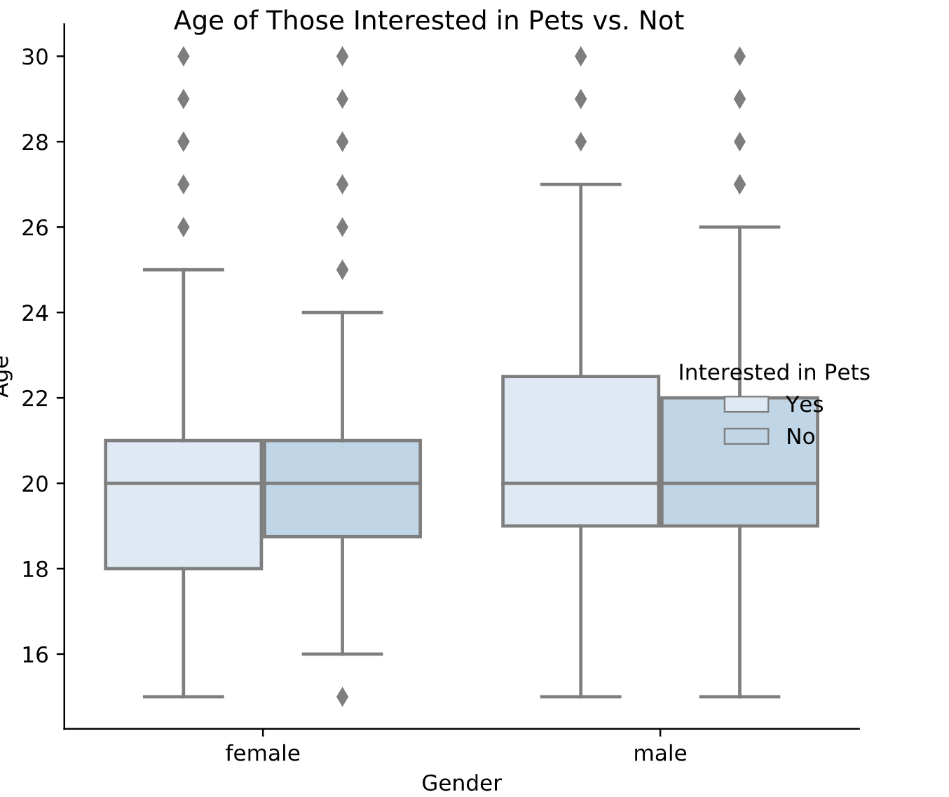
最后绘制一个参数较多的
# Set palette to "Blues"
sns.set_palette("Blues")

# Adjust to add subgroups based on "Interested in Pets"
g = sns.catplot(x="Gender",
                y="Age", data=survey_data,
                kind="box", hue="Interested in Pets")

# Set title to "Age of Those Interested in Pets vs. Not"
g.fig.suptitle("Age of Those Interested in Pets vs. Not")

# Show plot
plt.show()
结课证