HTML5 内联 SVG
什么是SVG?
- SVG 指可伸缩矢量图形 (Scalable Vector Graphics)
- SVG 用于定义用于网络的基于矢量的图形
- SVG 使用 XML 格式定义图形
- SVG 图像在放大或改变尺寸的情况下其图形质量不会有损失
- SVG 是万维网联盟的标准
SVG优势
与其他图像格式相比(比如 JPEG 和 GIF),使用 SVG 的优势在于:
- SVG 图像可通过文本编辑器来创建和修改
- SVG 图像可被搜索、索引、脚本化或压缩
- SVG 是可伸缩的
SVG 图像可在任何的分辨率下被高质量地打印
Canvas 与 SVG 的比较
下表列出了 canvas 与 SVG 之间的一些不同之处。
| Canvas | SVG |
|---|---|
|
|
SVG 的主要竞争者是 Flash。
与 Flash 相比,SVG 最大的优势是与其他标准(比如 XSL 和 DOM)相兼容。而 Flash 则是未开源的私有技术。
查看 SVG 文件
Internet Explorer9,火狐,谷歌Chrome,Opera和Safari都支持SVG。
IE8和早期版本都需要一个插件 - 如Adobe SVG浏览器,这是免费提供的。
创建SVG文件
由于SVG是XML文件,SVG图像可以用任何文本编辑器创建,但它往往是与一个绘图程序一起使用,如Inkscape,更方便地创建SVG图像。
简单的 SVG 实例
一个简单的SVG图形例子:
//第一行包含了 XML 声明。请注意 standalone 属性!该属性规定此 SVG 文件是否是"独立的",或含有
对外部文件的引用standalone="no" 意味着 SVG 文档会引用一个外部文件 - 在这里,是 DTD 文件
<?xml version="1.0" standalone="no"?>//第二和第三行引用了这个外部的 SVG DTD。
该 DTD 位于 "http://www.w3.org/Graphics/SVG/1.1/DTD/svg11.dtd"。
该 DTD 位于 W3C,含有所有允许的 SVG 元素。
<!DOCTYPE svg PUBLIC "-//W3C//DTD SVG 1.1//EN"
"http://www.w3.org/Graphics/SVG/1.1/DTD/svg11.dtd">
//SVG 代码以 <svg> 元素开始,包括开启标签 <svg> 和关闭标签 </svg> 。这是根元素。
//width 和 height 属性可设置此 SVG 文档的宽度和高度。version 属性可定义所使用的 SVG 版本,
//xmlns 属性可定义 SVG 命名空间。
<svg xmlns="http://www.w3.org/2000/svg" version="1.1">
//SVG 的 <circle> 用来创建一个圆。cx 和 cy 属性定义圆中心的 x 和 y 坐标。如果忽略这两个属性,那么圆点会被设置为 (0, 0)。r 属性定义圆的半径。
stroke 和 stroke-width 属性控制如何显示形状的轮廓。我们把圆的轮廓设置为 2px 宽,黑边框
fill 属性设置形状内的颜色。我们把填充颜色设置为红色。
  <circle cx="100" cy="50" r="40" stroke="black"
  stroke-width="2" fill="red" />
  </svg>
SVG 在 HTML 页面
SVG 文件可通过以下标签嵌入 HTML 文档:<embed>、<object> 或者 <iframe>。
SVG的代码可以直接嵌入到HTML页面中,或您可以直接链接到SVG文件。
使用<embed>标签
优势:所有主要浏览器都支持,并允许使用脚本
缺点:不推荐在 HTML4 和 XHTML 中使用(但在 HTML5 中允许)
语法:<embed src="circle1.svg" type="image/svg+xml"/>
使用 <object> 标签
优势:所有主要浏览器都支持,并支持 HTML4、XHTML和HTML5标准
缺点:不允许使用脚本
语法:<object data="circle1.svg" type="image/svg+xml"></object>
使用<iframe>标签
优势:所有主要浏览器都支持,并允许使用脚本
缺点:不推荐在 HTML4 和 XHTML 中使用(但在 HTML5 中允许)
语法:<iframe src="circle.svg"></iframe>
直接在 HTML 中嵌入 SVGA 代码
<svg xmlns="http://www.w3.org/2000/svg" version="1.1">
   <circle cx="100" cy="50" r="40" stroke="black" stroke-width="2" fill="red" />
</svg>
链接到 SVGA 文件
可以使用 <a> 标签链接到 一个 SVGA 文件
语法:<a href="circle.svg">View SVG File</a>
SVG Shapes
SVG有一些预定义的形状元素,可被开发者使用和操作:
- 矩形 <rect>
- 圆形 <circle>
- 椭圆 <ellipse>
- 线 <line>
- 折线 <polyline>
- 多边形 <polygon>
- 路径 <path>
SVG 矩形 - <rect>
<!DOCTYPE html>
<html>
<body>
<svg xmlns="http://www.w3.org/2000/svg" version="1.1">
    /**
    rect 元素的 width 和 height 属性可定义矩形的高度和宽度
    style 属性用来定义 CSS 属性
    CSS 的 fill 属性定义矩形的填充颜色(rgb 值、颜色名或者十六进制值)
    CSS 的 stroke-width 属性定义矩形边框的宽度
    CSS 的 stroke 属性定义矩形边框的颜色*/
  <rect width="300" height="100"
        style="fill:rgb(0,0,255);stroke-width:1;stroke:rgb(0,0,0)" />

    /**
        x 属性定义矩形的左侧位置(例如,x="0" 定义矩形到浏览器窗口左侧的距离是 0px)
        y 属性定义矩形的顶端位置(例如,y="0" 定义矩形到浏览器窗口顶端的距离是 0px)
        CSS 的 fill-opacity 属性定义填充颜色透明度(合法的范围是:0 - 1)
        CSS 的 stroke-opacity 属性定义笔触颜色的透明度(合法的范围是:0 - 1)
    */
<rect x="50" y="20" width="150" height="150"
  style="fill:blue;stroke:pink;stroke-width:5;fill-opacity:0.1;
  stroke-opacity:0.9"/>

    /**
        CSS opacity 属性用于定义了元素的透明值 (范围: 0 到 1)。
    */
     <rect x="50" y="20" width="150" height="150"
  style="fill:blue;stroke:pink;stroke-width:5;opacity:0.5"/>

    /**
        rx 和 ry 属性可使矩形产生圆角。
    */
    <rect x="50" y="20" rx="20" ry="20" width="150" height="150"
  style="fill:red;stroke:black;stroke-width:5;opacity:0.5"/>
</svg>
</body>
</html>
SVG 圆形 - <circle>
SVG 椭圆形 - <ellipse><!DOCTYPE html> <html> <body> /** cx和cy属性定义圆点的x和y坐标。如果省略cx和cy,圆的中心会被设置为(0, 0) r属性定义圆的半径 */ <svg xmlns="http://www.w3.org/2000/svg" version="1.1"> <circle cx="100" cy="50" r="40" stroke="green"
stroke-width="2" fill="red" /> </svg> </body> </html>
<!DOCTYPE html>
<html>
<body>
<svg xmlns="http://www.w3.org/2000/svg" version="1.1">

/**
- CX属性定义的椭圆中心的x坐标
- CY属性定义的椭圆中心的y坐标
- RX属性定义的水平半径
- RY属性定义的垂直半径
  */

<ellipse cx="100" cy="80" rx="100" ry="50"
          style="fill:yellow;stroke:purple;stroke-width:2" />
<ellipse cx="100" cy="100" rx="100" ry="50"
         style="fill:red;stroke:black;stroke-width:3;"/>
    </svg>

</body>
</html>
SVG 直线-<line>
<!DOCTYPE html>
<html>
<body>

<svg xmlns="http://www.w3.org/2000/svg" version="1.1">
    /**
        x1 属性在 x 轴定义线条的开始
        y1 属性在 y 轴定义线条的开始
        x2 属性在 x 轴定义线条的结束
        y2 属性在 y 轴定义线条的结束
    */
  <line x1="0" y1="0" x2="200" y2="180"
        style="stroke:rgb(255,0,0);stroke-width:2" />
    <line x1="0" y1="0" x2="0" y2="100"
          style="stroke:red;stroke-width:2;"/>
    <line x1="0" y1="100" x2="165" y2="150"
          style="stroke:red;stroke-width:2;" />
</svg>

</body>
</html>
SVG <polygon> - 多边形
polygon 用来创建含有不少于 三个边的图形。多边形是由直线组成,其形状是封闭的(所有线条连接起来)
<!DOCTYPE html>
<html>
<body>

<svg xmlns="http://www.w3.org/2000/svg" version="1.1" height="400">
    //SVG的图形填充规则通过fill-rule属性来指定
    //points 属性定义多边形每个角的 x 和 y 坐标
  <polygon points="100,10 40,180 190,60 10,60 160,180"
           style="fill:lime;stroke:purple;stroke-width:5;fill-rule:evenodd;"/>
    <polygon points="50,50,150,50,70,150,100,20,150,150"
             style="fill:red;stroke:yellow;stroke-width:3;fill-rule:nonzero;"/>
    </svg>
</body>
</html>
SVG曲线 - <polyline>
<polyline> 元素是用于创建任何只有直线的形状:
points 属性定义多边形每个角的 x 和 y 坐标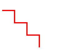
<!DOCTYPE html>
<html>
<body>
<svg xmlns="http://www.w3.org/2000/svg" version="1.1">
  <polyline points="0,40 40,40 40,80 80,80 80,120 120,120 120,160"
            style="fill:white;stroke:red;stroke-width:4" />
</svg>
</body>
</html>
SVG - 路径<path>
<path> 元素用于定义一个路径。
下面的命令可用于路径数据:
- M = moveto
- L = lineto
- H = horizontal lineto
- V = vertical lineto
- C = curveto
- S = smooth curveto
- Q = quadratic Bézier curve
- T = smooth quadratic Bézier curveto
- A = elliptical Arc
- Z = closepath
注意:以上所有命令均允许小写字母。大写表示绝对定位,小写表示相对定位。
<!DOCTYPE html>
<html>
<body>
<svg xmlns="http://www.w3.org/2000/svg" version="1.1">
    /*上面的例子定义了一条路径,它开始于位置150 0,到达位置75 200,
    然后从那里开始到225 200,最后在150 0关闭路径。
*/
  <path d="M150 0 L75 200 L225 200 Z" />
</svg>
</body>
</html>
SVG文本 - <text>
实例:
<!DOCTYPE html>
<html>
<body>
/**写一个文本/
<svg xmlns="http://www.w3.org/2000/svg" version="1.1">
  <text x="0" y="15" fill="red">I love SVG</text>
</svg>
 /*旋转的文字*/
    //rotate(deg,y,x)
<svg xmlns="http://www.w3.org/2000/svg" version="1.1">
  <text x="0" y="15" fill="red" transform="rotate(30 20,40)">I love SVG</text>
</svg>
/*元素可以安排任何分小组与<tspan> 元素的数量
    <tspan> 元素的样式可以同 fill="" 单独设置*/
<svg xmlns="http://www.w3.org/2000/svg" version="1.1">
  <text x="10" y="20" style="fill:red;">Several lines:
    <tspan x="10" y="45">First line</tspan>
    <tspan x="10" y="70">Second line</tspan>
  </text>
</svg>
/*作为链接文本<a>元素*/
<svg xmlns="http://www.w3.org/2000/svg" version="1.1"
xmlns:xlink="http://www.w3.org/1999/xlink">
  <a xlink:href="http://www.w3schools.com/svg/" target="_blank">
    <text x="0" y="15" fill="red">I love SVG</text>
  </a>
</svg>
</body>
</html>
SVG stroke 属性
stroke 属性:
- stroke
- stroke-width
- stroke-linecap
- stroke-dasharray
<!DOCTYPE html>
<html>
<body>
<svg xmlns="http://www.w3.org/2000/svg" version="1.1">
  <g fill="none">
     //Stroke属性定义一条线,文本或元素轮廓颜色:
    <path stroke="red" d="M5 20 l215 0" />
    //stroke-width属性定义了一条线,文本或元素轮廓厚度
    <path stroke="black" stroke-width="10" d="M5 40 l215 0" />
     //stroke-linecap属性定义不同类型的开放路径的终结:
    <path stroke="blue" stroke-width="10" stroke-linecap = "round"
          d="M5 60 l215 0" />
     //stroke-asharray属性用于创建虚线:
      <path stroke="green" stroke-width="5" stroke-linecap="round"
            stroke-dasharray = "10,10"
            d="M5 80 l215 0"/>
  </g>
</svg>
</body>
</html>
SVG 滤镜
svg 滤镜用来增加对 svg 图形的特殊效果
- feBlend - 与图像相结合的滤镜
- feColorMatrix - 用于彩色滤光片转换
- feComponentTransfer
- feComposite
- feConvolveMatrix
- feDiffuseLighting
- feDisplacementMap
- feFlood
- feGaussianBlur
- feImage
- feMerge
- feMorphology
- feOffset - 过滤阴影
- feSpecularLighting
- feTile
- feTurbulence
- feDistantLight - 用于照明过滤
- fePointLight - 用于照明过滤
- feSpotLight - 用于照明过滤
 除此之外,您可以在每个 SVG 元素上使用多个滤镜!
SVG 模糊效果 - <feGaussianBlur>
<!DOCTYPE html>
<html>
<body>
<p><b>Note: </b>Internet Explorer and Safari do not support SVG filters yet!</p>
<svg xmlns="http://www.w3.org/2000/svg" version="1.1">
/*所有互联网的SVG滤镜定义在<defs>元素中。
    <defs>元素定义短并含有特殊元素(如滤镜)定义。*/
  <defs>
      /*<filter>标签用来定义SVG滤镜。
     <filter>元素id属性定义一个滤镜的唯一名称*/
    <filter id="f1" x="0" y="0">
    //<feGaussianBlur>元素定义模糊效果
    //in="SourceGraphic"这个部分定义了由整个图像创建效果
    //stdDeviation属性定义模糊量
      <feGaussianBlur in="SourceGraphic" stdDeviation="15" />
    </filter>
  </defs>
    //<rect>元素的滤镜属性用来把元素链接到"f1"滤镜
  <rect width="90" height="90" stroke="green" stroke-width="3"
        fill="yellow" filter="url(#f1)" />
</svg>
</body>
</html>
SVG 渐变
渐变是一种从一种颜色到另一种颜色的平滑过渡。另外,可以把多个颜色的过渡应用到同一个元素上。
SVG渐变主要有两种类型:
- Linear
- Radial
SVG 渐变 - 线形 - <linearGradient>
<linearGradient>元素用于定义线性渐变。
<linearGradient>标签必须嵌套在<defs>的内部。<defs>标签是definitions的缩写,它可对诸如渐变之类的特殊元素进行定义。
线性渐变可以定义为水平,垂直或角渐变:
- 当y1和y2相等,而x1和x2不同时,可创建水平渐变
- 当x1和x2相等,而y1和y2不同时,可创建垂直渐变
- 当x1和x2不同,且y1和y2不同时,可创建角形渐变
实例:
    <!DOCTYPE html>
<html>
<body>
<svg xmlns="http://www.w3.org/2000/svg" version="1.1">
  <defs>
     //当y1和y2相等,而x1和x2不同时,可创建水平渐变
    //当x1和x2相等,而y1和y2不同时,可创建垂直渐变
    //当x1和x2不同,且y1和y2不同时,可创建角形渐变
    //<linearGradient>标签的id属性可为渐变定义一个唯一的名称
    //<linearGradient>标签的X1,X2,Y1,Y2属性定义渐变开始和结束位置
    <linearGradient id="grad1" x1="0%" y1="10%" x2="120%" y2="100%">
    //渐变的颜色范围可由两种或多种颜色组成。每种颜色通过一个<stop>标签来规定。
        offset属性用来定义渐变的开始和结束位置。
      <stop offset="0%" style="stop-color:rgb(255,255,0);stop-opacity:1" />
        <stop offset="50%" style="stop-color:green;stop-opacity:1"  />
      <stop offset="100%" style="stop-color:rgb(255,0,0);stop-opacity:1" />
    </linearGradient>
  </defs>
//填充属性把 ellipse 元素链接到此渐变
  <ellipse cx="200" cy="70" rx="85" ry="55" fill="url(#grad1)" />
      //在椭圆内添加一个文本
     <text fill="#ffffff" font-size="45" font-family="Verdana" x="150" y="86">SVG</text>
</svg>
</body>
</html>
SVG 放射性渐变 - <radialGradient>
<radialGradient>元素用于定义放射性渐变。
<radialGradient>标签必须嵌套在<defs>的内部。<defs>标签是definitions的缩写,它可对诸如渐变之类的特殊元素进行定义。
实例:
    <!DOCTYPE html>
<html>
<body>
<svg xmlns="http://www.w3.org/2000/svg" version="1.1">
  <defs>
     //<radialGradient>标签的 id 属性可为渐变定义一个唯一的名称
      //CX,CY和r属性定义的最外层圆和Fx和Fy定义的最内层圆
    <radialGradient id="grad1" cx="50%" cy="50%" r="50%" fx="50%" fy="50%">
    //渐变颜色范围可以由两个或两个以上的颜色组成。每种颜色用一个<stop>标签指定。
        offset属性用来定义渐变色开始和结束
      <stop offset="0%" style="stop-color:rgb(255,255,255);stop-opacity:0" />
      <stop offset="100%" style="stop-color:rgb(0,0,255);stop-opacity:1" />
    </radialGradient>
  </defs
    //填充属性把ellipse元素链接到此渐变
  <ellipse cx="200" cy="70" rx="85" ry="55" fill="url(#grad1)" />
</svg>
</body>
</html>

