3d 小demo
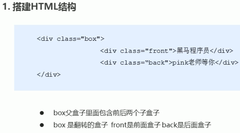
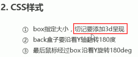
demo1 两面翻转的盒子
<!doctype html>
<html lang="en">
<head>
    <meta charset="UTF-8">
    <title>rotate</title>
    <style>
        body {
            perspective: 500px;
        }
        .box {
            position: relative;
            width: 300px;
            height: 300px;
            margin: 100px auto;
            transition: all 1s;
            /*很重要的一段代码  开启子元素的3d环境*/
            transform-style: preserve-3d;
        }
        .box:hover {
            transform: rotateY(180deg);
        }
        .teach,
        .back {
            position: absolute;
            width: 100%;
            height: 100%;
            border-radius: 50%;
            line-height: 300px;
            text-align: center;
            color: white;
        }
        .teach {
            background: #313131;
            z-index: 1;
        }
        .back {
            background: #B3181C;
            /* 像手机一样 背靠背 旋转 */
            transform: rotateY(180deg);
        }
    </style>
</head>
<body>
<div class="box">
    <div class="teach">正面</div>
    <div class="back">我是背面</div>

</div>

</body>
</html>
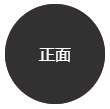 执行结果
执行结果
这个案例需要好好理解 立方体按照中心轴旋转
<!doctype html>
<html lang="en">
<head>
    <meta charset="UTF-8">
    <title>翻转导航</title>
    <style>
        * {
            margin: 0;
            padding: 0;
        }
        ul {
            margin: 100px;
        }
        li {
            float: left;
            margin: 0 5px;
            list-style: none;
            width: 150px;
            height: 35px;
            line-height: 35px;
            /*添加透视效果*/
            perspective: 500px;
        }
        .box {
            position: relative;
            width: 100%;
            height: 100%;
            transition: all .5s;
            /*开启子元素的3维环境*/
            transform-style: preserve-3d;
        }
        .box:hover {
            transform: rotateX(90deg);
            cursor: pointer;
        }
        .top,
        .bottom {
            position: absolute;
            top: 0;
            left: 0;
            width: 100%;
            height: 100%;
            text-align: center;
            color: white;
        }
        .top {
            background: pink;
            z-index: 1;
            /*很重要的一步 z轴向前移动17.5*/
            transform: translateZ(17.5px);
        }

        .bottom {
            background: purple;
            /*如果有位移和其他样式 必须先写位移*/
            transform: translateY(17.5px) rotateX(-90deg);
        }
    </style>
</head>
<body>
<ul>
    <li>
        <div class="box">
            <div class="top">我是洛维</div>
            <div class="bottom">我是皓维</div>
        </div>
    </li>
    <li>
        <div class="box">
            <div class="top">我是洛维</div>
            <div class="bottom">我是皓维</div>
        </div>
    </li>
    <li>
        <div class="box">
            <div class="top">我是洛维</div>
            <div class="bottom">我是皓维</div>
        </div>
    </li>

</ul>
</body>
</html>

案例的重点
1 bottom经过翻转后,和top是十字交叉的状态 我们需要将它向下位移17.5px
2 top 向前在Z轴上移动17.5px,让父盒子按照中心轴翻转
 鼠标滑过翻转

 浙公网安备 33010602011771号