
登录对话框随页面尺寸的变化而响应式布局
用到的知识点是:1.媒体查询
2.rem
320px以上的尺寸通过设置 @media screen and (min-width: 320px | 783px | 1400px | 2000px )来对不同的尺寸设置html的字体大小,用px单位,其他的元素单位使用rem或者%
320px以下的尺寸通过设置@media screen and (max-width: 320px), 然后把屏幕拉到最小尺寸,在最小尺寸下改变html字体的大小,直到找到一个最合适的字体大小,用px作为单位,其他的元素用rem或者%
rem的使用方法:在媒体查询中,对html设置字体为px单位,并且加上!important, 然后对于屏幕缩放时显示不正常的元素使用rem或者%来调整大小,直到在该屏幕大小下显示正常
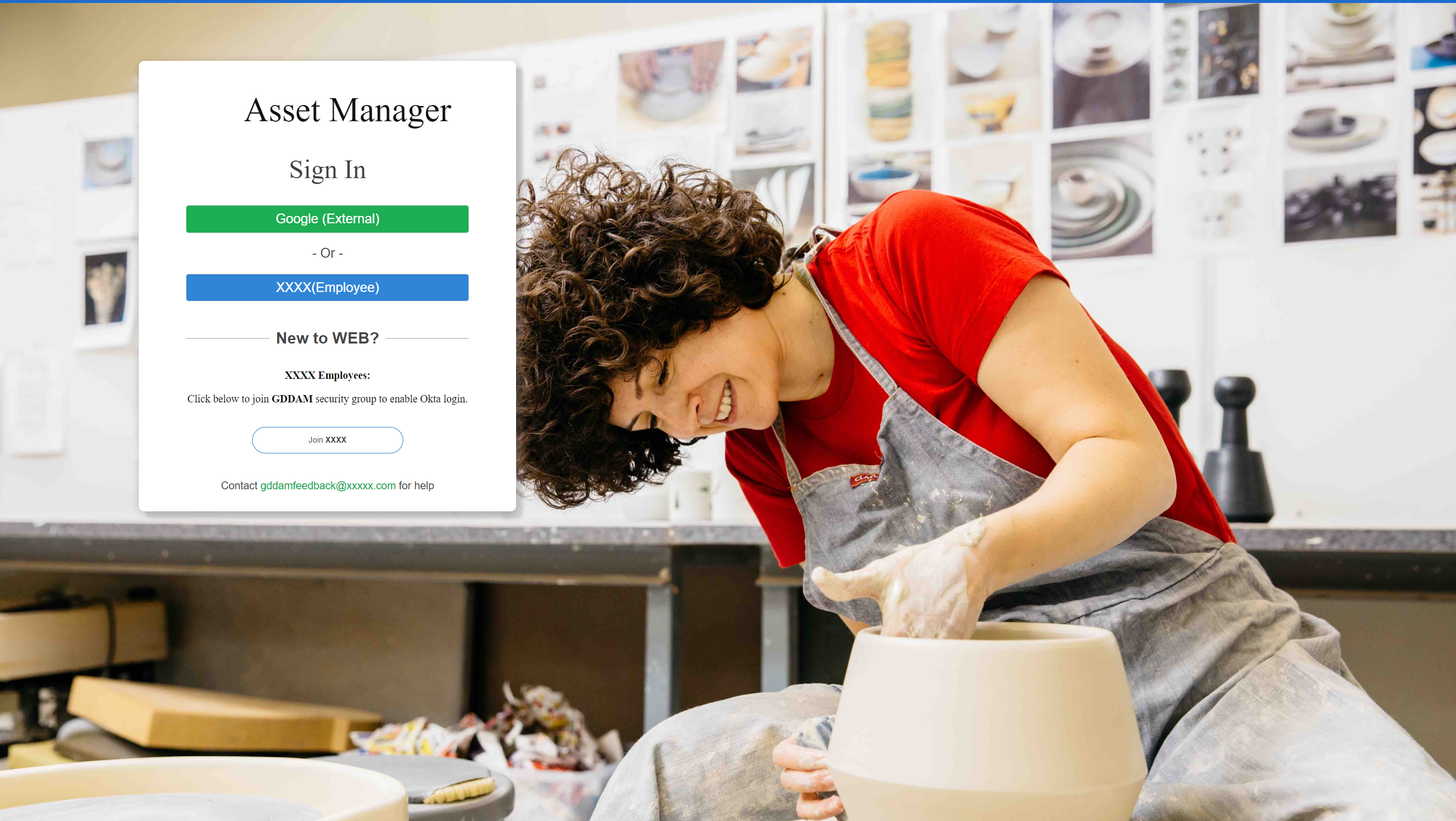
参考代码如下:
html代码:
<body>
<div style="display:none;">LTDV-BLIU</div>
<nav class="navbar godam navbar-fixed-top ">
<div class="container-fluid">
<div class="navbar-header godam" id="godamHeader">
<a class="navbar-brand godam visible-xs" href="/">GdDam</a>
<button type="button" class="navbar-toggle" data-toggle="collapse" data-target="#godamHeaderMenu">
<span class="sr-only">Toggle navigation</span>
<span class="icon-bar"></span>
<span class="icon-bar"></span>
<span class="icon-bar"></span>
</button>
<a class="navbar-brand godam hidden-xs" href="/">xxxx<sup>®</sup></a>
<ul class="nav navbar-nav top-nav hidden-xs">
</ul>
</div>
<div class="navbar-collapse collapse" id="helpMenu">
<ul class="nav navbar-nav navbar-right">
<li><a class="glyphicon godam glyphicon-question-sign toggleHelp no-sign" role="button"></a></li>
</ul>
<ul class="nav navbar-nav navbar-right">
</ul>
</div>
</div>
</nav>
</div>
</nav>
<div class="container-fluid body-content">
<div id="login-container-row" class="row">
<div id="loadingDiv" style="display:block">
<div class="loading-block show">
<img id="loading-picture" src="/images/loading_darkblue.gif" />
</div>
</div>
<div class="col-md-1"></div>
<div id="login-container-col" class="col-md-5 text-center">
<div id="login-container">
<link rel="stylesheet" type="text/css" href="/css/Views/shared/loginProviders.css?v=4yChpGBaRRldC3JyNcfoySQyg4DNu4nO4ug2yDOONtk" />
<div id="login-panel" class="login-options">
<div class="login-options-heading login-title" id="login-title">
<span>Asset Manager</span>
</div>
<h3 class="style-for-title">Sign In</h3>
<h2 class="login-options-heading">
<form method="post" class="form-horizontal" action="/Account/ExternalLogin?returnurl=%2FAssets">
<form method="post" class="form-horizontal" action="/Account/ExternalLogin?returnurl=%2FAssets">
<div class="login-options-button">
<button type="submit" id="GoogleBtn" class="btn btn-default godam-login-btn " name="provider" value="Google" title="Log in using your Google (External) account">
Google (External)
</button>
</div>
<div class="font-title-or">- Or -</div>
<div class="login-options-button">
<button type="submit" id="GoDaddyBtn" class="btn btn-default godam-login-btn " name="provider" value="OpenIdConnect" title="Log in using your GoDaddy (Employee) account">
XXXX (Employee)
</button>
</div>
<div class="bottom-login-info">
<div class="register-head">
<div class="register-wording">New to GDDAM?</div>
<div class="register-border jmu-border-1px border-bottom"></div>
</div>
<div class="login-show-info"><b>XXXX Employees:</b><br />Click below to join <b>GDDAM</b> security group to enable Okta login.</div>
<button onclick="javascript: window.open('http://x.co/adgroups'); return false;" class="join-btn">Join <b>GDDAM</b></button>
<div class="login-bottom"><p>Contact <a href="mailto:gddamfeedback@xxxx.com" class="godam-email">gddamfeedback@xxxx.com</a> for help</p></div>
</div>
</div>
<input name="__RequestVerificationToken" type="hidden" value="CfDJ8MzM6xnORFBBg0spFwvTyT2t9wrAGt8_AHlLvZU8Bv2g-45R-K0b2uEF7MN1bpbrUZ4gfYBtxMp0EfiV30qFh92O27QHnx5OQrP9-beJ_43ojErSTcsGIiZ1GwxkfNnLpnFuaoQHKZwoi2_6-lzvkzs" /></form>
</div>
</div>
</div>
<div class="col-md-6"></div>
</div>
<footer>
</footer>
</div>
<div class="help-menu sidebar" id="helpSidebar" style="overflow: visible;">
<div class="help-footer" style="">
<div><i class="glyphicon glyphicon-lock"></i><a href="/legal/privacy">Privacy</a></div>
<div><i class="glyphicon glyphicon-cog"></i><a href="/legal/enduserlicense">End User License</a></div>
<div><i class="glyphicon glyphicon-exclamation-sign"></i><a href="mailto:gddamfeedback@godaddy.com">Report a Problem</a></div>
<div class="version">Version: 1.0.1.1-2018.11.28.1924</div>
</div>
</div>
<div class="help-menu-tran-icon" style="display:none;"></div>
<div class="notifications sidebar" id="notificationSidebar">
<div class="notifications-header">
<span class="glyphicon glyphicon-bell"></span>
<span>Notifications</span>
<ul class="notifications-toolbar pull-right">
<li><span class="glyphicon glyphicon-remove toggleNotifications"></span></li>
</ul>
</div>
<div class="notifications-display-options">
<ul class="nav nav-pills">
<li><a id="allNotifications" class="godam-menu selected" href="#">All</a></li>
<li><a id="downloadNotifications" class="godam-menu" href="#">Downloads</a></li>
<li class="pull-right"><a id="clearNotifications" class="godam-menu" href="#">Clear All</a></li>
</ul>
</div>
<div class="notifications-list">
<div class="notifications-empty"><p>You have no notifications</p></div>
</div>
</div>
</body>
CSS代码:
@media screen and (max-width: 320px) {
html {
font-size: 8px !important;
}
html {
font-size: 8px !important;
}
#login-container-col {
height: 26rem;
width: 100%;
margin-top: 10rem;
}
height: 26rem;
width: 100%;
margin-top: 10rem;
}
.register-wording {
position: absolute;
top: -3.2rem;
font-size: 0.5rem;
}
position: absolute;
top: -3.2rem;
font-size: 0.5rem;
}
.join-btn {
font-size: 18% !important;
}
}
font-size: 18% !important;
}
}
@media screen and (min-width: 320px) {
html {
font-size: 20px !important;
}
html {
font-size: 20px !important;
}
#login-container-col {
margin-top: 3rem;
height: 20rem;
width: 17rem;
}
margin-top: 3rem;
height: 20rem;
width: 17rem;
}
.register-wording {
position: absolute;
top: -1.5rem;
}
}
position: absolute;
top: -1.5rem;
}
}
@media screen and (min-width: 783px) {
html {
font-size: 25px !important;
}
html {
font-size: 25px !important;
}
#login-container-col {
margin-top: 2rem;
width: 18rem;
height: 18rem;
margin-left: 2rem;
}
margin-top: 2rem;
width: 18rem;
height: 18rem;
margin-left: 2rem;
}
.register-wording {
position: absolute;
top: -1.3rem;
}
position: absolute;
top: -1.3rem;
}
.register-border {
border: 1px solid #999999;
}
border: 1px solid #999999;
}
.join-btn {
font-size: 40% !important;
}
}
font-size: 40% !important;
}
}
@media screen and (min-width: 1400px) {
html {
font-size: 30px !important;
}
html {
font-size: 30px !important;
}
#login-container-col {
margin-top: 4%;
width: 16rem;
height: 18rem;
margin-left: 0.5rem;
}
margin-top: 4%;
width: 16rem;
height: 18rem;
margin-left: 0.5rem;
}
.register-wording {
position: absolute;
top: -1.1rem;
}
}
position: absolute;
top: -1.1rem;
}
}
@media screen and (min-width: 2000px) {
html {
font-size: 40px !important;
}
html {
font-size: 40px !important;
}
#login-container-col {
margin-top: 4%;
width: 15rem;
height: 17rem;
}
margin-top: 4%;
width: 15rem;
height: 17rem;
}
.register-wording {
position: absolute;
top: -0.9rem;
}
position: absolute;
top: -0.9rem;
}
.register-head {
height: 14px;
position: relative;
}
.register-wording {
z-index: 2;
left: 50%;
background-color: #fff;
transform: translate(-50%, 0);
padding: 0 10px;
font-family: Helvetica;
font-size: 0.6rem;
color: #474747;
letter-spacing: 0;
text-align: justify;
margin: 31px 0 30px 0;
font-weight:bold;
}
height: 14px;
position: relative;
}
.register-wording {
z-index: 2;
left: 50%;
background-color: #fff;
transform: translate(-50%, 0);
padding: 0 10px;
font-family: Helvetica;
font-size: 0.6rem;
color: #474747;
letter-spacing: 0;
text-align: justify;
margin: 31px 0 30px 0;
font-weight:bold;
}
.register-border {
position: absolute;
top: 7px;
left: 0;
height: 1px;
z-index: 1;
border: 0.5px solid #999999;
width: 75%;
margin: 0 auto;
}
position: absolute;
top: 7px;
left: 0;
height: 1px;
z-index: 1;
border: 0.5px solid #999999;
width: 75%;
margin: 0 auto;
}
.jmu-border-1px {
position: relative;
}
position: relative;
}
.jmu-border-1px.border-bottom::after {
border-bottom: 1px solid #dedfe0;
}
border-bottom: 1px solid #dedfe0;
}
#login-container {
width: 100%;
height: 100%;
background: #FFFFFF;
box-shadow: 0 2px 20px 0 rgba(0,0,0,0.20);
border-radius: 10px;
}
#login-panel {
width: 100%;
height: 100%;
}
.login-title {
font-family: GDBoing-Black;
font-size: 1.3rem;
color: #121311;
letter-spacing: 0;
text-align: center;
}
width: 100%;
height: 100%;
background: #FFFFFF;
box-shadow: 0 2px 20px 0 rgba(0,0,0,0.20);
border-radius: 10px;
}
#login-panel {
width: 100%;
height: 100%;
}
.login-title {
font-family: GDBoing-Black;
font-size: 1.3rem;
color: #121311;
letter-spacing: 0;
text-align: center;
}
.style-for-title {
font-family: Helvetica-Bold;
font-size: 1rem;
color: #414141;
letter-spacing: 0;
text-align: center;
margin: 0.8rem 0 0.8rem 0;
}
font-family: Helvetica-Bold;
font-size: 1rem;
color: #414141;
letter-spacing: 0;
text-align: center;
margin: 0.8rem 0 0.8rem 0;
}
.form-horizontal {
height: 100%;
}
height: 100%;
}
#GoogleBtn {
background: #05A53F;
border-radius: 4px;
width: 60%;
font-size: 0.5rem;
color: white;
}
background: #05A53F;
border-radius: 4px;
width: 60%;
font-size: 0.5rem;
color: white;
}
.font-title-or {
font-family: Helvetica;
font-size: 0.5rem;
color: #474747;
letter-spacing: 0;
text-align: center;
margin: 0.5rem 0 0.2rem 0;
}
font-family: Helvetica;
font-size: 0.5rem;
color: #474747;
letter-spacing: 0;
text-align: center;
margin: 0.5rem 0 0.2rem 0;
}
.bottom-login-info {
margin-top: 1.2rem;
}
margin-top: 1.2rem;
}
.login-show-info {
margin: 0.8rem 0 0.6rem 0;
font-family: Helvetica-Bold;
font-size: 0.4rem;
color: #111111;
letter-spacing: 0;
text-align: center;
line-height: 0.9rem;
}
margin: 0.8rem 0 0.6rem 0;
font-family: Helvetica-Bold;
font-size: 0.4rem;
color: #111111;
letter-spacing: 0;
text-align: center;
line-height: 0.9rem;
}
.join-btn {
display: block;
background-color: white;
font-size: 45%;
width: 40%;
height: 1rem;
border: 1px solid #1977D1;
border-radius: 20px;
margin: 0 auto;
}
display: block;
background-color: white;
font-size: 45%;
width: 40%;
height: 1rem;
border: 1px solid #1977D1;
border-radius: 20px;
margin: 0 auto;
}
.login-bottom {
width: 70%;
height: 0.8rem;
font-family: Helvetica;
font-size: 0.4rem;
color: #444444;
letter-spacing: 0;
text-align: center;
margin: 0 auto;
margin-top: 1rem;
margin-bottom: 0.5rem;
}
width: 70%;
height: 0.8rem;
font-family: Helvetica;
font-size: 0.4rem;
color: #444444;
letter-spacing: 0;
text-align: center;
margin: 0 auto;
margin-top: 1rem;
margin-bottom: 0.5rem;
}
.login-options-heading {
margin-top: 0.7rem;
height: 1.8rem;
margin-bottom: 0;
}
margin-top: 0.7rem;
height: 1.8rem;
margin-bottom: 0;
}
#login-title {
width: 70%;
height: 1.8rem;
line-height: 1.8rem;
padding-left: 1.5rem;
background: url(/images/brandportal/logp.jpg) no-repeat left center;
background-size: 2rem 2rem;
margin: 0 auto;
margin-top: 0.7rem;
}
width: 70%;
height: 1.8rem;
line-height: 1.8rem;
padding-left: 1.5rem;
background: url(/images/brandportal/logp.jpg) no-repeat left center;
background-size: 2rem 2rem;
margin: 0 auto;
margin-top: 0.7rem;
}
.login-options-button button {
min-width: 75%;
}
min-width: 75%;
}
.login-options-button {
margin-top: 0.5rem;
margin-bottom: 0.5rem;
}
margin-top: 0.5rem;
margin-bottom: 0.5rem;
}
}