
组件基础
组件基础
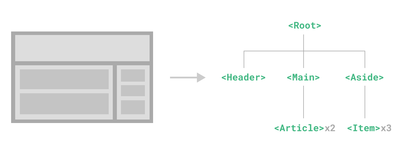
组件允许我们将 UI 划分为独立的、可重用的部分,并且可以对每个部分进行单独的思考。在实际应用中,组件常常被组织成层层嵌套的树状结构:
Vue 实现了自己的组件模型,使我们可以在每个组件内封装自定义内容与逻辑。
定义一个组件
当使用构建步骤时,我们一般会将 Vue 组件定义在一个单独的 .vue 文件中,这被叫做单文件组件 (简称 SFC):
<script setup>
import { ref } from 'vue'

const count = ref(0)
</script>

<template>
  <button @click="count++">You clicked me {{ count }} times.</button>
</template>
使用组件
要使用一个子组件,我们需要在父组件中导入它。假设我们把计数器组件放在了一个叫做 ButtonCounter.vue 的文件中,这个组件将会以默认导出的形式被暴露给外部。
<script setup>
import ButtonCounter from './ButtonCounter.vue'
</script>

<template>
  <h1>Here is a child component!</h1>
  <ButtonCounter />
</template>
在单文件组件中,推荐为子组件使用 PascalCase 的标签名,以此来和原生的 HTML 元素作区分。
向组件传递数据 props
Props 是一种特别的 attributes,你可以在组件上声明注册。要传递给博客文章组件一个标题,我们必须在组件的 props 列表上声明它。这里要用到 defineProps 宏:
<template>
<h4>{{ title }}</h4>

</template>

<script setup>
import { ref } from 'vue';
const props= defineProps(['title'])

console.log(props.title)

</script>
defineProps 是一个仅 <script setup> 中可用的编译宏命令,并不需要显式地导入。声明的 props 会自动暴露给模板。defineProps 会返回一个对象,其中包含了可以传递给组件的所有 props:
循环数组批量调用组件
父组件数据:
const posts = ref([
  { id: 1, title: 'My journey with Vue' },
  { id: 2, title: 'Blogging with Vue' },
  { id: 3, title: 'Why Vue is so fun' }
])
使用 v-for 来渲染子组件:
<BlogPost
  v-for="post in posts"
  :key="post.id"
  :title="post.title"
 />
子组件触发父组件的事件
<template>
<h4>{{ title }}</h4>
<button @click="changeFontSize">Enlarge text</button>
</template>

<script setup>
import { ref } from 'vue';
const props= defineProps(['title'])
//公开 enlarge-text 事件
const emit=defineEmits(['enlarge-text'])
function changeFontSize(){
  emit('enlarge-text')
}
console.log(props.title)

</script>
父组件
  <div :style="{fontSize: postFontSize+'em'}">
        <BlogPost @enlarge-text="postFontSize+=0.1" v-for="post in posts" :key="post.id" :title="post.title"/>
    </div>
通过插槽来分配内容 <slot />
将在父组件调用子组件时,把传递的内容插入到子组件中
<template>
  <div class="alert-box">
    <strong>This is an Error forDemo Purposes</strong><br/>
    <slot/>
  </div>
</template>

<script setup>

</script>

<style >
.alert-box {
  /* ... */
  font-size: 20px;
}
.alert-box strong {
     color:red;
    }
</style>
父组件调用子组件,交将内容传入子组件
<AlertBox>
      Somthing bad happedn.
    </AlertBox>
动态组件
有些场景会需要在两个组件间来回切换,比如 Tab 界面:


<script setup>
import Home from './Home.vue'
import Posts from './Posts.vue'
import Archive from './Archive.vue'
import { ref } from 'vue'

const currentTab = ref('Home')

const tabs = {
  Home,
  Posts,
  Archive
}
</script>

<template>
  <div class="demo">
    <button
       v-for="(_, tab) in tabs"
       :key="tab"
       :class="['tab-button', { active: currentTab === tab }]"
       @click="currentTab = tab"
     >
      {{ tab }}
    </button>
      <component :is="tabs[currentTab]" class="tab"></component>
  </div>
</template>

<style>
.demo {
  font-family: sans-serif;
  border: 1px solid #eee;
  border-radius: 2px;
  padding: 20px 30px;
  margin-top: 1em;
  margin-bottom: 40px;
  user-select: none;
  overflow-x: auto;
}

.tab-button {
  padding: 6px 10px;
  border-top-left-radius: 3px;
  border-top-right-radius: 3px;
  border: 1px solid #ccc;
  cursor: pointer;
  background: #f0f0f0;
  margin-bottom: -1px;
  margin-right: -1px;
}
.tab-button:hover {
  background: #e0e0e0;
}
.tab-button.active {
  background: #e0e0e0;
}
.tab {
  border: 1px solid #ccc;
  padding: 10px;
}
</style>
上面的例子是通过 Vue 的 <component> 元素和特殊的 is attribute 实现的:
<!-- currentTab 改变时组件也改变 -->
<component :is="tabs[currentTab]"></component>
在上面的例子中,被传给 :is 的值可以是以下几种:
- 被注册的组件名
- 导入的组件对象
你也可以使用 is attribute 来创建一般的 HTML 元素。
当使用 <component :is="..."> 来在多个组件间作切换时,被切换掉的组件会被卸载。我们可以通过 <KeepAlive> 组件强制被切换掉的组件仍然保持“存活”的状态。

 浙公网安备 33010602011771号